Now I know I posted about my interior trend predictions for 2020 last week, but at this time of year, the inbox is flooded with emails from brands talking what they are actually selling and launching in the months ahead so I thought we would have a look at a couple of them today. This is the concrete stuff that will be in the shops as opposed to the notional ideas and forecasts that don’t always take off straight away.
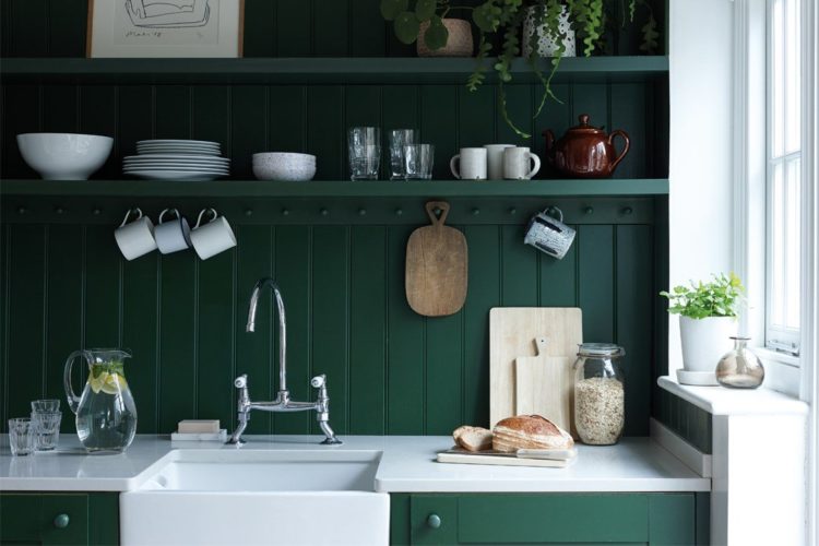
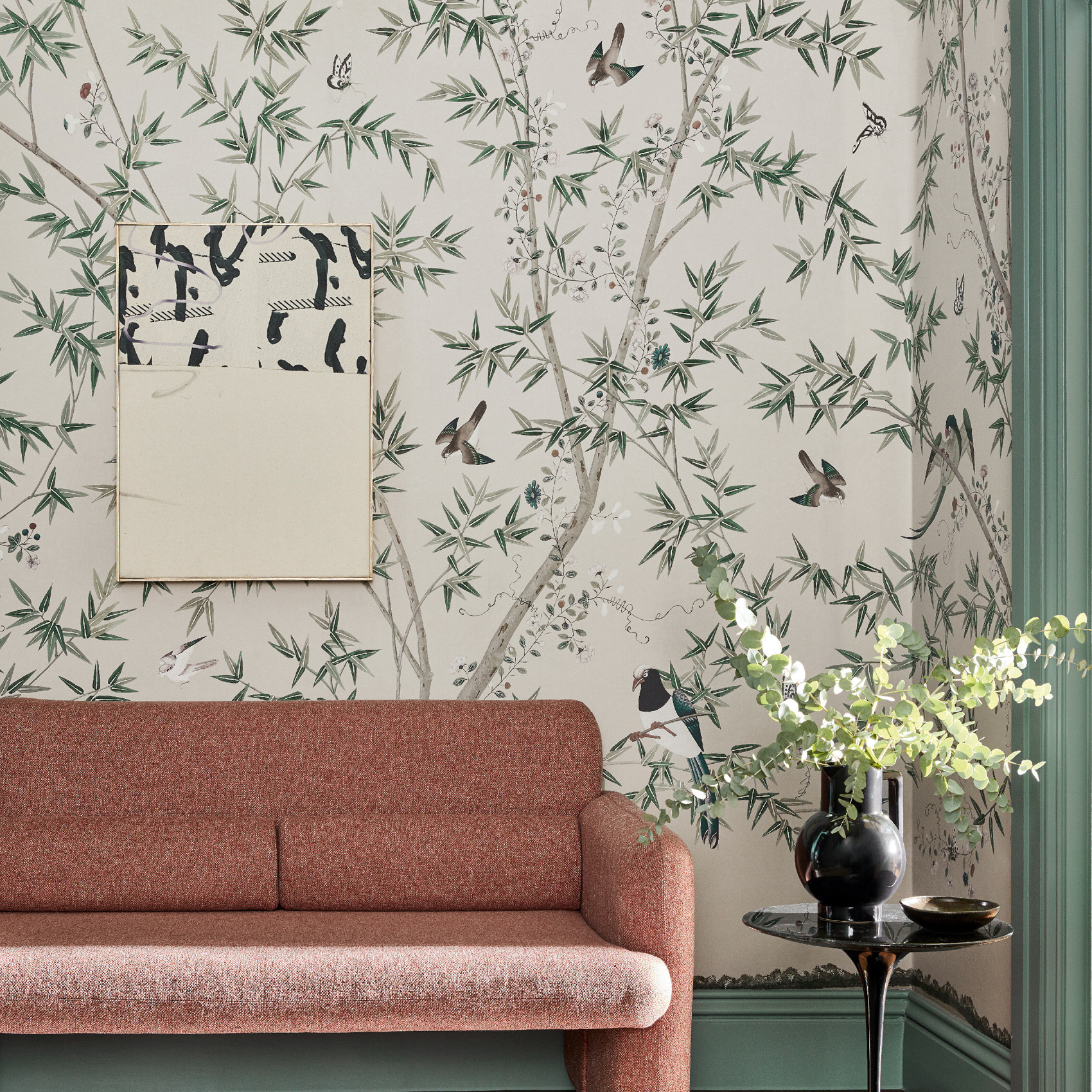
First up and Farrow & Ball are talking about their key colours for the year ahead, which, it will come as no surprise, are all very nature-based. They haven’t released any new colours but are, instead, predicting the shades from the current collection that they think will take off this year. So look out for Duck Green and Sap Green (both from their collection with the Natural History Museum), Mouse’s Back, Pigeon and Ammonite. As well as Wimborne White (phew – my whole house is wimborne white where it isn’t a stronger colour) and Stiffkey Blue (chiming with Pantone’s classic blue colour of the year).
Joa Studholme, the company’s colour curator, said this year is all about creating homes that we are proud to show off to friends and family and that will be reflected in the use of strong, saturated colour. Now, I know there’s a lot of talk of pale neutrals coming back, but that is one of those trend prediction/forecasts, this is more about what companies think we will actually be buying this year and the strong colour theme is only just getting going. This just goes to show that pale or dark, saturated or soft, nothing is wrong and it’s all about what you like. This is just for inspiration.

“We want to use colours that make us feel proud of our homes, and increasingly, that’s coming to mean tones that are bolder and more saturated. Strong colours suit rooms that we tend to use at the end of the day, a time when we want to relax and be comforted, but this sense of wellbeing is also a wonderful side-effect of surrounding ourselves with colours found in nature. As we become increasingly environmentally aware, we’re collectively craving a connection with the natural world, which is why deep Duck Green and earthy, organic Sap Green feel perfect for the home in 2020,” she added.
And I will also tell you that three years ago – 2017 – I went to a talk with Joa who was predicting which colours would be strong that year and she yellow would be coming for us. And we all disagreed and then over the last few years we have gradually seen the arrival of turmeric and saffron, egg yolk and hay so ignore what she says at your peril. You might not do it this year but do it you probably will.
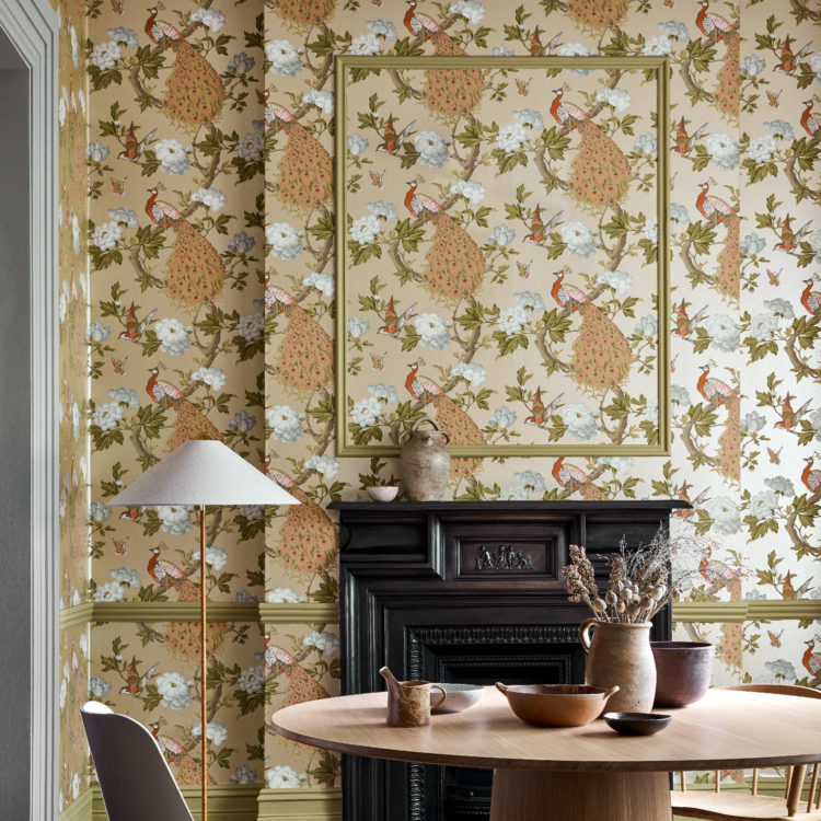
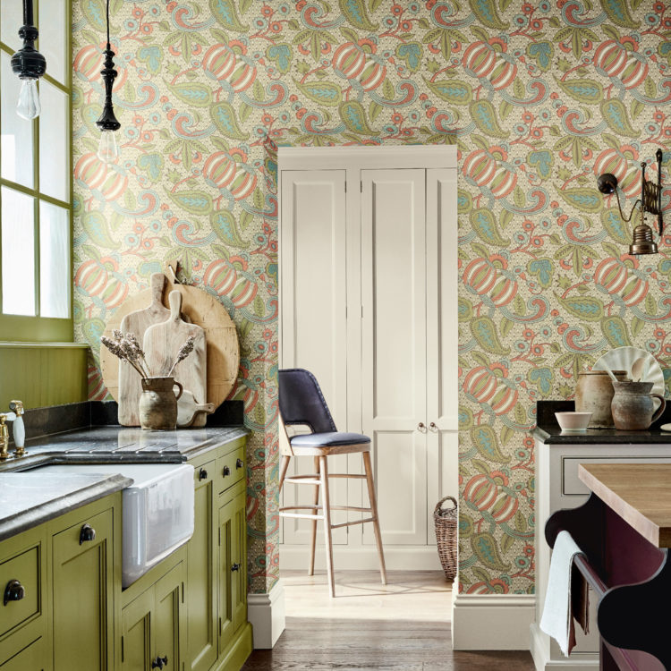
Next up Little Greene have released a collection of wallpapers in collaboration with The National Trust; their first collection (in January 2018) was a series of green paints based around shades found in NT properties around the UK. This has proved so popular the range has expanded to include wallpapers, most of which also have a nature theme to them.
So there are flowers, birds. pomegranates and plants. In fact there are 40 colourways over seven designs and the collection represents 200 years of pattern, from the early 18th to the early 20th century. Each wallpaper has been recreated from originals in National Trust properties nationwide, including papers still adorning ancient walls, fragments conserved in archive drawers and even preserved rolls found in the back of an attic.
The patterns are bold and intricate so they won’t be for everyone but they certainly fit with the nature and strong colour theme that seems be the direction for 2020. What do you think? Are you ready to go bold but using colours inspired by nature?
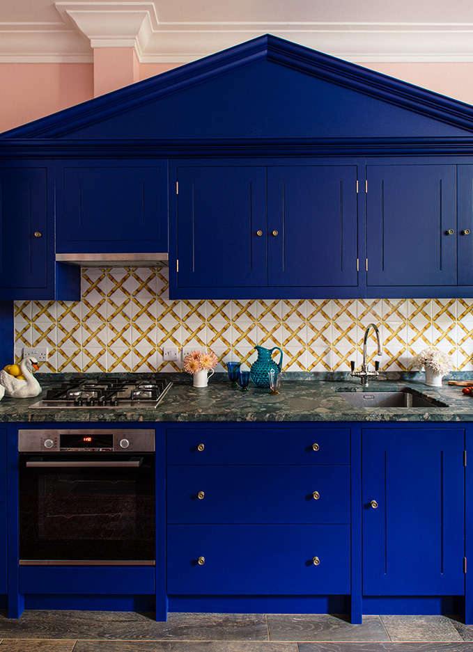
And a last minute press released from British Standard by Plain English, also predicted bold colours and strong colour combinations for the year ahead. You in?


Yes, I’m into strong colours and bold combinations! The cobalt blue kitchen is a bit too much for me, though.
It would have been nice to see some new prime colours from F&B this year. We sell printable wall art and are trying to get ahead of the 2020 colour trends; however it seems that not much will change this year. I can’t see any significant decor retailers embracing the Pantone COTY, and most of the mainstream interior designers seem to be sticking with some form of a shade of Grey.
Our printable wall art is mostly Scandinavian inspired, and Scandinavian decor has not changed for the best part of the last decade!
On a final thought, thank you for the clear, concise, and on-trend interior insights, as usual, Kate!
Cookie And Porter
It’s true that interiors trends move much more slowly than people think. I have just come back from the Paris Trade Show Maison et Objet and there aren’t that many changes from last year. I’m going to report on it in more detail on Tuesday but there’s still lots of pink (now called Salmon) and related colours. The one notable thing was that for the first time I didn’t see any grey.
It all looks so lovely! I don’t think I could love these rooms more! xx
Cobalt blue is gorgeous, but for all the kitchen cabinets? It’s a bit of a shock!
I must of predicted the blue! Mid last year we chose the colours for our kitchen RAL5013 (Cobalt Blue) for the cabinetry and Wimborne white for the walls (we too have this colour everywhere in the house we don’t have colour !) . We included wood shelves for warmth. My red line takes the blue through out our house (yes my favourite colour !)
BTW – love your blog and always make the time to read it, so informative
You’re a genius! It’s a lovely combination and thank you so much for your kind words x
Yes! The decorators are just finishing our hall/stairs/landing with F B Ammonite above the dado and Inchyra Blue below, looks absolutely stunning! Somehow this combination of colours is uplifting and calming at the same time and the depth of colour in the Inchyra Blue is almost like having fabric on the walls! I’m now looking for contrasting fabrics and the acidy yellows are everywhere – great!
Loved the wallpaper designs then, whoa! The cobalt blue kitchen is a no-go for me. Spectacular as it is, how not to get tired of it within a year, even less?