Last week’s beautiful rooms post was all about using strong colours, so this week I have swung the pendulum back the other way – because there is no right or wrong answer – to look at some gorgeously pared back interiors full of natural materials and textures and all of which I find incredibly restful and calming. I’d be interested to know if you do too or if it just looks boring to you?
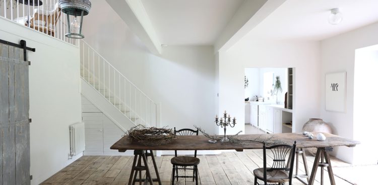
First up is this location house belonging to Cassandra Ellis, who makes the chocolate brown paint that I have used in my living room. It’s a blank canvas for sure (she hires it out) but the vintage table and chairs are great pieces. That darker wood is definitely going to be the colour to look out for this year. I’m pretty sure if I lived here I would end up painting the walls but perhaps in a very pale pink or cream rather than something dark.
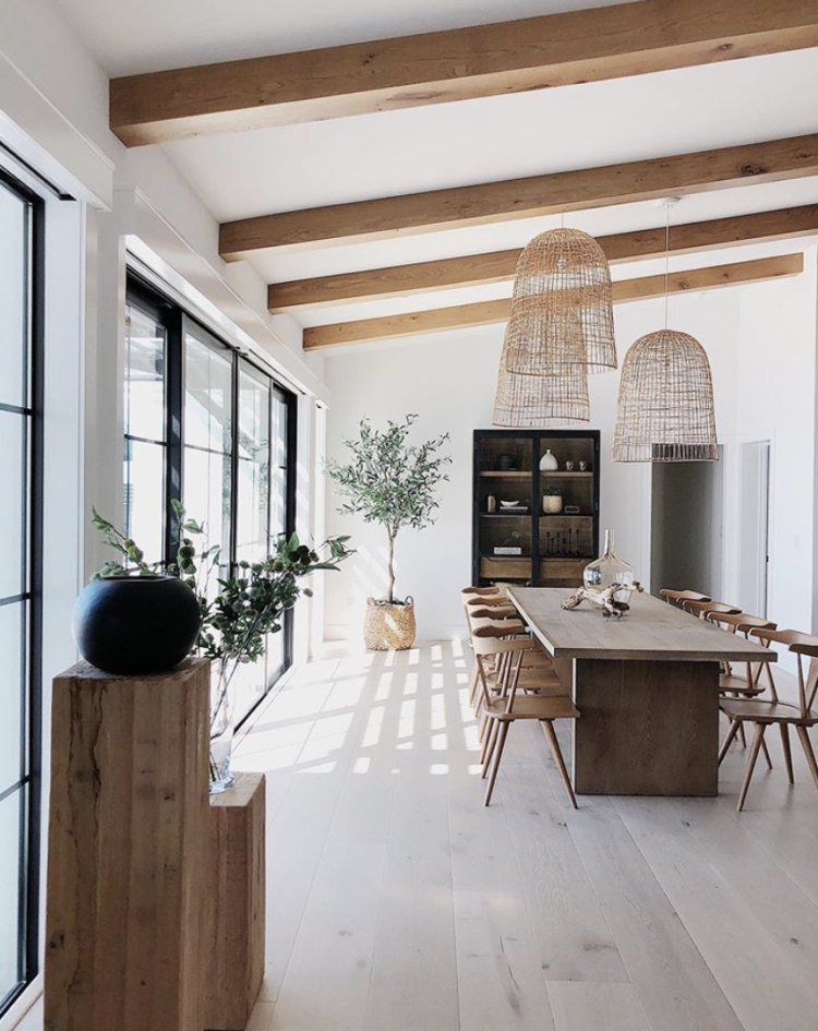
This room by House Seven Design also showcases the power of wood and natural materials and also answers a common question which is what do you do if you have a wooden floor and want a wooden table and chairs? Here the floor is very pale and so it doesn’t fight with the other woods in the room. Often, in the UK at least, the floorboards are pine, which can go very orange so they tend to start a fight with any other wood you bring into the room. These are perhaps oak, or whitewashed pine, so they’re up for a more harmonious relationship from the start.
That’s not to say you can’t have natural wooden pine boards, but you might want to put a rug between a table and the floor to break things up a little. Or find a very dark wooden table, or a marble one, or something a bit different.
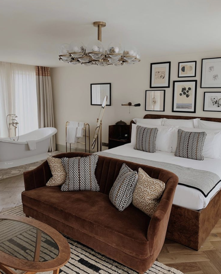
This room at Redchurch Townhouse, part of the Soho House group, shows that you can mix all the browns if they are in different materials. So here a brown parquet floor is mixed with a brown velvet sofa, and a coffee table that tones beautifully with the sofa but is preventing from having an argument with the floor by the insertion of a rug. This also works on another level as the table and rug are from different periods and the rug helps to harmonise them.
The whole palette looks natural and restful as there aren’t too many colours but, that said, the colours that are there are all quite intense: black, cream, chocolate, caramel and brass. They are all strong, which is why the pale background sets them off really well. You could absolutely paint the walls in dark chocolate or navy blue, and it would look great, but it would be less relaxing to be in which might not be the effect in a bedroom, which, despite its gargantuan size, freestanding bath and sitting area is still its primary purpose. If you wanted to use the same colours in a sitting room then dark walls would be an easier fit.
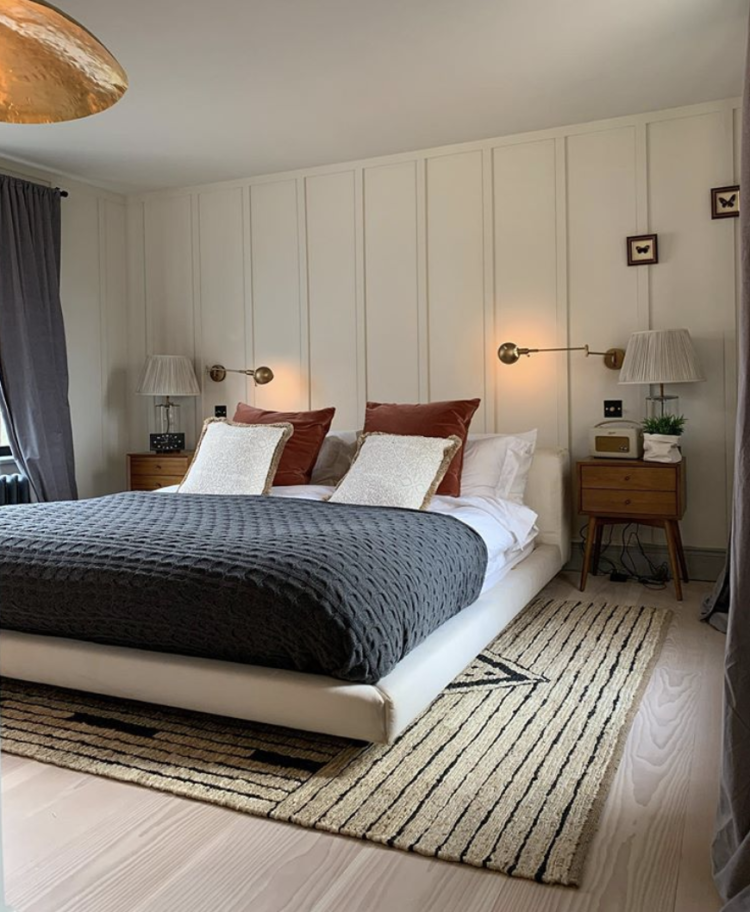
A similar look to above with panelling behind the bed which makes the room more cosy. Panelling is the look of the moment if you spend any time on instagram but it’s not always appropriate to the house. This works really well however, as it’s not tied to any period. I love panelling but prefer the Georgian style (usually full height) to the Victorian (traditionally dado rail height) and since my house is Victorian it feels wrong to create an effect belonging to a period before the house was built. That said this might be original Edwardian panelling, which is when Katy’s house was built although she has added the most incredible modern extension so if you are on instagram you should look and follow.
There’s probably a whole post to be done on mixing different periods of furniture and architecture – in fact I will absolutely do this – but as a general line rule I tend to be of the opinion that rather than trying to copy something old with something modern, which may end up in a sort of Disney pastiche effect, it’s better to go for a completely modern contrast that makes its own statement and can still marry well with the old original it sits next to. The second line is that a sensitive addition using original materials to tie in with the original thing it sits next to can also work. I’ll expand another time but in the meantime I have already written this.
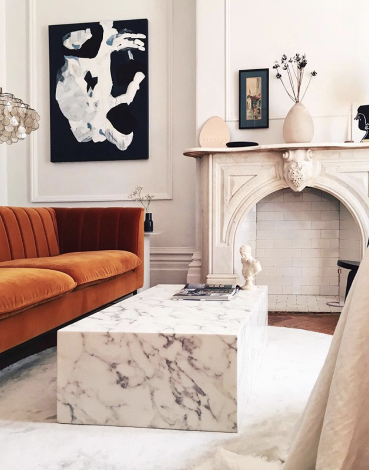
Finally, this sitting room which is all wood and stone and velvet and marble. Keeping to the restrained colour palette but making sure that the textures are all quite luxurious. This is another way to do a room if you are nervous of lots of colour – bring it in the texture. Lauren, lives in Montreal and her table is by a Canadian company called Prunelle Furniture (lucky Canadian readers as you can buy the same one) for $999 Canadian (not quite the same as US) or, for the UK readers I have found this, by Timothy Oulton on sale at £1,680 down from £2,100 (delivery not till May either which gives you time to save!).


Lovely images!
Could I get your thoughts on panelling in our 1930s home. We don’t have a panelled hallway but do have lovely original plate rack. We have recently moved in and are converting the loft into the master bedroom. We are thinking we would like the add a bit a ‘feature’ to the wall behind our bed. Would it be wrong to add panelling?
Thanks
No I think it would be fine. Lots of 1930s houses had panelling originally so it can be perfectly in keeping. It wouldn’t have existed in the loft but I would perhaps try and find one that is relatively in keeping with the period and it should work well.
I would do it. Lots of 1930s houses had panelling and while it wouldn’t have been in the loft if you can find one you like that is similar to the period it would look great.
Absolutely love it; our home is also restful and calming and we are using warm neutrals but it is work in progress! Your posts are always inspirational.
“Restful and calming” is exactly what I always want for my home, so this post really speaks to me!
I think warm neutrals are lovely in the right setting. However it’s interesting that all the examples you have shown are architecturally beautiful rooms, I think it is much harder to use neutrals in “ordinary “houses. Architraving, cornicing and fabulous fireplaces really do make a difference, and lots of people don’t have these !
Totally agree! Kate, do you have a post on how to make plain boxy rooms seem less plain and boxy?
So have I spotted the new “IT” rug that shows up above? 2018 was the cream rug with the black diamond stripes…. I crave the thought of white/cream but really can’t relax that way. Too much life shows up and I already clean enough. Love the post, though, per usual. Keep up the great showings!
I swing to the more neutral end of the décor spectrum, however the photos in this post are a bit too plain for me. I would have to inject a little colour somewhere (artwork, textiles, books etc) even if its just something in teal, olive, mustard or rose.
I agree with William’s comment having moved into a magnolia house myself a few years ago (walls, ceilings, carpets, lino, built in storage, everything was the same colour). Luckily all traces are now, near enough, a distant memory!
Great post but those walls are just crying out for some colour! I’m afraid the schemes don’t look restful to me at all – they look like a work in progress and if I spent time in them I would be twitching to get my paintbrush out!
I’m sorry Kate, good attempt, but you’ll never sell me a cream interior, anywhere! The house doctor did to cream what the iceberg did to the Titanic and having bought a house that was “magnolia” throughout I can honestly say it was very much akin to living in a bowl of rice pudding. Give me my greys, blues and greens any day.
I especially enjoyed today. Thanks
I adore all of these images! I know strong colours can work so beautifully but for me home needs to be calming and this pallet does it for me every time. Beautiful x