How is it Friday already? This week totally ran away with me and I wanted to tell you first that my book is now OUT. I made a video telling you all about it which you can watch below if you fancy to find out where the inspiration came from and who it’s for (spoiler: everyone) and how to use it. If you’re on the bus or at work you can watch here with subtitles ! And if you want to skip to the cart then you can just buy it here. I hope you will like it. It was super hard for my publisher Pavilion to make but they have done a beautiful job and it is very lovely to look at and flick through. Thank you all, as ever, for your support and readership and, of course, questions, that often go to form the foundation of the books I write.
So houses. Back to the normal order of the day. And after all the excitement I fancied running away to the countryside for a few days. Coming? We’re off to Wales to this pretty stone cottage in Carmarthenshire which is on with Inigo for £1,400,000.
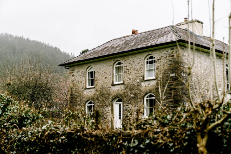
Isn’t it pretty and inside the decor picks up on these soft rain-washed tones so the house sits perfectly in and of its environment. Now of course there’s nothing to say you can’t decorate in brighter tones – inside these stone walls probably looks completely different in the middle of August but there’s no getting away from the fact that these muted shades do suit our (current) climate.
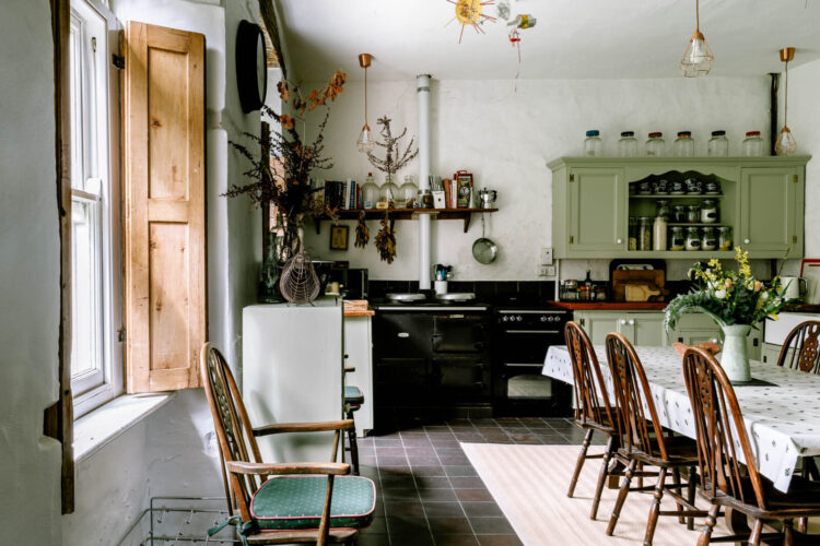
I might point out as well for those of you who listen to the podcast (by the way yesterday’s Style Surgery is here) that we have a brilliant interview coming up with the Head of Home at Pinterest talking all about using the site for business but also about trends and he told us that searches for sage green kitchens are up 45 per cent and 80 per cent for living room schemes using this colour).
Strictly speaking this probably isn’t sage (at least not on my computer) but let’s go for pale greens as opposed to dark. And the reason this works is that it immediately connects you with the view outside while if you live in an urban setting it can provide the green nature feeling that might be missing from your view so it’s a brilliant colour for both town and country.
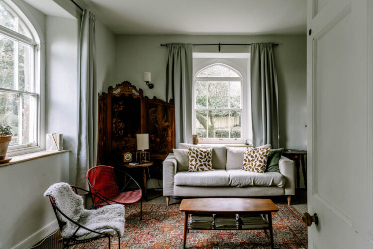
Moving into one of the sitting rooms and this too works with the climate outside – a soft grey sky doesn’t always have to be oppressive, particularly when mixed with green trees. The reason this works is that the curtains, which are long and luxurious, match the walls so you are keeping the colour palette simple but adding layers of texture. If you feel overwhelmed by choosing fabric, and I know I do as there are so many, then sticking to a plain colour that tones with, or matches the walls can be a really simple solution as it will always look super elegant and refined.
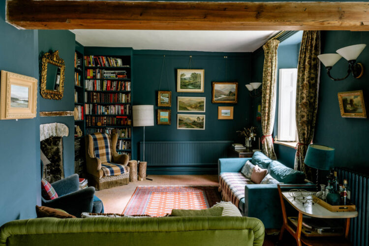
Now this is a great example of why you should always paint your radiator to match your walls. This is not a radiator of beauty. Some are this isn’t. If it was left white it would draw the eye to this end of the room and not to the pictures hanging over it. Painted to match the walls it just about disappears and allows you to look at the decor. For those who are nervous you can now get metal and wood paints that work well on radiators but standard eggshell will work too. Below is a crude photoshop to illustrate the point.
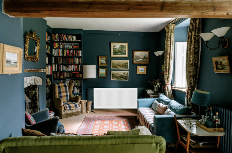
I think white radiators should be marketed as “paintable” in the same way that textured wallaper is. That way it wouldn’t feel like such a big deal and would just become industry standard. If you have doubts about it then bookmark these two images and refer back to it when needed. I am firmly of the opinion that there is no right or wrong in interiors unless it’s radiators. And on that subject I will not be moved.
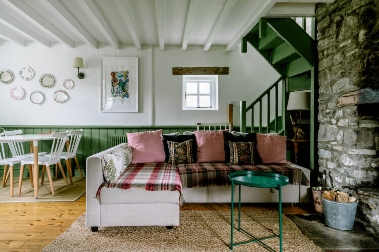
Now I called this a cottage but it is, in fact, a farmhouse extending to some 7,000Sqft – it’s huge! The former stable block has been converted into four cottages of which this is one. And there are a couple of points to note on this on our tour. One is note how the green panelling takes your eye round and up the stairs. Now I appreciate you might not have a room like this but it’s a factor to consider -using colour to direct the eye to where you want it to go – ie: towards the things you want to highlight or away from those you want to hide.
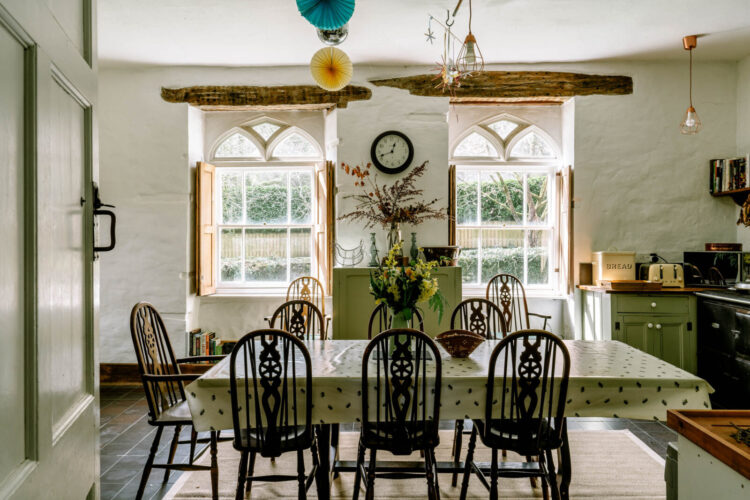
Secondly the rugs are used to zone the two spaces; one for sitting and one for dining.
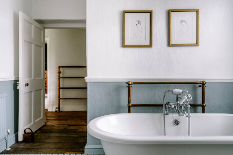
Upstairs to the bathrooms and this pale blue is so pretty with the weathered copper. You can just see in the corner of the picture how there is another radiator painted to match and it really is invisible. If it wasn’t for the pipe you would barely notice it.
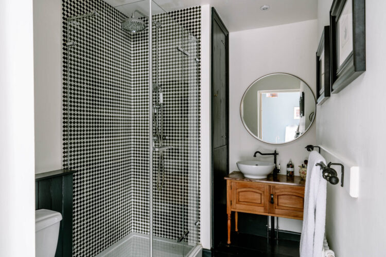
This shower room almost looks like tweed. It’s quite busy on the eye when the pattern is this small in a small area but the vintage wooden basin unit warms the whole thing up and makes it look more inviting. Another – let’s call it idea – is to always bring in some vintage wood to a bathroom or kitchen or room that is full of straight lines and hard edges. If you don’t want a vanity unit like this and don’t have room for a stool it can be as simple as a couple of picture frames.
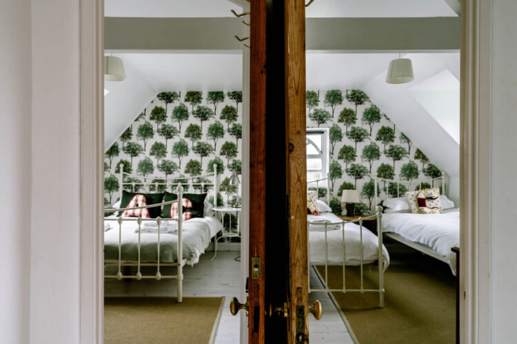
Finally, a couple of bedrooms and this is another example of a layout that you might not have but which talks to a wider point that’s worth remembering and that is views. You should always consider what the view is when you walk past a room. A doorway acts like a giant picture frame so think about what you are illustrating there. Here, the wallpaper has been matched across the two rooms to create a seamless view when walking past. As I say, you probably don’t have this but you do, I assume, have doorways so think about how you place artwork or objects so the “picture” is pleasing when you go past.
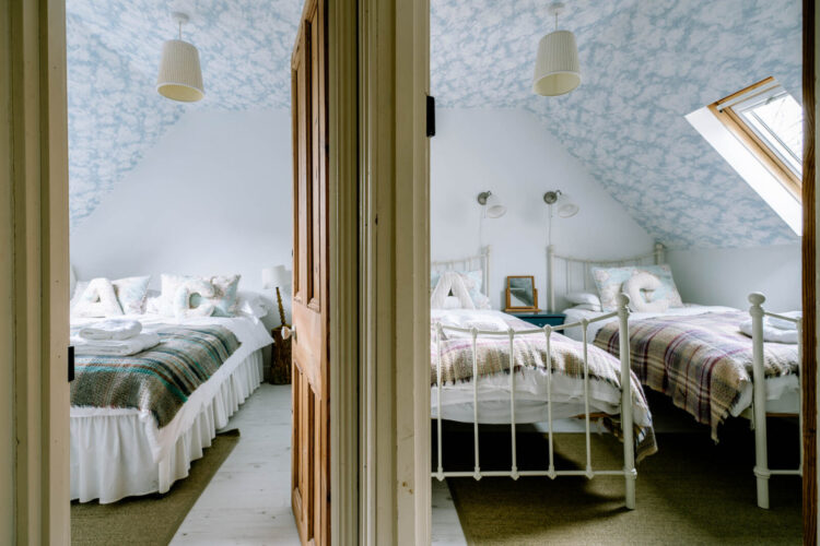
Below is for all those who remember Kramer v Kramer and the cloud wallpaper from the little boy’s bedroom. I might have painted the walls in a pale blue to continue the idea but the white works just as well.
I hope you feel rested for our little trip to the country. Thank you so much for coming with me and thank you to anyone who has bought the book. I hope you like it.


Someone compared this house’s exterior (NOT interior) to Father Ted’s house on Craggie Island. I can’t unsee it now!
I love this. Clearly a home as well as artful. Thanks for sharing!
Glad to hear that I was ahead of the curve by fitting my sage green kitchen 5 year ago!
What a beauty…. A dream family home in my eyes.
I like the top on bringing vintage wood into the bathroom and kitchen – do you think original pine doors in a Victorian terrace would satisfy that element?
PS I liked the Instagram showing the inspiration behind your new book
At first glance this house isn’t to my exact tastes, but I am glad I paid attention properly because there are some very clever touches and ideas here, and a very subtle use of colour. And several radiators hiding in plain sight because they’ve been painted properly!
My book came yesterday! As soon as I finish working (from my small home), I’ll be starting the weekend with it.
Brilliant idea on the view from the door: I didn’t realise that the two bedrooms were separate rooms, it was so well executed.
Just ordered the book! Excited to read it when Mr. Bezos delivers it tomorrow.