It’s time – this house is a few minutes walk from the beach and it has an outdoor pool and it lies in a protected area of outstanding natural beauty which means no-one is going to come along and build a house right in the middle of your view. And this week had the longest day so if ever there was a time to be at the coast it’s now.
And for that, plus a four bedroom house and two bedroom annexe in Wincheslea, East Sussex WITH a Devol kitchen (which is probably a selling point these days) you can expect to pay £2.35m via the Unique Property Company.
So you can come in if you’re house-hunting and you can come in if you’re only here for the inspo as you never know what might strike you.
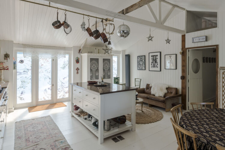
It is all quite white and pared back but there is lots of texture which is the way to make pale colours work and also to create a more rustic look if that is your vibe. So the walls are timberclad, the fluted Belfast basin echoes that and the cupboards are detailed. But the worktops are wooden, the handles brass and there’s a copper kettle and pans. In other words lots of natural colours and materials have been used.
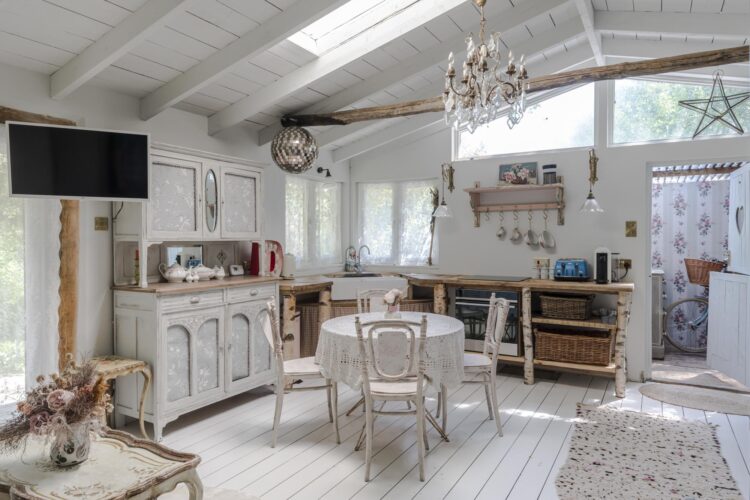
And if you’ve ever wondered about the power of misdirection to hide something you don’t want showing then look at the blue cupboard on the left. How many of you noticed the microwave first? My guess is you saw the cupboard and then your eye drifted down. The question is – without the blue cupboard does that corner of the room with the microwave disappear altogether or does the blue draw attention to it or does, in fact, your eye find the blue cupboard interesting and therefore it is prepared to overlook the microwave below. And I’m not saying all kitchen appliances should be hidden by the way, this is a working room and it needs to do that. No point putting everything in a cupboard or you won’t use it. That said, I do know someone who keeps their toaster in a drawer.
And yes i think I am muddling up the annexe and the main house but it’s partly just to give you a look at the rooms and partly depends on what I might have to say about a particular room. So this is the other side of the kitchen and another trick to dekitchen a room (as well as hiding the appliances one way or another) is to use unexpected lighting. Both the lamps on the right of the picture are more sitting room than kitchen with their frills (and furbelows) but they are far enough away from the cooking action to be able to cope. Beware of using fabric and fringing in a small kitchen as they will just attract grease and dust. Works brilliantly in here though.
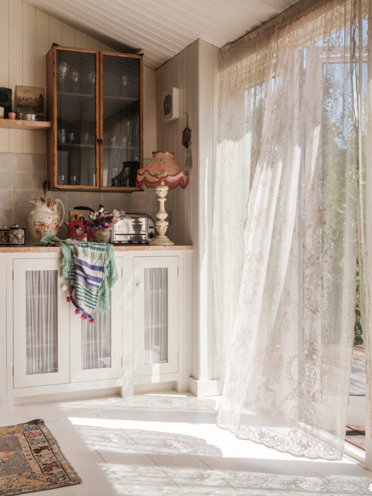
Zipping past this area because – did you spot it – a vintage glass cabinet on the wall. I’m now seeing these everywhere I look which means – if you’ve got one get it on the wall and ride that fashion horse. If you haven’t, and you want one, be quick or you won’t be able to find a bargain.
Which leads me to a quick point about trendY v trendING. I was going to write about this in more detail in a separate post but in brief. A trend is often a short lived fashion that comes and goes. You should buy in only if you love it but be prepare to look at in a a year’s time and no longer want it as you might feel it has reached saturation point – pineapple motifs and shiny copper lamps being a case in point.
Or something might be trending which means it’s a classic that’s having its runway moment. So a vintage glass cabinet will always look good but you are going to see a lot of them at this point. Invest only if you think you will love it for ever as, when the show is over, you want to be able to feel that you have added something you will always enjoy to your home and you won’t care about fashion. So brass hardware – a classic that is trending. Shiny copper homewares – a trend that has now passed. Scallop tiles – probably a trend that will go (unless your permanent vibe is art deco) – square tiles – definitely trending.
If you’re not sure if an item is trendy or trending then first see what a vintage version might look like. To return to pineapples – actually a classic motif that means welcome. So vintage lights and ice buckets will always be in style while an appliqué cushion might not. Another version of this is the different between style and fashion and while style never goes out of fashion not everything in fashion has style.
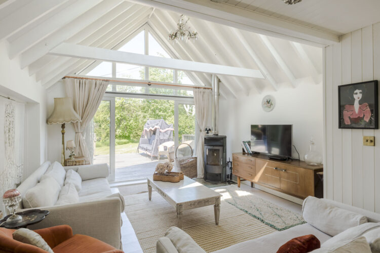
And there endeth today’s lesson. I included the image above as it’s a step change from the all white elsewhere and shows you how to add colours to paler backgrounds which, by the way, is often easier with cream than white. White and colour will give you that very clean Palm Springs look so beloved of Jonathan Adler (listen out for him on the podcast next week by the way) and requires slightly cleaner shades of blue and pink while, if rustic is more your thing then have cream walls and add all the colours of autumn as has been done here. Bronze, by the way, is dramatic but softer than black.
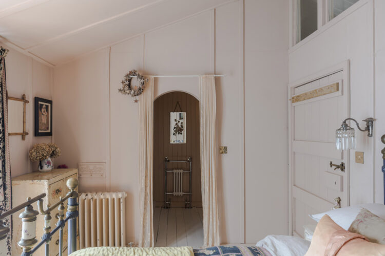
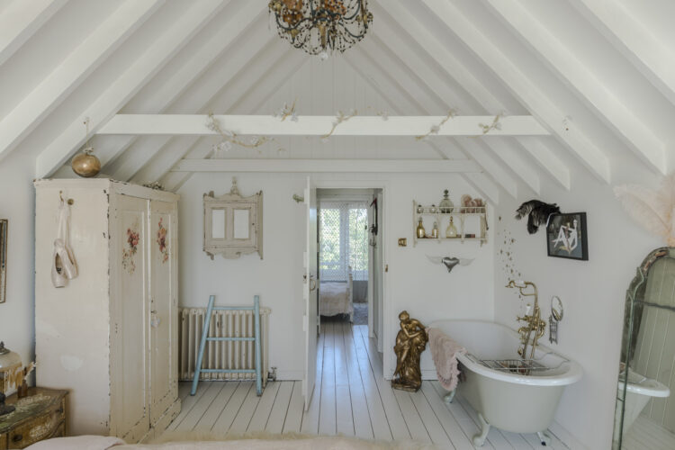
If have an ensuite then, if at all possible, see if you can move the loo so it doesn’t face the door. A radiator or basin is a much better view. If you can’t for space or budget reasons then keep the door closed.
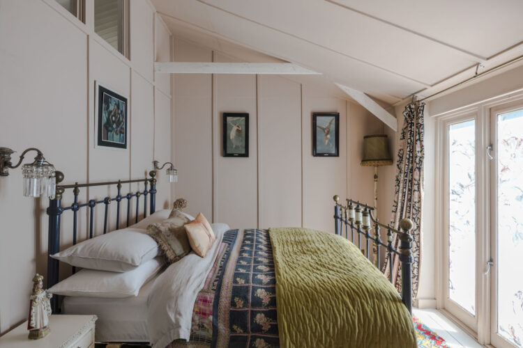
This is the view from the aforementioned bathroom and I love the colour palette in here. A soft pink always loves an olive and you can add a darker pink and a navy for a colourful but soft mix of shades.
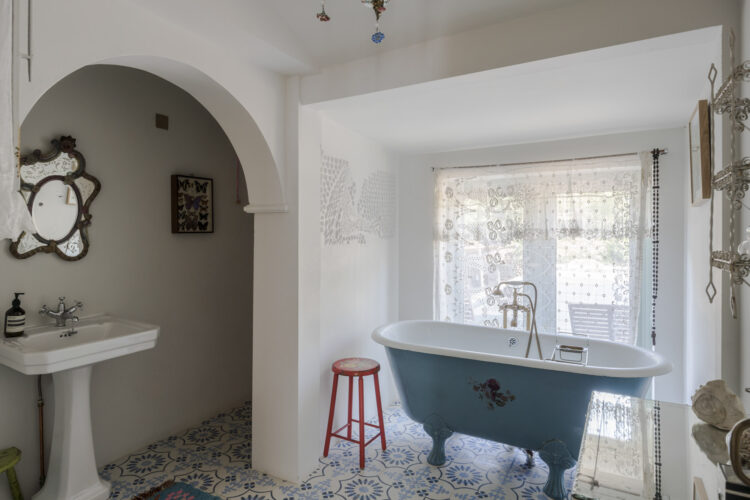
Another bathroom and I love the pop of red here but if you are gifted with an architectural feature like this arch try and make something of it. Now perhaps this started out as something annoying. We all have odd shapes and spaces in our houses and sometimes it’s hard to see beyond the fact that it’s stopping us putting a loo where we want or extending a space but try, if you can, to take a step back.
This is clearly the architecture of the room and perhaps it’s not wide enough to tuck the loo into but you can own it by painting the inside of the arch to match the blue of the bath. Or the whole of that alcove. Or perhaps installing a blue basin to match the bath.
Coco Chanel famously said when getting dressed that you should take off the last thing you put on. In interiors the opposite can be true – adding just one more thing might be the missing part that brings the whole scheme together.
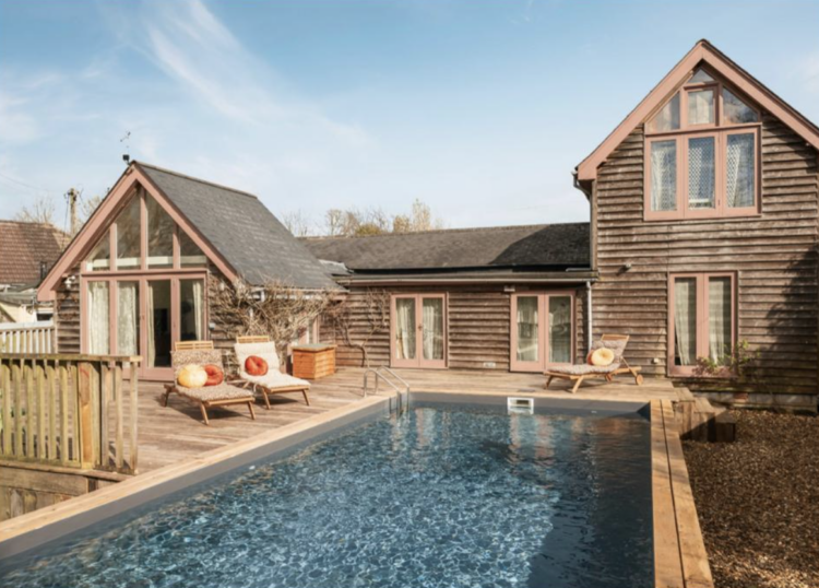
And while we ponder on that let’s go for a dip. Have a lovely weekend everyone. Let me know if you buy this because we’re all coming round.


Is it Pearl Lowe’s house ? Could explain why it’s so well curated 😉
That’s what I thought too! It is exactly like her holiday home but the island colour is different. Is is Pearl Lowe’s house, Kate?
You might very well think that. I couldn’t possibly comment.
I think that the kitchen island has changed color from when Kate showed this house the first time. It had a nice yellow color then and it was during lock down and the yellow kitchen phase. I used that picture as inspiration for a lofted ceiling. Still a beautiful kitchen but I think I liked a color on the island. Perhaps not yellow but something more than just plain white.
Beautiful. I’d snap it up instantly if I had the money *buys lottery ticket*
I quite liked the odd shelf! In fact all of it, despite the whiteness. Especially the bed. And even the real life touch of the wall TV in the first picture…!!
Thanks for the inspiration
My dream home, I’ve got nothing else to say. 🤍
I saw this on *insert well-known sales website* yesterday and thought ‘Odd that Kate hasn’t covered this house’ but here we are! The only thing that distressed me about this house was the driftwood shelf which looks like it’s sloping to the right. Fish eye lens effect maybe? Other than that, what a perfect summer house!
No fish eye lens in that photo, it’s definitely sloping!