So this was clearly meant to arrive yesterday but I got the date wrong when scheduling! My apologies. Here you are – a colourful Edwardian House in London.
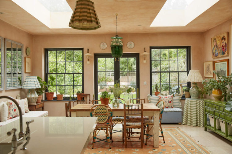
Don’t panic – it’s not the high contrast colourful which upset so many of you the other week rather this is a warm layered effect that feels like the sun is always shining. More of a tonal maximalism if you like. It belongs to the homewares designer Alice Palmer so if you like the look you can shop for many of the accessories.
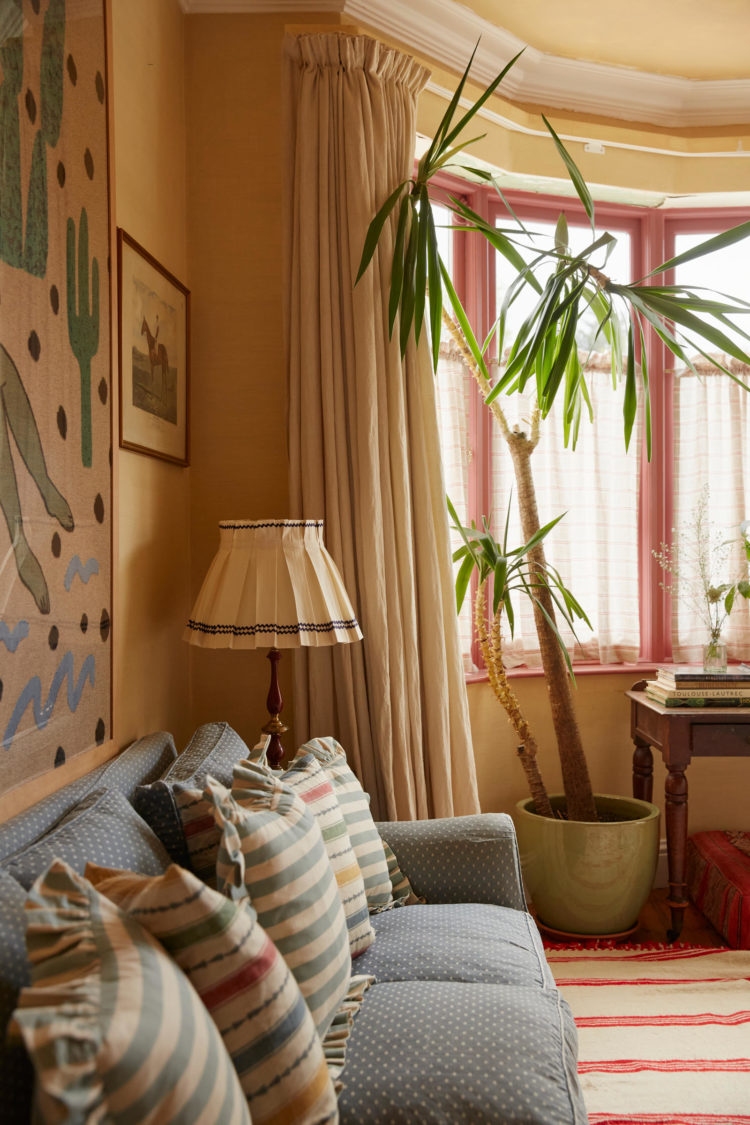
One of the key things that struck me in this house (which is on with Inigo for £2,200,000) is the attention to detail. And that, my friends, is what matters. You might think you paint all your windows and doors white but they can be different in every room and painted to suit the room they are in. You can paint the door one colour for the room it’s in and another for the room it faces. This is how you create a cohesive “joined-up” space that will look considered. And while you might feel instinctively allergic to the word “design” I once worked for an interiors editor who banned it entirely (tricky) you want your home to feel as if you have spent time considering the details to make it the best it can be.
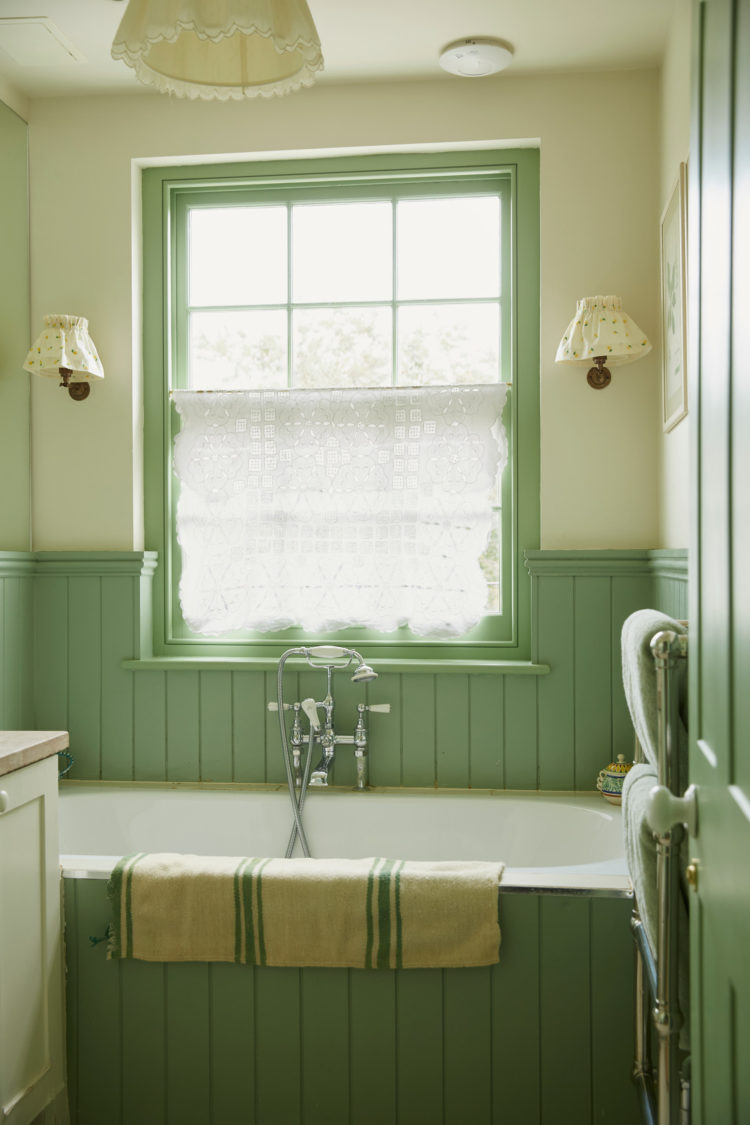
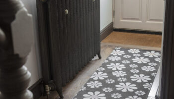
So there are pink windows and black ones, green ones and, yes, white ones. There are solid doors and glass doors. There is a striped ceiling for fun and another with a painted pelmet. These are things you can do that cost time rather than money. You’re going to buy the paint anyway so why not vary the colours to make each room feel completely finished. We all know it won’t ever actually be finished but at least you can focus on simple changes like cushions and accessories rather than having to paint doors and windows which is boring and you don’t want to have to keep doing it.
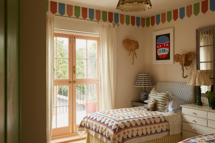
There is a clear pink and green theme in this house and while the palette doesn’t really deviate from that base you can see how lots of other colours have been added in in varying degrees in different rooms so we have red and blue – both extreme versions of the pink and green if you like – so while they appear to contrast they are actually different sides of the same coin. Good for anyone who doesn’t like a riot of clashing shades.
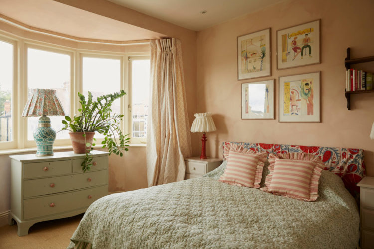
It is also, as you might expect, a lesson in how to mix texture, colour and pattern. Bold blocks of colour sit next to ruffled stripes, which lead the eye to a plain ruffle and from there to a pattern – floral or abstract. If you were to count the different patterns and colours you would find more than you thought but, at the same time, it’s not an assault on the senses as the overall impression is calmer as the colour palette is muted. It’s a very summery house but it would feel cosy and happy in the dark days of winter too.
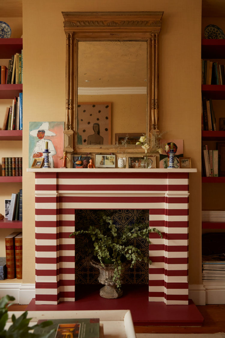
This, of course, is the joy. What a wonderful idea to paint the fireplace in bold stripes. If you have an original stone or metal surround then clearly not but if you have bought a simple wooden surround that isn’t very exciting then this is a great idea. It’s the perfect focal point to the room and rather than painting it black and pretending it’s a working bit of kit, doing this makes it a great backdrop to a vase of flowers or plants.
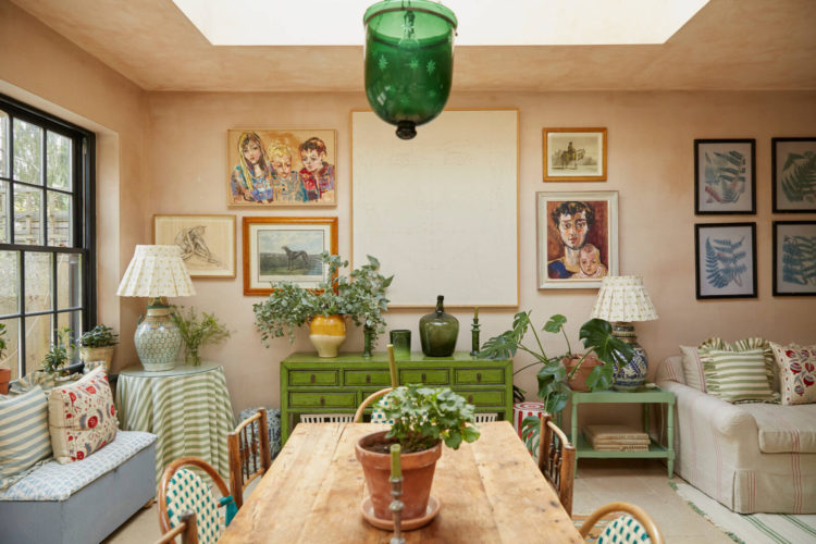
Another good lesson from Alice is using prints and artwork to zone a space. It’s very tempting to add one picture per area. It’s also very easy to create one large gallery wall but throughout this house she has zoned her pictures in different areas. So there is a collection of vintage prints in mismatched frames over the desk. Next to that a more regimented and matching set of botanicals.
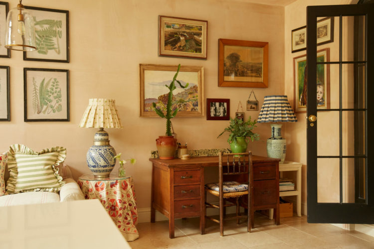
I am often asked how to zone open plan spaces – and they don’t have to be huge – think also of smaller multi-tasking rooms. I have spoken about changing the flooring, about using paint to create different zones but using art is another great way to do it. Especially if you have lots.
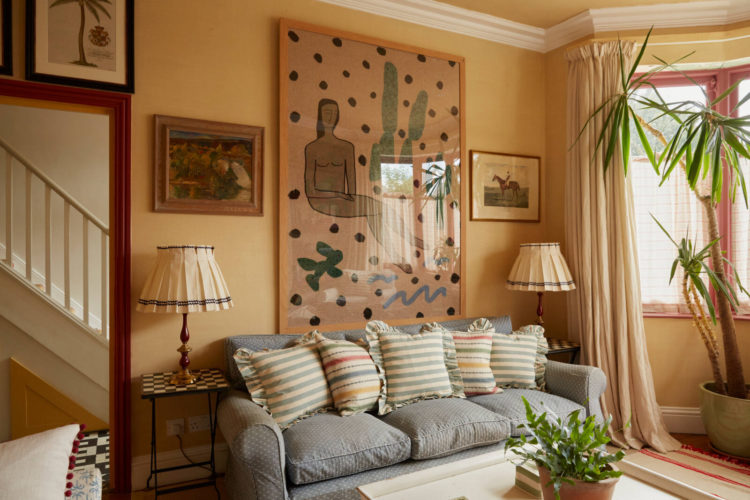
Above a picture fills the wall over the sofa with two smaller prints either side. They don’t match but they are symmetrical. You could hang a matching pair at different heights if you wanted to take this method in another direction. You could hang a pair either side of a door to frame that transitional view. Here the symmetry is continued with the matching lamps below the images and a set of striped cushions in different colours.
This is not to confuse you but to help you to be aware of all the possibilities so you can think about what might suit you best. After all the problem is not that we don’t know but more often that we don’t know what we don’t know. That’s what stops us. Hopefully this has helped.
Meanwhile my own collection of art – a grand term for all the pictures that hung on the walls in the last house – languishes in padded cardboard in the spare room. Perhaps I’ll start planning what should go where.



It’s lovely to look at the photographs, but would it be nice to live there? Thanks, but no. I’d choke to death. anything, including business. I would be in urgent need of some peace and quiet.
Oh my word, I love this!
I agree nice but a bit too cluttered to live in and dust! Has more of a 1920 feel to it than Edwardian – especially with the style of the rear windows they’ve put in. I think they’ll be lucky to get £2.2m for it.
Wonderful charming pictures to browse over, but to live there? No thank you. I would suffocate. All that stuff and business. I would be desperate for a bit of calm and space. But pretty none the less. So much of this 80s mini country house look around now.
Charming to a point but all those skirted lampshades are just too much. One or two maybe, but in every room – on every lamp? And some of them look so “crowded” in their corners. The striped fireplace does seem like an interesting idea but I found the color choice a bit jarring. Anyway – the home is lovely but a bit over-the-top for me.
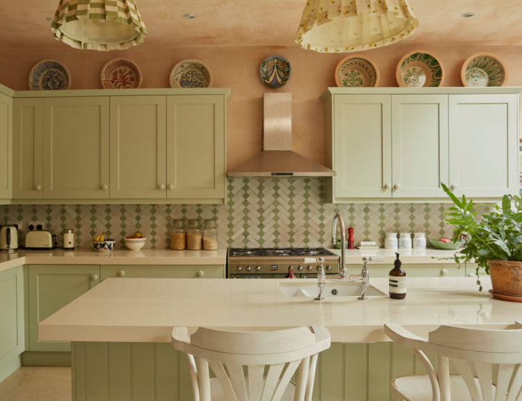
What a wonderful kitchen/dining space! Cheers from Canada!
Lampshades are one of the key items Alice Palmer sells, so it’s probably not a surprise that they feature so heavily in her home. I really like them, but they’re not everyone’s cup of tea.
It’s been a while since I really loved a house in its entirety but things is it. Absolutely lovely, so interesting and layered. Thanks so much, Kate, for analysing and dissecting it. I wouldn’t have seen and understood the beauty and structure without your guidance.
Lovely way to spend my porridge-eating time this morning!
And another question: are we going for the richer, fuller, more complex interiors because it’s time for a change, or (to what extent) are we looking for sanctuary in a scary world?
what a lovely home, note I write Home, not house. it begs the question: when is a house just a house and what makes it a home ? Well…thank you for the answer…here it is ! The kitchen is gorgeous and I just love kitchens that are a happy confusion of kitchen-sitting-room-garden room. Thank you for the inspiration Alice and thank you Kate for sharing it with us.
The kitchen/dining/office/family room is the room I like least, the multiple zones and fussy decoration makes it feel far too stressful for me. I really dislike all the different ways the art is hung along the big wall, it’s like she couldn’t commit to a proper gallery wall. Rooms like this make me want to live in a minimal white box! Funny how we’re all different.
I would suggest using anti glare glass on large artworks as the glare can be quite distracting.