There are so many things I love about this week’s property that I ended up wanting to include too many pictures but I have tried to restrict myself to those that are useful and which illustrate so many of the points that we discuss on these pages time and again. Also, some of the pictures are like Old Master paintings so even if the house isn’t for you you can just admire the photography.
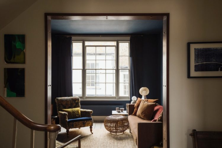
Now this might be slightly tricky to do without you having to scroll up and down a bit but let’s see how we get on. So, it’s a four bedroom duplex Grade I listed apartment on the first and second floors of an old building in the old town of Hastings. It’s on with Inigo for £550,000 and the core of it dates from the 17th century with 19th century additions.
Responding to comments over the years, note that it also has low ceilings – mostly wonky – beams and small windows so it’s dark and I hope that this will therefore prove useful to those of you wrestling with the same issues who have admired the lofty ceilings and sash windows that often grace these pages, while wanting to know how to deal with your own smaller, darker rooms.
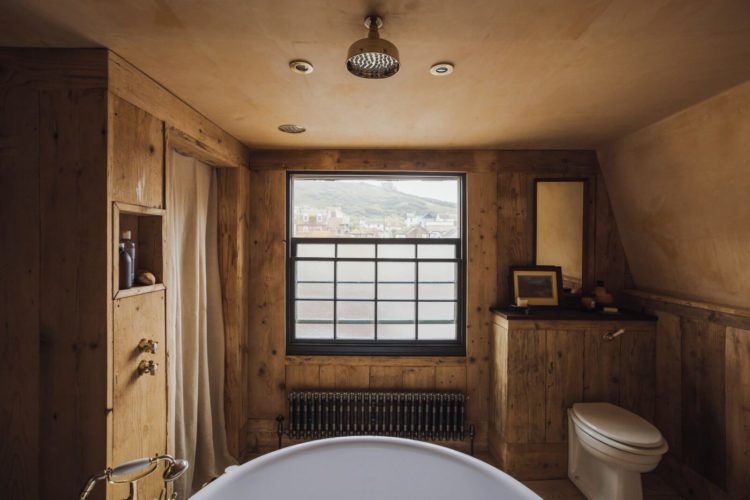
Now the owners have employed various tricks to deal with the darkness and I shall endeavour to point them out as we go along. But before we do that you should know that the kitchen/dining room is on the first floor, along with a separate sitting room and a bedroom, while upstairs there is the bathroom and three further bedrooms. There’s no outside space but it’s in Hastings, you can see the sea from the bathroom window.
The house has been fully restored and many of the original features, covered up in the last century, have been revealed.
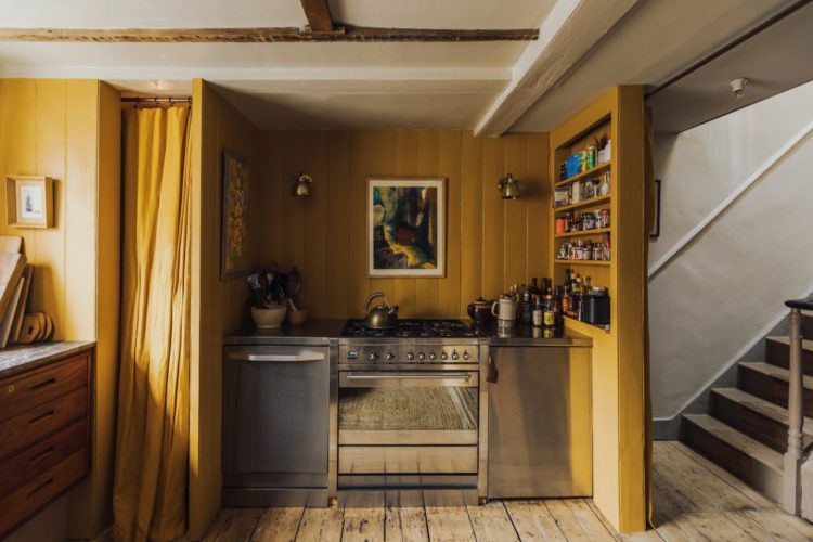
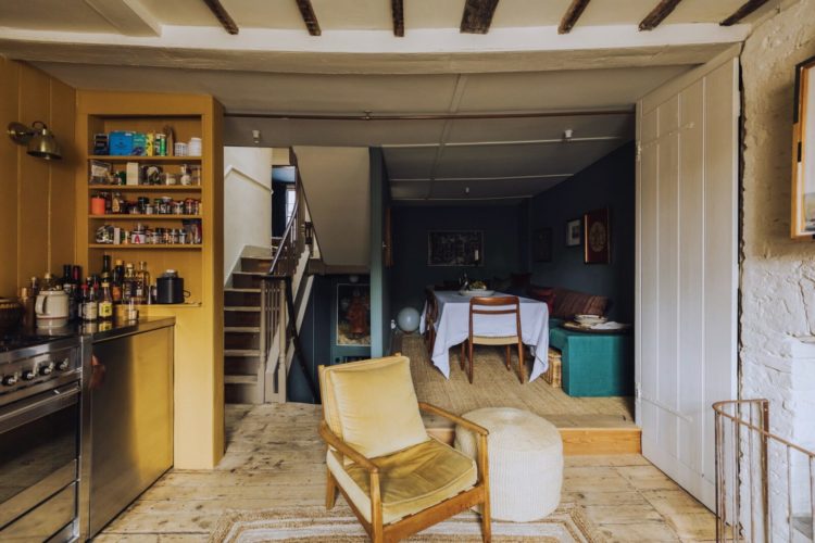
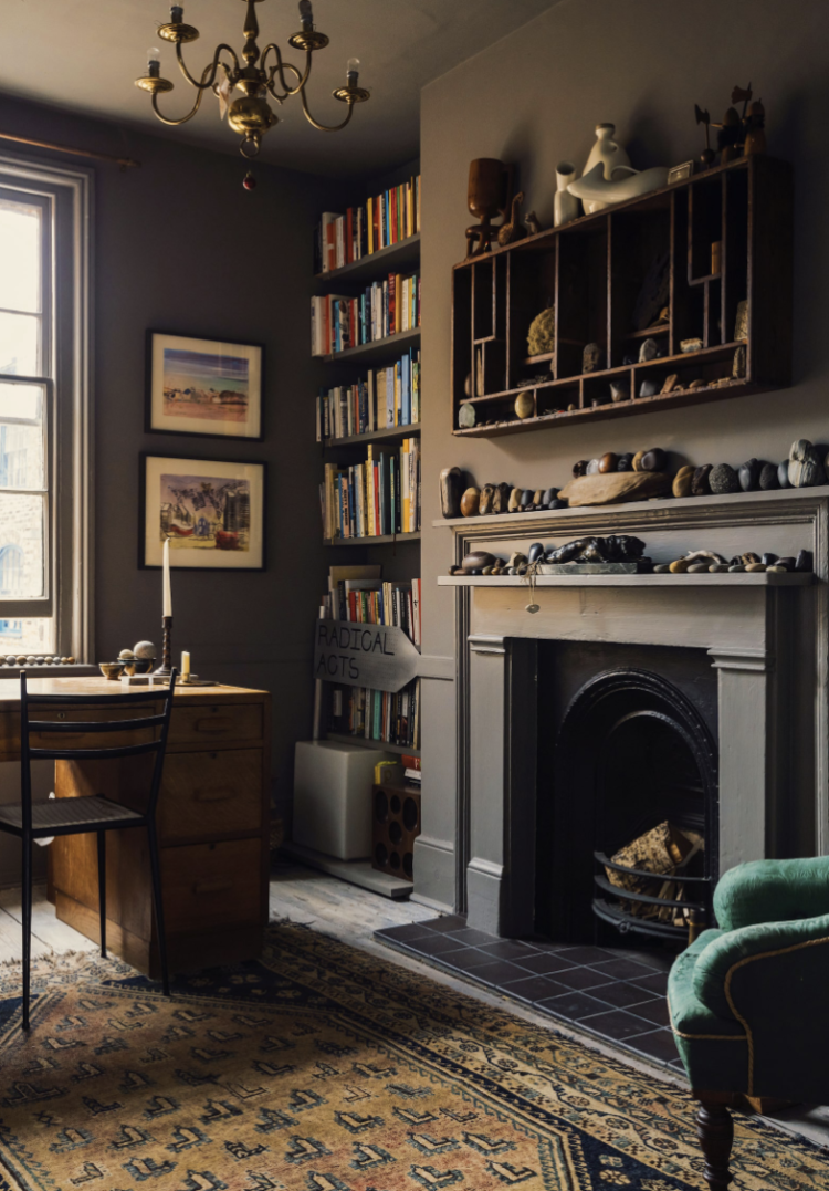
First then, the kitchen diner which is a rectangle of around 23ft long and 13ft wide (7m x 4m) with a single window at the front. The kitchen is, therefore, sensibly at the front, and the warm yellow walls, wooden floor and armchair all make you feel like the sun is shining in and make the room feel lighter and brighter and warmer. And, given that studies have found that just looking a pictures of an open fire can make you feel warmer, it makes sense that bringing the sun in – even if it is via paint – will also boost your mood on a cold grey day (and having spent six months in Hastings doing my journalism course I can tell you that it has its fair share of those).
Also another trick – that reflective oven door is going to catch any stray sunbeams and throw them back out again.
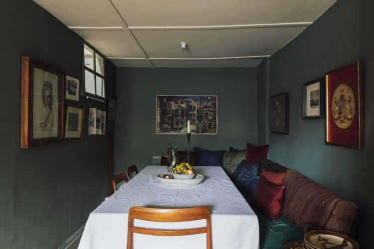
Now you can see that the dining area is right at the back of the room with almost no natural light (it took me a while to even spot that tiny window and it’s an internal one from the staircase) and this is where you can do nothing but embrace the dark. White paint needs natural light to bounce off if it is to do its job of making a room feel light and bright. In the absence of that you will end up with a drear grey which will make everyone miserable. Instead, make it cosy and warm as the owners have done here by using a white tablecloth to catch any light from the front and the ceiling (this is the Old Master painting trick).
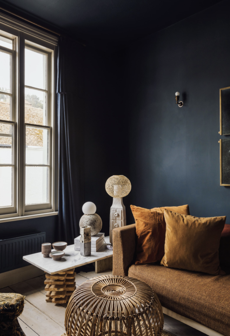
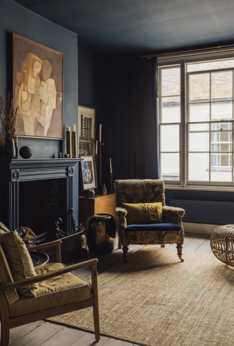
At the other end of this floor is the sitting room, which is practically square. Now the window is a good size, you could go pale in here and it would work. However, this is where you have to ask yourself when you use a room and what you use it for. My sitting room is mostly for evenings so we have painted it dark. That may have been the calculation here. It may just have been that the owners love blue! Note also the reappearance of the yellow in the form of the chair and cushions sitting on the terracotta sofa – the red thread starts to appear.
Now painting a ceiling to match dark walls is a bold choice. It’s not for everyone, but what it will do is make the walls and ceiling recede so you can’t see the edges which can have the effect of making a small room feel larger and a low ceiling appear higher. This, incidentally, is why you should never put white skirtings and woodwork with dark walls – you are simply outlining the edges of the room and drawing attention to its size and ceiling height. My kitchen has low ceiings and we have painted the same pale colour from skirting boards up over the walls and across the ceiling. It’s the same trick as this blue sitting room but the paler version.
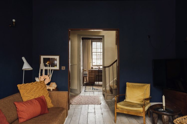
You can see below how it’s almost impossible to see where the wall ends and the ceiling starts. Now I’m not saying you must always match dark walls to dark ceilings – the owners haven’t done that in the dining room – but it looks fabulous if you feel confident you can pull it off and feel comfortable in it. That said, if you don’t want to go dark don’t just default to a bright white but pick something that is a softer contrast – the cream of the windows, a very pale version of the yellow chair, a washed out coffee (latte?) that will mirror the floorboards.
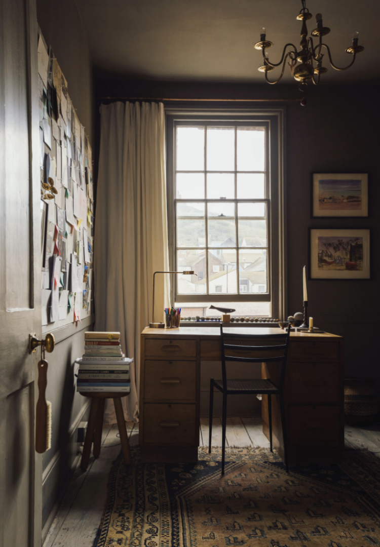
Below is the fourth bedroom, currently used as an office. The painting trick is the same, but this time a warm greyish brown that has been used all over. It’s not a huge room – you could go light in here and it would also look fabulous – but it feels cosy and bookish. I can imagine sitting in here all winter and writing. We’d have to buy it and move in to know how it worked in high summer but room colour can often be dictated (or aided depending on your point of view) by the orientation of the room. This is north east so it will be lovely in the mornings and probably never that light so a dark colour makes sense.
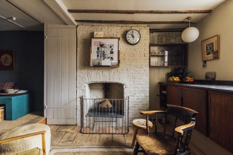
Below is the fireplace of this room painted to match the walls. Now this is a personal choice. I have done it in my house – the fire surround is nothing special and I think it makes the things on the mantelpiece stand out more while keeping the background muted and calm.
The fireplace below is certainly more ornate but again it has been painted to match the walls, which allows the painting over to stand out. There is also an argument to say why paint the fire surround in a strong colour as you are mostly highlighting a black hole? It’s like putting a bright colour behind the TV which only draws attention to it. But if you are feeling that your room could do with a lift and as long as you bring that colour in elsewhere so it’s not just a random guest to the party then by all means do it. I have seen fabulous yellow fireplaces (with a yellow vase on a table nearby) and I once painted one bright pink and matched it to the trestle table legs of the desk. The answer, as it so often is, is that you must take the time to think about what you want from a room – a calm space in which to relax (and learning what does that for you) or an energetic burst of colour to raise a smile when you come in.
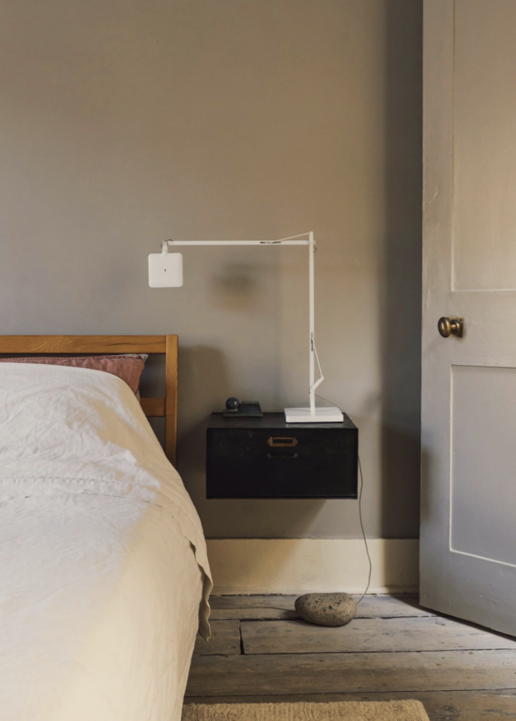
Now to avoid the scrolling up and down there are some long paragraphs and now a very short one. This bedside table – brilliant. Fixed to the wall so you see more floorspace which makes the room look bigger. Has a drawer for all the rubbish that inevitably accumulates by the bed. Very simple, very pretty and much nicer than the usual shabby chic bedside tables of which there are so many.
Finally the bathroom. Now I said there was no outside space but you can just about see the rather fabulous view through this window. And yes that does appear to be a shower right down over the middle of it. Dramatic.
What do you think? I love it and I think it shows that you don’t have to have high ceilings and huge windows to make something fabulous. You just might have to work a bit harder at bringing out its best bits. But then that’s the difference between Kate Moss and most of the rest of us isn’t it?


I am a person who loves natural light and would want to reconfigure the dining room of this house with more ambient light and a few mirrors along with the framed art. But then, I don’t live by the sea and to the owner/s of this house the dining room is as a ship’s cabin, cosy and water tight. The paned window is a delight to see in this room, and it would stay. The shelving unit by the cooking range is useful storage, it could also be opened up to let in more of the natural light from the stairwell, if one wanted this. I am also drawn to the collection of pebbles and stones which sit in this house like small sculptures. The study room is stunning in its simplicity and again, that natural light. On the bathroom shower head, wonder if this is more decorative? In the left hand corner there seems to be a hand held shower attached to the tub. A splendid find Kate!
His is so interesting as it’s quite like my house, certainly the kitchen which I have to admit is all white! Yup I’ve said it. My dining area is exactly the same but I haven’t been brave enough to paint it dark, but when I put a tablecloth on, a nice tasteful french sheet 😉 it does brighter up the area even more. How I wish I was brave . Thank you for pointing out so many things, which I can takeaway. Your posts are excellent and I really enjoyed the podcast being back especially from my Covid bed. I learnt a lot
This is a beautiful home. I had already seen it and saved the image of the inky blue room with yellow chair for future inspiration. But I loved having your wise analysis.
My only question about this house is what is going on with that shower head directly over the bath? Surely it would spray water all over the beautiful bathroom? There does appear to be a curtained off recess beside the fireplace and I wonder if this is a more sensible shower?
Yes I agree and actually it wasn’t until I was going to write about the lights (not in a grid formation but more where they might be needed) that I noticed that it was actually a shower and then I was so distracted I forgot to write about the lights! I think one of us is going to have to go round IRL (as they say) and find out!
🤣🤣🤣 I agree – we need someone based on south coast to visit and check this out and hopefully buy it! I would offer to go but it might be difficult given that I’m in Scotland! Maybe we could send Sophie? Doesn’t sound like she’s got much on at the moment…😉
I’ve seen this property before but your very considered analysis this made me look at it in a fresh light. Beautifully put together, apartment and commentary both! Nicely put,Kate – on all fronts.
xx
What a shame my husband’s comments on yesterday’s item about making your house more eco friendly, were deleted. A sign- if any were needed- that ‘cancel culture’ is alive and kicking. Shame on you
Firstly, if you have read this blog for any length of time you will know that this is a team of just me. Secondly, either you or your husband might have noticed that his comment was submitted “for moderation”, which means that I have to accept it, which in turn means that I have to find time during the working day to do that very thing, among many other tasks. I have just seen it. I have just approved it. And yours is there too. So please don’t jump to conclusions as you just have – less than 24 hours after the original comment was submitted – while throwing around accusatory statements such as “cancel culture” and “shame”.
Jumping on someone like this with public attempts to shame is “cancel culture”, not failing to approve a comment (quickly)!
Sally Legg this isn’t the place for your crosspatch criticism. Good manners dictates that your forceful comments should have been sent to Kate using her personal email. All you have done is humiliate yourself.
Kate’s loyal following will look out for your name appearing where it’s not wanted.
Shame on you!