A gorgeous colour-drenched house for you this week but one where we are very definitely not looking at the price unless some of you are much richer than you have been letting on. This last one before the annual summer break when the housing market goes very quiet (and this year that might be even more extreme than usual) and I thought a house tour might be in order.
It’s on with Inigo for, whisper it, £3,000,000, and is a wonderful Georgian house in Islington. It’s arranged over four floors and has four bedrooms with the total square footage coming in at 2,700. It was built in 1720 (with modifications in 1750) so just imagine the history of the people who have lived there. I think we need David Olusoga to come and investigate. In addition to being located just off Upper Street it also has a private 55ft walled garden so as much as we might despair at the price I’m not, for the time being, surprised.
Now to the colour drenching and there is one sense in that it’s a very easy way to decorate. Pick a colour for the room and cover the lot. No worrying about what toning or contrasting colour you want for the woodwork and the ceiling. No trying to choose between different shades of white and how they will react in the light. Simple count your rooms, pick a palette of your favourite colours and divide them up accordingly. Then, to create a red thread or link then make sure you have similar woods and metals throughout the whole house – so bronze light switches in every room for example – and vintage furniture and then when it comes to the textile and soft furnishings try and find some patterns that incorporate some or all of your chosen colour palette.
That, in a nutshell will work. Now if you are worried about colour clashing it can be a good idea to choose your colours from the same company – that way you know there will have been some coherent thought behind it. So all Farrow & Ball or Little Greene or Paint & Paper Library. The problems start if you use those muted shades in one room and switch to the cleaner, brighter shades of Dulux or new brand Yes for example.
This isn’t a hard and fast rule but a guideline for anyone who wants to be bold but is a little nervous of painting out a whole room. I will admit to playing slightly fast and loose with the term here as not all these rooms are completely drenched. It’s perhaps more of a colour blocking scheme with one dominant shade per room.
However, what you will notice is a) and absence of white and b) the woodwork and doors tend to be the same as the walls – this was, after all, a Georgian habit. The other thing is where the ceiling isn’t the same neither it is white. It’s a softer neutral shade that is reflecting some of the wall colour back. So the sitting room looks like it’s pale pink as it’s bounces off the walls, the kitchen has a pale yellow tint to it for the same reason.
That’s a good way to keep the feel of a colour drench if you are using dark colours but you don’t want to make the room too dark. So take something like a School House White or a Slaked Lime and let the colours of the walls do their thing.
If your palette (and budget) is more Dulux however you are in luck as they tend to produce colour cards in six variations from light to dark which you can use to stunning effect. So, for example; 3 on the walls, 5 on the skirting and doors and 1 on the ceiling. That will give you the tonality and coordination and all the thinking has been done for you, apart from which base colour obviously. I should also add that Paint & Paper do this with some of their neutrals too and my sitting room is Powder 2 and 4 while my kitchen is 3 and 1.
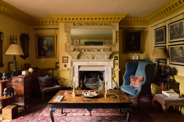
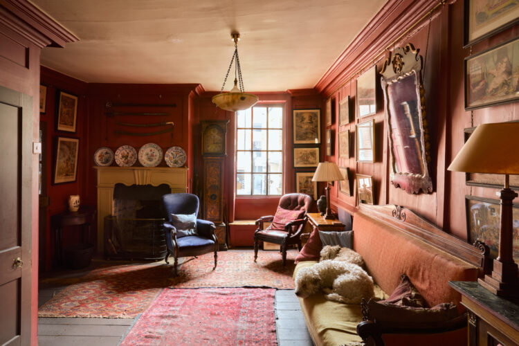
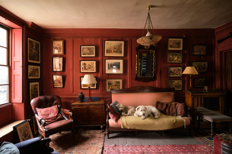
In the sitting room above the ceiling has taken on some of the red tones from the walls, while the pale pink sofa and leather armchair link to the reddish shades of the Persian rugs. A hing of a navy blue chair in the corner provides a hint of disruption. When you choose this type of decor it is very rich and can feel a little too much so you will need to break it up with a burst of a contrasting colour or perhaps toughen it with some metallics.
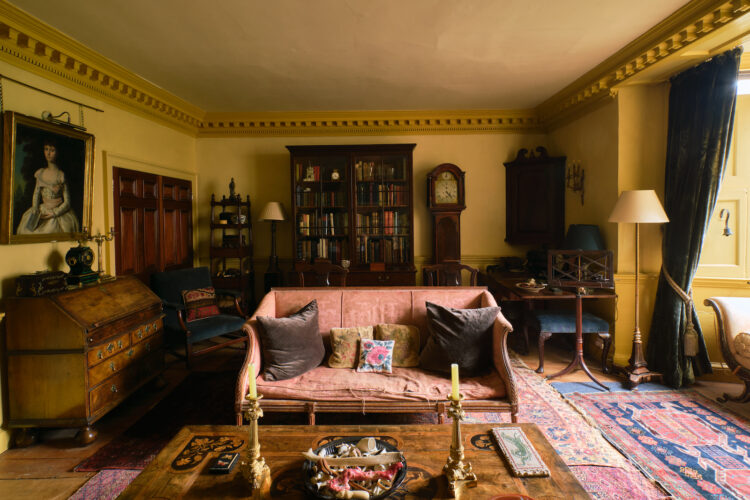
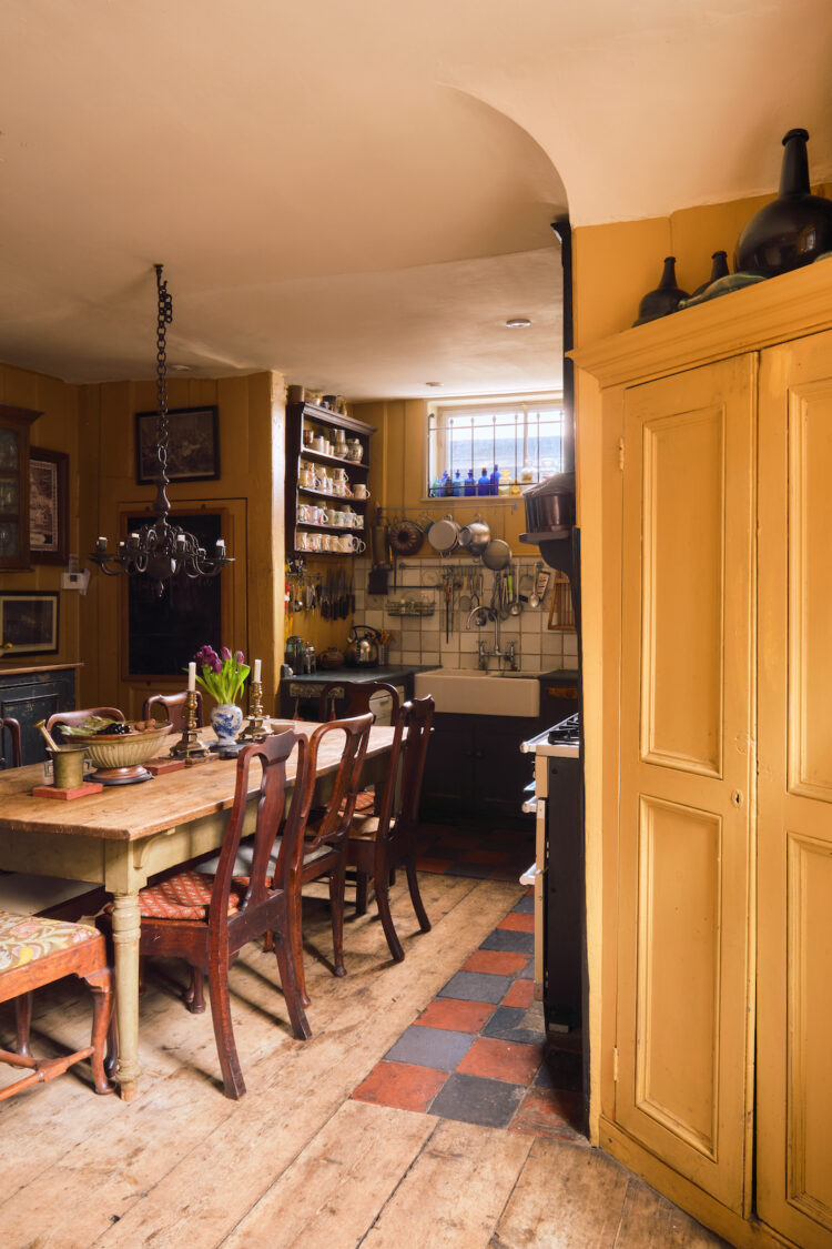
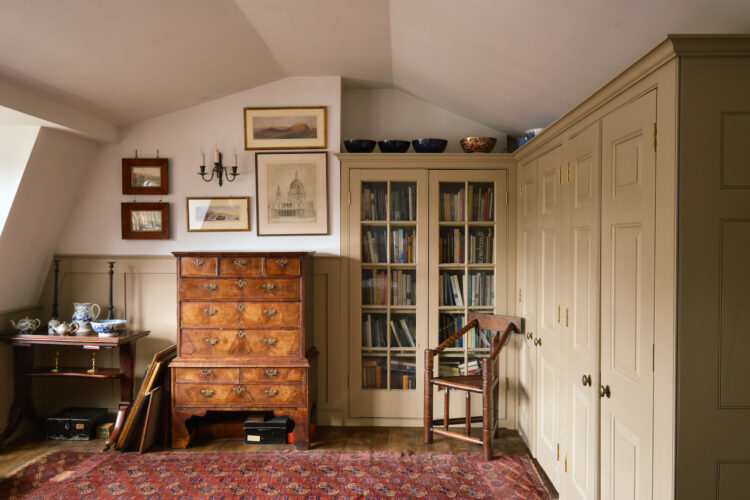
Above you can see how the ceiling has taken on a slight buttery tone that goes with the walls and the contrasting colours of the rug – which will include similar yellows and creams – have been taken into the furniture so this room is immediately less intense than the red sitting room. The rugs and antique furniture provide the linking thread.
Now a word here about mixing furniture styles. Old and new can work together but you have to find some sort of link between between them. Clearly a gigantic modular sofa isn’t going to work in this room with its more delicate antiques. If you wanted to go vintage – say a 70s style sofa that could work as long as – and it’s a big as long as – you had other pieces of a similar age in the room. One failsafe is mid century – that loves everything and is often smaller and more delicate like these antique pieces.
It’s not an exact science so you will have to do a bit of trial and error but as a guide look like shapes and outlines and try and see a common element between them.
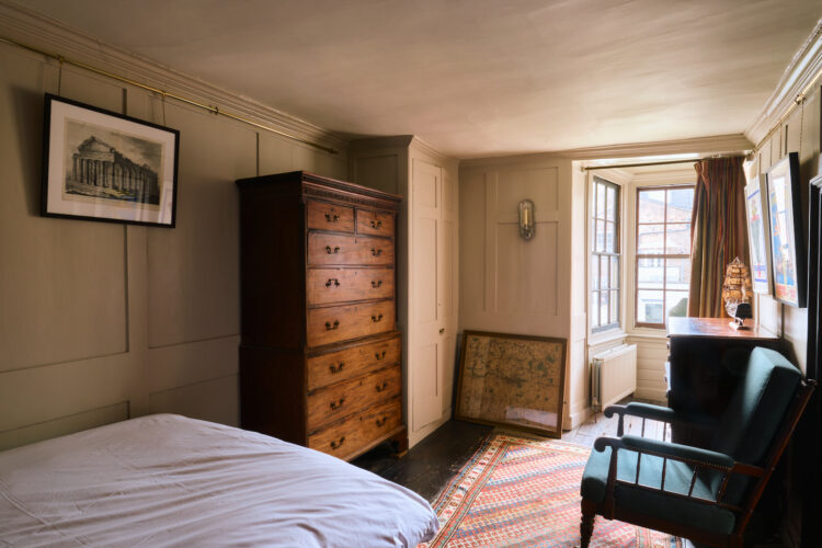
Above the ceiling has been left plain but the yellow curtains and red wall hanging echo the schemes of the rooms downstairs. We can’t know if that was deliberate but one thing you will notice when you are planning a scheme is that you will naturally be drawn to a range of colours that sit together either tonally or contrasting so it’s not really a surprise when certain colours repeat themselves in different ways.
And remember the red thread isn’t all about colour. Pick a colour and use it in paint in one room, fabric in another, artwork in a third and an accessory in a fourth. That’s probably the most important point when it comes to creating a cohesive look that isn’t just about painting the entire house in the same shade.
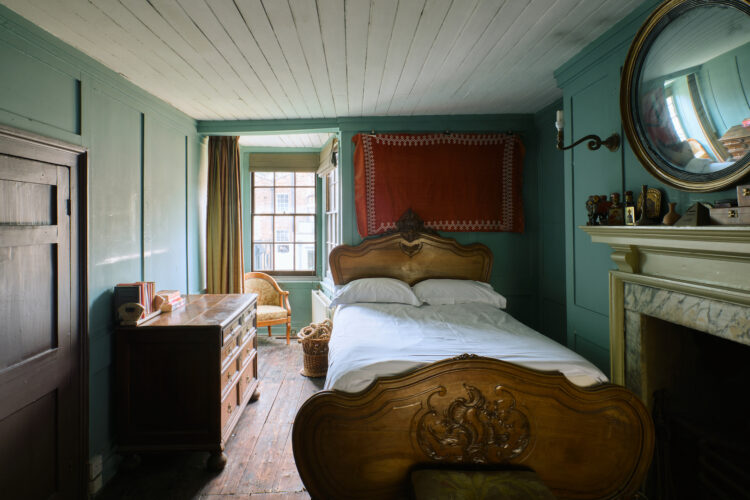
Finally, this bedroom which is colour drenched in the same soft shade of pink which loves a bit of dark wood. The rug brings in other colours and gives you other shades to play with and the overall effect is one of calm relaxation – perfect for the bedroom. But it’s also a paler version of the red sitting room downstairs and that can be another way to play with colour. Start dark at the bottom and gradually lighten it as you work your way up.
This, by the way, is another Georgian trick – they sometimes did it from front to back starting dark and getting paler as you looked through a series of rooms from one to another.
I hope that has helped you with your own colours schemes. Or is anyone going to cut out the middleman and just buy this house?


I do think the walls look better with color than they would have with white, but the place still looks terribly dreary and oppressive. It’s like I can almost smell the stuffiness. The location for this price must be fantastic.
Wish they had turned the lights on for the photographs, but perhaps the budget for electricity had run out!
I find these colours quite depressing.. i want to open the windows and let some sunlight in !!
Beautiful house for sure. I was really drawn to the red room with the pooches on the couch and noticed I started to feel slightly claustrophobic looking at that image.
I can see what you mean. Do you think it’s the camera lens? It does appear like the interior of the room is falling toward you. Nice color, though.
Give yourself some credit! I am sure you can get the look because it is more about creativity, which it sounds like you have plenty of! Don’t be intimidated and discouraged by the decorating-industrial complex, which has to sell expensive stuff.
I get it though, the other day I was reading about this “cute couple” and their boho brownstone on Brooklyn. No surprise, they are the children of two incredibly wealthy parents, whose multiple houses are featured in several deco magazines. I found it totally unrealistic and depressing and unfair of the magazines to project this as the standard. On the other hand, it wasn’t as if the huge sums of money made that much difference. Nothing that you couldn’t have done! (And the expensive stuff, alas is what you don’t see, such as the wiring or insulation.) Cheer up, get the paint you can afford (it doesn’t make much difference) and remember your priority is keeping you and your family warm. No one should judge you for that.
I love the less cluttered upper rooms The busier ones full of stuff I find less restful to look at and positively anxiety inducing as my brain just thinks DUST !! Suppose back in the day these houses came with servants … it’s fascinating learning about just how important colour is and how we all react slightly differently to different shades etc … whether Dukux or Farrow & Ball I’m relieved to know it’s not just me and I’m not just nuts but that colour does affect mood and a slap of paint whatever brand can work wonders .. clever Georgians …such is my calm feeling when I visit it look at this particular period I used to wonder if I had a past life as a Georgian ( if so I’d be in the scullery rather than the morning room having tea) thanks to you Kate I now know it’s just the symmetry and colour palette that makes me feel at home … clever Georgians
As with fashion and garden design articles, I adapt the underlying ideas of this blog to my own modest budget. I don’t see a conflict, and I greatly appreciate the free advice.
I’m really glad you mentioned that some of us only have a Dulux budget, and sometimes it’ll be Wilko or Homebase own range. I love this blog and have been reading it since it began and I’ve listened to every one of the podcasts but I always come away feeling that I’ll never “get the look” because I just can’t afford the more expensive paints, fabric etc.
After the summer break we’ll be going in to Autumn and we’ll all be putting our heating on and that’s where the money goes so perhaps you (and Sophie) can consider this and spare a thought for those who still want a lovely home but need to creative on where any spare cash might go.