I may have mentioned (once or twice!) that I recently completed the fastest zip wire in the world on a press trip to visit The Little Greene Paint factory in north Wales. What I didn’t tell you was that we were given the choice between the zip wire or forest bathing. Now I am not an adrenaline junkie; I may be the only person in London who is happy that the speed limit is 20mph. I ski extremely slowly (elegantly, but veeeeeery slowly) and I’m definitely a sunbed and beach holiday kinda woman. Why then did I choose to fly over a disused quarry at 100mph on a length of tensile steel rather than lie on a forest floor and listen to the wind rippling through the leaves?
Well, the short answer is that I was dared to to the zip and I feared an attack of the giggles in the forest. Walking in the woods fine. Being asked to meditate and dig my hands into the earth while contemplating my life another. Also, I am guilty, as I suspect many of us are, of not pushing myself out of my comfort zone as I grow older. At 56 I can take myself down to the woods any time I like (my part of north London is full of them) but I also know that I’m not going to voluntarily book myself onto a zip wire so if someone does that part for me I must follow through.
But what, you ask, has that to do with wandering around beautiful rooms on a Monday morning? It’s school holidays and we’re frazzled already and we need nice things to see and feelings of calm, you shout. Well this, my friends, is the digital equivalent of a forest bathe.
This week I was drawn to the earthy tones and rich warm shades of nature. So come with me and breathe them in deeply (no flute playing or mediation required) and I guarantee you will feel calmer and better by the end of it. Pour yourself a cup of coffee (it should probably be peppermint tea but let’s not run before we can walk) and take five minutes for yourself.
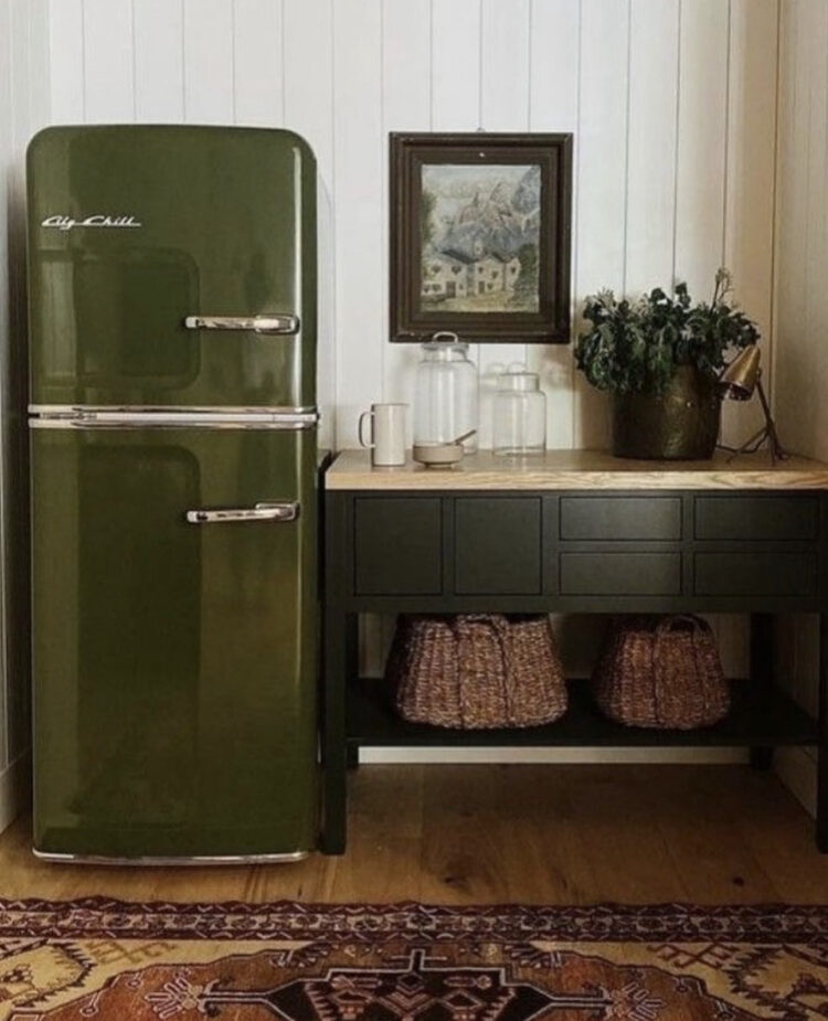
This first image of the olive green fridge stopped me in my tracks. Long term readers will know that I wrapped my old fridge in cream vinyl to stop it dominating the room as a a cold hulk of chrome. It’s expensive to buy coloured fridges but there is a growing trend (a good one) for people to wrap them or paint them in the colours of their choice. I love this idea. As our kitchens increasingly become our restaurants (first the pandemic now the cost of eating out) making your kitchen a room that fits with the decor of the rest of the house while still functioning is important and, for the most part, the aim is the eating part of the restaurant rather than the cooking end. You can, of course, buy coloured appliances from both Smeg and Big Chill but they may not have the colour you want (no olive on a quick search yesterday). If it’s too late to redo your kitchen around an integrated appliance then paint or vinyl may be your friend.

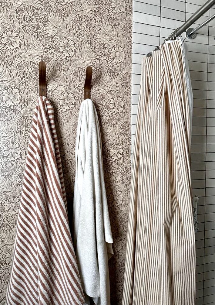
Next up on our tour of earthy colours is this gorgeous bathroom while vertical subway tiles that almost look like bars of chocolate. A few points to note here if you are aiming to get the look.
Subway tiles are often cheaper than others. The way to elevate the look is either to lay vertically as above (herringbone will cost more in labour and, as it has been very trendy recently, may date faster) or stick to the classic brick formation but – and it’s a key but – stay away from white grout. There are dozens of colours available now and not only does white attract brown soap stains it also needs cleaning more often. Instead pick a colour that matches or contrasts and your bathroom will look instantly more expensive. In my bathroom I used pale tiles laid in columns but picked a chocolate brown grout to minimise dirty marks and go with the wallpaper.
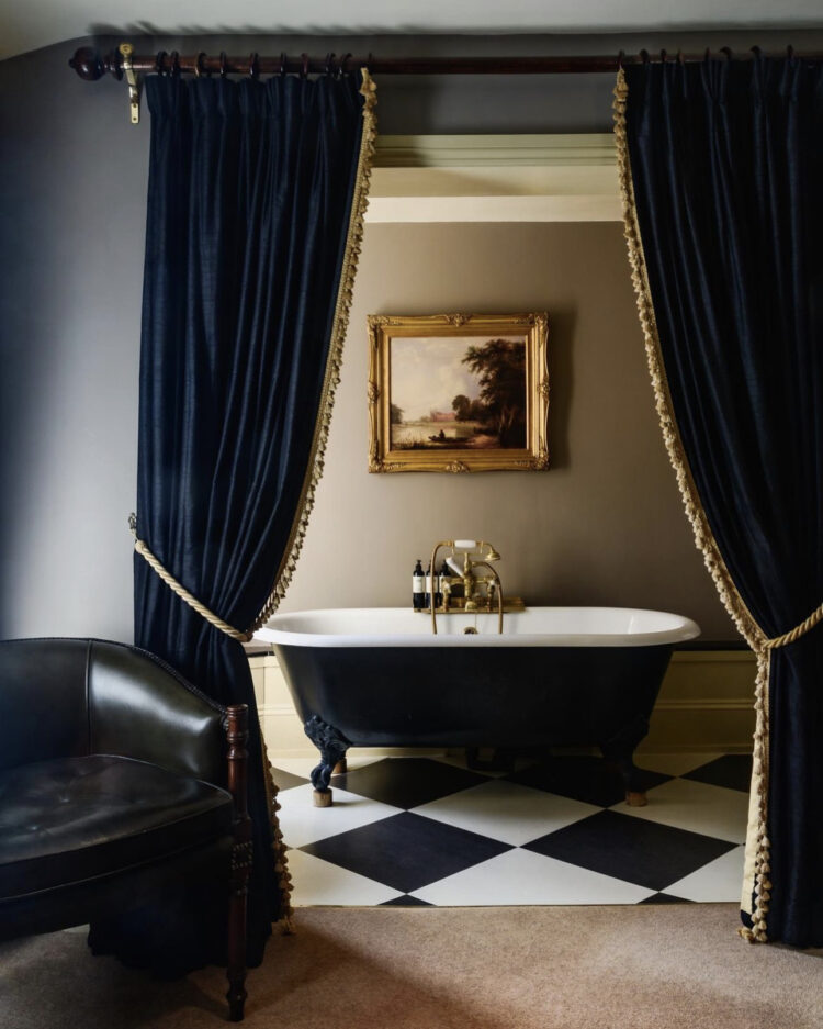
From deep olive green to the darkest chocolate, we’re heading to rich navy – admittedly not necessarily a colour you find in nature but the night sky is still calming if you’re away from light pollution and flight paths. The photographer, the rather brilliant Paul Whitehead said he was aiming for a Vermeer look with this image and he’s nailed it.
We’ve discussed baths in bedrooms in recent weeks and most of us don’t love it but if that’s how your space works then you might want or need to do it. Hiding it behind a curtain is perfect. It makes a beautiful view from the rest of the room and certainly looks more inviting when you know you can pull the heavy curtains around you for privacy.
Since we’re talking about elevating your design details in this post – here’s another. Buy plain velvet or linen curtains and sew fringing or pompoms along the edge. You can do it by hand and you might even find it relaxing.
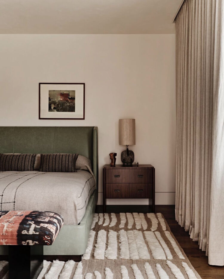
Now if you felt that was all a little too dark for you then here’s a lighter room that is still bathed in those rich earthy tones. The walls are a warm cream (look for a shade with a red base as opposed to green or yellow). The floor length curtains match so there’s no distraction but merely a change in texture. The heavily textured rug will be wonderful to walk on while the pattern echoes the pleats of the curtain. The olive green headboard is padded and velvet while the dark wood brings depth and richness to the scheme.
On that note wood has been shown to reduce heart rate and stress when included in a room so if you can bring some into your own rooms that’s going to help with the grounding and calming effect.
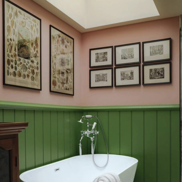
Now that we’ll bathed in all those forest colours we’re ready to emerge into the sunlight and it’s back to Paul Whitbread with his pretty pink and green bathroom – the flowers at the edge of the woods if you want to continue this analogy but I think we may have pushed it as far as it will reasonably go.
I hope that has helped you breathe deeply and brought some calm to your day. The blog will now be taking its annual August break while I search for my own calm and deep breathes but, as has become an annual event, there will be three postcards a week pointing you at posts you may have missed during the last six months. I hope you will enjoy rediscovering things old and new and I will be back in September.


Thanks so much for this, Kate – I haven’t been able to visit the blog as much as I would like in recent months, but I have continued to faithfully follow along on IG and the podcast. I really enjoy the images you present to us and your reflections on them. You have given me much food for thought and inspired much more intentionality as we continue to live in our home of 8 years. I wish you a lovely break!
Fabulous read love your style of writing. The line kitchen is like a restaurant is so true due to reasons you mentioned . But also I am back with a toddler stage and redecorating the kitchen. And I just love this image. The books are my go to . When unsure mad about the house books come out.
I love the first image, especially that rug… not sure about the fridge though, it reminds me of a vintage car!
It’s always nice to see photos of your old house, I miss the tin tiles but really warming to the colour way in your bathroom, especially the shower curtain.
I hope you have a lovely restorative break Kate. Until September…
Loved the forest bath, very refreshing & calm for a Monday morning
I am really struggling: I don’t connect with either the “brights” of the final pink and green bathroom (too brittle for me), nor with the warm, earthy tones in the rest of the pictures. They are lovely, but not for me.
I’m struggling with finding a soothing, restful and inspiring palette in my new-to-me house that isn’t suffering from a huge dose of the blahs!
Have a great break, Kate. I’ll miss your posts and podcasts.
Lovely post. I can’t tell you how much your ideas have shaped our own design experiments in our home over the last three years. We live in an old building (1733) that had lost much of its older character over the years. The rooms downstairs all flow into each other and it was important to us that each room “talks’ to the next and that the vista through is harmonious. Having finished the kitchen now (nearly killed us) we have arrived at a wonderfully peaceful and utterly unique place. Our thanks to you, the “Red Thread” lady, as my husband refers to you. Have a wonderful break. All best, Cynthia