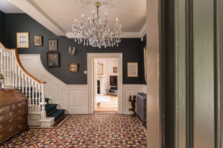
Oh the Georgians had all the best houses and this one, apparently, has one of the finest staircases outside London. I’m intrigued by that – is there a staircase judge? Is it a committee that has things to tick off – the width, height of the riser, fanciness of the finial (I mean spindle)? Does it have a particularly fabulous turn at the top? Or is it just a lone architect – like a Michelin restaurant judge who visits stairs the length and breadth of Britain and rates them? Sadly we shall never know as the estate agent, one Blenkin and Co, who are selling this six bedroom establishment for £1,250,000, haven’t seen fit to photograph more than the bottom bit. Which has a very fine bannister to be sure but who knows what happens around the unseen corner?
But we needn’t let that detain us as there is lots more to see. But before we start – a potted history. The house was built around 1780 and has been fully restored, and updated and even has a Victorian extension. The joy of this particular house being that while it looks like a country house, by which they mean “country house” it’s actually on the edge of the village and a short stroll from the local shops and train station.
Now in addition to the two storey east wing, the 4,000 sq ft, “ample storage” and “glorious interiors” it has superfast broadband which, I imagine, if you are either working from home or trying to convince your children that a move to the country is A Good Thing, may well turn out to be the clincher.
Ok so let’s look around. As you might imagine, to balance all those bedrooms upstairs, there is lots of spaec downstairs including the huge drawing room, dining room, kitchen with boot room and separate utility room, as well as family room with study leading off it.
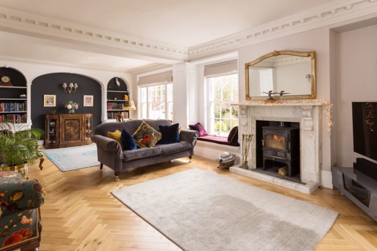
Now I think we can all agree that that sitting room is fabulous. It’s big, it’s got a parquet floor, incredible windows and a window seat. I think we all know that I’m going to take issue with the rug islands and the sofa sitting marooned between them facing what may well be the largest tv media unit I’ve ever seen.
Dealing with large rooms is not the most common of problems of course, but it can be about making a large space feel more intimate by pulling the furniture in from the edges. Here you need to create two functions as there’s no way you can see the telly from one end to the other (and let’s not rule out that they may have rearranged the furniture for this picture). But essentially, I would move the tv back to the dark grey wall (maybe wall mount and get one of those Frame TV’s that looks like a picture, flip the sofa round and create a spacious, yet cosy seating area while the other end of the room, by the door so it will always be more passage-like becomes more of a chairs and chat round the fire area. I might even have two sofas back to back across the middle, perhaps with a console table between them for lamps and glasses of wine.
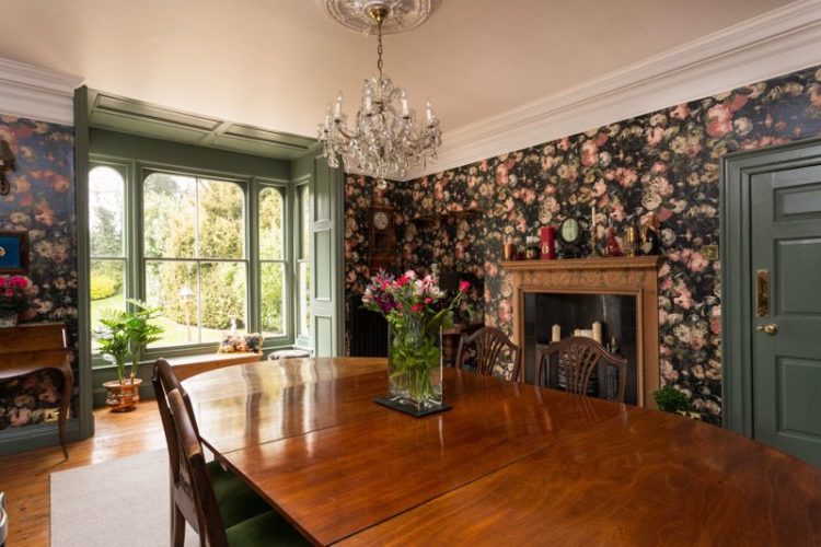
The dining room, however, is glorious and this shows you a) the power of wrapping wallpaper round all the walls as its designer intended and b) the reason why I keep banning white paint. How much greater is the connection to the views of the garden when framed with by a green window that ties in so well with the floral wallpaper. I know tradition says white woodwork but if you are ever needing to convince anyone why being bolder is better then bookmark this picture to show them. And I know the ceiling is probably white but imagine also that it’s a very pale pink that picks up the palest flowers in the wallpaper.
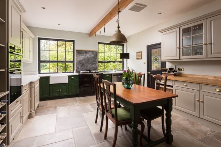
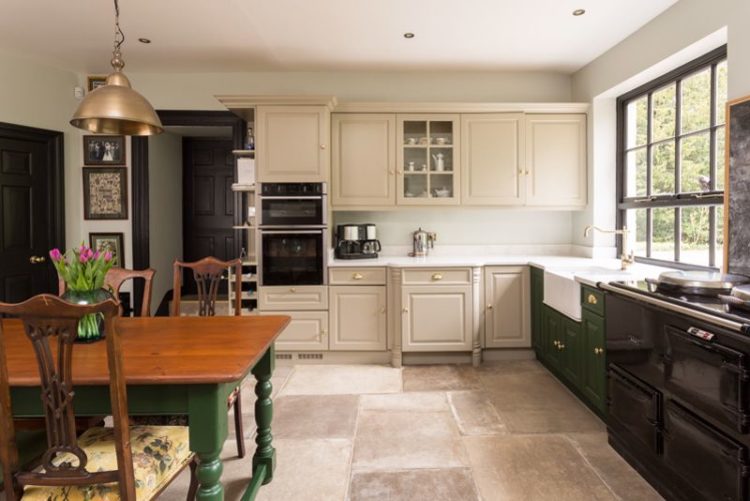
The link continues into the kitchen, which leads off the dining room and where a green and cream theme prevails. Now you don’t have to match base and wall units any more and I would be tempted to carry on the green base that flanks the aga all round the room and leave the cream on top. If you are using two colours the general rule of thumb is to use the darker one on the bottom – it’s not hard and fast but it tends to be more relaxing that putting a pale shade below and a heavier one on top which can make the brain feel unaccountably stressed.
Out into the hall and there’s a glimpse of that famous staircase. Any experts reading do let us know. I think the shape of the bannister and the panelling is quite unusual so maybe it’s that. And here you can see the dark colour on top. You can judge and see how you feel. I think I would be tempted to flip it – not least because the dark colour won’t show the scuffs and marks that inevitably collect up the side of the stairs.
Another trick which I have seen done to great effect is to use the same colour but make the bottom woodwork gloss or eggshell and leave the wall matt. That creates texture but means you’re not introducing too many colours. The darker shade also makes the artwork pop in way that white doesn’t. It also solves the problem of what to do with the door architrave – usually the bottom colour prevails.
We’ll poke our noses into two of the four bathrooms. Below because fashion comes and fashion goes but you can never go wrong with a classic white subway tile laid in a brick formation. Trends will tell you to be laying them vertically and in herringbone formation and all of that but if you are of a mind to do a bathroom and leave it for 10-15 years (most of us?) then stick to the classic.
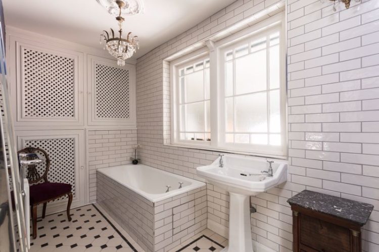
I like a fully tiled wall although I appreciate some find it a bit Victorian public baths, but you could add colour by painting those cupboards at the far end, or the window frames and you could also add some pattern blinds to warm it up a little.
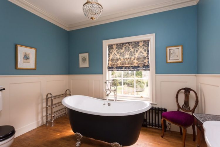
Which is exactly what they have done with this window below and the same rule applies for the colour on the top and bottom. That said, because I know someone will ask, you can have the walls white in their entirety and paint the ceiling blue and that works – it’s something to with the splitting of the wall in half.
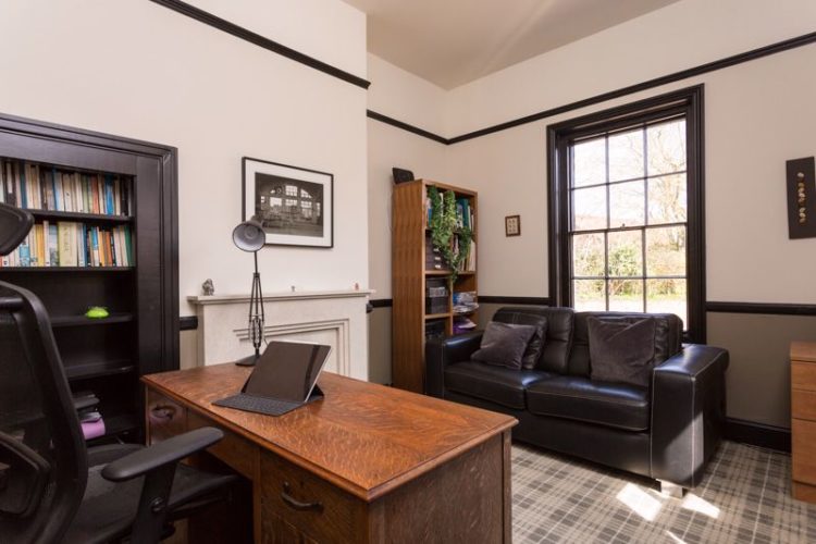
I’m showing you this because, again, it might spark some ideas of using paint in clever ways. The dark window frames the view beautifully and while the black lines – skirting, dado and picture, are chopping the walls up it works because the ceilings are high so it doesn’t matter if you visually bring them down a little.
It’s about understanding what you have and working with it so in a low ceiling or small room you might want to stick to one colour for the walls, ceiling and woodwork, but here you can afford play around a little more. Never forget paint is a wonderful, affordable tool in the decorator’s arsenal and if you get it wrong you can redo it so you can have fun with it. In here I might be tempted to fill in that alcove next to the window and create a similar inset bookshelf to the one on the other side of the fireplace, because in addition to the brain not liking dark colours on top it also likes symmetry which it finds calming and that might be what you’re after in an office.
If your brain craves symmetry but your architecture won’t allow for it then try working with a pair of chairs, or matching lamps or decorating your mantelpiece with pairs of items rather than the traditional styling trick of odd numbers. Yes interior design is about how it looks but it’s also about how it makes you feel and that will be different for every one of us and crucial for all of us.
So anyone moving to East Riding? I might if only because reading the details has informed me there’s access to the village from the garden gate via a snickleway and frankly who doesn’t want their own snickleway?


You’ll have to go and visit the home to see the rest of that staircase (or perhaps the current owners will send a pic)! Debs xox
I’m considering a dark ceiling and light walls in my bedroom…but what colour would you do the skirting, door and window frame? The ceiling colour or the wall colour? I’d rather not do a third colour as I think it would make it too busy. Any ideas would be appreciated!
I’m with you on the third colour. It will slightly depend on the size of the room and your gut and how much light it gets. You could match woodwork to the doors if it’s a smaller room to keep it calmer and make the ceiling a feature in its own right – like this https://www.instagram.com/p/CQjAzQjHri8/ or you can match woodwork to ceiling if you think the ceiling will be too random on it’s own. I would tend to the former but maybe bring some of the ceiling colour into the soft furnishings or rugs to just make sure it ties together.
Fabulous house Kate. Love all of it but like you i’d Paint the cupboards in the white bathroom.
The Dark Colour rule on lower walls as far as I know is something to do with “anchoring” the space. Otherwise it looks top heavy like a vase whose Centre of gravity is too high and it looks like it could fall over!!!
The same reason they always painted the lower areas of shopfronts etc., in a darker colour. In think it used to be an architectural rule!!
Really useful post Kate, gorgeous house. Let’s hope the script today pleases last week’s critics.
How you found the house is to be applauded.
Yes, the white bathroom is a little sterile, but I’ll take it. Really, what’s not to like here – and I always wanted to try a snickleway. Cheers from Canada!
For me the bathroom is my favourite room, I love a Victorian public baths vibe and wouldn’t change a thing about it.
Yes I would like it please as the lure of country house + fast internet + personal snickleway is too good an offer to resist. However having listened to your podcast on colour psychology I now know why the dining room wallpaper would not work for me and why that’s okay. Here in Sydney houses are usually presented half empty ( presumably in an effort to make them look bigger) and styled and I wonder if that’s what’s happened to this house?
I’m buying it tomorrow( if only!) What a stunning house. Amazingly for me I really like all the rooms & wouldn’t change anything. Just have to convince my husband to move from Wales.
Totally agree with your comments on the living room. I’m thinking that the husband doesn’t really trust the wife to decorate and as a compromise he got the responsibility for the living room? And got a bad case of interior design cramp once he got the TV and seriously ugly TV bench into the room. The wife then tried to save the situation for the listing photos but it was a bit of a mission impossible?
I also agree with darker color below on walls. My guess is that it was too much work? Wouldn’t that bathroom look great with dark charcoal paneling that also includes the window and then use the blue for the ceiling as well? Would be much more inviting. And the white bathroom really needs a potted plant.
Thank you for brightening my day with your post!