I won’t lie, it feels odd to be writing about what colour paint to put on your walls when I have spent the weekend glued to the news and my Twitter feed wondering what madness is going to come at us next. But, then again, maybe it’s not wrong to want a little respite. A little escapism and a few moments of loveliness to calm us down. A sort of visual deep breath before you open the door and go out once again into the storm.
So yes, let’s put down our lives for a few moments. Mute the tv, the radio and the incessant drone of social media. Let’s shut ourselves away and take a little walk through these lovely spaces and breath deeply of their design. After all, when times are tough, the old mantra comes to the fore – don’t move improve. But, it’s not just that we can’t afford to move or don’t want the upheaval. It’s that, when the world outside feels uncertain, we turn naturally inward and focus on our homes.
Our homes, be they large or small, rented or mortgaged are our safe places. Within those four walls we can decide what colours make us happy, how to arrange our furniture to please us best, and what we want to do there. So it is at times like these, more than any others, that we start to pay attention to our interior decor.
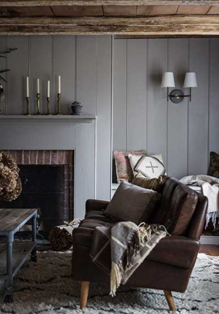
It is, perhaps, no coincidence that rich colours and luxury materials come to the fore at these moments. Velvet has been flying out the shops so fast for the last six months it’s a wonder there’s anyone left who doesn’t have a velvet chair. I’m typing on one at this very moment.
The colours are rich, the textiles are natural and they are layered up to create a sense of warmth and welcome. Throws and faux fur, lots of plants and metallic textures. Whether you are trying to create the feel of an escapist country cottage or a luxurious hotel retreat, it’s up to you to create whatever you want to create as long as it makes you feel happy and secure.
Lighting is key for this kind of look. You need lots of it – also in layers. Table and floor, task and wall. The overhead pendant light is more of an earring – a sculptural detail – that the the actual light you are going to use. When you are creating cosy spaces it’s all about the ambient light. The Danes use candles. Personally, I’m afraid of fires so I stick to the electric version of light. Or perhaps a real fire. In a fireplace. With a guard. Not a spindly thing that can get knocked over by an errant child, cat, gust of wind. Did I mention I’m a catastrophist?
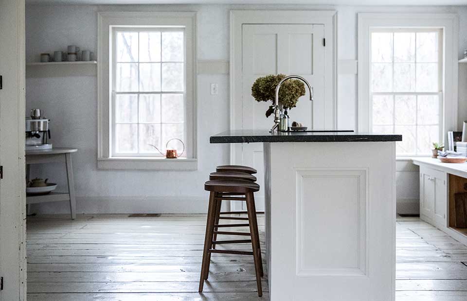
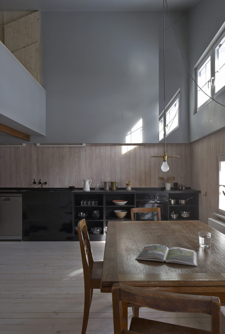
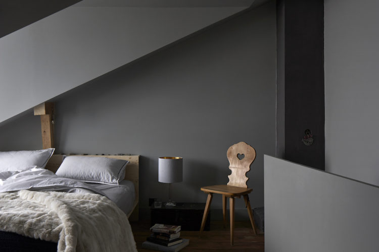
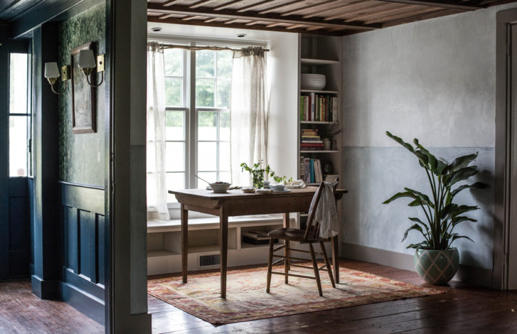
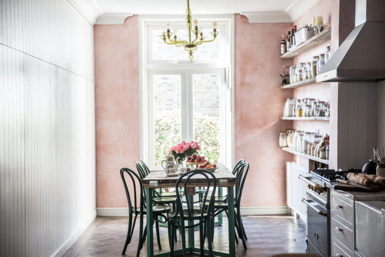
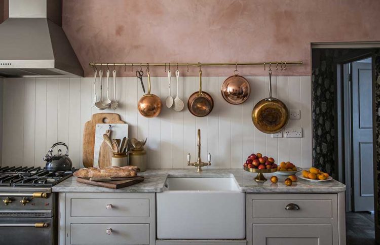
It is, perhaps, also no coincidence that most of the rooms in these week’s ten beautiful rooms are filled with restful muted colours. The texture of bare pink plaster in Skye McAlpine’s London home, the wooden walls and soft grays of projects by the Jersey Ice Cream Co, whose name is as misleading as its design is comforting.
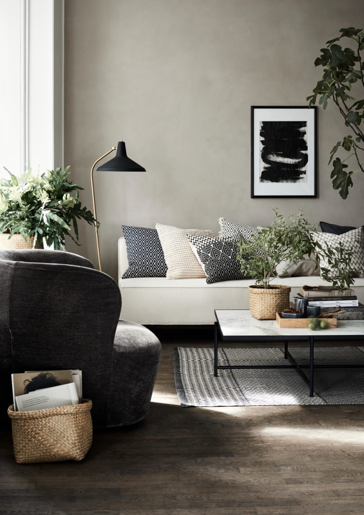
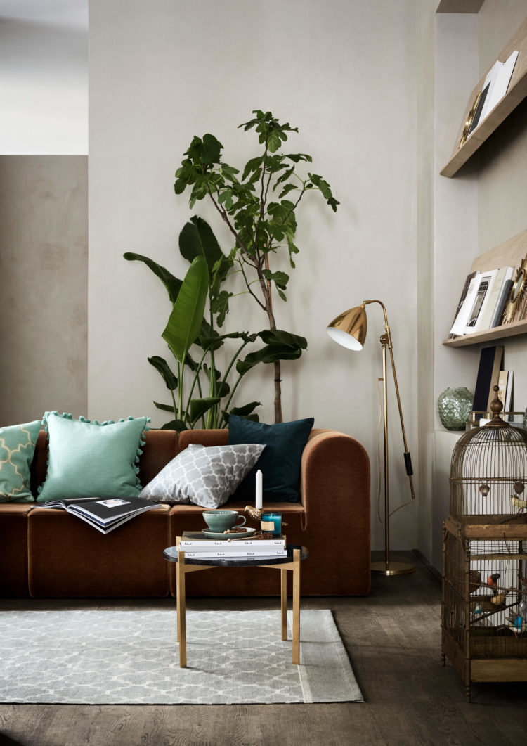
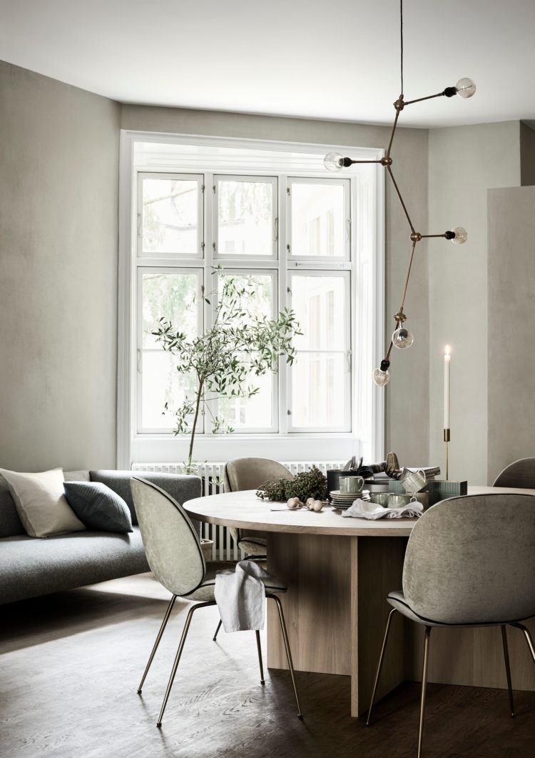
Finally, these two images are from the new H&M home campaign. The green is coming people whether it’s in fabric or foliage it’s coming. And it’s both calming and beautiful and I love it.
Now, take that deep breath, pull back your shoulders and go back out to your day. It’s waiting for you.


Bravo! Inspiring!
And quite alluring!
A splendid start to the week.
Thank you?
10 beautiful rooms and one dreadful hallway. I’ve read your book, bought every grey tester pot in South Wales and have a Pinterest board to rival the Great Interior Design Challenge. But my Lamp Room Grey has just gone up on N,S,E and W facing HS and landing and is green! Help, I’ve gone and got it wrong. I need 25 litres of Pavillion by tomorrow……
No shame at all in writing about paint colours. Why are we fighting, if not to make a better more beautiful world where everyone gets lovely safe spaces? Thank you for the post.
What a great start to the week – such restful calm rooms. I could happily relax in any of the above rooms.
thanks for this Monday morning therapy – now ready to brave the world and this little 5 minute escapism was the perfect way to start the day 🙂