Fancy a little stroll round a virtual art exhibition in aid of charity today? As many of you know I try to support homeless charities whenever I can. In the acknowledgements of my book I ask that anyone who has enjoyed my book, particularly when bought at less the RRP, perhaps make a small donation to a homeless charity as I am very conscious that I make my living writing about and helping you to make your homes prettier and yet there are so many people who have no homes at all.
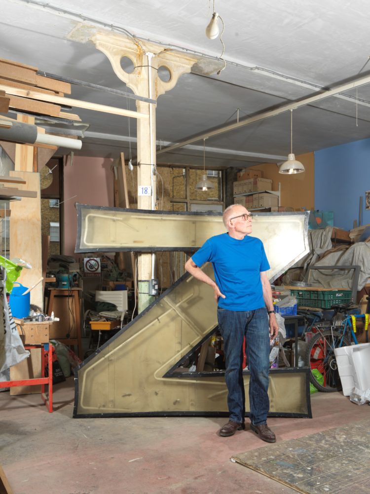
So when I heard about this auction for the homeless charity, Centre Point, I wanted to show you all as it has involved some of the country’s most important artists. Since 1966 the 34-story tower been one of the most recognisable buildings in the city and the letters, which are around 2m high, were visible from all around.
But when the building was revamped in 2015 and turned from offices to flats, the neon letters had to be replaced with LEDs. Almancantar, the company dealing with the redevelopment decided to give each letter to an artist for them to renovate.
The photographer, Christoffer Rudquist shot them at various stages of their reinvention as published in GQ’s November edition last year and the finished letters will be exhibited at Centre Point’s VIVI restaurant and Christie’s auction house. They will all be auctioned individually by The Auction Collective next week on 24 June at VIVI restaurant in collaboration with Christie’s. All proceeds will be donated to the charity Centre Point, that works to give homeless young people a future in the capital and the rest of the UK.
Now if you want to go to the auction on Monday night you can email here [email protected] and if you want to bid – or know know someone who might like to – perhaps they fancy a letter for their company reception or something then click here to find out how to bid by telephone or absentee bidding if you can’t be in the room.
Just remember they’re big before you get carried away. And I have done that. I once asked an interiors exhibition to send me the model of a swimming lady that had been suspended from a 30m high ceiling at Decorex. It was going to be destroyed and they were happy for me to have it. It duly arrived, took up the whole hall and they laughed and legged it. When The Mad Husband came back from work he actually didn’t lose his mind, but very quietly set about sawing it up into small pieces so that we could get it in the car and take it to the tip. When he turned up there with a boot full of seeming body parts, the guys who worked there were speechless. Which is a long way of saying always check your measurements.
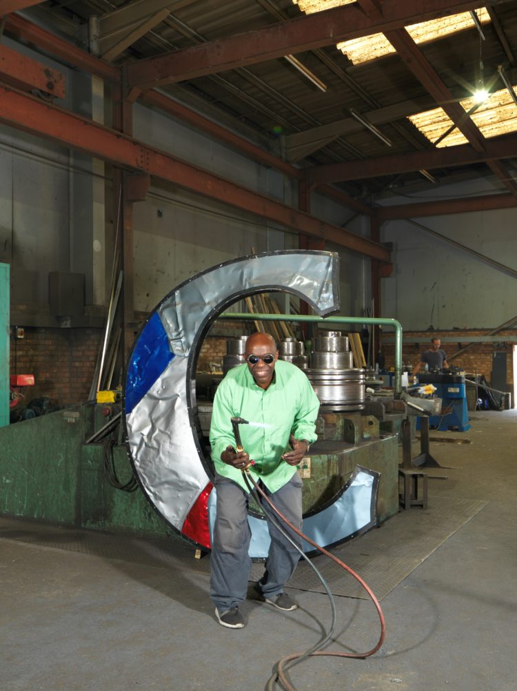
Anyway, moving on, all the artists were asked about their inspiration for their letters. Sculptor Cedric Christie said: “The ‘C’ is crushed steel panels and the colours, blue and red, chose me more than I chose them, in the way that colour always does. Colour says something to you. It gives you an answer or a question. These colours said, ‘This is it. Leave me alone’.”
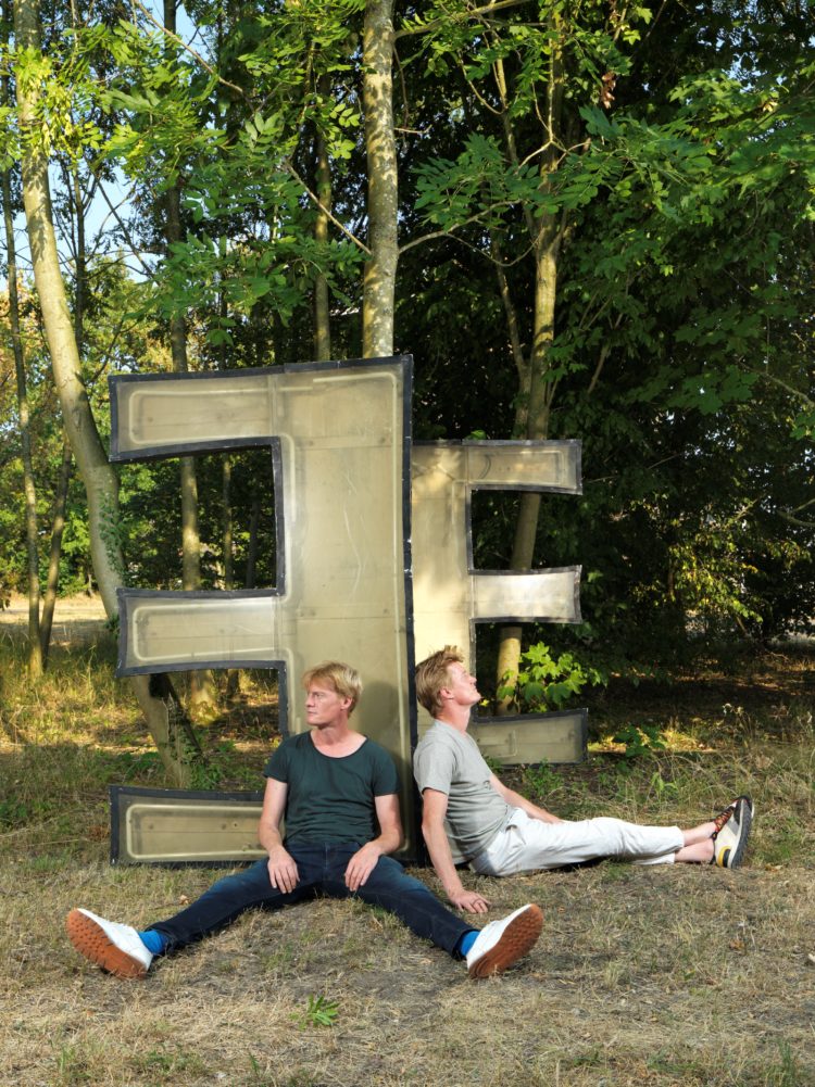
The twins Jeroen and Joep Verhoeven, took the E’s and said: “We are identical twins, so were given the two identical ‘E’s to work with together. We will make one look like a galaxy, to represent dreaming and hope. The other we’ll re-case in glass, to represent a ghost image of the past that looks forward to the future.”
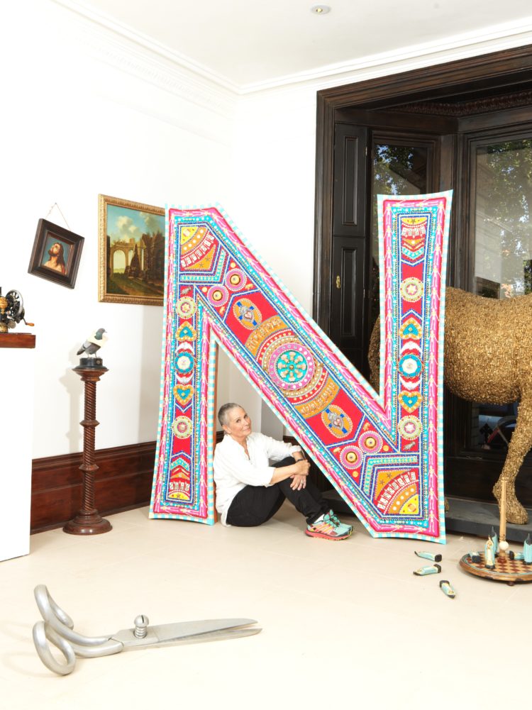
Nancy Fouts, took the N: “When the letter arrived, it was so heavy it took three men to drag it into my garden. My thought was to make it into sailor’s beadwork, so I removed the electrics and Perspex, painted the metal to make it look like wood and filled the inside with foam. I used whatever I found in the studio to adorn it. It tickled me to decorate something so gigantic with tiny beads and trinkets.”
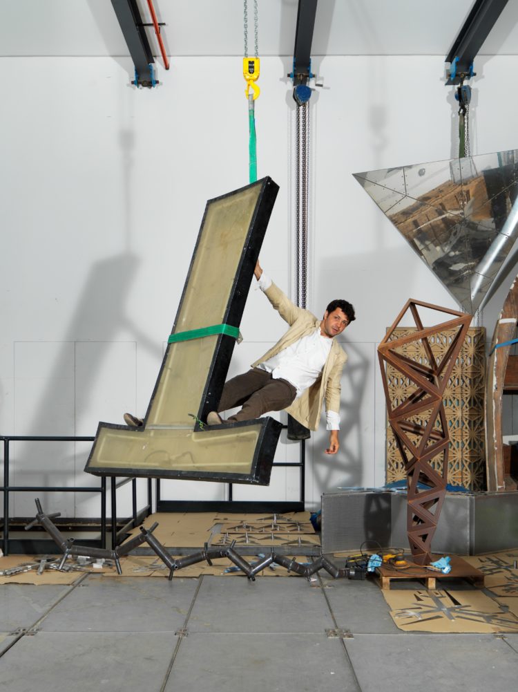
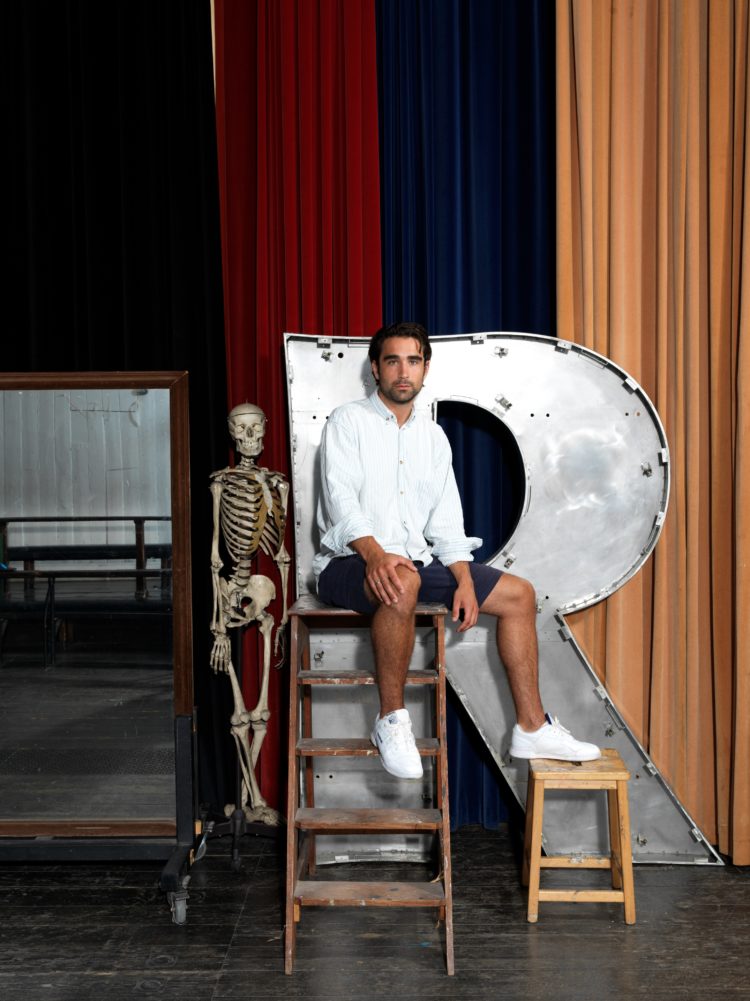
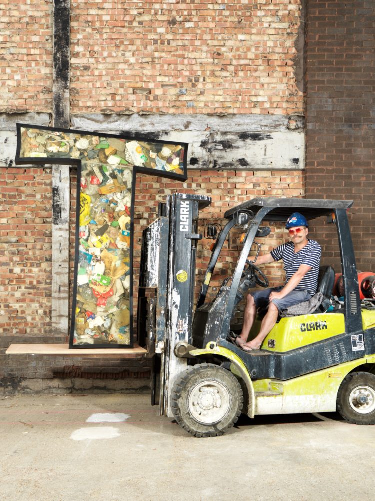
Conrad Shawcross said he chose a T because: “because it felt the most precarious of the letters that were still available from the Centre Point sign. A lot of my work towers upwards and grows as it ascends, so this letter seemed to share this structurally perilous potential” while Charlie Fagan took the R: “This year, my practice has been mainly summoning ghosts, and at my RA School’s degree show it was sculptor Eric Gill’s. This project felt appropriate as Centre Point was one of London’s ‘ghost towers’ when it was first built [it remained empty for years]. This ‘R’ has witnessed every sunset since the Seventies, so I want it to become a repository of these.”
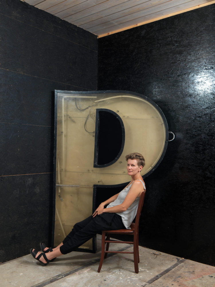
The P went to Laure Provost who said: “The letter ‘P’ is turning into a bust. I have added a nipple to symbolise our efforts to push forward with this new history in which women have an increasingly stronger place and where points of view are increasingly diverse.”
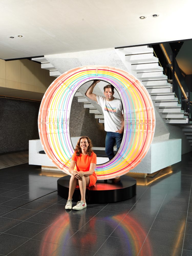
The O and the I went to Rob and Nick Carter and Mark Wallinger respectively. Rob and Nick said of their letter: “We wanted to draw on the origins of this iconic Sixties London neon sign. In signature Rob and Nick fashion, the neon has been formed in concentric circles running through the colour spectrum, emphasising the wonderful shape of this letter.”
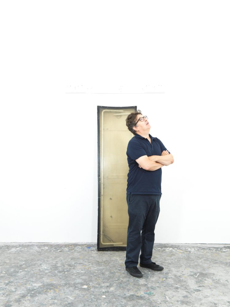
Mark said: “This letter will hold affinities with my series of ‘Self’ sculptures. When the letter is leaned against the wall it will be evocative of a human figure or a full-length mirror and be a meditation on the meanings we attach to selfhood.”
Finally, Richard Wentworth said of the N: “Things can be ‘read’ at any angle – upside down or back to front – and this has remained my family rubric for point of view. I want to remind the observer that words have an inner life. These letters are bodily (they once lit up from inside) and, like bodies, they have guts.”
And the last T was for Gavin Turk: I chose ‘T’ for Turk. The aged Perspex cover and space inside the letter had an antique, vitrine-like quality, so I filled it to the top with rubbish from the road outside my studio as an evocation of the Sixties painter Arman, who used refuse as a fine- art material to critique consumer culture.”
It’s interesting how many of them chose the letters of their names. With no letters of mine available I have been pondering which I would have chosen because then it’s just about the shape. I think I would have gone for the O or the E. What about you?
I will update you with the results of the auction and should anyone wish to make slightly smaller donation to Centre Point you can find out more here. This is what I wrote in the book:


