I’m so excited to share this project again for anyone who didn’t see it the first time around. I was asked by Obbard to consult on this historic building and came up with the concept, colour scheme and look and feel for the five apartments. Come and look around and rediscover the details you might have missed first time round.
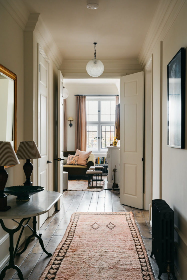
I was invited to work on this iconic (I don’t use that word lightly) London building a little over a year ago by Obbard who asked if I would consult on the concept, the colours and the look and feel of the apartments, which, at the time I first visited were run down and empty. Obbard had already redesigned the layouts to create five lateral apartments from what used to be a collection of small pieds a terre built for gentlemen to use when they came up to town to visit clubs or entertain women who possibly weren’t their wives. The Grade II listed building now belongs to the wine merchants Berry Bros & Rudd and we all immediately agreed that we wanted to develop the apartments in a high end, sustainable and eco-conscious way, as far as was possible, for what was to become a collection of rental flats.
Read on...
If you like the colours used they are from Graphenstone and are as follows:
Off white walls Bougie
Yellow Ceiling – Lamplight
Red Ceiling – Barolo
Green Ceiling – Aspidistra
Pink bedroom and bathroom – Powder Pot
Brown room – Bookcase
These are special colours so if you want you need to ring 01379 772940 or email [email protected] and ask for what you want.


Such a beautiful project. I love the crittal style doors in the bathroom with the reeded glass sections – where are these from please?
I love the pink used… warm, subtle, the perfect amount of colour for layering textures and patterns against!! Would love to get my hands on this colour but can’t see it on Graphenstone website 🙁 nooo 🙁
Great work!!
These are special colours and aren’t listed on the main website. You can email [email protected] to order samples and pots or ring 01379 772940.
Hi Kate – simply adore these apartments! Love the bathrooms, the yellow ceiling, everything! Could you please share the source of the rugs? They complement your soft neutral colour schemes do well.
They came from a chap in Morocco who is on instagram as Berber Treasures – tell him I sent you!