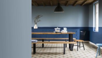
Monday morning inspiration comes in the form of these gorgeous new images from the Little Greene Paint Company. I showed you a while ago their Grey Paint collection but now they’re moving on to new colour combinations.
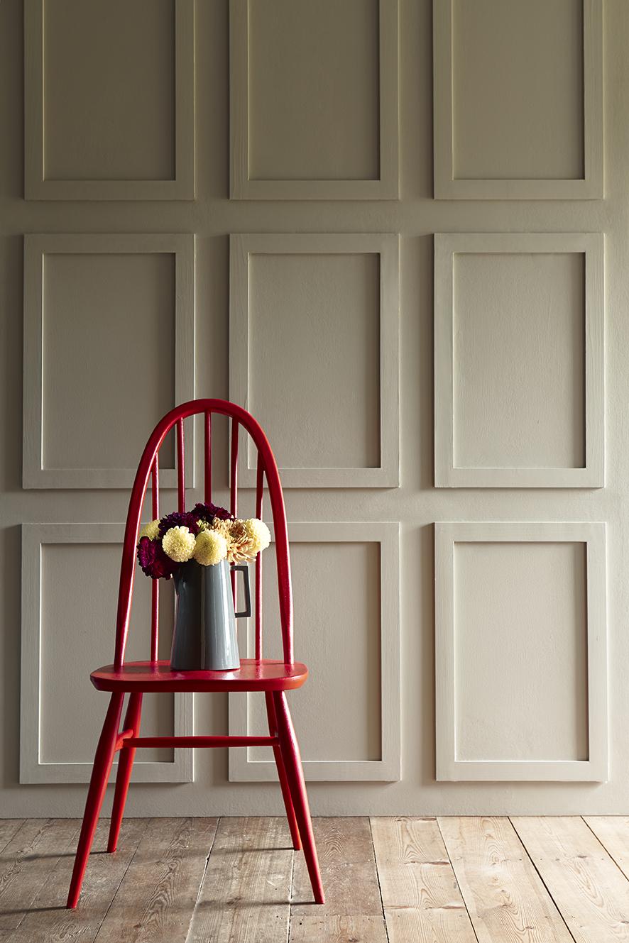
Moving on from the neutral shades, the paint company wants to us all experiment with new colour combinations. These historical colours have been in the catalogue for a while, but it’s about how you mix them up.
Now, I’m the first one to admit I’m a bit scared of too much colour and prefer to keep things monochromatic, but when I look at these images I could definitely be persuaded to crack open a tin of paint.
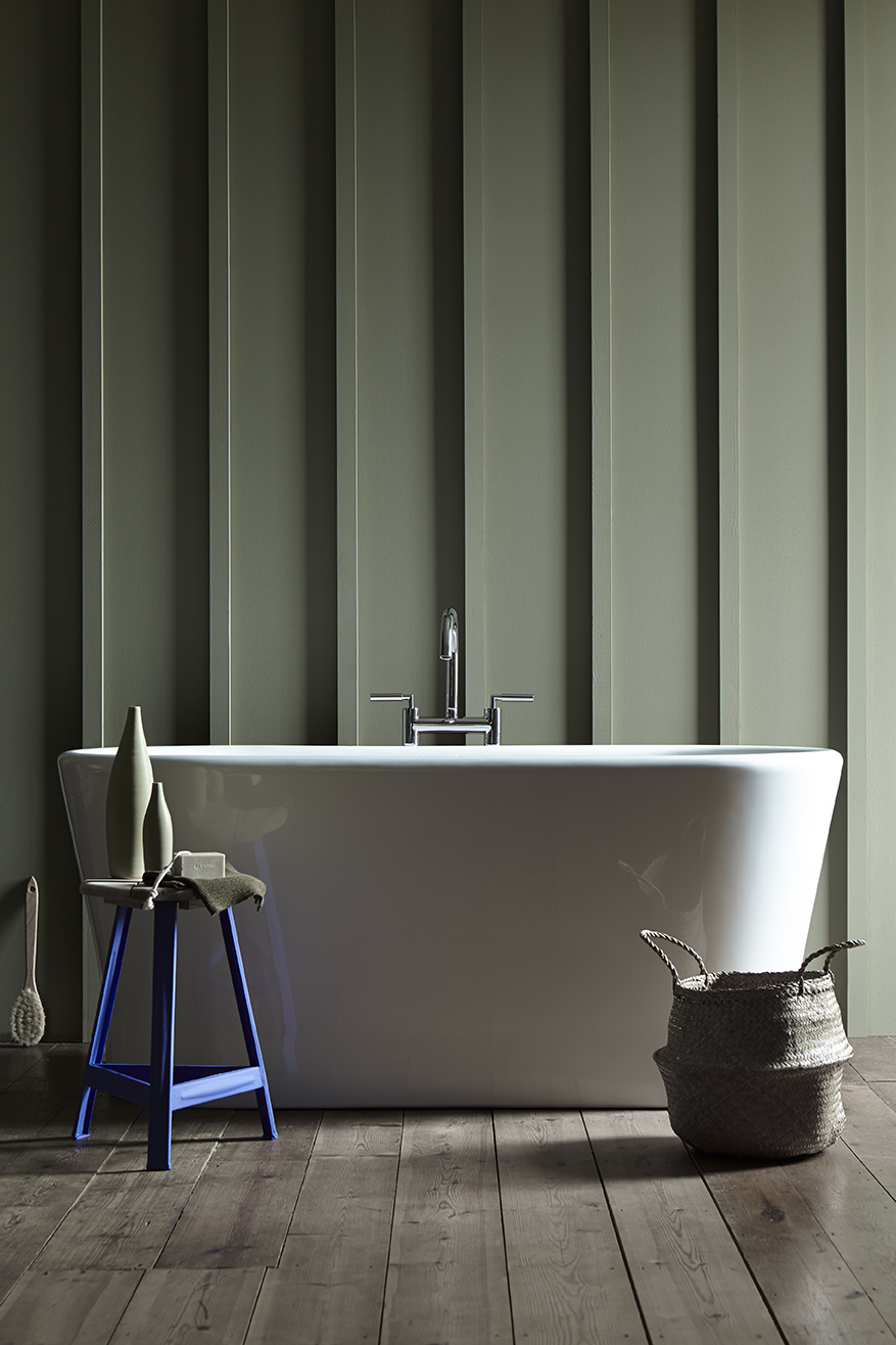
With so many of us living modern lives in buildings originally designed for a completely different lifestyle, Little Greene is interested in finding ways in which these historical so-called neutral colours can remain true to their origins and architecture, whilst forming the basis of contemporary design schemes.

So it’s not about changing the paint colours, but instead changing the colours used with them.
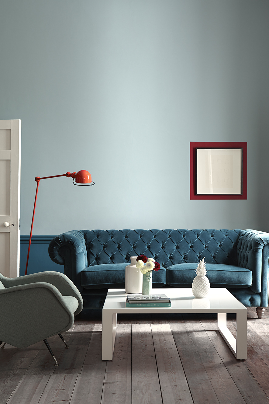
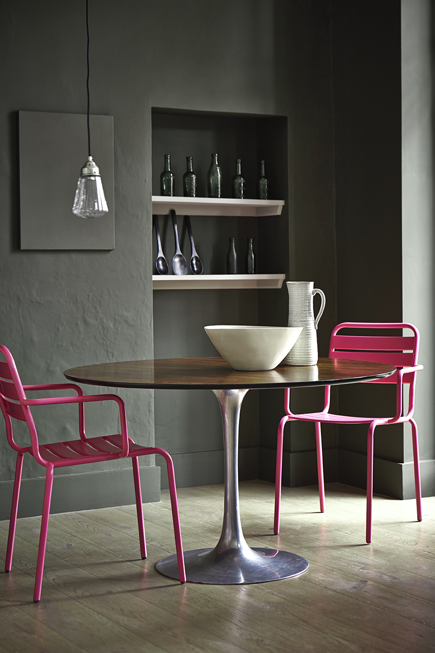
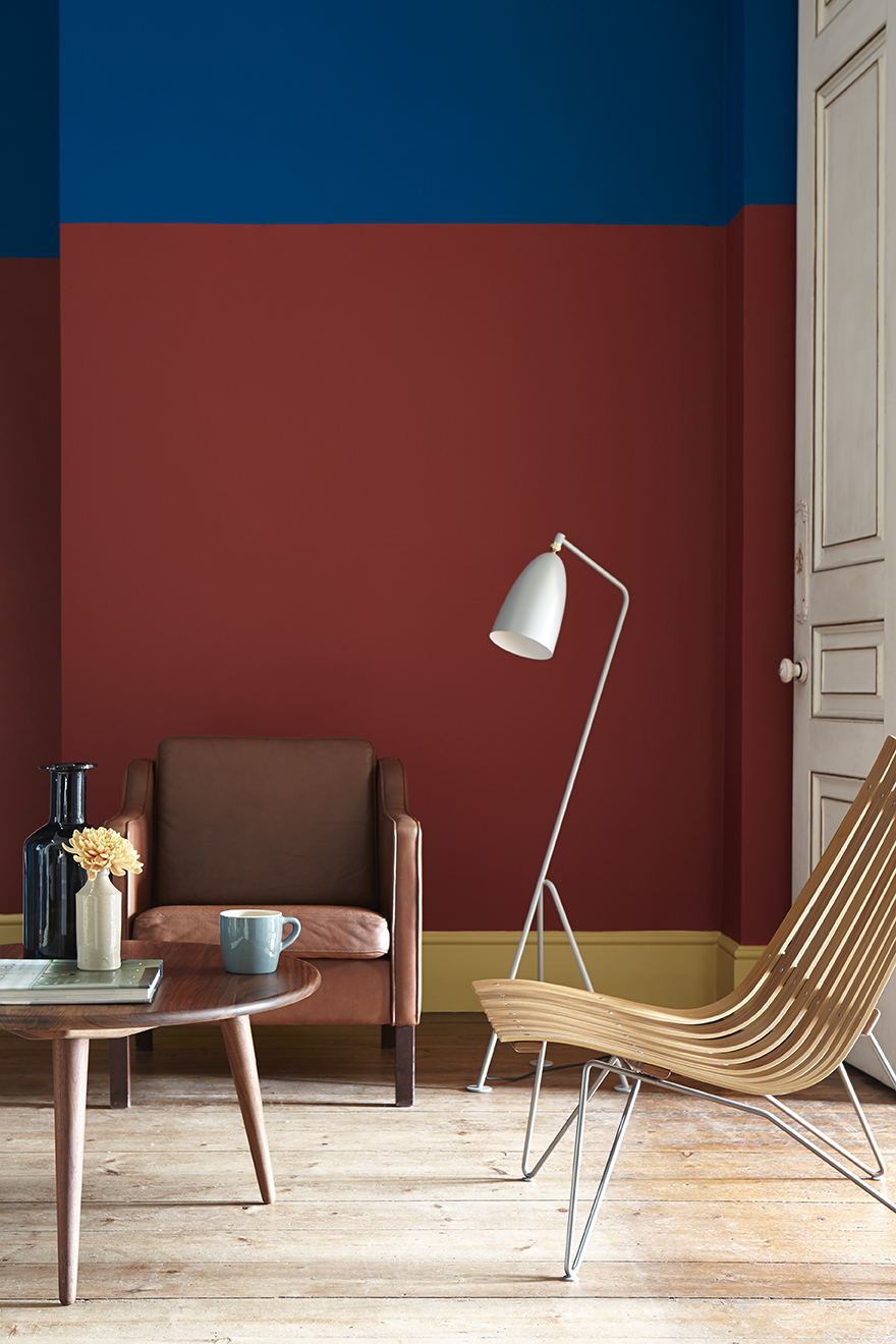
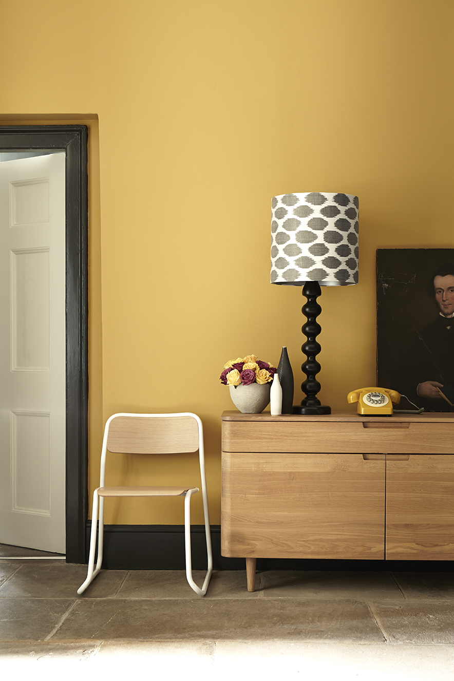
David Mottershead, the managing director of Little Greene, says: “Using paints effectively in interior design is a much more sophisticated process than selecting a single colour from a paint chart. One colour in isolation can be attractive, two in combination can be beautiful and three shades used together can be quite exquisite.”
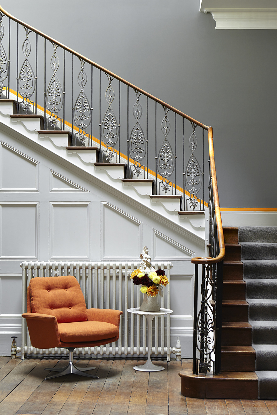
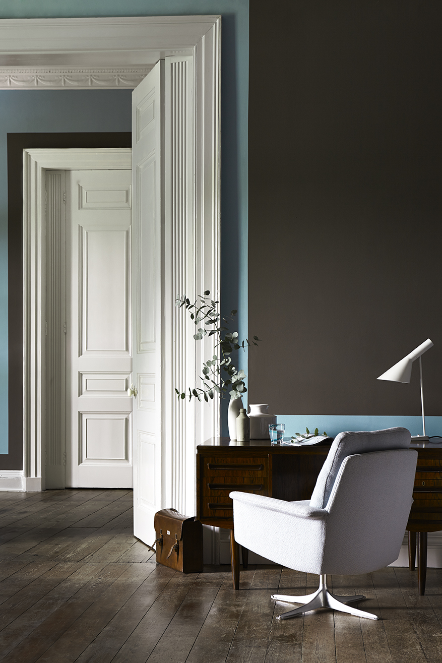
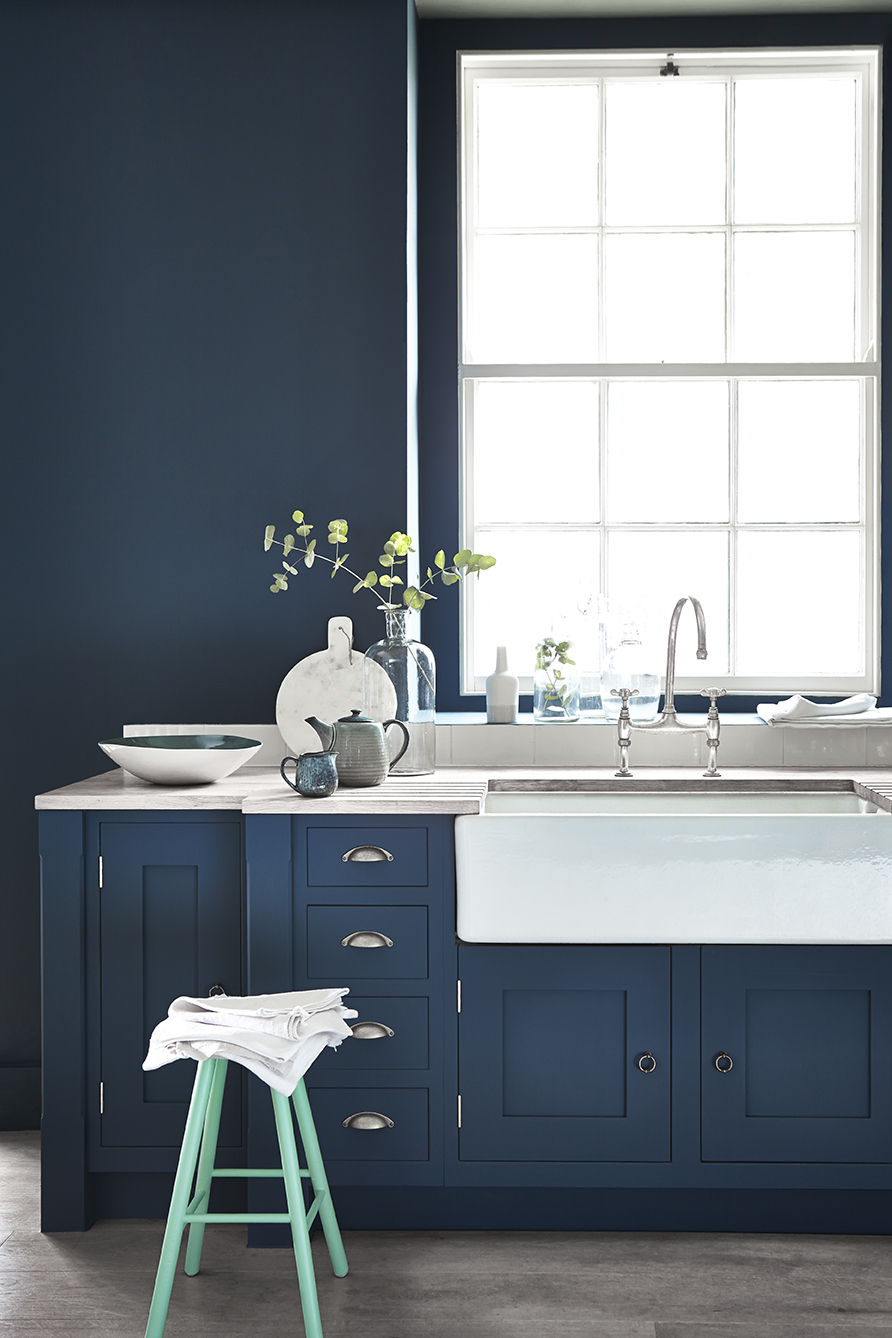
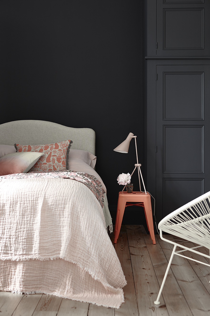
That’s dependent on you getting the right three mind you. If you’re not sure then follow the 60-30-10 rule. Use the ten per cent for the added punch of colour. It doesn’t have to be paint, it could be, as in the image above, an orange chair which highlights the little stripe of colour above the skirting board going up the stairs.
Obviously the 60 per cent is the walls as that’s the biggest area. Consider a man in a suit: the dominant colour of the suit, the secondary colour of shirt and the punch of the tie.
You can have one accent wall for the secondary colour ( I know it’s unfashionable, I don’t care, I still like it) or stick to furniture and rugs and then have fun with the skirtings and or window frames.
It’s not hard and fast but it is a guide to getting the proportions right and it’s as good a place as any to start.
I’ll leave you for now with this pictures. Enjoy your day and, dare I say it, enjoy the colours.


Mmm yum! I especially love the color pops in the first 5 images 😀
I feel inspired by looking at these truely beautiful colour combinations – especially the happy colours like sky blue, oranges and yellow-pink with the darker backgrounds. Very inspirational!
Thanks Kate, lovely inspiring pictures. I’m a big fan of Little Green Paint Co. Great coverage and depth of pigment to their paints. Have to say I’m somewhat sick of the grey trend at the moment, too ubiquitous. As a self confessed maximalist and colour lover I tend to decorate with real colour rather than neutrals.
Thank you I really enjoyed the article and the pictures were fantastic!!