This week’s inspiration was begun by the top two pictures – one wallpaper, one paint and then I realised there was a theme developing as I had also promised to show you a couple of the new shots of my house taken by Mark Anthony Fox, who does a lot of the dreamy photography for Inigo (see last Friday’s post for the relevance). I chose the two brown rooms – the sitting room and kitchen although admittedly they look darker than they actually are but we’ll come to that in a minute (trying to avoid the annoying scrolling up and down…. )
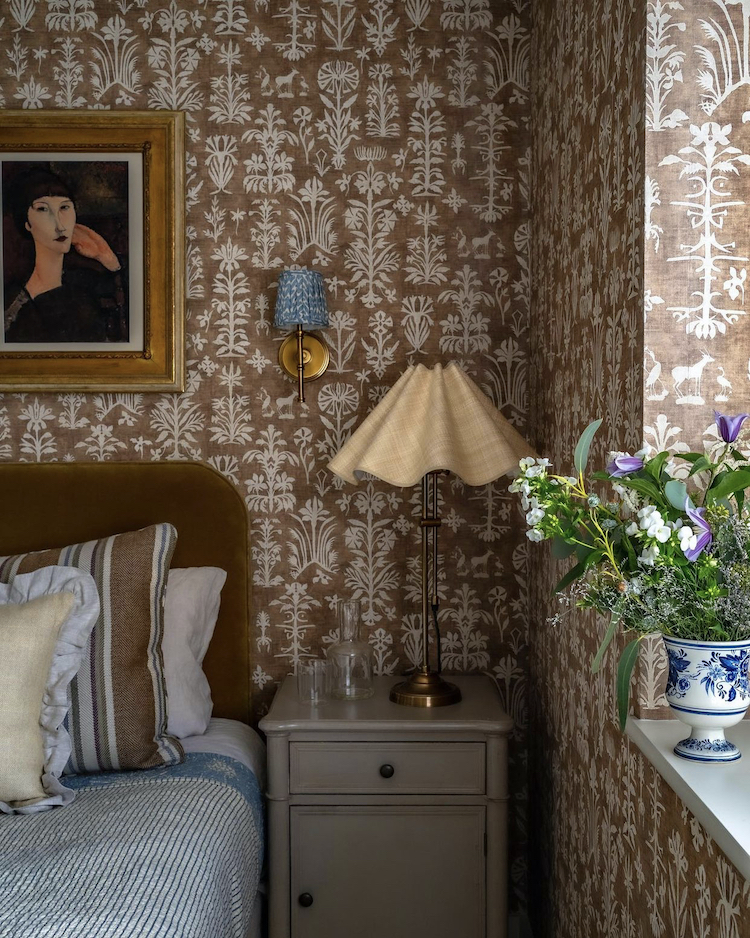
So first up this wallpaper and I just adore it. But I have nowhere to paper. For now. It’s called Papyrus and it’s based on a 16th century paper cut design and comes in lots of shades including this Desert Sand but also rosewater, quince, nero and malachite (and more). I love this sort of pattern and will always gravitate to a pomegranate or a tree of life style of wallpaper. What I like about this is that since it’s only two colours it’s easier to use than some of the highly patterned ones. It’s happy with pictures hung on it – sometimes artwork on wallpaper can be a little busy – and it gives you the opportunity to add toning patterns (stripes on the cushions) a third colour – in this case blue – and a dash of disrupter – yellow and rattan. The effect, because it’s tonal rather than high contrast, is sumptuous and inviting rather than busy and overwhelming. If these sorts of colours appeal then do follow Alice Grace Interiors to see more of her style.
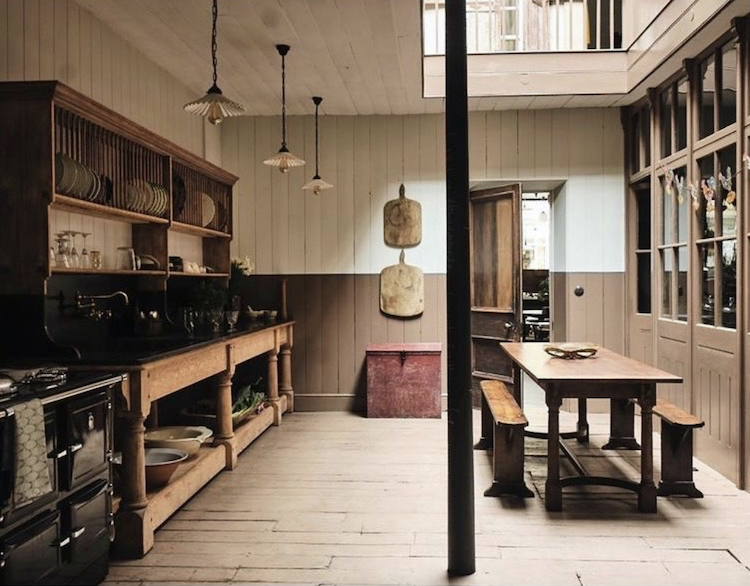
Similar colours but this time in paint in the Berdoulat shop and this is London Brown by Edward Bulmer who says it is a simple mix of red oxide and black. You must try it before you buy though as in some pictures it looks very dark (indeed he calls it his dark chocolate) while above it’s definitely more towards the Galaxy (milk chocolate for non UK readers) end of the spectrum. Either way it loves a bit of cream and some antique furniture and that red box at the far end brings out the pinky tones.
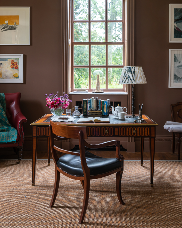
Here it is in Edward Bulmer’s own home.
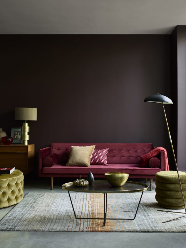
Now to my own house and this image is all about the sharp shadows but, once again, I have to tell you that these walls are not this dark. Fallen Plum by Atelier Ellis is, to continue the food analogies, almost a perfect match for a Bourbon biscuit. Which means it’s lighter than 70 per cent dark chocolate (I’ve just had to have a piece to check) but darker than milk chocolate, making it about perfect in my eyes. This is a south-facing room though so it can take a strong colour.
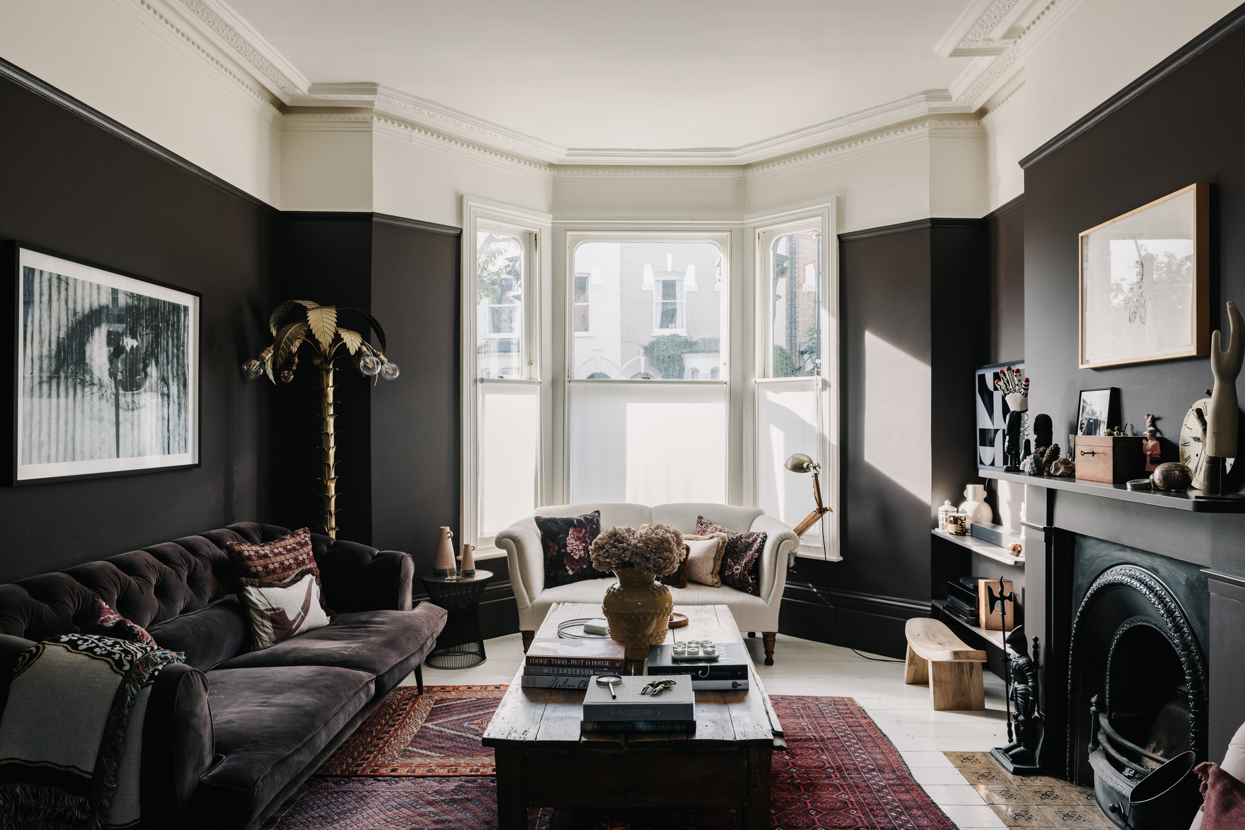
If you have a narrow room you can try matching your sofa to the walls so that it doesn’t dominate the room in the way a large pale one would. And having done this for several years I am about to install my new sustainable sofa in this spot which will go more with the rugs than the walls but that was a choice. If you look at the post on the sofa you will see how the pink version looks much larger in this room.
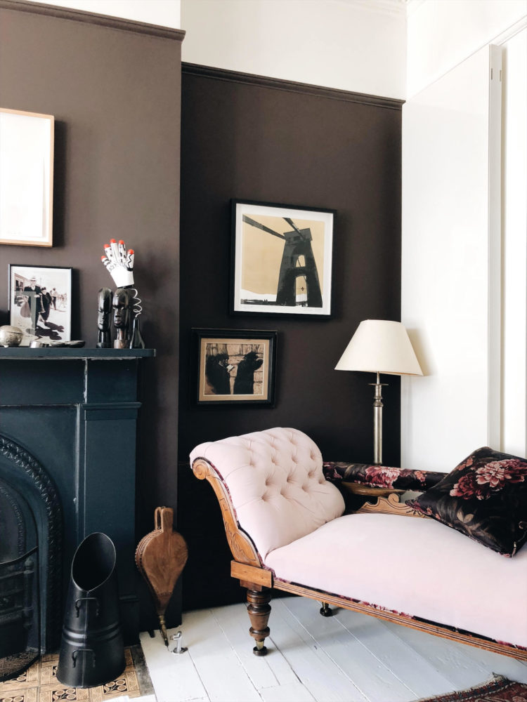
Above is probably a more accurate representation of the colour but a less pretty picture. Which is why you must take interiors photography with a pinch of salt and ask yourself what the picture is trying to tell you. In the top picture – by Mark – it’s a mood and a whole room, whereas above – shot on my phone – it’s more about the paint colour – which still won’t be entirely accurate to what’s in the tin by the way. This is how it appears on Cassandra’s website (Cassandra Ellis) and as I sit here with my screen facing the wall of the same colour I have to say that when the sun is in it’s a good match. When it’s out the screen version looks more purple.
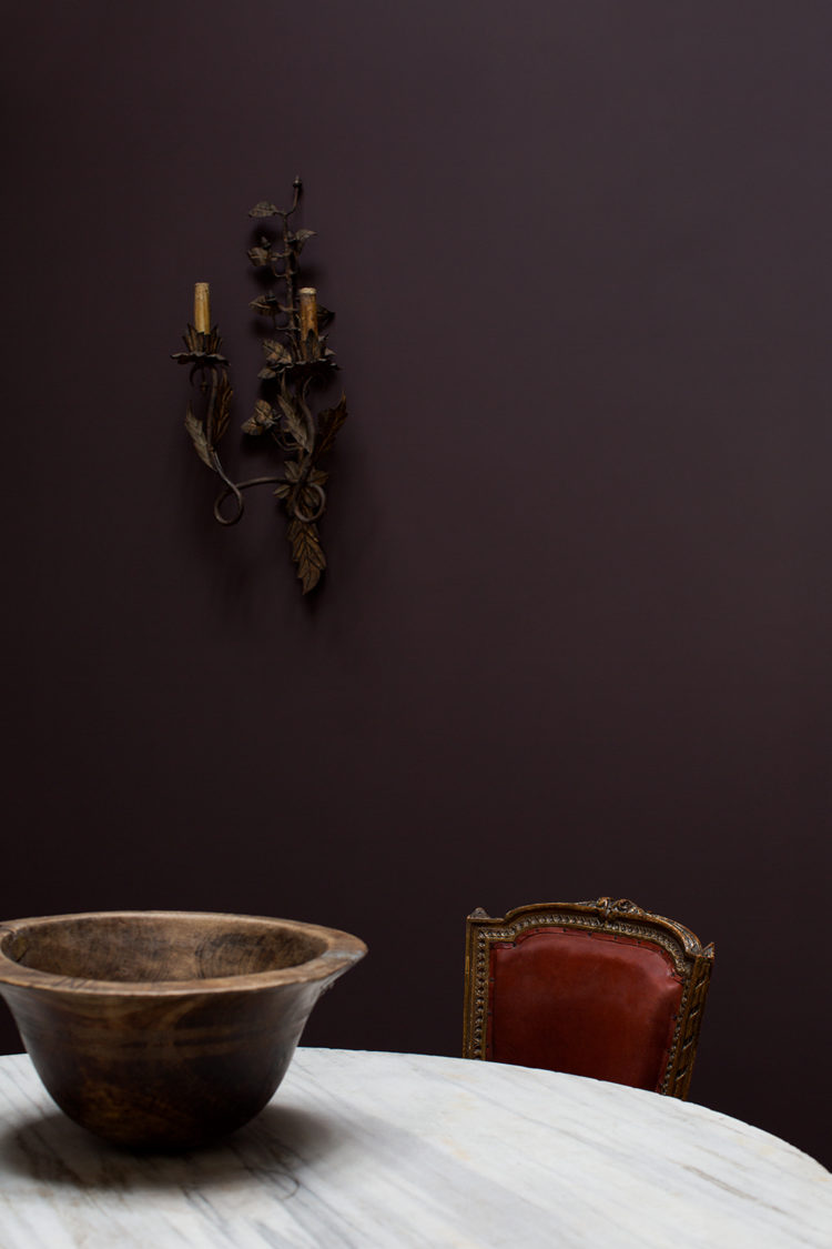
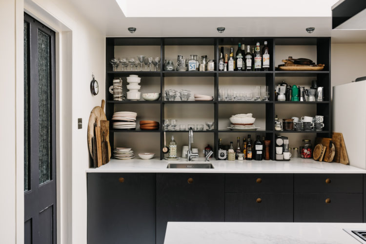
I have used a similar colour on my kitchen cupboards (a north facing room) this is Tanners Brown by Farrow & Ball and this is why you must test in your own rooms. In there, the Fallen Plum became more plum-like whereas the darker Tanners Brown (and this really is bitter chocolate ) worked better against the rich cream walls. And yes I can see it looks almost black in these pictures, as mentioned on the website but in brighter light it becomes warmer and browner. It has a slight purple undertone – as if an aubergine had eaten a bourbon and it is one of my favourite shades of chocolate.
Other shades to try include Little Greene Purple Brown (the most like Tanners) their Felt brown and, well let’s finish with one that does what it says on the tin – Chocolate Colour. All of these shades will pair well with ivories and cream, soft pinks and blues and ochre yellows and oranges as well as, for the daring – emerald and lime green. It’s a more versatile shade than you might have thought.
For a more affordable version try Dulux Cherry Truffle and to continue the food analogies ,that can be a great way to find colour combinations. I was in the Marks & Spencer food hall the other day and walked past a pack of macaroons that was vanilla, chocolate and raspberry (basically my house) but so gorgeous I nearly bought them for the colours alone and I don’t even eat sugar. Add also a splash of mint for the disrupter colour and it’s a great room set. Inspiration can strike anywhere – don’t assume you have to be looking at catalogues and wallpaper charts – you can just as easily be doing the weekly food shop.


All these rooms look gorgeous, as always, but as I don’t like brown in my own home (apart from wood) I was most tempted by the final Dulux ‘Cherry Trifle’. Enough to click through the link and realise I’d mis-read Truffle as Trifle! And strangely enough, I didn’t like it so much afterwards. Ah well, back to the drawing board/menu.
As far as I’m concerned, you can never have too much chocolate. Cheers from Canada!
At 14 I was asked to paint my own bedroom. We’re talking 1974 here . . . the “givens” were : orange (nylon) velvet curtains, violet (nylon) quilted bedspread, white carpet. With no money whatsoever, in the garage I found leftover deep, dark brown paint that my Dad had used on the bottom/plinth of our exterior house walls. I did 3 of the 4 walls in the brown and the remaining wall was already a warm pinky magnolia. I was thrilled with the result! I soon managed to get rid of the violet bedspread and was always happy with my decisions, despite the constraints (till we moved in 1978)
asked … not was asked
OOPs sorry my comments have appeared twice!
I am amused by this article. Fifty years ago we painted a room the colour you’d find at the bottom of a cup of hot chocolate. The ceiling and wood work where white and the third colour for cushions, cherry red. The floor was covered in hard wearing brown carpet with an old Persian rug on it. It was knock out at the time!
I am amused by this article. In 1971 we painted a room the colour you’d find at the bottom of a cup of hot chocolate. The ceiling and wood work where white and the third colour for cushions, cherry red. The floor was covered in hard wearing brown carpet with an old Persian rug on it. It was knock out at the time!
Beautiful! I’ve never really thought about using dark browns in the house but this has made me reconsider.
I’d be really interested to hear how the atelier Ellis paints are holding up. The colours are pretty – I’d love to know how durable they are, especially in the darks!
I LOVE that Papyrus wallpaper – really beautiful – and great choice of colours. The brown kitchen left me cold – ugh. However, I did like looking at the rest of the rooms, lovely chocolate/plummy tones, even though I lean towards the Scandi washed out palette and won’t be tempted away from grey….
Now I’m HUNGRY!