Gooooooooood Mooooooooorning Monday. I hope that the wind has died down, the floods have receded and the viruses are at bay in your corner of the world this morning. And in an attempt to distract ourselves from all those horrors who fancies a little stroll through some beautiful rooms with a cup of coffee before the reality of Monday morning work bites?
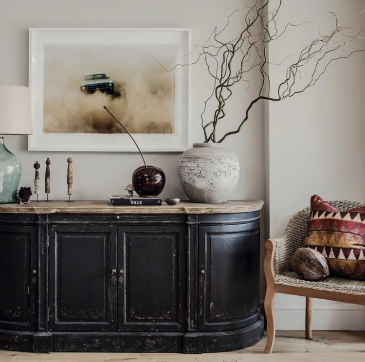
First up is this room with its vintage black cabinet that pulls all the other dark details out in the room from the branches in the vase to the car in the picture. The colours are all muted and natural but the earth tones of the cushion really stand out and make it seem well put together without feeling deliberately styled – which is the perfect balance that we are all aiming for. And why, incidentally, the key is to avoid everything being too matching which leads inevitably to the latter. But grouping colours and shapes rather things in sets will give you more of the former.
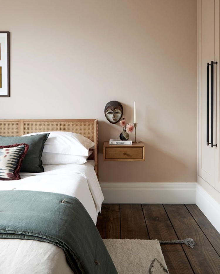
This bedroom is from the same home and I show you mainly because of the delicious combination of dark wooden floor and warm pink walls. Note also that the bed and the headboard – while being different – ie not both cane – match each other in colour and don’t fight with the floor although they are all wood and different versions thereof. The greeny blue throw and cushion add a welcome disruptive burst while the pink flowers on the table serve to intensify the colour of the walls.
But another point to make is the picture on the wall of the face. You can just see that there is a large picture over the bed but fixing something else to the wall that is close enough to the bedside table to create a relationship with the things on it and far enough, and different enough, from the large painting works really well. This would be easy to recreate with a small picture in a large gold frame – that sort of thing you used to find in charity shops so often. Imagine a picture of flowers that you could recreate with real flowers in front. Then on the other side you could have a picture that was a different size and subject but made enough of a link to make it look like you had thought about it.
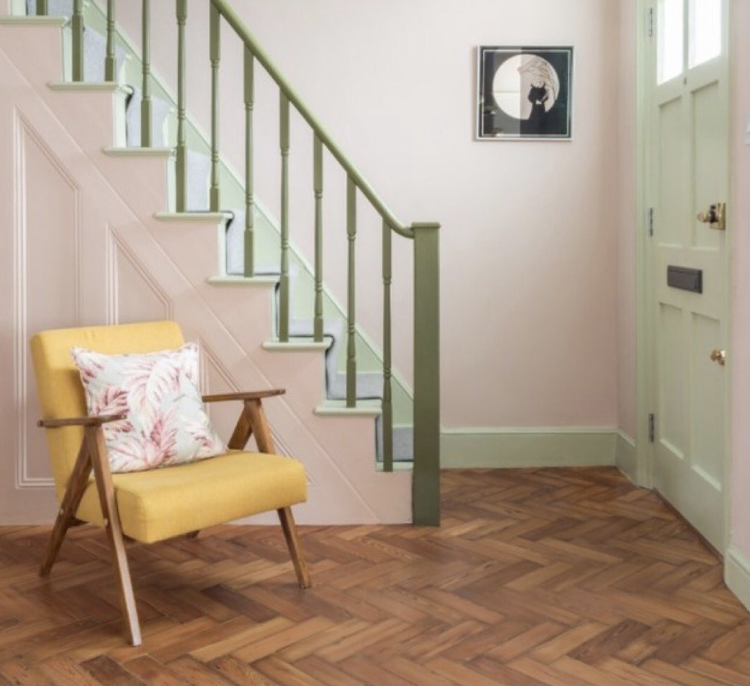
Here is a perfect example of why you should always pause before you select the white paint for the woodwork. Here it’s mint green and, while not really much darker than white, its impact is so much more not to mention that clever detail of making the bannister a darker shade of green.
Now I know I usually say match the woodwork to the walls rather than painting it white and that’s because, for many of you who are hesitant to stray from traditional white, that’s an easy and logical step. But taking it one step further and choosing a contrasting colour (that still isn’t white) is also a great idea for those who are more confident with colour. These are ice cream colours – especially with the disrupter yellow chair. If you’re not sure which colours to choose look at nature for her combinations of greens and flowers, or the patterns on clothes in your wardrobe. Or even just look at the colours that sit around your chosen wall colour on the paint chart. Those little folding card brochures aren’t put together haphazardly after all.
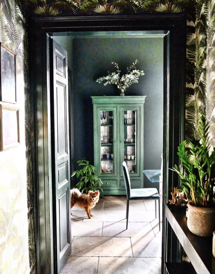
I love this image above. It shows not just how important it is to consider what you see of a room when you are walking past but also how the green links the spaces and finally how you can transform a piece of vintage furniture that may not cost very much in the first place. This has been painted green with leftover wallpaper stuck inside to create a backdrop for the items on display. You could also paint the inside in a contrasting colour and even use wrapping paper if you don’t have any leftover wallpaper or don’t want to buy a whole roll.
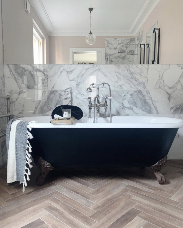
And finally because it’s Monday let’s end with a luxurious bathroom because everyone wants that. And because these pale pink walls are so much warmer than white would be against this marble and work to turn this bathroom from something that might be a bit cold and hotel to something warm and characterful and, yes that word again, deliberate. That’s all we’re looking for people – something that looks like you meant it. That looks like a deliberate decision was taken. That’s how it works.

With the exception of the image of the yellow chair and green banisters none of these walls you have noted as pink appear pink or even pinkish, more taupe to sand and I have viewed on two monitors and an ipad. One of the monitors is brand spanking new !!
That painted Green Cabinet is giving me inspiration… just need to shake myself out and do it!! Totally agree about the pink walls in the bathroom.. takes it to a different level. Very restful looking.
I adore the vintage cabinet room . Very drawn to the dark richness of the colours and the greenery. Pastels leave me cold.
Good morning Kate! Hope you had a good weekend.
I really love this pink on the walls in the second room. It is so much warmer than plain white, and it goes so well with this greyish green on the bed. Also, this floating bedside table is super cute. Do you happen to know where it’s from?
This bathroom looks fab as well. I really like this bathtub, it looks chic yet quirky at the same time.
Happy Monday Kate!
Renaud
http://blogbyrenaud.wordpress.com
Excellent photos & thoughts Kate. I especially love the first photo of considered muted colours & textures and also the green room with vintage painted cabinet. And although not a fan of pastel pink, it really lifts the marble bathroom.