A bumper post for you today as it’s a mix of househunter and inspirational rooms and that’s because the house of top interiors stylist Marianne Cotterill is on the market and I thought, since it’s a top location house as well that you might fancy a look.
Located in north west London, this six bedroom house is in a conservation area and combines a mix of original features – sash windows and cornicing with modern touches and wonderful use of colour. It’s on with Camerons Stiff if you want to check out floor plans and the other rooms – there are three receptions, a kitchen and a conservatory downstairs, a fabulous master suite and en suite bedroom on the first floor and four more bedrooms and two bathrooms above.
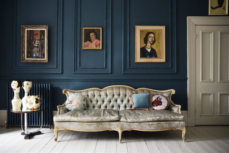
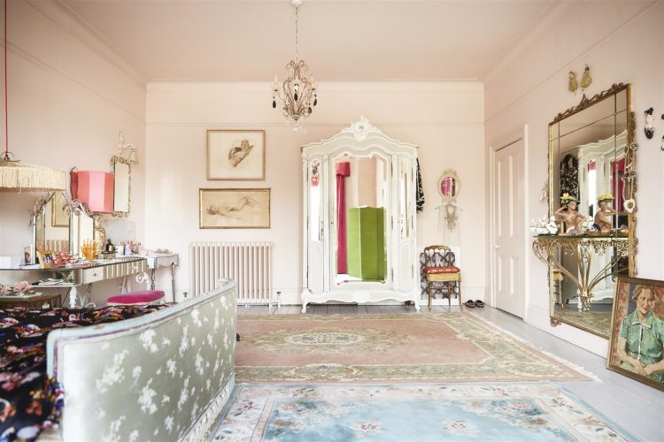
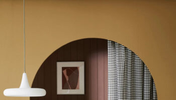
So first up the sitting room (one of three) and I imagine the walls are different as it’s a location house but I just love how these vintage paintings sit so well against the dark blue and the white painted floorboards stop it all feeling too dark.
There are, of course, two schools of thought with dark paint: if you have a light room why voluntarily make it darker but I tend to think that a light room can handle dark paint so why not. I have adopted a similar principle in my south facing sitting room where the walls are chocolate brown and the ceiling and floors are off white.
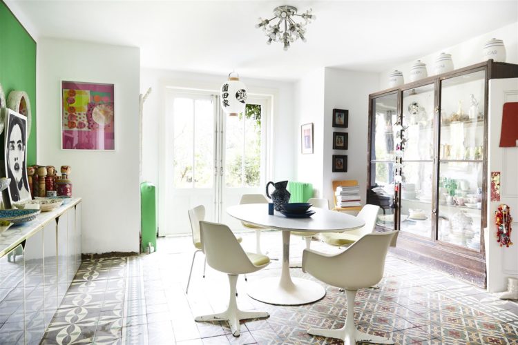
Now come to the kitchen, or at least the dining end of it and see what you think. First of all the patterned floor. It’s so unusual to see pattern in kitchens which tend to be full of solid blocks of colour with maybe a tiled splashback to liven things up a bit. So consider keeping it all quite pared back and, in this case, mostly white and then throwing a floor bomb down.
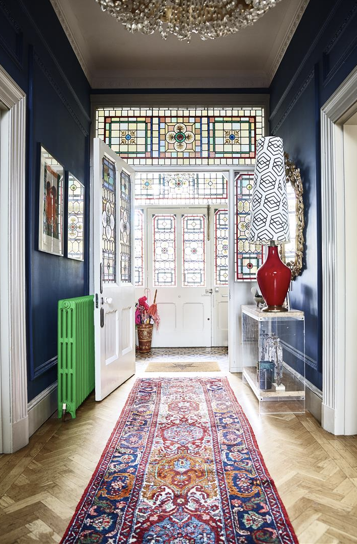
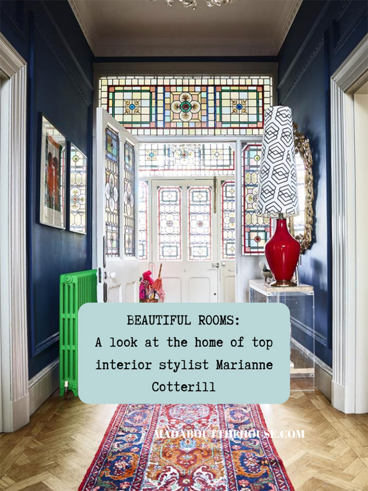
The other element, which you can’t have failed to notice is the bright green disrupter colour. This first appears on the hall radiator where it contrasts perfectly with the red and blue colour scheme which is mostly taken from the stained glass and the runner, which is almost like a reflection of the glass it lies in front of. Yes there is a little bit of green in the glass but Marianne has turned it up to 11 and it brings style and humour to the space and stops a sense of everything being in matching good taste – which is lovely of course but can also be a little dull. Have some fun with your decor – after all in the current circumstances you’re at home a lot so never underestimate the power of stirring things up a bit. After all it’s only paint and it’s only a radiator – you can paint over it by lunchtime if you go off it.
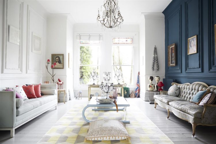
The other clever thing is this green wall below. At first glance it looks like a feature wall and we have spoken before about how that can look random and like you weren’t brave enough to paint the whole thing. First point – if it was a feature wall it is saved from looking timid by the matching radiators at the other end of the room which make it look deliberate and thought out. So if you fancy a feature then you need to incorporate it into the rest of the room and make it look like you meant it and not like you were scared of committing to the bold colour. Also – a few matching cushions isn’t going to cut it. You’re going to need a stripe on a ceiling or a cupboard door or something definitive.
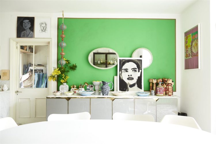
Look again though, this isn’t a feature wall it’s a feature panel. And that as an idea looks bold and modern and clever. A large patch of the green with a contrasting colour to frame it – you could actually do this with washi tape if you didn’t fancy painting small edges. Then you can hang things within the panel, or prop them up against it or, again, change it on a whim in a couple of hours. This is a really quick and easy way to refresh the decor without it taking days and also having to worry about all the time consuming fiddly bits like skirtings and corners.
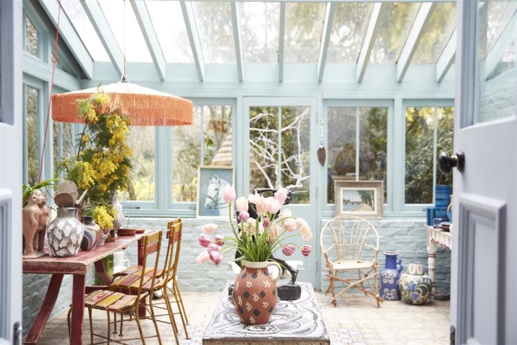
We’ll just pop out to the conservatory and here, once again, Marianne has demonstrated the importance of decorating your house as a whole. Most conservatories are white. Some of the modern ones are black, which frames and highlights the view better. But why not treat it like any other room in the house and pick a colour you like and go with that? Who says you can’t have pale blue, or green or even yellow? Just because most people don’t doesn’t make it wrong. After all most people are painting their skirtings and doors white for no reason other than that’s traditional. Pick a colour you love and pick up that brush.
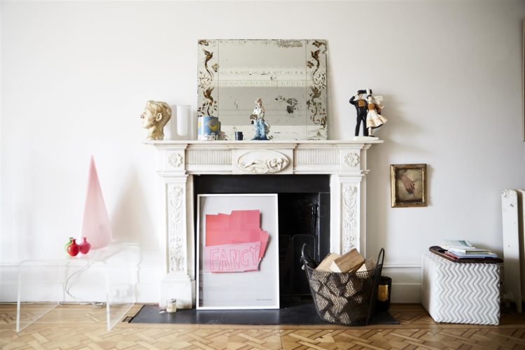
Before we go upstairs just a quick look in here for no reason other than it’s pretty but also if you ever doubted the power of glass or perspex furniture to keep a room feeling uncluttered then look at that lucite table to the side of the fireplace. If you have a small room and feel that all the furniture is bringing it in and making it seem smaller and darker, then consider a piece like this. Just make sure you have something on top so that you don’t trip over it as you will hardly notice it.
For this reason glass coffee tables, or sofas on legs, rather than those will sit almost flat to the floor, will always make rooms look bigger and lighter. And the lighter and brighter it appears the lighter and brighter you will feel and, if we’re looking at a winter spent largely in our own homes this might be a key decorating tip.
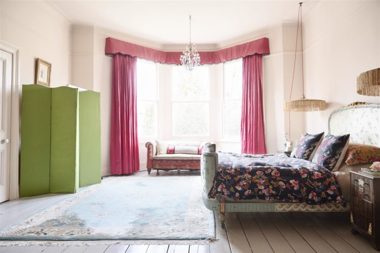
Upstairs and we shall look at just one of the six bedrooms because again it’s cleverly done. I suspect it’s actually painted white but the bright pink curtains and lamps reflect back against the walls and create an air of the softest pink boudoir. And as someone who trialled about 20 shades of pink before finding the right one don’t rule this out as an option.
But it was the cupboard I wanted you to notice. A different green from the lime downstairs but still a disrupter colour that stops it all being too saccharine pink and girly. It could have been orange, or cobalt blue. But do think about picking a completely contrasting shade when you decorate. And if you are nervous about finding it then look in any patterns you are bringing in and simply pick out one that feels very small and hardly noticeable and make it bolder.
So the question is what will your disrupter shade be? I’m currently planning the new bedroom decor for the 17yo which will be cobalt blue and off white (he won’t have anything too fancy) but I think I might throw in a green radiator or shelving just to liven it up a bit. I mentioned last week that he is moving to my office (no he won’t keep the gold ceiling although I am working on it..) and I am taking his very small bedroom as my new office. There will be a wallpapered ceiling in shades of green, pink with emerald green gloss walls and I am currently pondering my disrupter. I think it’s going to be orange.
Just read this post as I am in a dilemma about an element in my dining room that is painted in F&B Railings. The different metals of the the old photos fixed to the living room wall was a huge help in deciding NOT to paint an 1890’s mirror featuring the Greek god Pan copper or gloss black and leaving the original, nearly rubbed off gilt finish. Thanks!
You show how in these exquisite high-end interiors there are transferable ideas to use in our more humble homes.
Thank you for such reliably interesting content. You say it all so well.
Last week I finished our guest bedroom in creamy white with the tall, wood panelled window bay and frame in cobalt. I used a darkish chartreuse to shake things up. A tiny bit of lilac in the mix too. I hope we get to see your adventures in bright blue.
I live 2 minutes from Marianne’s home, and I’ve often wondered who lived there. Plus now I have had the chance to peep inside.
I love this house and your comments.
Yes ! Orange for your study – go for it ! I love this post.
I love how you continually emphasise the difference between the “good taste” of “traditional” (can be a wee bit safe & boring), and encourage the disrupters, floor bombs, red threads … in good taste BECAUSE it’s what you love (there are exceptions of course!).
Many of us put a lot of thought into what we wear, colourwise, and far less into what suits us / what we absolutely love for our décor.
Hi Kate – absolutely love Marianne’s house. I have just introduced a disruptive colour to our bedroom. I painted it in F&Bs setting plaster during lockdown. The Victorian fireplace was white and it just looked a bit twee with the pink, I then painted it the same colour as the walls – that didn’t work. So with your words ringing in my ears went for a sage green and absolutely love it! With half a tin of paint left over, I am now looking for what I can paint in sage green next! Love the blog and all the tips – thank you.
Oh that sounds amazing! I’m so glad the blog inspired you to push things a little.