Well come on then own up? Who’s spent the weekend cheating on instagram, twitter and blogs with the new app Threads? Me first? Yes, yes I have. And I have to say I rather like it. Having given up on the toxic cesspool that is Twitter some years ago (even this blog has somehow disconnected itself and refuses to upload to it) and finding it increasingly hard to think in video format (not to mention feeling harassed by the constant music that suddenly blares out even when the phone is on silent) I have been rather enjoying the summer garden party feel of Threads where everyone (so far) is falling over themselves to be polite and charming and not to promote themselves too much. It’s all quiet chit chat and crustless sandwiches rather than the teeth-bared snarling and selling of the other two. Who knows how long it will last? Some of the Twitter lot are already complaining of being bored, while the instagrammers are being given short shrift for uploading their reels. I suspect Threads needs to decide what it’s for and for all that Meta invented it it won’t be able to control what it becomes. Let’s see and if you’re curious you will find me there under my instagram handle of @mad_about_the_house. And if not well I’m always here. Right then on with this week’s inspiration.
Now this was in part, I’ll admit, prompted by a question on Threads which simply asked what colour is your favourite kitchen ever? GOOD QUESTION. And despite having just painted my newly installed kitchen pale pink with dark red woodwork I answered instinctively (the best way) that despite having none in my house I would always stop the scroll for emerald green.
And then I looked back among my recent photo saves and there it was. And so I give you deep green. And while I am contemplating three different shades of green for the house in Italy none of them are, as yet, emerald.
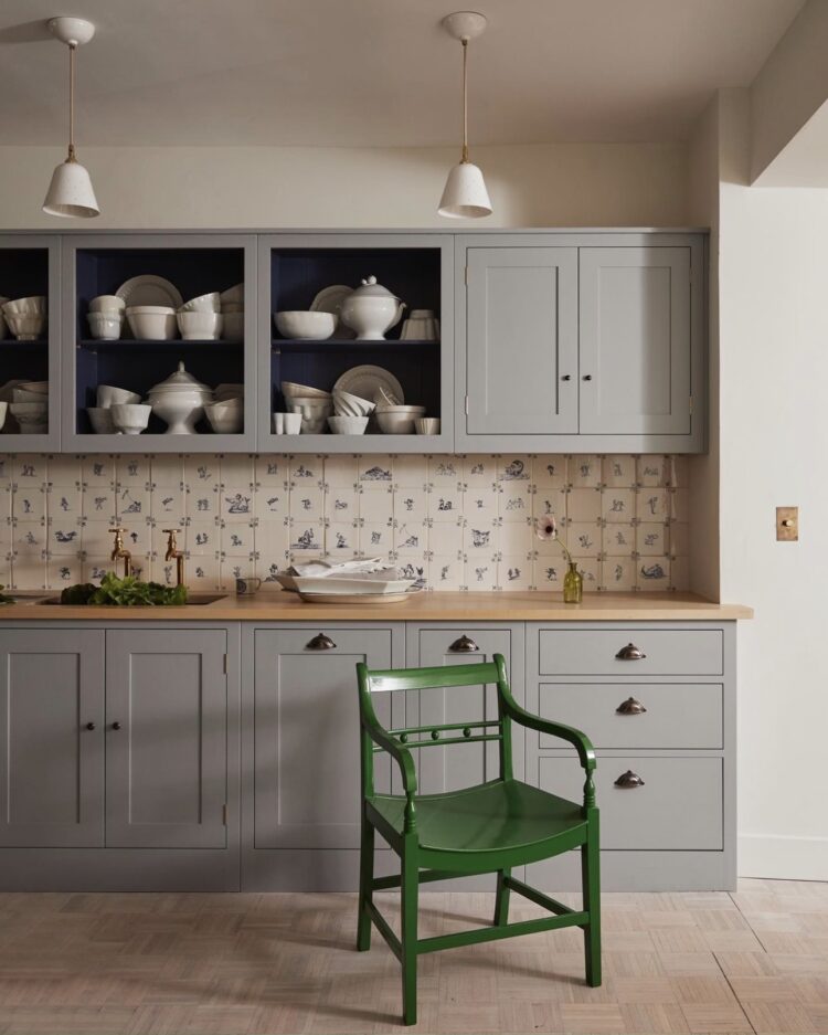
But, quickly, because I know you find it annoying to scroll up and down – that kitchen above. Yes it’s very pretty and those Delft style tiles are gorgeous but it is, let’s be honest, it’s grey. Now you’ll find no grey shaming from me here – I literally wrote a book in praise of it – but I will suggest that, these days, all grey can look a little cold and unyielding and I have removed it all from my current house during the renovation. But if you aren’t renovating it can be expensive to paint over but that’s where grey is good – it’s friends with all the other colours on the spectrum which means it’s easy to warm it up with a bit of natural wood, a warm metal and, in this case a splash of emerald green. So if you’re feeling out of sorts with your neutral greys take a look at what colours make you feel happy, relaxed, energetic (always match the colour emotion to the mood of the room it’s going in) and try introducing it to your grey.
Next up let’s forget that old adage that blue and green should never be seen because clearly that’s rubbish and, while we’re on the subject, I have absolutely no truck with those who refuse pink and red because those two are MATES, but let’s look instead not only at the colours but the storage. Bathrooms, in the UK at least, tend to be very small and almost an afterthought when it comes to house design.
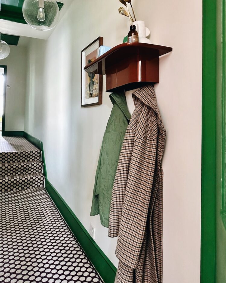
In the current house (all will be revealed in the October issue of Red magazine) space was so tight that we removed the bath in favour of a decent sized walk-in shower and, instead of a glass shower screen, added a wall so there was space for heated towel rail and some shelves on the outside.
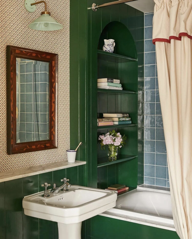
Above, the owner has cleverly added some shelves at the end of the bath. Far enough away from the shower to stay dry and much cheaper to install than the pesky tile niche which so often leaks. This has been styled for a lovely photo, although for those who do like to linger with a book it’s a great place to put them. But for everyone else imagine how much moisturiser and shampoo you can store on there. And, in a family or four, you can give each person their own shelf and save arguments. Good storage is vital but deciding who gets which bit and making it easy to use is priceless.
I love everything that Sarah Brown does – the scallops of the bath mat echoing the curves of the bath and juxtaposed with the sharp lines of the herringbone tiles, but we are here for the green and what a glorious, unexpected feast it is. It’s bold and it just arrives out of nowhere but is brought into the fold with the windows, the tiny battery powered lamp – these are brilliant for ambient bathroom lighting if you don’t have a dimmer – try Pooky for a range of really pretty ones – while the floral chair mixes both blue and green.
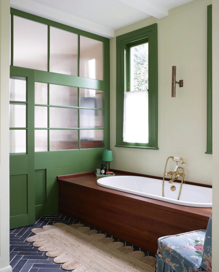
I have written about the joy of a disrupter colour before and while it’s often a small accent, it works brilliantly when used bold as well. It’s an integral part of the scheme here but rather than being used on a wall it’s on the woodwork which is what gives it its disruptive element.
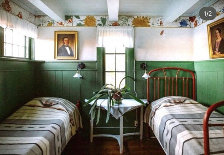
Now this is a joy. The Swedish home of Carl Larsson, a painter from the arts and crafts movement whose home has been preserved and is often regarded as the birthplace of Swedish interior design. It was largely designed by his wife Karin, and depicted by him in his paintings just to get that straight. This is also why using the generic term Scandinavian for design can lead to confusion as Danish and Swedish style is very different and Finland is Nordic not Scandinavian.
Anyway… this is less disrupter and more the decor itself but it serves as a handy reminder that if you love a strong colour but are nervous of it being too much then you can just paint the bottom half of the wall. Here there is panelling that provides a natural break. In a period house you can recreate this. In a modern house you can simply decide where to stop painting and make a line with a laser or a strip of frog tape. The clever bit here is the border round the top that links to the green below. Those borders are also back by the way. Try Susie Atkinson and Salvesen Graham.
Finally this is such a great use of colour. The carpet (Quirky B Spotty in Damson from Alternative Flooring) may be familiar to some of you as I used the same in my last house. But whereas I teamed with with plain old off white (wimborne to be exact) Natasha has brought it to life with this strong green and it looks incredible. Sometimes when you have picked one strong element the temptation is to keep the rest small so as not to interfere. Here Natasha has trodden a clever line between not going full on maxmimalist but really bringing two strong personalities together and watching them have a party. The neutral walls in the middle only enhance the the rest. It looks great and if that doesn’t convince you of the power of a disrupter then I don’t know what will.
Come back on Wednesday to learn all about my visit to the cork forests of Portugal.


thank you for the article
I don’t normally comment (just drool enviously or snort disdainfully at the images/prices!) but the lovely chair in the first pic is made right here in sunny Suffolk by obluxton.co.uk , @obluxton and is featured in our wonderful new Gainsborough’s House gallery in Sudbury, Suffolk. Different colours and even little sizes for kids. I don’t know the chap, but I’m sure he’d like a mention!
I agree that this green just sings! I noticed that each of these rooms (except the Plain English) also includes a deep burgundy/red, sometimes as an accent, though more prominent on the tub surround. I’m curious about this relationship between complementary colors—the disrupter’s friend? The green wouldn’t be so glorious without it.
Wow! This is MY colour. Good old fashioned RAL6001. It started with emerald green bar stools from Woodmancote (as recommended by you many years ago Kate). I loved the colour so much I asked the company what the exact colour was and got a tin of RAL6001.
So bit by bit I painted stuff and it’s now the red thread that runs through every room in my house – walls, lamp bases, upcycled stools and side tables, mirrors, back of my glass fronted kitchen cabinet, picture frames…. The list goes on.
About to change the lighting in our kitchen and just sourced a big vintage industrial pendant light to go over the island which is home to the bar stools which started the whole thing off.
Thanks for the fab post. I am definitely already here for emerald green!
Oh the joy of emerald. Kate you’ve got me thinking why haven’t I used it either. Just a soupçon brings energy to these beautiful rooms. I’ve worn the same emerald green beaded necklace for years – in a sea of black outfits, it lifts my spirits. So rather like an accessory, I feel it’s a woodwork colour.
Just joined Threads – no idea what’s going on but loved your description!
Interesting, thank you! These greens give me feelings of schools and council offices in the 70’s and 80’s . I can practically smell the dust and hear the rotary floor polisher on the floor tiles…. but I love having the design ‘explained’ and I could always change it for another colour, couldn’t I?
My thought was schools and council buildings too! Interesting though