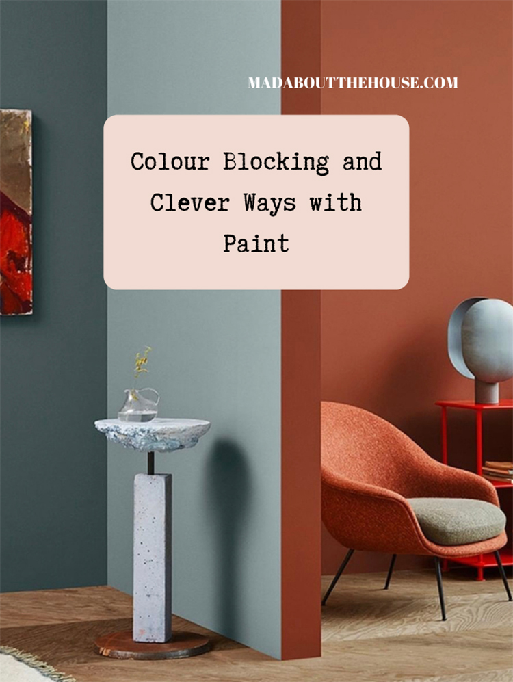
From Friday neutrals to Monday’s (muted) brights and I hope you like these rooms that I have found to show you today. While I may not enjoy the zingy brights of a clean colour palette I’m all over lots of intense but muted colours; you know the ones that have a dollops of grey in or that look a bit muddy and slightly more subtle. So ochre not primrose, dusky not magenta pink, forest not neon green. Have a look at these.
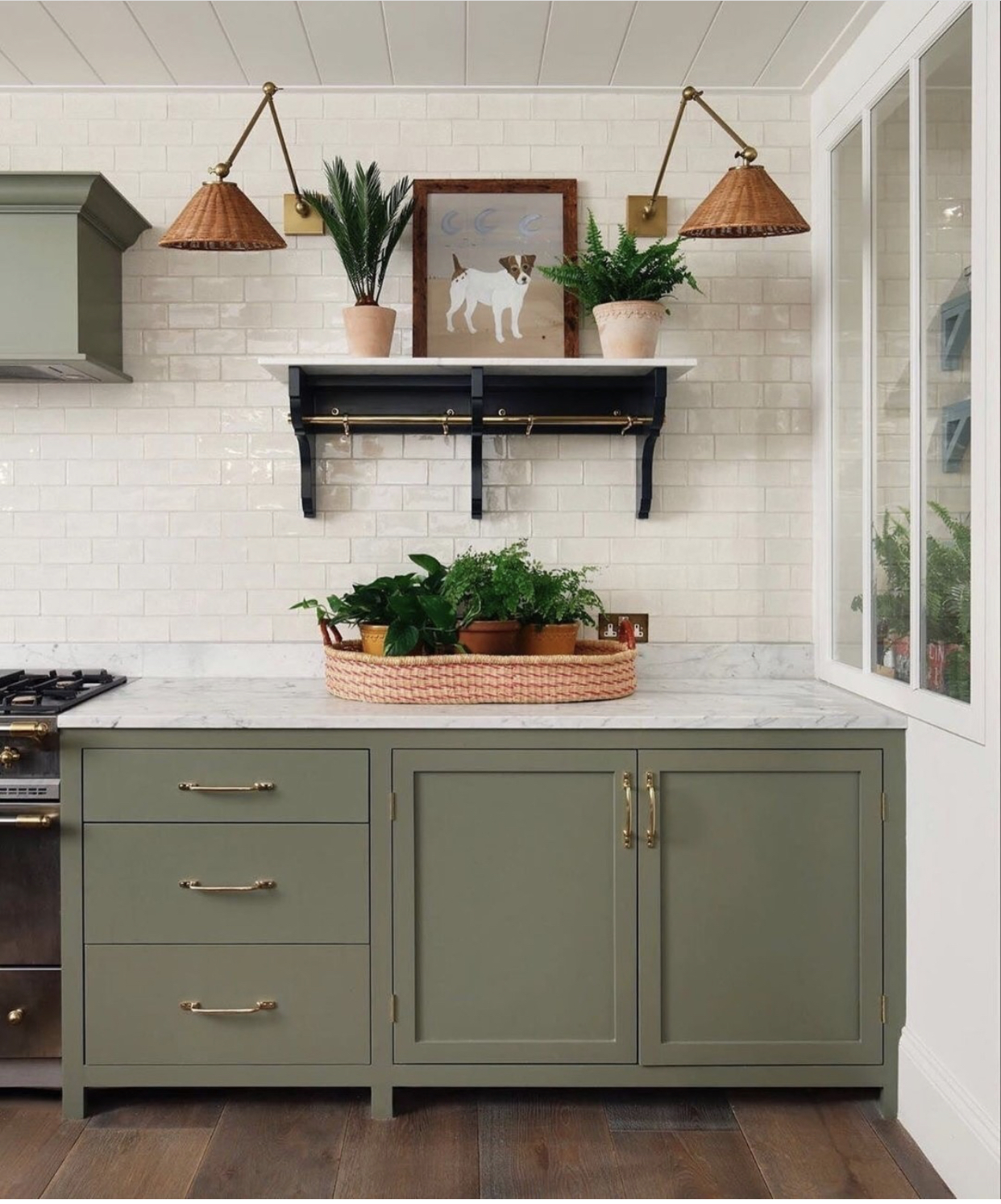
Now actually I have slightly lied as this first image isn’t particularly about colour blocking but although that Farrow & Ball Treron is a great colour if you like green, it’s not too yellow (that would make it more olive) and it’s not bright. It feels to me like a colour you could live with for a long time and if you wanted to add more colour blocking (she says, wrenching it back to a self-imposed topic) you could paint the walls in pale pink or a pale toning green.
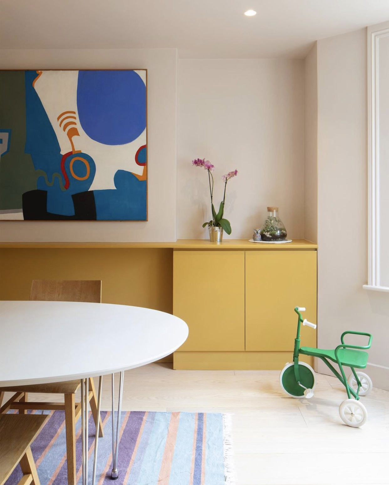
However, what I want you to notice is the lack of kickboards. Allowing the cabinet legs to show a) increases the amount of visible floor so makes the room look bigger but also, crucially lightens the whole space and stops if feeling like monolithic slabs have landed in the room and are dominating the space. If it’s too late to change this – because, for example you don’t have right flooring under your cupboards (that’d be me) you could replace the existing kickboards with some antique mirror to reflect the existing floor back out and make the cupboards look as if they were floating.
If I could make one change to my kitchen it would be this – that the island were on legs, however small, to bring an element of lightness to the space.

Staying with green, this time Calke, and this is a really good example of something else I often talk about which is adding colour to the woodwork if you want to keep the walls pale. Don’t worry about having to do all the woodwork either. You can see here that the skirting boards match the walls while the doors are a different colour. And, of course, if you wanted to tie the skirtings in with the doors there is nothing to stop you.
This is also, if you remember the post on how to get a feature wall right, a great way to tie it in with the rest of the room – by picking out one colour from a feature wallpaper, or buying more of the feature paint, and bringing it round the room on the woodwork to include the feature wall in the party. Otherwise it risks looking like the person who wore a ballgown to a barbecue.
Before we leave these two images, I want to add a huge thank you to Farrow & Ball for taking the Design For Diversity pledge and you can read about what they are doing at the link. I will be doing a round up on this soon as lots of companies have been working on project behind the scenes and indeed Rukmini and I are working on a couple of projects too so while it may be quiet on the news front it’s busy behind the scenes. If you’re new to this you can read about the pledge here.
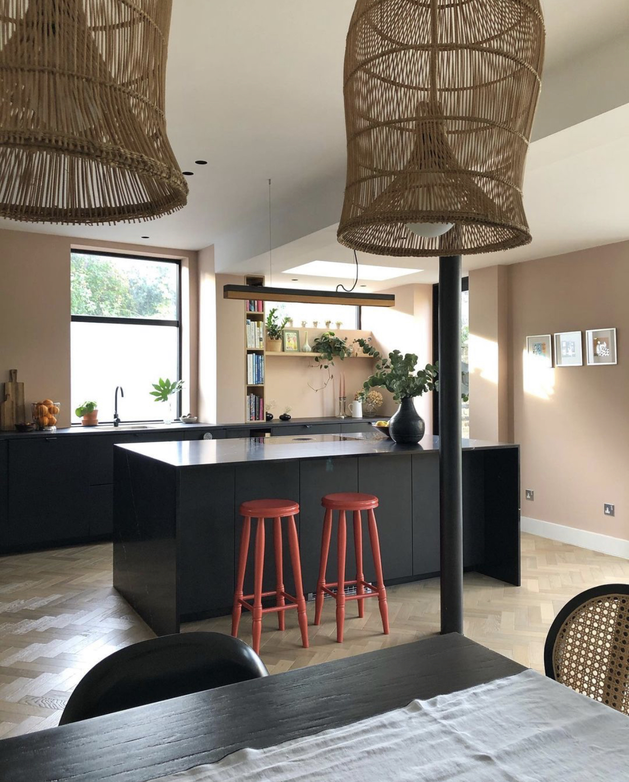
Next up and a little disrupter colour for this kitchen (point 3 of 15 Interior Design Rules to Live By) Now as this is a bolder version of the walls, it’s perhaps not a classic disrupter – that would be cobalt blue or bright green, but it reinforces the colour scheme by adding something that is tonally cohesive but several shades darker than the soft pink walls. You can also do this in reverse if you have dark walls. And it doesn’t have to be a lot – these two stools are perfect. Or you could have painted the stools to match the unit (and possibly tripped over them every time you walked past) and painted the supporting pillar in a disrupter shade.
Supporting pillars are an occupational hazard when you are taking down walls to open up rooms but another interior design rule to live by (make that 16) is that if you can’t hide it and you don’t like it then make a feature of it. Own it, paint it bold and don’t pretend it isn’t there because it won’t disappear. If it’s a radiator paint it to match a wall and it will fade into the background but a dirty great pillar in the room is never going to vanish. That said, in open plan spaces, it’s a great way to zone a room. Paint the wall of the area you are zoning and the pillar the same colour and you will have created a separate zone ( you can just see this in the navy dining room pictures in this flat I consulted on.
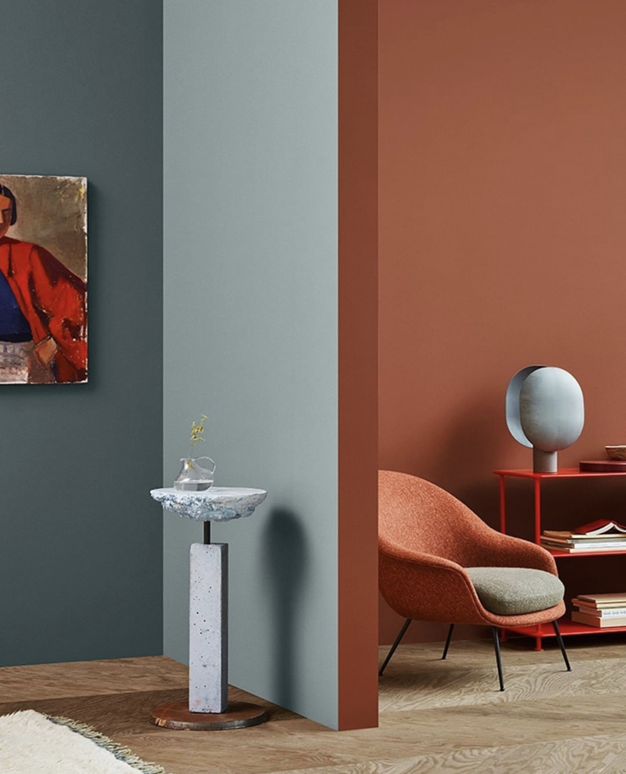
This does take colour blocking to extremes with the orange and blue and blue and orange and while it (probably) isn’t something you would recreate in your own home it gives you an idea of how to play with paint or run two colours together. If you wanted to create something less extreme you could do it with toning rather than contrasting colours – look at the two shades of blue for example. And, if there were skirting boards you could run the darker shade round to the lighter room to link the two with one one colour.
Another option which I have suggested to clients in the past if you have a knock through, or two linking rooms, is to do the ceiling one colour in one and the walls to match in the other. Or the ceiling in one and the woodwork to match if you wanted to keep the walls pale. So, for example, to take the green doors from above, you could either match it to the kitchen cupboards (imagining that the top kitchen was the other half of the same room) or add that green to the ceiling of the other half of the room.
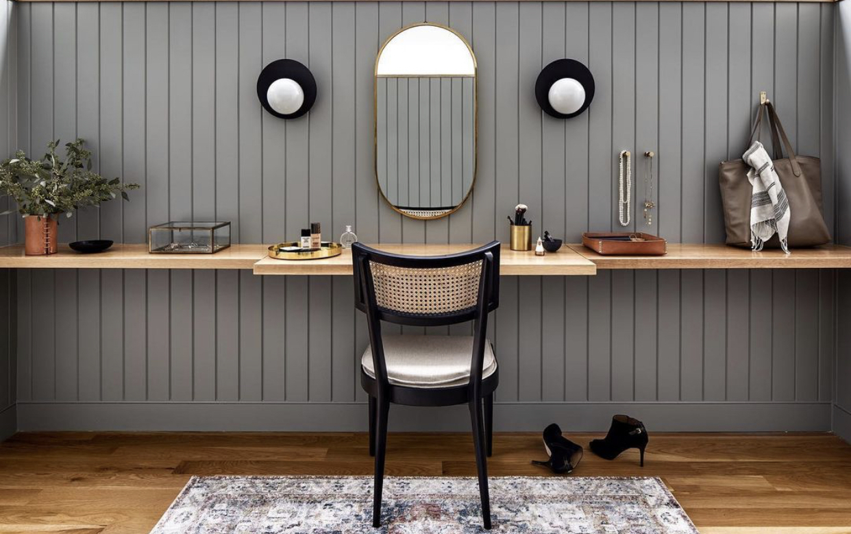
Above, in passing, a really good example of a multi-tasking table. This one is billed as a dressing table but you can see how it could work as a desk as well. If you have more space and you don’t want to stare at yourself in a mirror you could have make up at one end and tech at the other. Or, if you have a room with two alcoves you could split the activity that way. That is the plan for the 17yo’s room which is due to happen next year – school work on one desk and 3D printers and woodwork/jewellery workshop on the other.
And we finish with the latest work of the colour genius Emilie Fournet. I have featured her work before and the term Queen of Colour is one that gets bandied around (in a slightly meaningless fashion) a lot on instagram but Emilie really does know what she is talking about and is really clever at putting schemes together.
This was inspired by the artwork but instead of matching, the simple option which I suspect many of us might have done with a cushion here and a rug there, she has taken the colours and played with them to create something that works harmoniously but is slightly unexpected and doesn’t come out as too matching and coordinated. As well as a full interior design service Emilie also offers colour consultation from paint to accessories (perfect for rented homes where you aren’t allowed to paint but still want to make the place your own).
I hope, as ever, that has given you all some ideas and inspiration for your own places and spaces.


You mention your wish for your kitchen island, Kate. To make my kitchen island less of a “block” plonked on the floor, I had some acrylic mirror pieces cut to size and I stuck them on with foam pads. They change the light in a huge (but subtle) way and really lift the island.
My kitchen is basically Ikea but I had customised the framing between the cabinets (or pairs of cabinets) to make an unfitted-looking kitchen. So there are “legs” in front of kickboards and the mirrors sit between the legs, reflecting the floor.
I can’t remember who I had the acrylic mirror supplied by, but it was all online (8 years ago or so) and all I had to do was measure the spaces accurately. It was very, very inexpensive, so I took the risk and was thrilled with the result. The cat was very confused … as there was suddenly another cat, under the cabinets, in his kitchen !
Yes that’s a very good idea. I might try it x
Good Morning Kate,
All excellent photos showcasing creative thought with purposeful function. The gubi photo reminds me of a favourite colour from my Laurentian Canada 8 coloured pencil school pack days. It was Sarasota Orange. Speaking the name alone conjured a scene of sun kissed desert and ancient stone. I even painted a bedroom, all four walls, in a colour close to this orange. If I were to use it now, it would be as you have done with colour blocking. Think the chosen colour palette in the photo is perfect for a contemporary, minimalist setting. Also love the colour and design work of Emilie Fournet.
I absolutely love the last image with the yellow and pink – do you know what the paint colours are please? Makes me smile just looking at it!
Thank you so much for using my kitchen photo! It really was a lovely surprise this morning.
Frauke xx
Like the person who wore a ball gown to a barbecue- your posts are really entertaining not just what you describe but how you do it! Thank you they are such a pleasure to read.
Maybe it’s lockdown delirium kicking in but I’m starting to see faces in furniture. The placing of the mirror, lights and chair back in the dressing table image made me think of a nice smiley face. As long as it doesn’t start talking to you….
Love your blog, which I only recently discovered. Do you know the source of that very striking orange chair?
I think it will be Gubi as it’s publicity shot from them.
…duh! Thanks! 🙂