Two for you this week as I couldn’t decide which one to include so thought we could go town and country. Also, while both are very different the colour palettes are similar – basically they look like someone lay down in the middle of the Farrow & Ball factory and rolled around for a while. Which is my kind of colour scheme really. In other words, the colours, while strong, are also muted with lots of grey in them to make them softer. They look a bit like they have been washed out by the rain, which is perfect for the UK climate. The stronger, harder, light of the southern hemisphere works well with cleaner and brighter colours but this palette tends to be restful on the eye as it echoes the colours we see through the windows.
Anyway, we’re off to Taunton, in Somerset, first. To this restored Georgian rectory which is on the market with Savills for £1,350,000. It has all the mod cons including a tennis court and swimming pool, secondary cottage, six bedrooms, seven reception rooms and is located in over four acres on the edge of the Exmoor National Park.
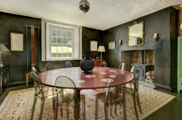
First up this dining room. Now if you look closely you can see that it’s a mix of red, black and – from earlier in the week – an almost neo-mint cupboard just in the corner. On paper this many colours together shouldn’t work but it does because of the aforementioned washed out palette. Also the rug works brilliantly to tie to black, red and off white ceiling together while the cupboard provides a hint of that valuable disrupter colour I have talked about before. The decision to add smoked ghost chairs was also clever as plain clear might have been too modern and jarred but the smoky effect means they don’t dominate the space and stay within the muted palette.
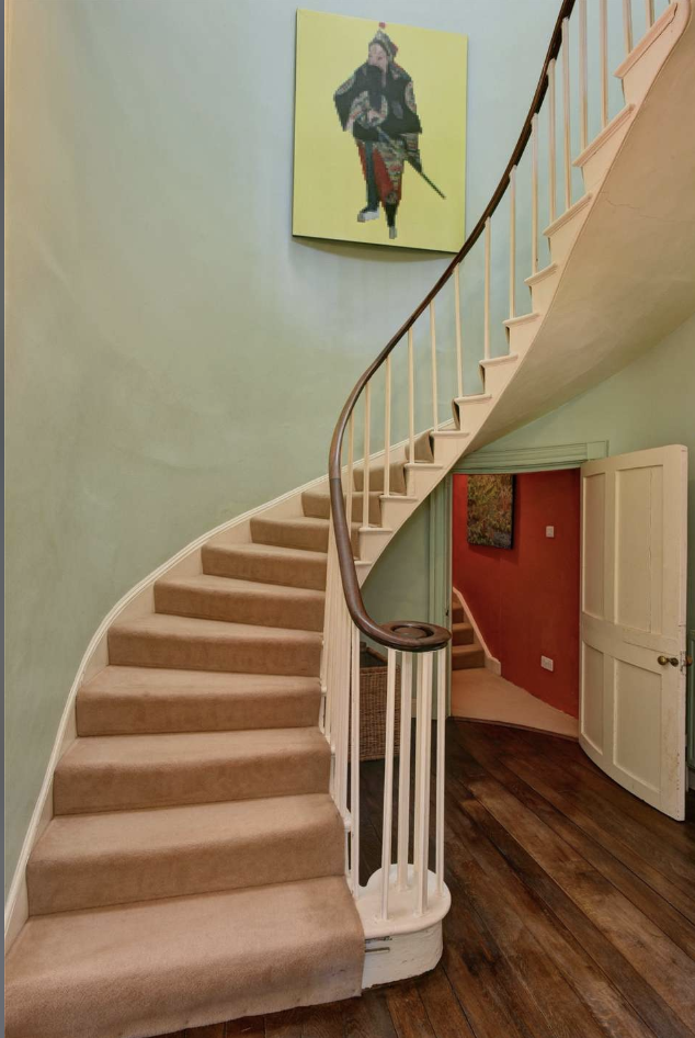
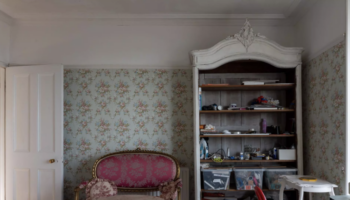
I have included this staircase image to highlight all the colours used here as well. Admittedly it’s an unusual layout with a second staircase behind the first – something to do with servants I imagine, but the red wall that is a more intense version of the pale pink stair carpet works really well to highlight the colours. You could do these with a wall behind your own staircase or even paint the area under the stairs in a strong colour to create a similar effect. The walls appear to be a soft green, which works well with both shades and the yellow picture provides the disruption although if you want to get in deep you will notice that his red trousers also echo the red room behind.
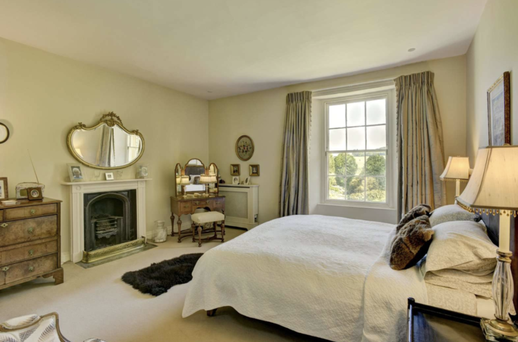
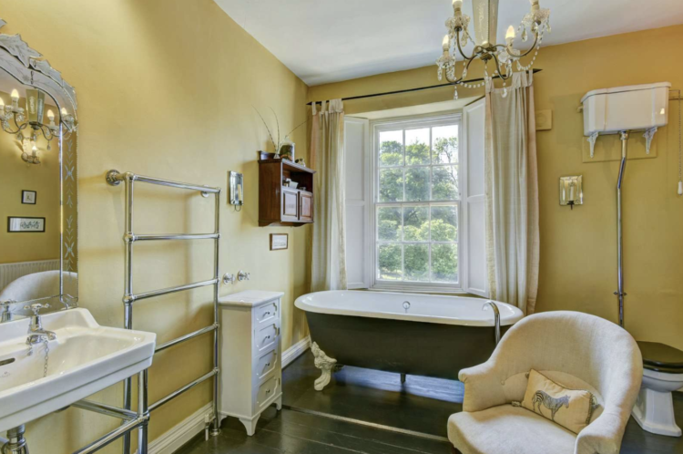
The bedroom and bathroom are both soft shades of cream and yellow and are built-up layers of neutral shades with nothing disruptive in either scheme. This might be perfect for creating a restful bedroom but also gives you the option to add a bedspread or lampshade in a another strong colour – maybe a really strong, dark green or a burnt orange. Not so much a contrast as adding in a single element of the existing colours but turned up to maximum saturation.
Also an armchair in the bathroom. What decadence is this? Are we yay or nay?
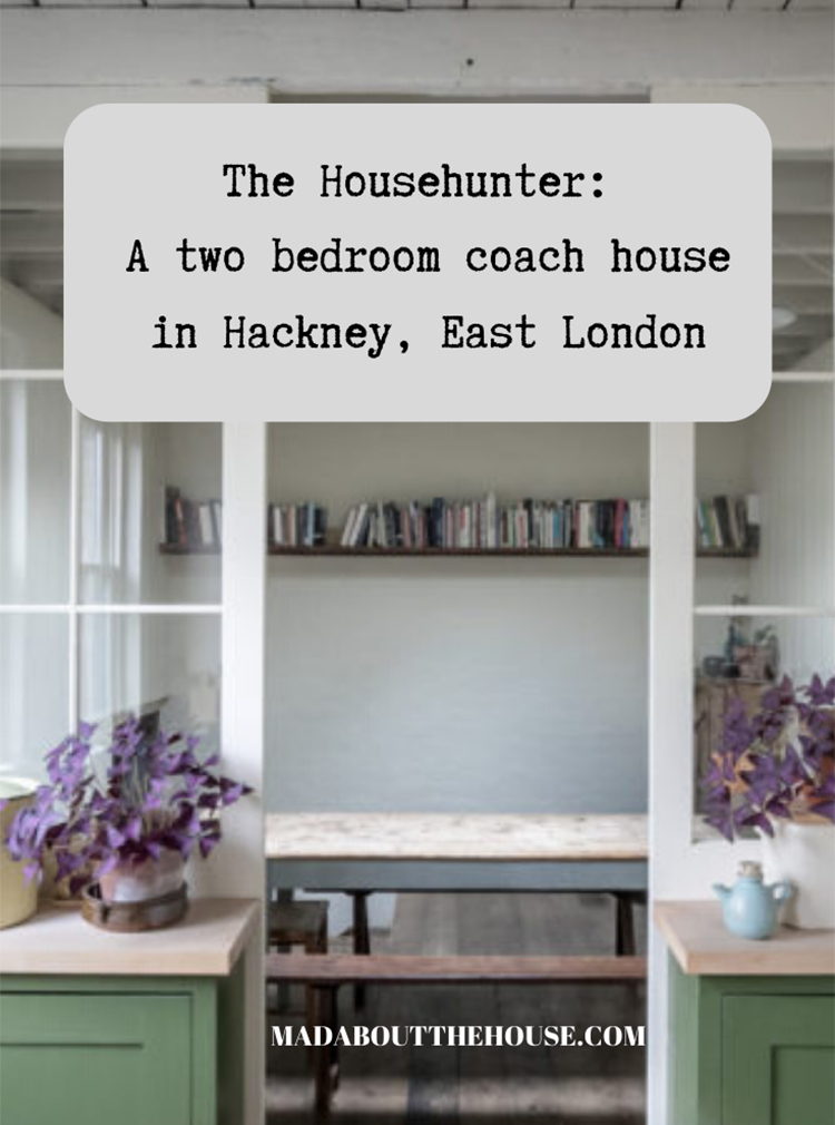
And back to the city to have a look at this two bedroom coach house in Hackney, east London, which is for sale via The Modern House for £750,000. Downstairs there is a kitchen/diner and a reception room, as well as a downstairs loo, while on the lower ground floor there are the two bedrooms and a bathroom, although the freestanding bath is not included in the sale.
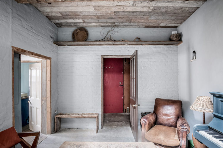
Here the owners have kept the raw materials visible – brick, wooden cladding and beams – and used a variety of soft chalky paints to add colour. Again you can see how there are lots of shades put together from yellow and green to red and blue which sounds like it ought to be fairly intense but, because of the paint, is actually soft and restful. At least I find it so.
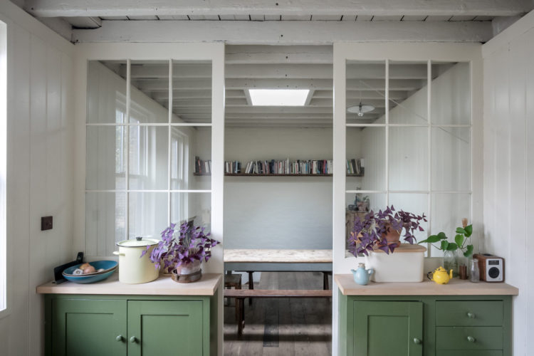
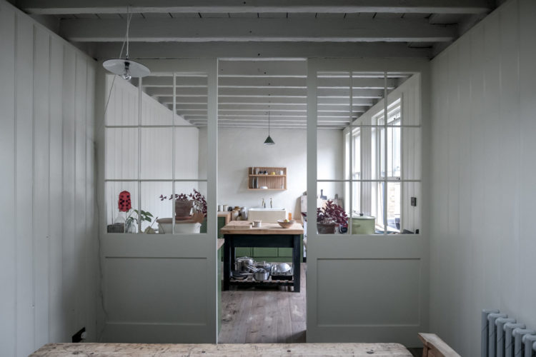
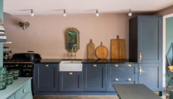
More green in the kitchen although this is more of a sage than a mint. If I ever have a house with a long thin kitchen diner I will definitely divide it up like this. It means you can add more storage, always vital, and just creates a little bit of a break between the two spaces. It’s a perfect example of the new move towards broken plan rather than open plan. Glass walls allow the flow of light between the two spaces but you can have dinner without staring at a pile of washing up and half empty serving dishes.
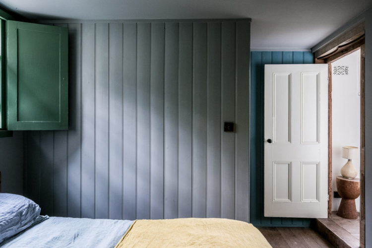
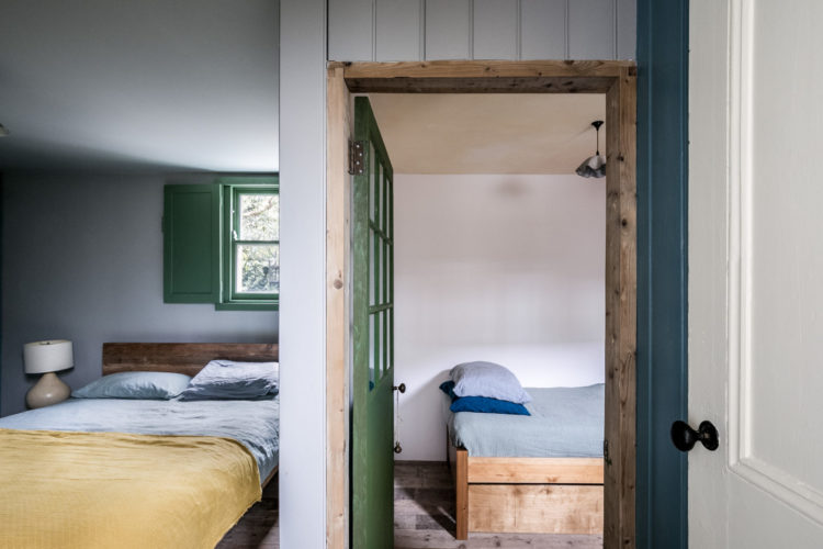
Now if you asked me to live in a room that was green, yellow, blue and grey I would refuse but this seems to work. There is a fashion for panelling at the moment and while I love it, it doesn’t always work. Faux Georgian and Victorian panels only work in houses of the right period, and ones with larger, grander rooms. If your home isn’t like that then considering simple tongue and groove like this. It’s cheaper, easier to fit and more in keeping with smaller rooms. It’s also excellent for sound proofing, which, if you live in a terrace house, is always a good idea.
Here’s the same room from outside on the landing. Remember on Monday I showed you a kitchen where the RSJ and the radiator had been painted in the same shade of neo-mint? Well, this is a similar idea. Instead of painting the door and the window white and the wall in a colour, the scheme has been reversed to make a feature of the pretty little window with its wooden shutter and the glass panelled door. Keeping the walls white means they stand out and become decorative as well as practical.
If you do nothing else when you decorate always ask yourself why you are painting something a particular colour or shade. Is it white because it has always been white? White because, well, everyone does it white? Would a colour work better? It doesn’t have to be a bright one and, indeed, it doesn’t have to be a colour at all if that is what you decide but I just encourage you to ask yourself the question.
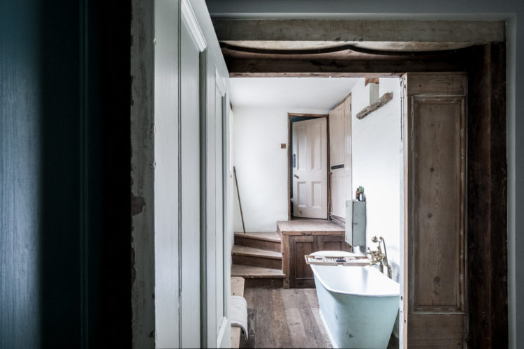
Below, before we go, is the bath that isn’t for sale. It’s a proper vintage old tub but it looks narrow. These days I might be in favour of something slightly wider…
So, town or country? Period elegance or modern rustic? Who’s moving where this Fantasy Friday?
Interesting that so many people seem to dislike the second one; i think they’re both gorgeous, in different ways.
Love the broken plan treatment in the Hackney House Kitchen but God it’s all so cold n miserable looking!!! Yes to the chair in the bathroom of the Taunton house tho!
To me the Hackney house is a dream. I love a place that looks like a “starving artist” has fixed it up, although at that price I guess they aren’t too hungry.
Yes, I feel the same way. The second place sort of looks damp and cold. And I can’t get past how much I dislike the dining room in the first home. Think it’s the colours and the chair with the very high back. There’s something about furniture with off proportions that I find quite disturbing!
The Hackney house has appeared quite a bit in Features and Blogs this year. Clearly owned by a creative couple. I guess they have made the best of the day light in an awkwardly placed property. To me it simply looks a “damp” place if you left it for any time. Copy what they have done but save your deposit money for something else.
Really good read, thanks for sharing Kate 🙂
We’ve noticed that lot’s of people are starting to take a real interest in more traditional Interior Design.
The Georgian rectory in Somerset is amazing but apparently it’s now under offer – dammit!
Oh my goodness that coach house looks so cold! And drab… think the colour scheme needs more warmth, it looks like the life has drained out of it. Maybe the odd rug too…