And welcome February – let’s hope by the end of this (short) month that things are looking up. Vaccination is proceeding and numbers are dropping and, what’s more, by the time the 28th rolls round those who have had their jabs should be on the way to being immune. So there are reasons to be cheerful. Which is why I was perplexed when I looked at the photos I had saved on Instagram this week.
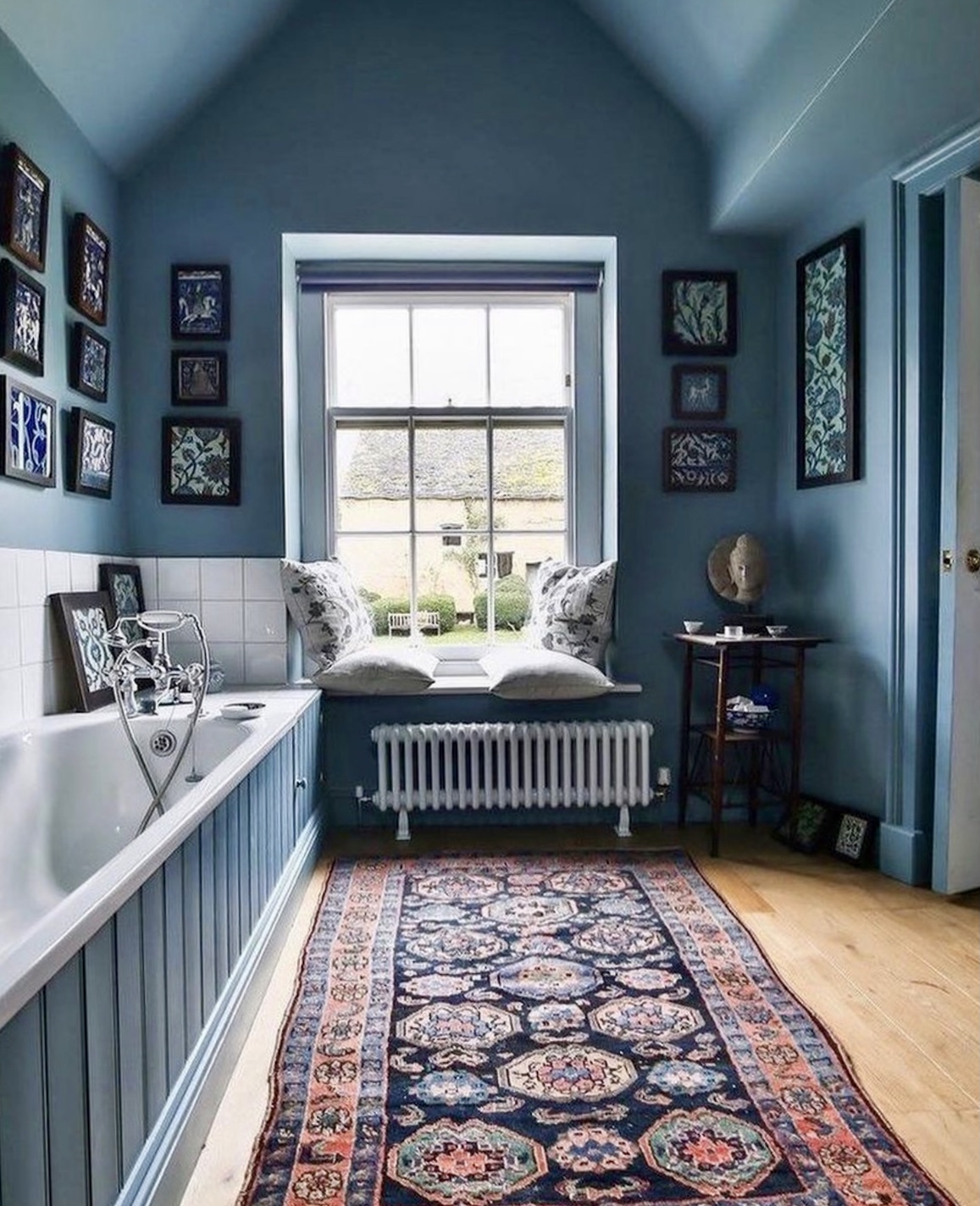
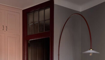
Now I don’t really do blue as some of you may have noticed. Green yes, pink and all variants thereof yes. Coming round to yellow. But blue? The only blue in this house is in the loft and that was because having found the perfect sofa bed – in Italy – and paying to ship it over and it only coming in grey or navy the colour for the loft was dictated. So the bathroom up there is painted in Hague Blue gloss with blue and bone tiles. And I do love it. But that is a separate space and it’s completely different from the rest of the house. It’s as if the red thread stopped at the bottom of the stairs on the way up. So you can imagine my perplexion (is that a word? It is now) when I realised that the last five images I saved on Instagram had a definite blue tint to them.
And I’m liking it. What about you? Of course we always worry that blue will be cold and yes it can be, but there are many ways to prevent that not least picking the right shade in the first place. We will be discussing the importance of knowing which way your rooms face and the effect that can have on the colours you pick on the next episode of the podcast (out on 11 February so do subscribe if you want to catch that).
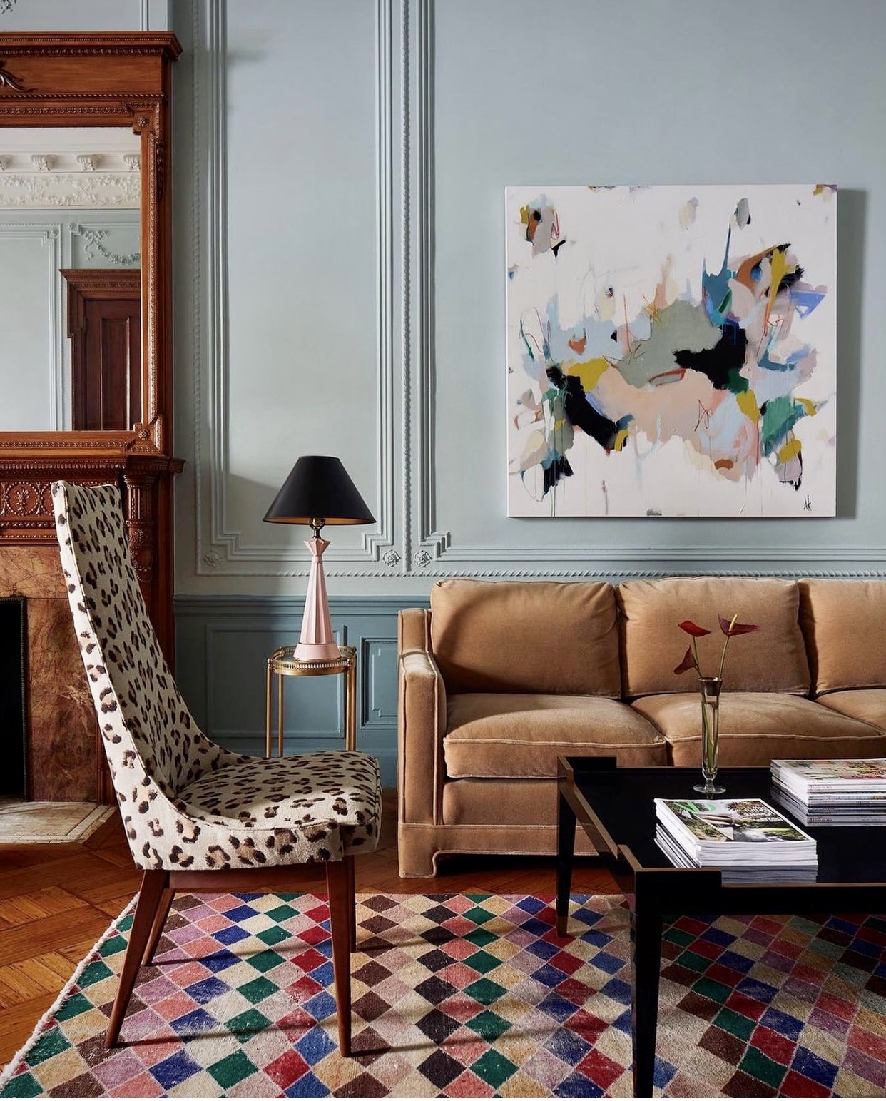
Certainly these blues are all of a similar chalky sort of shade with a dollop of grey thrown in so they aren’t too bright but you can see from the images how this particular version mixes well with a variety of other colours and how it particularly loves a bit of vintage wood.
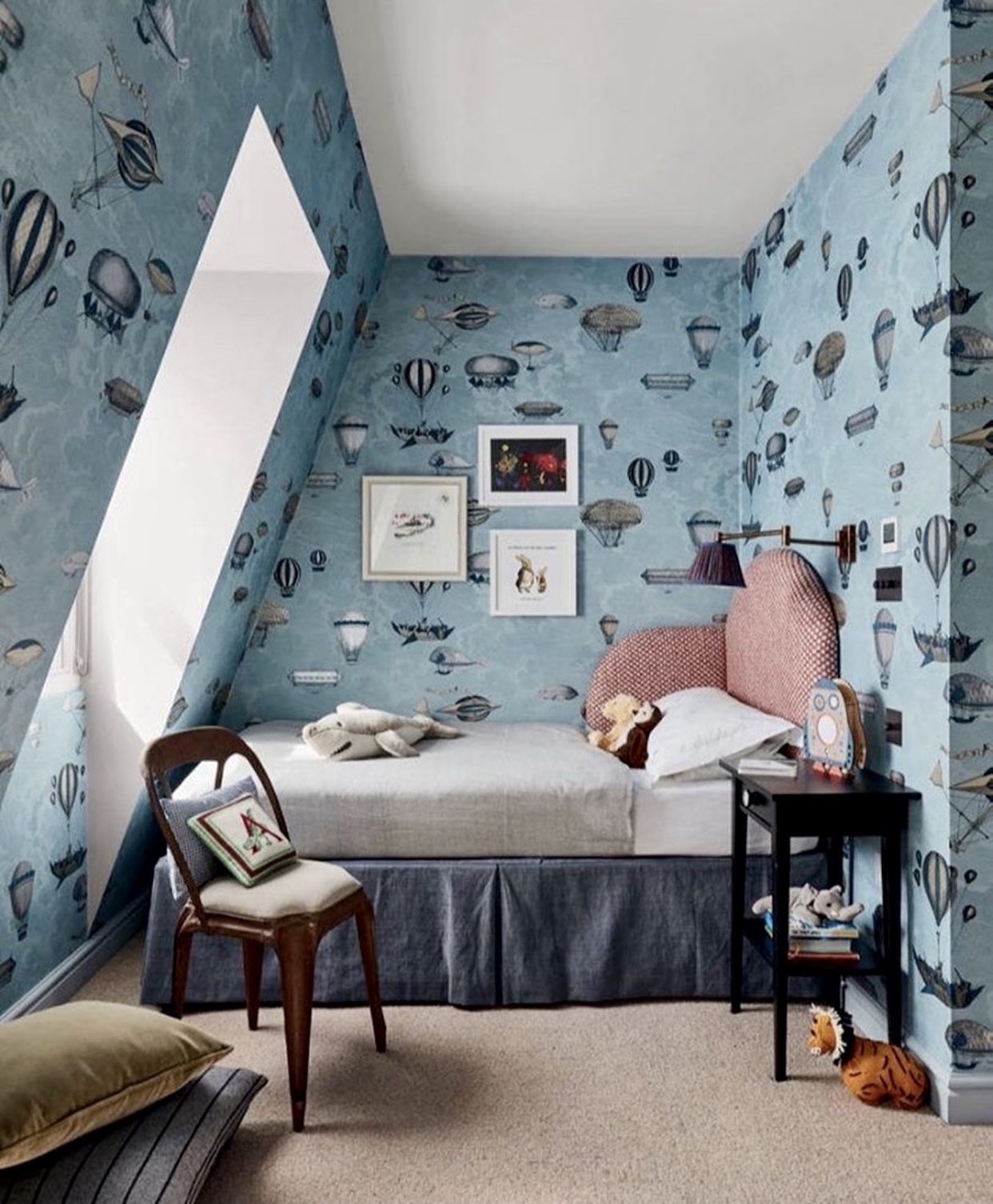
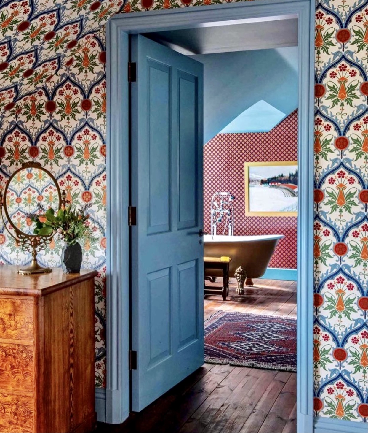
In the image above the fish wallpaper wraps the room and if you have a corner bed then just look at that headboard for a good idea as a cosy reading corner at night. Below the paper is vibrant and full of different colours and the palest blue has been chosen for the woodwork and to link to the bathroom next door. This would have worked with the darker blue and also the oranges and red. In fact, the cream would been the least striking, most traditional option.
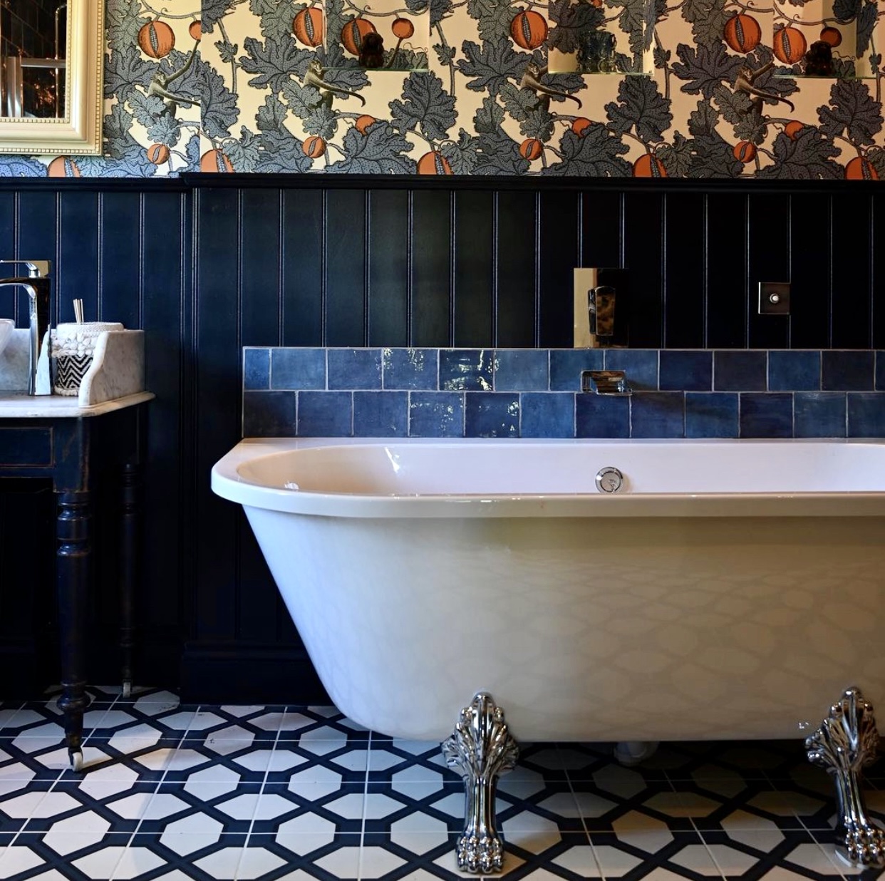
Finally, to the classic navy in this bathoom by SoJoJo Designs and there’s a bit of tongue and groove panelling (who saw last week’s post) some fabulous wallpaper (Fornasetti Frutto Proibito by Cole & Son) and, in a belt and braces approach to splashing some tiles too. And if you look at the marble-topped basin stand you can see that has been painted to match as well.
All of these rooms are warm and cosy and while they might be in various shades of blue they’re not giving me the blues. What about you? Am I late to the blues party?
Hi Kate
Do you happen to know what the wallpaper is in the Fife Arms example above? I love it!
I am in love with blue, as you might have guessed from my insta account handle @somethingbluehome! My preference is for deeper, inkier shades of blue BUT I’ll take most blues. I tend to stick to the same hues in my home and restrict the colour palette which I find creates harmony and gives a sense of restfulness. In terms of colour psychology, blue does signify peace, loyalty, safety, reminiscent of nature, sea and sky! My favourites are Hicks Blue, Basalt, Royal Navy. ( Little Greene) Hague Blue, Oval Room Blue , Farrow & Ball, Saxe Blue by Craig & Rose. Plimsoll by Paint & Paper. I could go on, but I won’t. I’m a fan!! xxx
I have a Juniper Ash living room (thanks, Erica Davies….) which I adore, and my son’s room is pale blue and oatmeal (a very safe combination that wasn’t going to offend him), but that’s about it. It was also the colour of my childhood bedroom in the 1970s house I grew up in.
I’m not a fan of muddy/sludgy colours, and it’s hard to make blue muddy.
Perplxity?
Possibly!
* ‘… having found the perfect sofa bed…’ ??
Would you mind telling me which this is, Kate, please? (And also why it’s perfect?!)
Thanks, Kate! X
Oh it’s, of course, discontinued! And the fabric wasn’t great so we will have to have it reupholstered but basically it’s a piece that separates to make two singles or an L-shaped sofa – you can read the post here.
Sigh – thanks anyway, Kate – the search continues for the comfy sofa AND bed combination! x
Ooooh we have a fab one!!! The Oswald sofa bed from Heals. Pricey I admit but the sofa is comfortable and I’m reliably informed the bed is seriously comfortable too. And it folds out into a proper king size bed but folds out the “wrong way” (i.e. your head is where the arm rests are if that makes sense) but that means it doesn’t take up so much space either when folded out. Definitely worth a look!
You might want to check out the living room of my son & his husband:
https://www.apartmenttherapy.com/monochromatic-brooklyn-apartment-home-tour-photos-36871572
I love blue – it’s my red thread for sure, and there are very few shades of it that I don’t like. In fact, I love blue so much that, at one point, my husband had to actively discourage me from adding any more of it to my wardrobe in favour of exploring other parts of the colour wheel – ha! Your comment to Wendy above re. the balloons vs fish wallpaper is hilarious!!!
To be honest I can’t get enough blue! I LOVE it!!!
I love all of the blues in the photos. The blue hues at the end of January inspire connectivity with Nature, being at the seashore, or just looking up at the clear, blue sky overhead. There is a strong sense of personal freedom in these images; floating gently upwards in the hot air balloons. Great choice!
I suspected that blue is the best loved color in the world and the Internet agrees. Yellow is the least favorite. You need to take many things into consideration when choosing wall color and I do think geographical location has a lot to do with it because the kind of light you have makes a lot of difference. I am thinking of the vivid blue you see on doorways in North African and Mediterranean countries which look fantastic there but would look garish in some other places.
I’m normally Team Green, and sat out the navy walls and kitchen trend, but am also finding myself drawn to pale,chalky grey-blues. I have painted my kitchen ceiling Light Blue eggshell, but I’ve still got a bit of an itch.
No, blue makes me blue. Yikes, I really said that! Though find me a warm blue and I may change my mind. Same with grey.
Cheers from Canada!
I have a duck egg blue in my lounge, paired with natural wood, white, greys and rose.
Debating whether to paint my south facing bedroom Oval Room Room but dithering whether to go this shade or go very light and natural…. Decisions……
I cant bear to look at blue for some reason, the colour really doesnt work for me!
I’ve been a green person for a long time but recently I’ve been getting pulled by blue, such as in this room where the blue chair against the smoky green walls is obsessing me! https://www.pinterest.co.uk/pin/506443920603541784/. Susan Deliss has a gorgeous sky blue sitting room too. I am looking for a clean wedgwood-y blue for my husband’s study against Railings shutters and woodwork and greenish upholstery so the blue is definitely percolating in my brain and starting to come out…Actually, my husband and kids tell me that Railings (which we painted our victorian staircase in) IS blue but I refuse to believe that! The lighter blue in the first image might be great for the study – any idea of what it is?
I love blue, especially greeny blues! Our lounge is painted in F&B oval room blue and I love it.
But the fish wallpaper you mentioned…. Am I going mad or is it actually hot air balloons?
We had a freezing cold north facing bedroom painted duck egg blue when we moved into our house. It always made me shiver. Totally the wrong colour for such a cold room. It’s finally been repainted in a warm (yellow based) cream – F&B New White (same colour Sophie Robertson has used on the tongue and groove in her new bathroom). It’s still a cold room, but it doesn’t feel chilly like it used to.
In a previous flat we used F&B light blue (which is very grey) in a warm south facing bedroom, and it was beautiful.
Right paint for the right room!
I am a blue person so I have it everywhere
Some blues glow like in some of the pictures above so can become quite overwhelming. Others are cooling and calming (usually with the grey rather than yellow tints). I have it with pinks and reds. Still trying to fathom why I am basically blue but have a visceral reaction to anything green or brown (other than in the natural world)!
I love blue! I’m from Sydney, Australia and over here we have a bit of an obsession with blues, greys, greens and whites because a lot of us live near the coast. It’s interesting to see that in cooler climates like the UK, that blue and grey are not often the first choice and warmer colours are favoured. Colour has such a big influence on how we feel. I personally don’t want to look at warm colours while roasting in the heat! 😂
No blue here as yet…I am havering about painting the staircase and a couple of cupboards Little Greene’s Basalt, but although I do like it (and I think it will end up on our front door) I think Mylands Sinner will be the stronger look and will have longevity. Oh – a south-facing bedroom has a fireplace with deep sky-blue tiles. Perhaps I could do something in there. Hmmm….I like the blue pannelling in the first picture and the pairing of blue with vivid wallpaper. I have a lot of panelling in a north facing dining room, but don’t think blue would work there.
Love all of these – not too much blue here – except one duck egg blue bedroom and pale blue dressing room – but can always do more – –
I generally don’t like blue but these images are attractive. That wallpaper looks like hot air balloons rather than fish. I noticed because I really don’t like fish on wallpaper.
You’re absolutely right – it is balloons – in the absence of having suffered a blow to the head we can only assume that I was thinking about my supper at the time of typing!
Blue is very popular in online interiors chats. It also often has the largest range on colour paint charts. In colour psychology terms, blue probably does drop the heart rate; also reminiscent of family coastal roots. Instinct since moving has however led to the use of pink, pink and more pink