I’ve said for a long time that the Georgian vicars got all the best houses and now, it turns out, the Georgian doctors did pretty well too. This terrace, near Berwick-upon-Tweed, Northumberland, is believed to have been his (and it would have been a he) home with the surgery next door. Now it’s Grade II listed with three generous bedrooms and views of the sunset over the 12th century church.
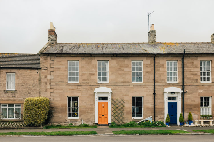
This double fronted cottage is on with Inigo for £375,000 and is just under 1,500 square foot, for those who like to operate in terms of size rather than rooms. But it’s not just a classic three bedroom house, as an extension has added a garden room and downstairs loo, while there are two bathrooms upstairs so if you lived here with family there would be different places for everyone to be at different times of the day which can be, as we all know, the key to harmonious living.
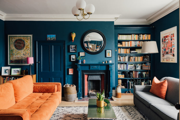
So come on in and note the colour of the front door and see how it’s picked up on the sofa in the sitting room. A couple of weeks ago I showed you a dark blue sitting room with a matching sofa and we saw how that sofa receded into the walls and made the room look bigger. That was a narrow room but this is wider (not quite a square) and the sofa sits away from the wall. See how the orange sofa immediately draws the eye to the cushion on the sofa in front, the books on the shelves (which stand out against the blue shelves – it is the books that are the feature here not their storage) and the colours in the picture on the wall. That door, which leads to a cupboard, has also been painted the same colour as the wall so allow it to blend in as much as possible. Again a door is not a feature so disguise it and allow your possessions and collections to stand out.
On the other side of the hall we come to the kitchen and you will see the same colour scheme – dark blue cupboards and an orange oven. But the palette isn’t restricted to two colours. The blue becomes green on the lampshade and kettle, the walls are painted in yellow although this does bring up the question of why does tradition say the woodwork should always be white. That’s a lot of white wall there and a yellow stripe across the top. You could have done the panelling in yellow and left the window, or just the window in yellow if it was all a bit too much.
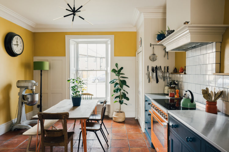
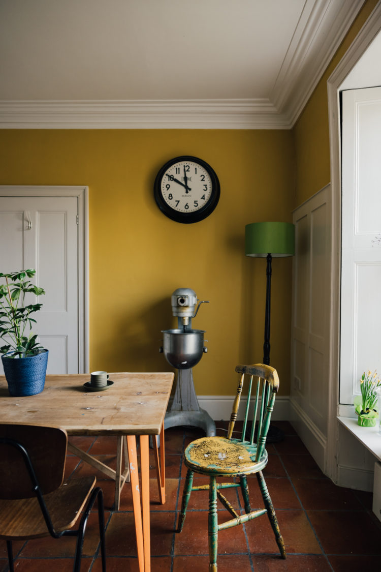
From this view the yellow makes more sense and if anyone is wondering about yellow Sophie and I had a long chat about it being the new pink on the podcast yesterday. Before we leave this room though look at the table legs – also orange. This red thread is strong but also done with a light touch – a front door, a sofa, an oven and a table leg – these are not obvious things – it’s not about walls and curtains and that makes it all the more interesting so when gathering your own red thread pay attention to the different objects and materials that are used and vary them as much as you can.
I’m stopping by the front door because there’s a little porch so you come in the orange external door and reach this blue one – it’s an announcement of what’s to come but I also love the colour composition of that door against that pinky/creamy wall. It’s just lovely and, again, we often default to either painting doors white or stripping them back to the wood if they are good enough and yet it’s an opportunity to bring in some colour and link it to the rest of the house. And, when it’s an internal door it’s easy enough to change the colour as the mood takes you.
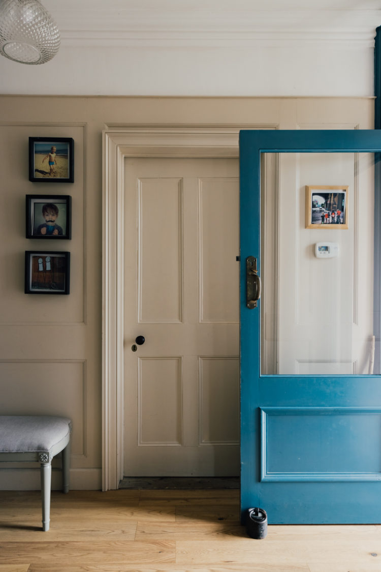
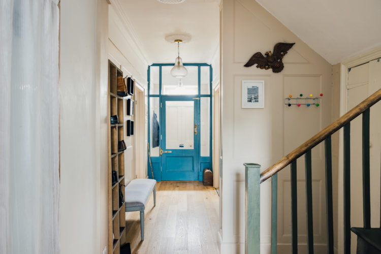
I’m showing you this distanced view as well so you can see how much extra light is brought in by the glass surround that is painted to match. This takes all the light that comes in from the windows over the front door and brings in right into the hallway – traditionally a dark spot in many houses. If you have a dark place in your house the first thing to do is look and see if you can borrow some from elsewhere – this might be by adding an internal window or, if budget and landlord don’t permit you need to try and encourage it in by careful placement of mirrors.
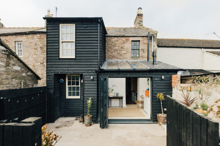
To the back and the timber clad extension which looks wonderful in the black paint. The wooden cladding is not too modern in style against this period house but the black brings a contemporary twist. Also, not everyone wants glass extensions and having spent the better part of 10 days staring at the pile up of Saharan desert sand on my kitchen skylight and feeling slightly weak at the thought of having to get the ladder out to clean it, I can see why. Cleaning a skylight is one thing, cleaning a whole extension is quite another.
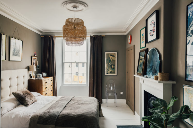
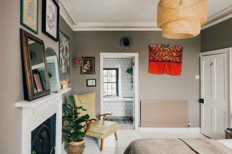
Upstairs now and we’ll just take a look at the master bedroom which has been painted in a soft brownish grey – try Mole’s Breath by Farrow and Ball. The rattan lampshade and wooden bedside chest warm up any coolness in the scheme which is very much tonal and textural.
This room also provides a great example of the power of invisible furniture. That ghost chair (so aptly named) isn’t drawing attention to itself but it’s there if needed. A wooden one may have been the same size but it would have looked as if it was taking up more space and sometimes that’s the point. In a small sitting room a glass or perspex coffee table won’t draw attention to itself and make the space feel cluttered but it will still be there discreetly waiting for your coffee cup or glass of wine.
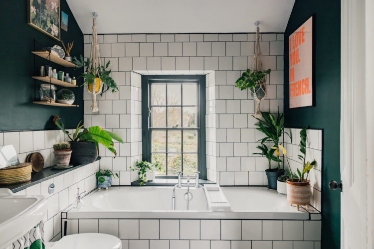
Spinning round to see into the bathroom. Firstly, tiling the side of the bath and the wall to match makes the bath disappear and means that the window, and its view is what you see. It’s also easier to clean and makes the room look bigger so it’s an easy thing to do. White tiles like this – whether you choose to go square or metro – will always be the most affordable option too. You can grout in dark – to match the window – and save stains or use classic white if you know that it will discolour in places where water and soap splash onto it.
Before we leave note the painted radiator. I can’t decide if it was a colour match that didn’t quite come off, or a tonal choice. Either way it’s better than white. And yes I would have painted the back of the door to match the wall as well as the architrave round the door to the bathroom. On the other hand, if you like a contrast between wood and wall, remember you don’t have to pick white, you could have gone, for example, for a darker brown shade to create a frame but in a more gentle colour contrast than white.
Here’s the bathroom. The owners have made the most of the space using the walls for storage and sticking to a two colour palette which really draws the eye to the window. In a tight space a built- in loo cistern can only make for a more streamlined look but will also provide extra storage and in small bathrooms every centimetre counts. Using the ceiling – in this case for trailing plants – is also a good idea and remember if you are really tight you could use macrame plant holders like this with bowls and keep make-up or shampoo and soap in if required.
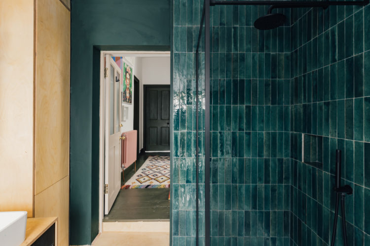
Into the small family bathroom and these gorgeous intense blue green tiles – again a nod to the red thread from downstairs. The temptation in small bathrooms is to keep them as white as possible but if you have a window – and this one does – and bearing in mind that all the bathroom “furniture” is white, and there is a large mirror and pale plywood storage, then you can for it with the rest of the walls and tiles. Remember, and this is a really good example, the bathroom is still part of your house and when you have spent time thinking about the decor there then you need to try and make sure the bathrooms are speaking the same language as the other rooms.
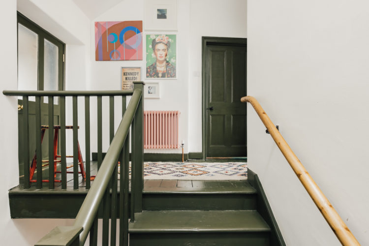
We’re going to finish with a better shot of the landing as glimpsed through the door above. Because it’s bold and cool and something you can easily take inspiration from for your own places and spaces. And that’s stairs painted in gorgeous dark olive colour – so unusual for floors but wow it works. And the radiator. Right at the top of the stairs. Not a thing of beauty. The walls are white so leaving it white is going to look like you didn’t know what to do about it and weren’t able to move it. Instead – own it. Make a feature of it and go bold. In this case pink. This is a fabulous colour contrast with the olive green and it acknowledges that it’s here, it’s moving and so no-one is going to make a half-hearted attempt to fail to hide it. Sometimes you gotta own those tricky parts. And that might be the most important lesson of the day.


I fell like many of the colours were inspired by the (coat-free) coat rack in picture 6. It is a beautiful house, with great use of colour.
That blue bath tile is incredible! Great use of color throughout-
I LOVE the use of colour in this house. The only jarring thing to me is the hand rail opposite the bannister in the last photo. Why isn’t that painted, I wonder? All the more mundane in such a vibrant house.
Lots and lots to love here, especially the stairs and landing and that stunning mid blue door frame, which is so fresh! I do think though that my eye is tiring of heavy colour drenching in dark blues and greens – there was a house earlier this week with it too I think (worse), and I am realising that I don’t enjoy looking at it anymore.
What a lovely house with great colour choices! It has brought up a question that I am hoping you can help with Kate – when painting doors, architrave and skirting in a contrast colour, as they have done in the hallway here – where do you ‘stop’ the colour on the doorframe/architrave going into the room, and for that matter on the door itself if the inside of the room is to have a different colour door architrave and skirting? I have looked and looked online but can’t seem to work out how to do this! Any advice would be much appreciated!
Maybe I’m misunderstanding and it’s not that simple in your space, but my guide for this is what is visible on each side when the door is closed.
That sounds logical, thanks Allison!
This is a gorgeous house and decor! Love the colours 😍
This is a gorgeous house. I think I pinned most of the images into my Pinterest account when it first came on the market last year. The owners have got a very sophisticated way with colour which is truly inspirational. Thanks for the expert analysis Kate!
Norham is a beautiful Northumberland town right on the Scottish border on the River Tweed and this house is a bargain compared to house prices down south. Somebody please buy it!
That living room is perfect. I wish I had the courage to copy it. Cheers from Canada!
I love it … especially the colours👌