For all last week’s talk of the death of pink and the birth of yellow, we all know that in real life things take a little longer to actually come through from forecasts into our homes. So if like me, you are talking about yellow, but haven’t actually taken the plunge yet, this post is all about the deeply comforting tones of softest pink creams and rich red shades which are still very strong. And I was wondering why I had been drawn to these colours so much this week and then I looked up and realised these are the colours of my office to which I have returned following a prolonged absence on the sofa. It’s a long story but it involves the cat and her litter tray. And, in another digression, having been spent several months looking at the chocolate brown walls of my sitting room I keep seeing features about how chocolate brown is the other new colour on the block, so on that note I feel emboldened to say that I am really, really feeling it for sludgy olive green at the moment. Again, a colour that has been hanging round the edges for a while but is about to go mainstream and no longer just for interior designers. And if you did listen to the podcast you will know that Joa Studholme, the creative director of Farrow & Ball, said yellow would be big in 2017. That’s how long it takes. So for all those who are worried about a trend passing them by I’d say you have time. And, of course, if you love it, it will never go out of style anyway.
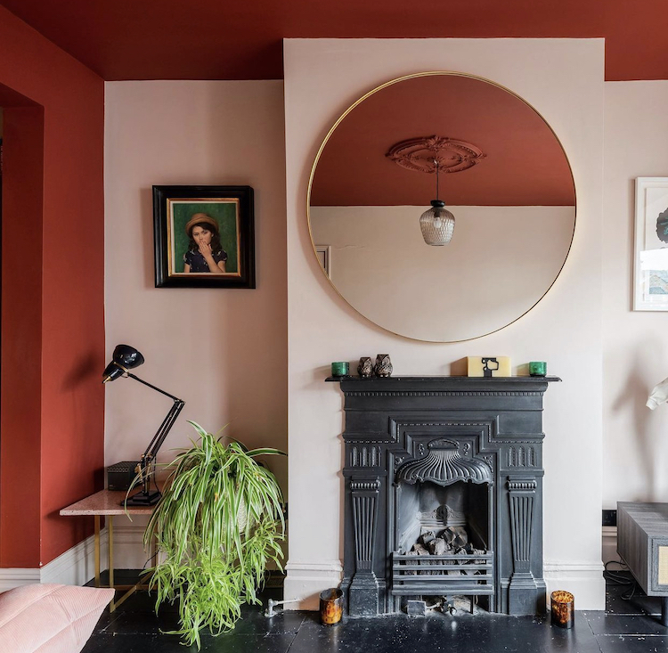
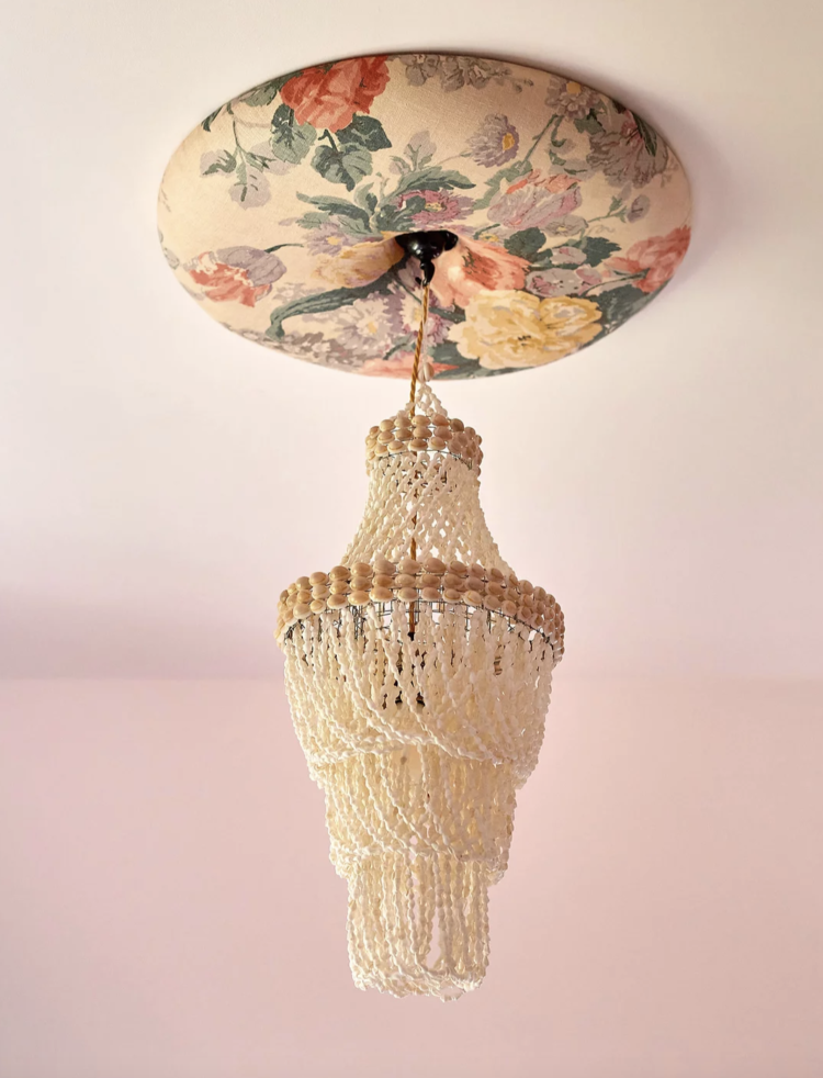
So first up, this room belonging to the super talented couple Emma Morley (Trifle Creative) and Simon Goff (Floor Story). The walls are a very soft pink but this is all about the ceiling and, in the case of this photograph, it’s all about the reflection of the ceiling in the mirror but there are a few points to note if you want to take your interior design to the next level. The walls are Cracked Clay by Dulux and the ceiling is Arabian Red by Craig and Rose. Now the joy of Dulux is that many of their colours come numbered 1-5 so you can choose the palest for the walls and the darkest for the woodwork if you don’t want to go for all out contrast as they have done here. But that ceiling flowing up from the walls is gorgeous and if you have a ceiling rose then it just adds a lovely decorative touch to paint it as well. You would if it was all white so do the same thing with your colour of choice. Talking of which, if you don’t have a ceiling rose then remember I showed you these padded versions by Wandalust. You can choose the size and the fabric and they are made using recyclable and biodegradable materials.
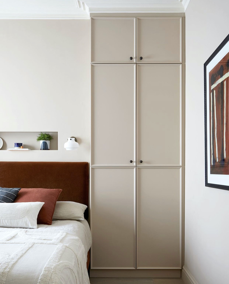
Now if all that felt a bit too intense for you here’s a gentler version of a similar colour scheme by Andrew Griffiths of A New Day Studio whose work is going from strength to strength. This is clearly a small room – the light switches are on the side of the cupboards but those cupboards are beautifully designed. A change from the classic Shaker we see so much of, but with a subtle beading that gives interest. Taking them right up to the ceiling makes the room feel less cluttered even though it has more storage and takes the eye up to where the space is emptier which also makes a room feel bigger.
Remember that everything happens on the floor so, if you have a lot of stuff in a small room, you need to find a way to take the eye up to where there’s breathing space and full length cupboards will do that. The rich colour of the headboard tones with the wall but then the eye is taken across and up to the artwork.
And, of course, if you have no room for a bedside table then this niche above headboard is very clever. If that’s too difficult to retro fit, then a shelf will do the same thing – just measure carefully so the tallest person isn’t banging their head when they sit up to read.
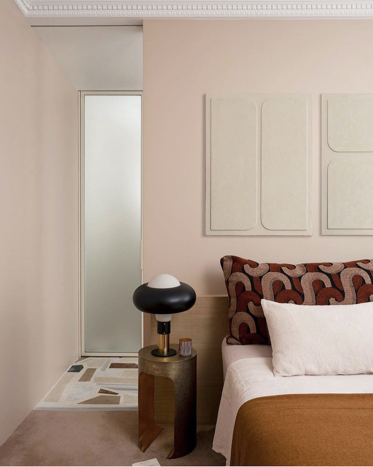
This room is similar but with the volume turned up slightly, so the walls are a little pinker, the cushions a little more patterned. This is a great way to see where your tastes lie when it comes to colour. Do you want the full on contrast from the top, the very subtle tones above or do you find yourself somewhere in the middle?
If you’re not sure then use Pinterest or Instagram to try and find a group of pictures in similar colours and see how they have used them and which one draws you in the most. There’s no correct answer, there’s no worrying about trends or neighbours, it’s just about where you land and what works for you in your space and the mood you need to be in in that room.
That is also a key point. The top room is a sitting room – a day time space – it can afford to be a little bolder than you might want in your bedroom. Hence it’s crucial to think about what is happening in the room you are planning to decorate and thinking about the colours that will allow you to do that thing to your best ability.
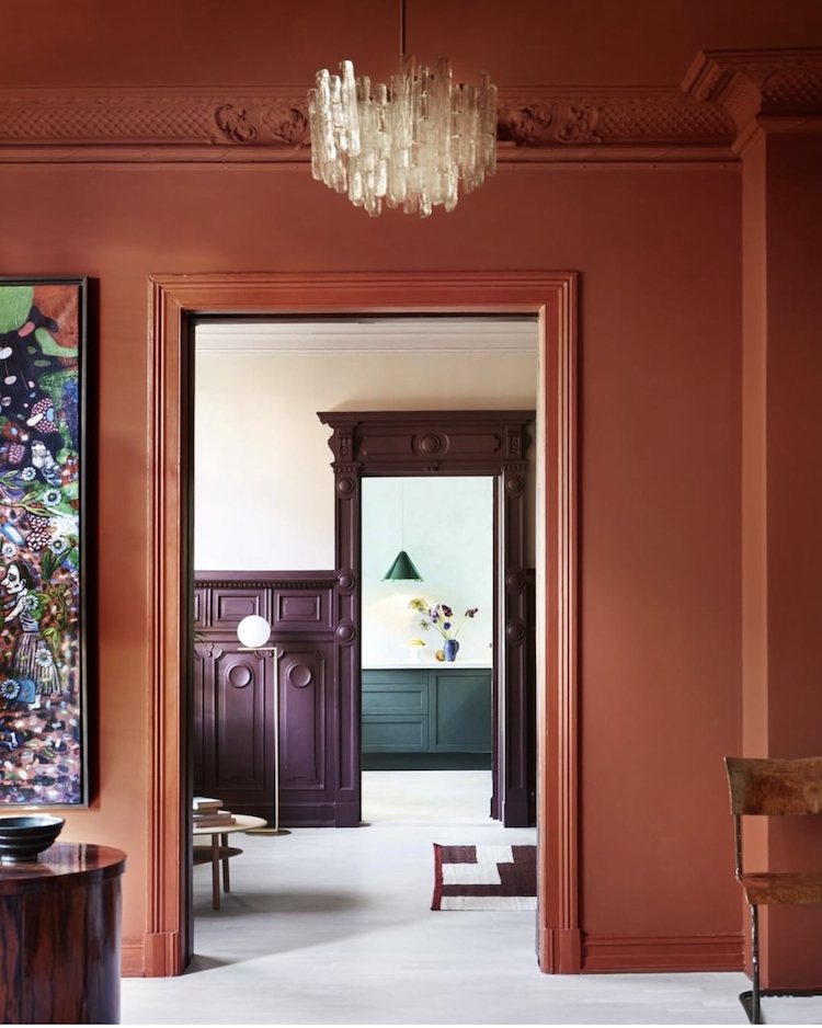
Back to the full on intense tones and here there are no half measures. The walls and ceiling have been swathed in the same rich terracotta but relief comes in the view through the door where the pale wall contrasts with the darker panelling and through the door to the far end again. The contrast between the rust at the front and the mint at the back is huge and would be – for me at least – too much if the colours were next to each other but the middle room breaks them up and allows them to be friendly acquaintances rather than passionate lovers.
If you look closely though you will see that the colours are all referenced in the painting that you just glimpse at the side of the picture. It’s been said before but it’s true – if you are stuck for a colour scheme you can use your wardrobe or you can examine a favourite picture you have and see if you can pull the colours out of that to use in a room or around the whole house. When you look at this colour scheme in the context of that picture it all makes sense – otherwise you might not have dared to put a warm red with a cool mint although the blue and orange are opposite each other on the colour wheel which means they will always work together, you just have to find the right shade for your taste and palette.
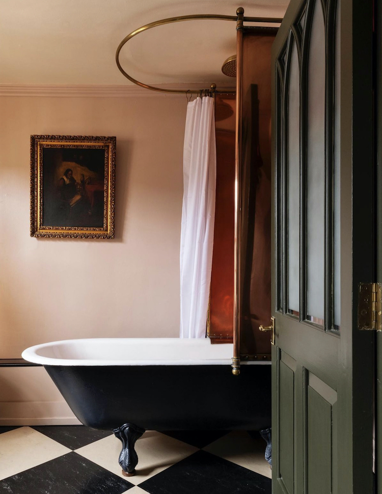
To the bathroom and this is in the Hazlitt’s Hotel and I suspect the walls may be more cream than pink but, of course, you never see a colour in isolation – it will always reflect those around it so this is picking up on the warm brass shower rail and tinted shower screen.
And, in the same way that a black and white stripe not only goes with everything but can slice through a rich colour palette so the checkerboard floor will do the same thing – as well as being a classic that will never go out of style. And, as if I planned it (!) a sludgy green door to contrast all these warm tones.
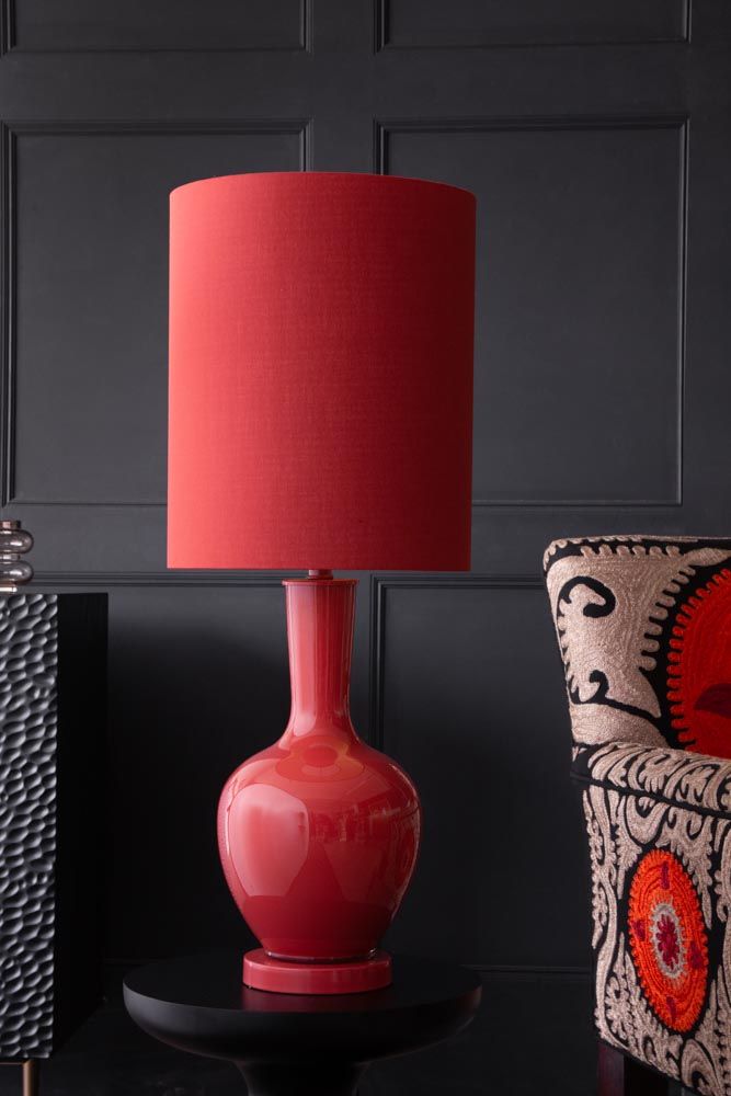
And if all that colour was too much for your walls but you fancy a little dabble then here’s a fabulous raspberry table lamp from Rockett St George.


Absolutely love seeing reds & pinks in homes! Bold & beautiful
Dear Kate, I really like bathrooms with an oil painting on the wall (just like the one shown here). However, I often ask myself if it is practical considering the humidity in the bathroom, i.e. if the back of the painting will get mouldy after some time. Regards Claudia