If Joa Studholme of Farrow & Ball said in 2017 that yellow is coming then you better believe her. That woman’s entire career is based on telling us what we will like in the future and she’s really, really good at it. It may have taken five years, which is a sign of how slowly interior trends actually move, compared with how fast everyone thinks they move, but it’s here now. And for those who are terrified of it being too much, then maybe just introducing a cheery little splash of a muted version and keeping it firmly away from the walls is the thing. Here are eight accessories that will bring the sunshine to suit a variety of budgets.
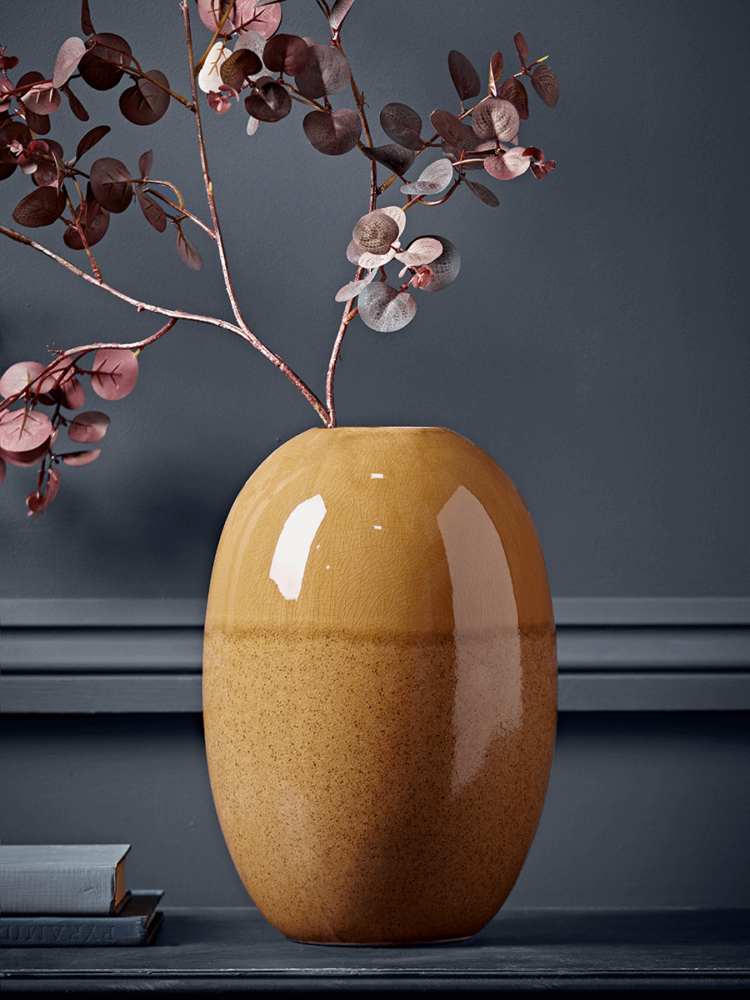
I have a paler version of this vase above that sits on the coffee table in my sitting room which, as many of you will know is decorated in shades of pink and chocolate brown. This vase is the perfect disrupter colour that makes the whole scheme work and yet it’s not too scary as it’s a single item. In fact, having got used to it I now think it’s a little pale and maybe I should replace it with a stronger version of the colour. Because, as I said a couple of weeks ago (to a flood of emails agreeing) if you are pondering strong colour and then back out you always regret it later as you get used to the toned down version and wish you had gone for it. Which, actually, means this can be a good way to experiment with a colour or pattern – started with a watered down version and see how you get on before you paint the whole room, cover the whole sofa. Cushions before chairs as it were.
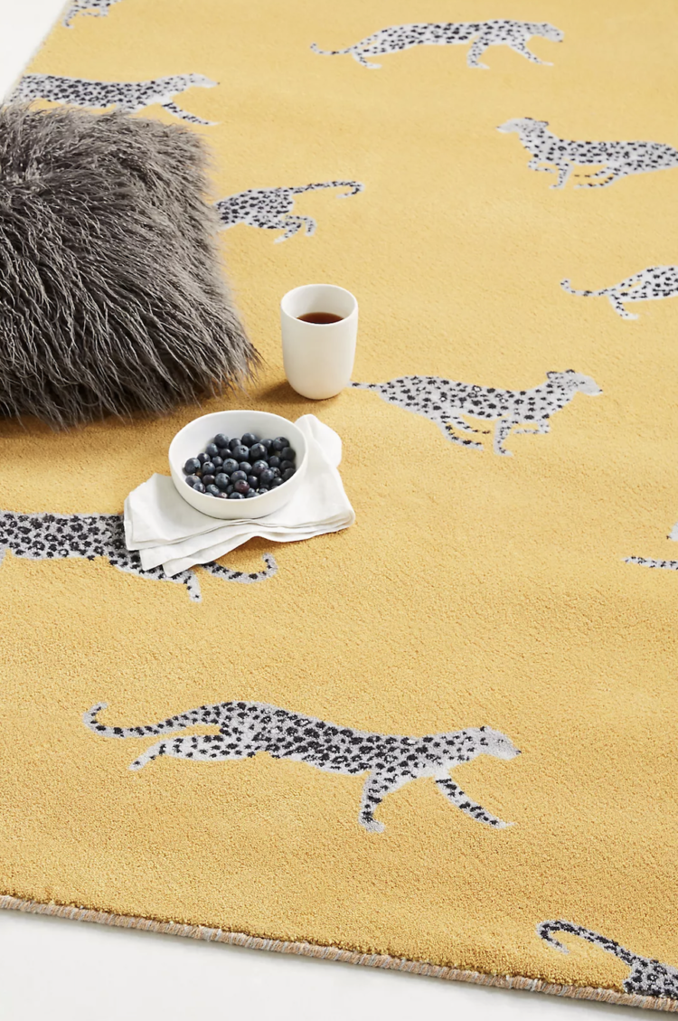
Now we’ve all seen leopards over everything over the last few years. I went to a press event in 2019 – one of the last ones before everything stopped – and I was the only person in the room NOT wearing or carrying something in that print in all the colours of the rainbow. But this is a little different. Firstly it’s a cheetah – what do you mean you can’t tell the difference…! The point is that this isn’t about spreading the pattern all over everything, which you might think is a little “done” by now.
Actually, we can use this to make another point about trends. If you were already into leopard you will have welcomed the increased choice available and carried on. If you were new to it as a design you’re either already in by now or you’re not going. I’m in the latter camp. However, I quite like this rug. It’s a lovely mustardy yellow which would look great with a pale pink, a strong green as well as both navy and china blue. And showing the whole animal instead of just its fur is a new way to look at this pattern. So it feels both new and different.
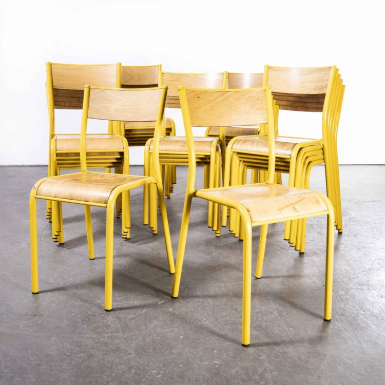
Always room for a bit of vintage and these yellow chairs from Merchant and Found cost £75 each and there are lots available. So you can pick a pair, have a set of four or more or just one in a corner. If you live in a small space then stacking is always good as these, which have a flat seat, can stack in a corner with a lamp or plant on top and be useful when not needed.
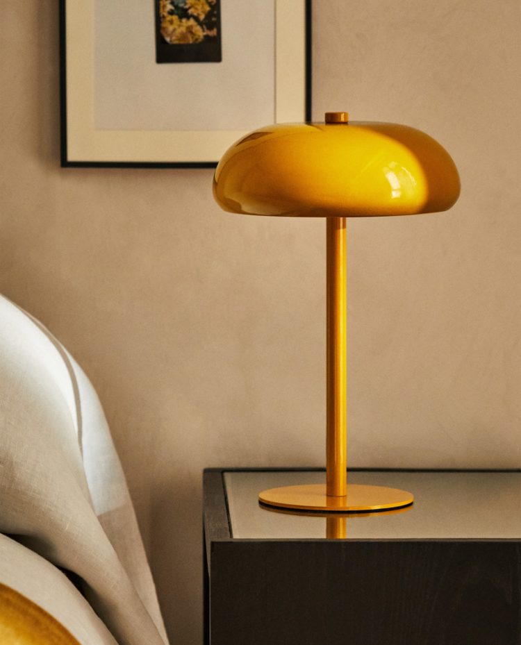
It’s always worth keeping an eye on Zara Home. Their clothes are controversial as the sizing is all over the place but they have a good eye for the homewares. This lamp is a classic shape that will provide a strong downward light – perfect for a bedside table when you are mostly lower than the light source and in a cheery colour that looks good on a miserable morning when it’s not on. It’s £39.99 and the cable is matching yellow cord rather than the white plastic which would totally cheapen the look.
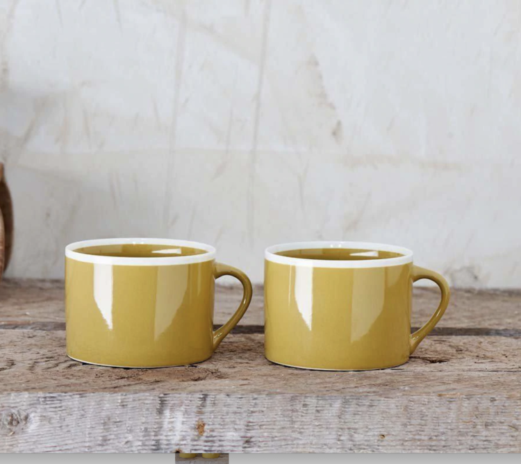
Maybe you just want a cup of coffee in a jolly yellow mug and these are by fairtrade brand Nkuku and an easy way to seeing how you get on with a colour. Does your heart lift when you see these mugs, in which case, it’s probably working for you, or does it sink. In which case avoid.
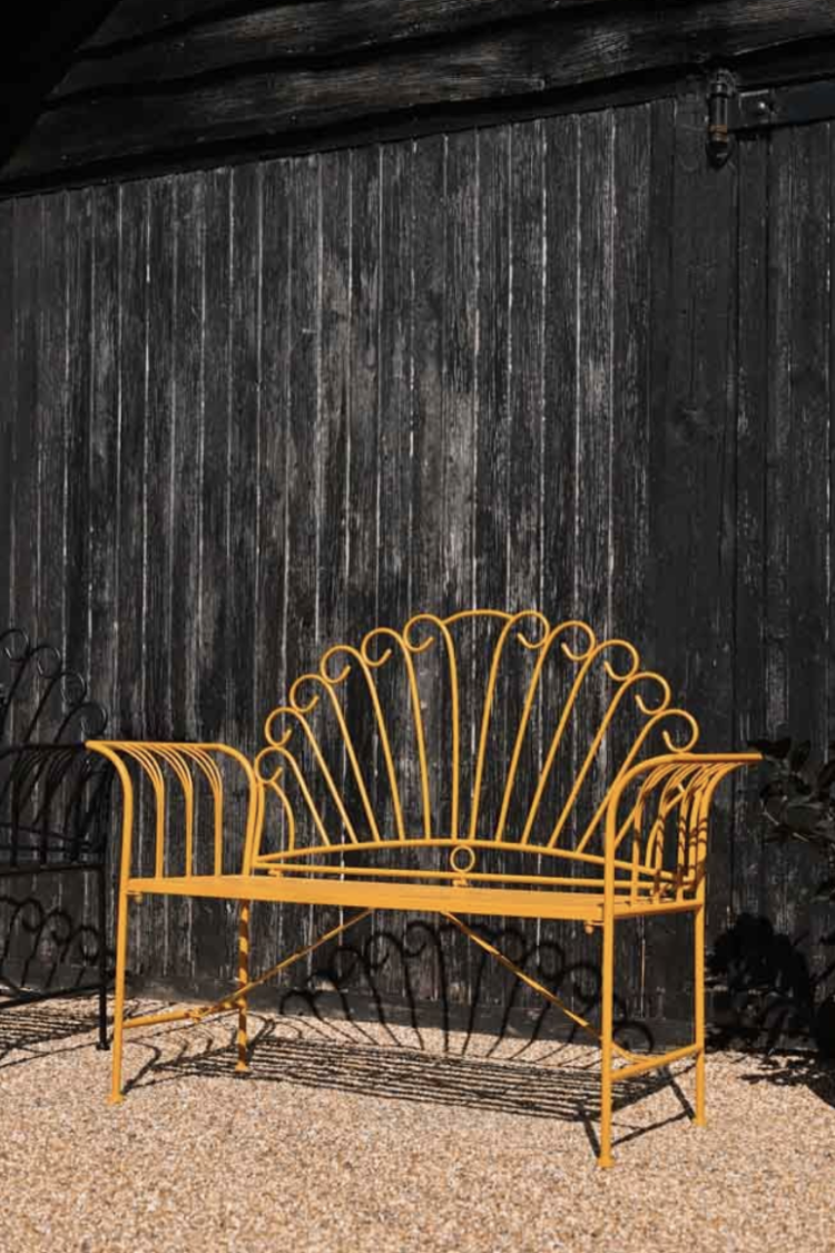
Probably too soon but it has been warmer this weekend (in London at least) and if you can’t have a yellow bench in the garden then where can you. Of course this looks great against the black but it would look good against green or any other colour too. And, if you had room, it would sit in a hall or garden room with a cushions on in Winter.
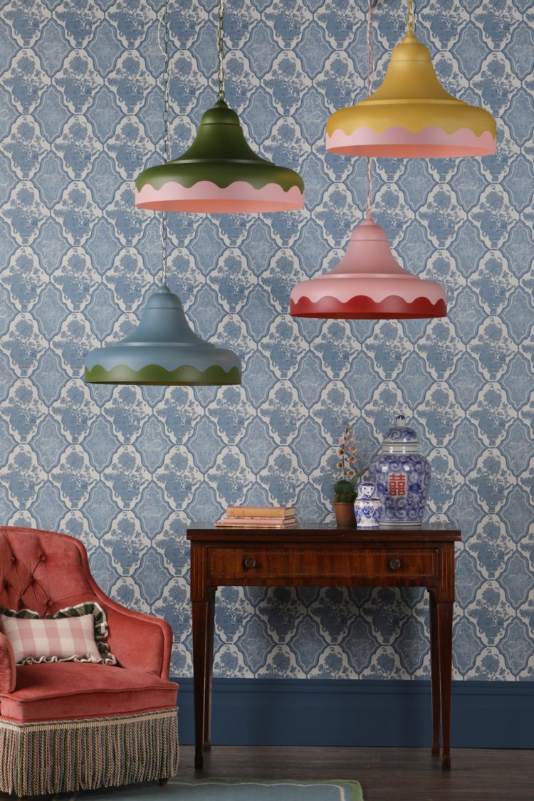
Or what about this fabulous new lighting collection from David Hunt. You can customise them in any of the (more classic) colours shown via this link or specify a RAL colour of your choice.
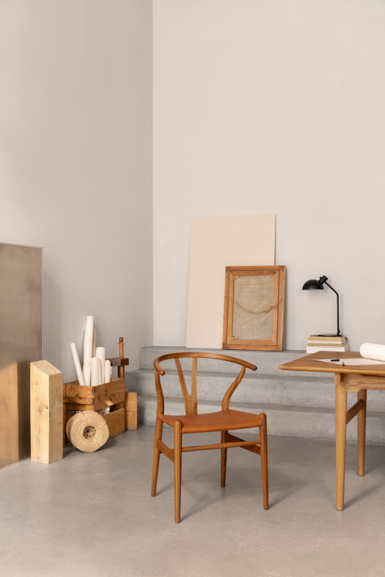
So we’ve had new and vintage, indoor and outdoor, affordable and now it’s investment time. This is a special anniversary edition of the Carl Hansen wishbone chair, which isn’t, strictly speaking, yellow but it’s wood and tan and tbqh (as they say) I thought it was yellow when I first saw it. It’s a limited edition that will only be available to buy on 4 April (in store or online) in honour of the designer’s birthday. They will be made to order and each one will have a small brass plaque and come with a dated certificate of authenticity. They will cost £742 (excl VAT) so keep an eye on the site if you think this is an investment for you. It will totally hold and probably increase in value too by the way.
Lastly, if that has got you thinking about paint then look at this gorgeous sunflower from the new paint collection at Morris & Co. Now I’m not sure if I would be brave enough for a whole room but it does look lovely here. On balance I think I would definitely consider it for a ceiling or for the woodwork in a room – the window frame and/or the door and skirting boards to link the two.
What do you think? Are you going full on yellow or tiptoeing round the edges for now?


Versions of yellow are my Red Thread. For decades, I have always had yellows in houses – sunshine ! daffodils ! joy !
Dear Kate, Do you have a solution for the painting of uPVC a window frames? I’ve just moved into a house with white plastic windows…
Lots of people are doing this now and it’s very successful. You can use ASP – all surface primer from Little Greene and then choose your colour for over the top. Really good results.
We chose Dulux Heritage deep emerald green emulsion for our family’s TV snug. Long sofa an exact match in “velvet” fabric. French Navy for main accent colour and a pouf in egg yolk yellow as a disruptor. Looks fabulous….. and then a vase was spotted in deeper yellow, possibly a cushion in yellow??? and then stop…enough.
In January I put up some curtains with a hint of yellow in them. People immediately commented on how cozy the living room felt. Important in our cold winters. Will I still love them in the heat of July? Cheers from Canada!
I have the cheetah print on a lampshade which looks good (well I think so?)
I absolutely love yellow. We painted the back of the front door yellow last year, have a mustard sofa in the bedroom, yellow blind in the study, yellow bookcase in my sons room. My partner thinks there’s too much already!!
I have still to find your previous article that showcased a hall with a wedge painted in yellow to be like the sun shining in. It is on my to do list for my hall.
I had a kitchen in a beautiful golden turmeric and cobalt blue. Always used to make my heart sing each time I entered the room. Maybe a bit too 70’s? But I loved it.
hmmmm….I am looking at a watercolour with yellow, grouped on the mantelshelf with an amber glass candleholder and Pantone yellow box. They’re staying. I love a daffodil, yellow tulip or hellebore in the house or garden. I have some amber glass light shades and ochre tones in Australian artwork which would pull together well with a mustard rug I’ve had my eye on. But the honey/mustard Bemz sofa cover I bought to experiment with the colour on a larger scale is probably not going to stay, and I’m getting rid of the yellow-toned Ringwold Ground paintwork in the dining room. So probably 5/10 for this trend for me.
The Zara lamp is great. I see it also comes in navy, which would look good in a yellow room. Great price too. Years ago I bought an orange Habitat desk lamp because I loved the colour and have never regretted it. Still looks fab today.