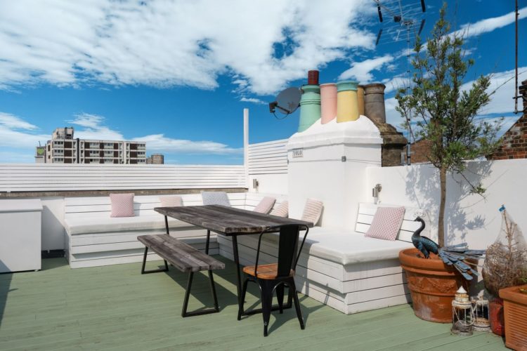
In a week where we’ve gone from Summer to Winter, sometimes on the same day, I was drawn to this west London flat with its chimney pots (that’ll be the winter) that have been painted in bright colours (that’ll be the summer). And I thought, as I sat in my office wearing my coat (that’ll be the cost of living rise from today) gazing at the bright blue sky (deceptive? Much?) I thought it’s not often we look at colour that isn’t deep and dark and moody (much like myself) so come on in.
It’s a three bedroom apartment in west London that is close to the famed Portobello Market. I’m told Friday is better than Saturday so if you buy this (from Domus Nova for £2.275m) it will be much easier to buy thrifty things on that day rather than waiting for the tourists to flood in at the weekend and push the prices up.
Now, as I say, it’s a little different from our usual fare but you can take the ideas and change the colours, or you might surprise yourself and feel that this is what you have been looking for all along.
The general colour theme is green in various forms – patterned wallpaper above, through to tiles in different shapes and shades and woodwork – verging towards blue and pink – again in various different colours from blush to coral with some splashes of orange. And that’s what’s interesting to note about this.
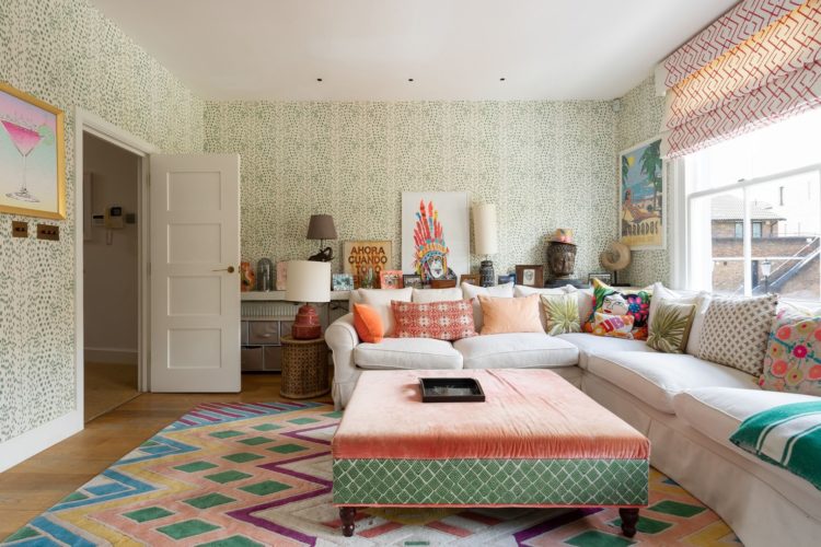
On first glance it appears very bright and colourful, but when you look closely there are, as I say, two base shades in varying tones, with a little cream and a tiny hint of yellow – mostly in the pictures on the walls. So you might think it’s a riot of colour but in fact it’s a great lesson in how to bring in lots of colour without feeling worried about what goes with what and what might be too much.
So the sitting room has all four walls wrapped in a pretty green and white sprig wallpaper. If you wanted to use a gentle pattern like this but give it a bit more oomph you could take the green and use in for the woodwork and or ceiling which would make it shout a bit more but in a polite way. More of an “ahem look at me” than yer actual shout.
You could do the same with the sofa too. The cushions come in a range of patterns and styles but not of them stray too far from the central colour scheme and the upholstered ottoman leads your eye straight to the darker orange cushion on the sofa and from there to the artwork behind.
If you want to really analyse a space you would then look at the shapes – lots of geometric zig zags, diamond and checks going on here while the curves have been left to the floral wallpaper. That said, the owner probably didn’t overthink it and you shouldn’t either or you’ll paralyse yourself. But if you’ve a room and it isn’t quite working this is a good way to see if you can solve a problem.
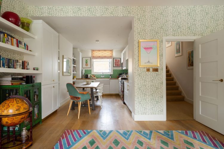
The sitting room is open to the kitchen and you can see how the colours carry on through. The green of the rug leads to the blue green of the chair and the tiles at the end of the room. Every green thing is something different, it is the colour that is consistent. If you want to vary the colours then you can keep the objects the same – so a set of multi-coloured chairs that are all the same style for example.
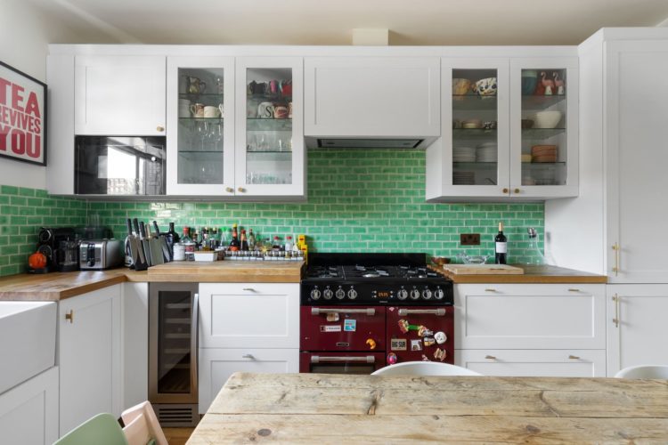
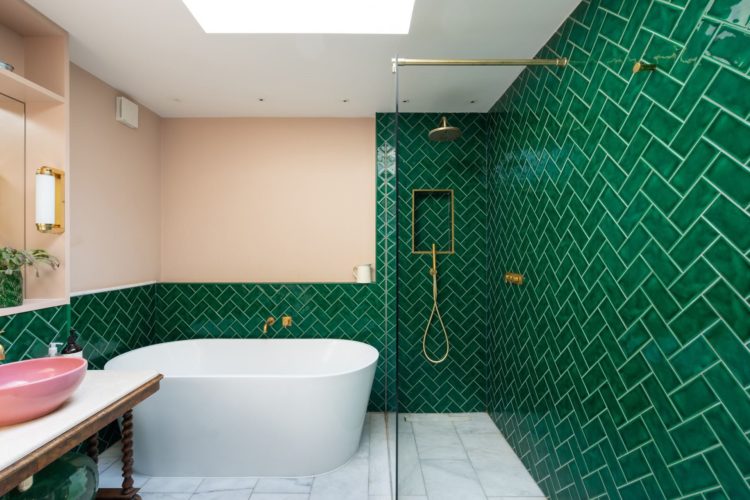
We’ll pause for the tiles in these two rooms. Above metro style in the kitchen laid in classic brick formation. Below, in the bathroom, same shape, slightly darker, laid in the the current herringbone fashion. Looks completely different in both spaces. It’s also possible that the grout below is a pale green but you could also match it to the pale pink walls. I would also have been tempted to match the ceiling to the walls but in a bathroom, which has a lot of white furniture by necessity there is no need and this also matches the white marble floor.
In the kitchen the white grout matches the cupboards. Again, it’s classic so it works. Matching grout to tiles is a more contemporary look and also makes for a more streamlined look in a small room. But both are right and neither is wrong. This is about helping you visualise the options so you can decide for yourself.
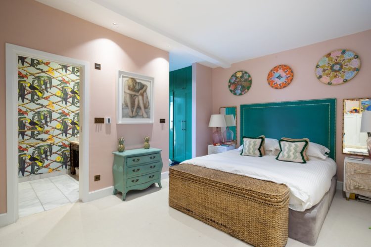
Finally, into the bedroom where the walls match those of the bathroom and the green has morphed to a softer greeny blue shade.
Now have a look at the floorplan because if you have a big bedroom you can see how they have taken a slice off to create a walk in wardrobe through which you access the main room and also created a small shower room. If you look at the kitchen plan, which is a mirror image, you can see that that room was initially 15ft or 4.6m wide and has been reduced to 11ft 5ins (3.5m). This is tight – especially when you are putting the loo and basin next to each other but that’s doable in 1.3m and the wall is thin. The plan is drawn with two showers but if you tanked the whole room and made it into a wet room you could have put the basin opposite the sliding door and had one large shower at that end.
The key point is that a huge bedroom isn’t necessarily the best use of the space. Leaving aside WFH issues you are only in there at night and not spending time in there during the day. If you can reduce the sleeping space and create a fabulous ensuite with great clothes storage the whole experience will be much more luxurious and give you more usable space in your home. I am definitely a fan of moving walls around to enhance the living space.
But where do you stand on the colours – light and airy or dark and moody?


Hi from not so sunny Sydney! Love everything about this home – love that cushions don’t match wallpaper – that wallpaper doesn’t match sofa and particularly the joy the home exudes. Love to meet the owners who must have a keen sense of fun. This is eclectic at its best without being contrived. This is what we Brits do best.
I kept thinking I’d seen this living room before. I think it’s a Barlow and Barlow design. Anyway, it’s lovely. Team light and airy here.
I really like it , I didn’t notice the chimney pots , had to go back and look for them. I’m usually for bright and airy but I’ve just bought a fuschia pink sofa and now the pale yellow walls in my living room/lounge/sitting room 😂 don’t feel right and I’m planning on changing to dark blue.
Coming from a sunny part of Australia (well except for the last month or 2 – everything has either been washed away in floods or covered in mould from the humidity), I found that I took a deep breath and a big stretch looking at these pictures. Your darks and moodies are certainly striking, but oh so oppressive on a state of mind. I’m not a fan of pastels and quite so much busyness, but the light and breeziness feels like home. Just needs more indoor plant life.
Just as a counterpoint to all the above: I couldn’t bear it for a minute. Would immediately start in on tidying up all that colour and pattern. Dark and moody all the way for me.
This owner seems to have a sense of humor, I would also like to see their apparel.
For me, neutrals with accent colors work but I enjoy seeing the bold colors that frequent this blog
Greetings from Atlanta USA
The playful ice cream colours on the chimney pots are an added delight to the spacious roof garden. The tonal shades of pink and green which show throughout continue the sense of colour harmony. As renovations have been made, I wonder about the layout of the kitchen.
Could the cooker have been installed on the opposite wall, and if so, the hallway wall opened up to permit more light into the kitchen and the reception area? The combination of the soft pink walls and the emerald green herringbone tiles in the bathroom are a striking combination of light and bright. If the shower wall were tiled in the same herringbone pattern but with a matching pink tile to compliment the opposite wall, would the contrast between the two colours balance out the room with less a feeling of heaviness on the shower wall? A lovely, airy flat just the same, and lucky are the new purchasers to move in.
Love it!
Made me happy!
Ohhh! Light and airy but colourful, yes please. This is fab 🙂 I need to maximise natural light, especially on cloudy winter days, but I also love colour.
I am redecorating a long north- and east-facing kitchen-diner which has always felt cold and a bit dank despite lots of glass looking to the garden. Colours were too strong (feels like a cave) or looked grey/dank. It leads into a sunny south-facing sitting room with existing sofas in soft straw chenille and deep emerald velvet.
After much reading of your blog (thank you for all of it!) and staring at paint samples I’ve eventually settled on pink, green and a touch of yellow – so like the house above, but with jewel-tone greens.
Soft nude pink (Little Greene China Clay) for the kitchen; walls, ceiling, wall cupboards, with deep green base units to ground the cooking end (Mylands Brompton Rd or F&B Duck Green tbc).
The sitting room will be painted in soft nude pink to bring the colours together (China Clay or Setting Plaster tbc), while a couple of accessories carry the yellow ‘red thread’ into the kitchen e.g. table lamp is now LG Yellow-Pink.
The impact of switching to nude pink in the kitchen is massive, it feels so much more friendly, cosy and warm yet still airy and light – HOORAY.
I’m about to make the final choice of deep green, ready to spray the kitchen units myself (bought a professional spray-gun for £50, borrowed a compressor, and turned my garden shed into a spray booth – we’re ready to have some fun…).
Love it – it makes me feel relaxed looking at it. A lot of thought has clearly been put into tying all the elements together .
Love it. The terrace completes it. I would move in tomorrow…except for the price. Cheers from Canada!
Love those bright green tiles in the kitchen. Very much in favour of white and bright here.
I adore that outside space.