We’re going dark and moody this week because, well, that’s the mood. Or to put it another way what happens when you decorate a house and use no white paint. Well, ok perhaps a single tin. I think the result is fabulous, let’s see if you agree.
As soon as I saw this house (which is on with Inigo for £1,050,000) I knew I had to share it with you as I am always talking about not using white paint. Now to be clear, for those who are new here, I have no problem with white paint as a colour – well I’ll qualify that to say a soft/off/warm white rather than a brilliant one. Where I take issue is when white is used as a default colour because it’s the tradition. Or because, like grey for many years, you didn’t know what else to use.
I have lots of white (wimborne) in my own house. It began on every wall and floor and has gradually been replaced on all the walls except for the hall, stairs and landing. To be honest I’d be up for changing it there but the ceilings are high and the thought of it makes me tired. So, as I say, it’s not the colour per se that I don’t like it’s how it’s used.
White needs natural light to reflect off if it is going to make a small dark room feel lighter and brighter. Without that it will just become drab and you will have a small, dark, drab room. Either go dark all over or choose a pale colour and use that all over instead, including the ceiling.
I also feel strongly (are you picking up on this?!) that woodwork doesn’t have to be white just because that’s traditional. A matching, toning or even differently contrasting colour nearly always looks better. Ok now I’ve got that off my chest are you coming round?
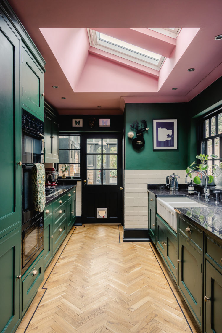
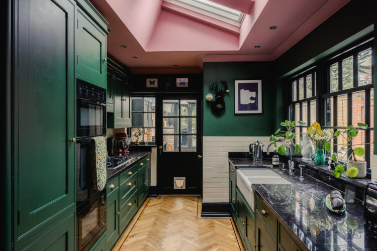
So let’s just look at this really bold kitchen. There are some white tiles and that is a super practical place to put them. I’m betting the dishwasher is there and as someone whose dishwasher is in exactly the same position, next to a wall by the sink, I can’t tell you how grubby that bit of painted wall is. We began, as did everyone 10 years ago, with the fashionable chalky matt paint which is not tough enough for this area. We moved to an eggshell that is wipeable but using tiles is the answer. Use it as a chance to add more colour and pattern or just install the classic Victorian metro style that ties in with the white sink.
But it’s the colour scheme we’re here for. That gorgeous forest green with the pink ceiling. Yes you could have used white – green and white is fine – would have toned with the tiles. But how much more dramatic and considered and FUN is the pink? I’m not saying you have to. You might like the idea and want to knock the whole thing back by several tones to a pale sage and a barely there blush.
But what I am saying, and this is in effect, the essence of this blog, take the time to ask yourself the question before you pick up the paintbrush. Is white right or should I take a minute to see if something goes better with the other colours I spent ages sampling and will that other something make my heart sing a a little more every time I come in here? And when I say the essence of my message what I mean is not just about white paint but taking the time to ask the question and think about the answer.
And if, on relflection, your answer truly is white then go with my blessing.
Now the layout of this house means the kitchen is very long and thin – another reason to distract from that fact by the use of strong colour because it wasn’t until I looked at the floor plan that I realised. I think the owners have extended but chose to extend the kitchen lengthways rather than fill in the side return and make the dining room – that infamous middle room that is often dark – even darker.
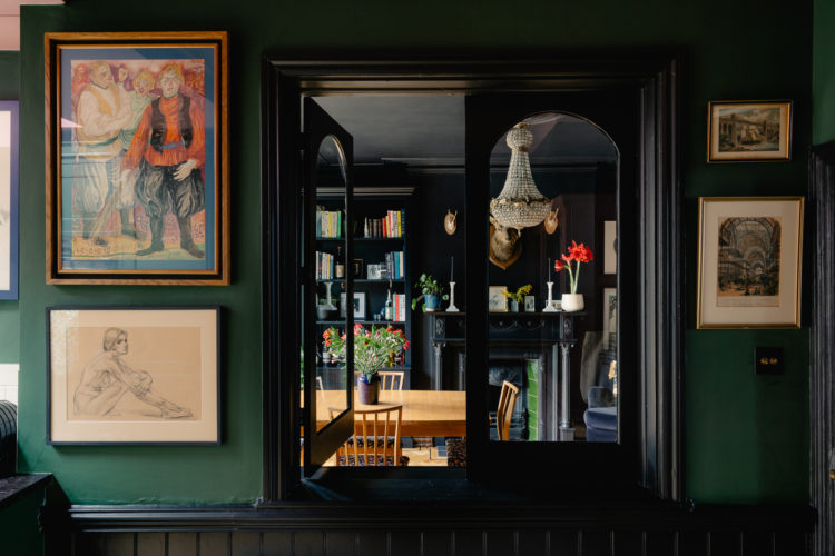
What they have done though, which is always cool is install an internal window. Now this is a brilliant way to make a small, or tight, space feel larger because it will immediately allow the eye to travel to the furthest point so you are looking at a larger space rather than hitting a solid wall with your gaze. It’s a small point but hanging pictures of outside scenes will do the same thing in a tiny corner.
Here the frame is dark on a dark wall so you almost don’t notice it but again, the eye is drawn to the light on the other side. It almost looks like a painting.
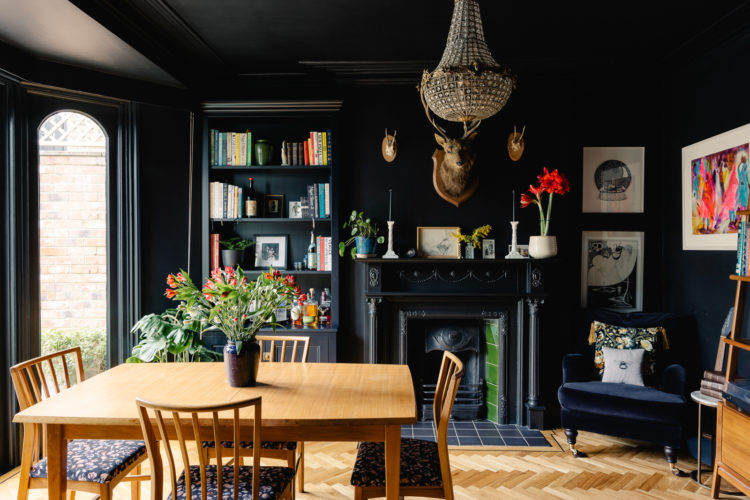
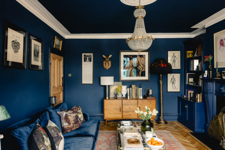
Now we in this room and it was a bold decision to paint it all black but there are large glass doors to the garden, the floor is pale and the table too. These are all valid tricks to counterbalance a dark decision. There are more – it’s a sort of checklist if you will: a crystal or glass chandelier will grab the light and bounce it back into the room, lots of pictures – mostly light ones, and even the books draw you eye and become a feature as the shelves have disappeared into the wall. The only thing missing on this list is a mirror over the fireplace which, if you were looking for maximum light reflection as well. And, of course that internal window will also be borrowing and sharing light between the two spaces. It’s probably a bit of a one way relationship – the light will mostly be going from here to the back of the kitchen but it’s not less valid for that.
If you look at 1930s houses a lot of them have a window over the door frame and it’s there for exactly that reason – to bring light from a bedroom or other room into what might otherwise be a dark hall or landing. Worth thinking about if you have dark spots in your house.
Finally, a word on those disappearing bookshelves. If your kitchen is small, it will help to paint the cabinets to match the wall behind as they will recede. Ideally choose flat fronted with no handles and the disappearing act will be even more effective. The difference is more noticeable with dark colours but you can do the same thing with pale. In this instance paint the ceiling to match as well and you will blur all the edges and give the impression of pushing the walls back and the ceiling up.
Now, here’s our first glimpse of white paint and it’s been used in the opposite way to the traditional. The skirting boards match the dark walls and make them feel taller/higher. The white band takes the eye upwards to the ceiling. Now there’s lots to unpack in this room so let’s start with that.
In a small room, the bottom half is basically full – by the time you have added the necessary furniture there may not be much space. So matching skirting to wall is the first way to keep things feeling simpler and less cluttered. Then the dark sofa matches the dark wall and recedes – same principle as above. The cupboards in the alcove have also disappeared while the stripped pine door matches the sideboard, which, in turn tones with the floor. You could have painted the door to match, the owners probably felt it was a nice door and didn’t want to hide it.
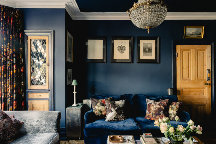
Next, the pictures. This is slightly complicated and will depend on your judgement – but many of you have been here for years so I think you’ll be fine with this one. One of the most common errors is hanging pictures so high that they float around the ceiling and have no relationship to the rest of the room below. However (and that word is doing a lot of heavy lifting here) if you have a small (smaller than you’d like) room that is feeling a bit full you need to take the eye up and by hanging your pictures a little higher you will do that. The eye leaves all the furniture, rugs and stuff in the lower half of the room and floats up to the pictures where there is a little more breathing space. And from there to the white cornicing and to the clear, empty ceiling adorned only with that light reflecting chandelier.
This is a perfect example of where a white accent can work. A fully white ceiling would not have done the same job. It would have been too much of a contrast between the dark at the bottom of the room. The effect would have been one of visual dissonance. White skirting boards and door would also have effectively outlined the edges of the room (like a cartoon) and made you even more aware of how much furniture was in there. A last word – white works well in this case but you could have created the same effect with gold or emerald green or a pale pink, for example. The point was a lighter shade.
Right, let’s just come out here for a little sit down. That has been an intense colour lesson (and talking of lessons I’m going to just mention that if you haven’t seen my online interiors course you can buy it here with a 15 per cent discount using the code MOTHERSDAY15 until midnight on 20 March and there are five hours of video lessons dealing with exactly this sort of thing and how to make the most of your interior decor for the home you have).
Shall we go back in and look at the upstairs?
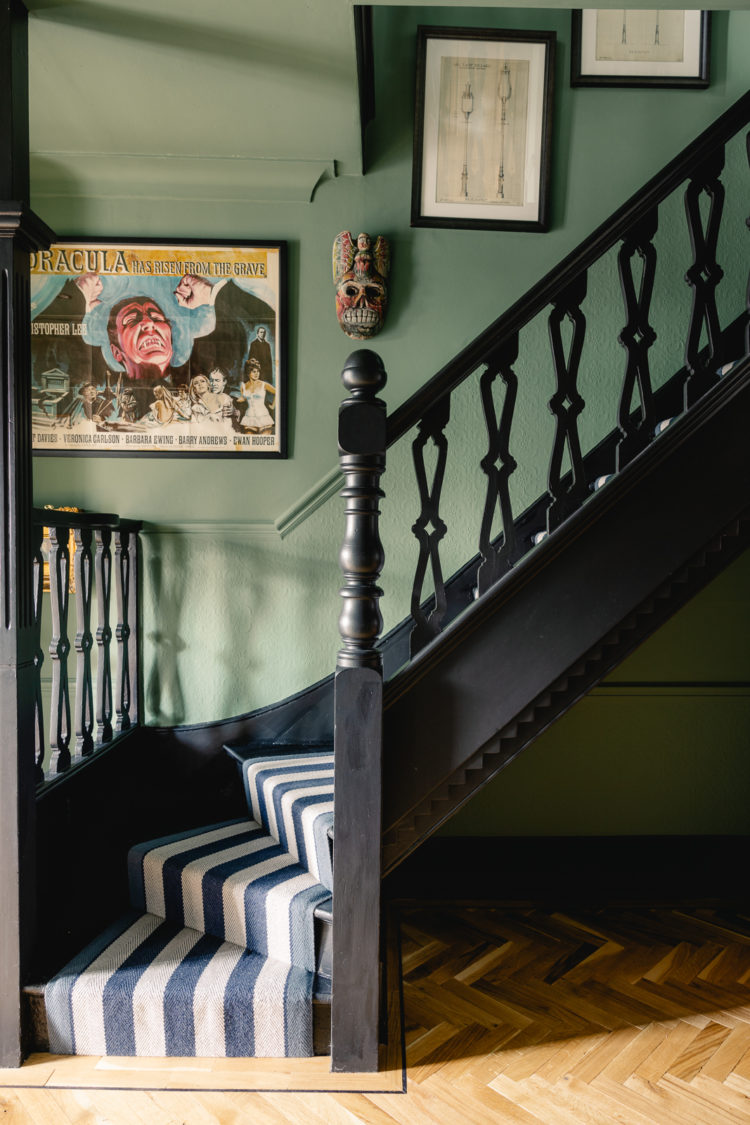
The hall is a very pretty soft green and, again, it has been washed all over the walls, woodwork and ceilings. The floor is a pale parquet so it’s not too Victorian and dark and, if in doubt, a black and white stripe is always a good idea. If you wanted to change things up you could have painted the bannisters the same as the wall, or the same but paler or a completely contrasting shade. When it comes to size this probably isn’t going to make a huge difference as the light passes through the spindles anyway so you might as well pick a colour that sings to you. With this colour scheme that probably isn’t white! Just saying.
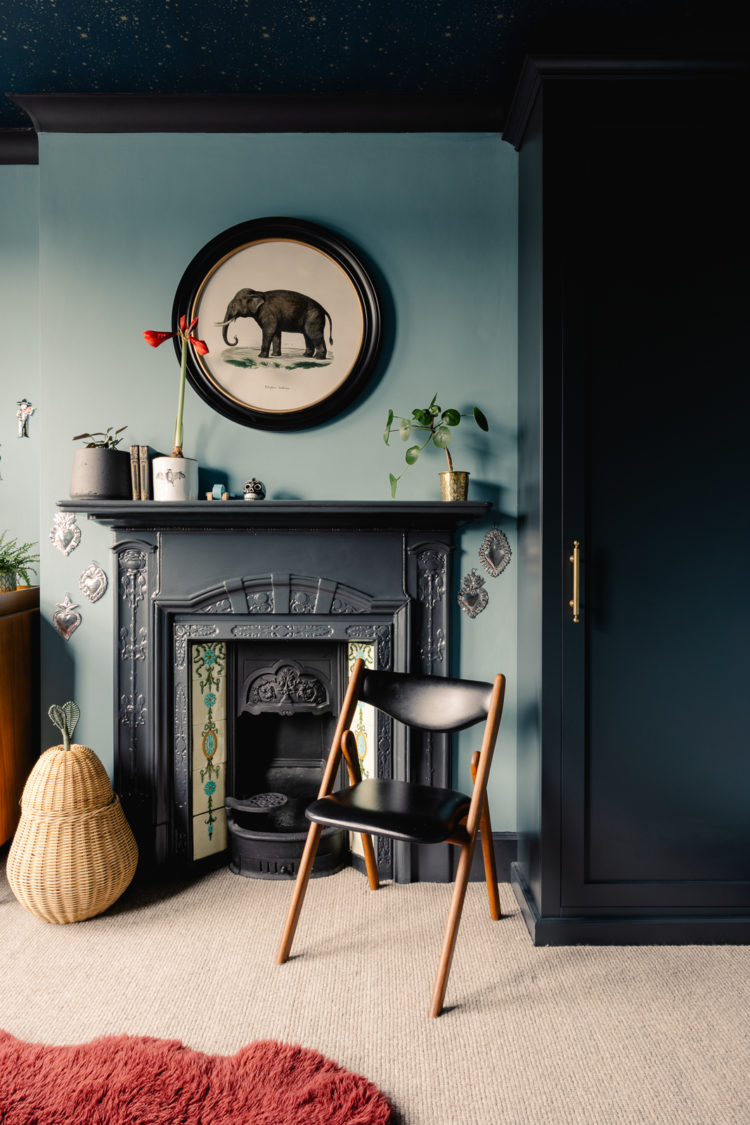
Once again, a room with no discernable white but instead a lovely tonal colour scheme in shades of blue. I find tonal colour schemes enormously relaxing while still allowing you a deep hit of saturated colour. You need to ask yourself if that’s the look you like or if you prefer a little more contrast. As I said above it’s horses for courses but just take the time to ask yourself if you’re Arab Stallion or Palomino.
The carpet is pale, the rug provides a lovely warm contrast but it’s from the same earthy palette so it’s not jarring. By which I mean the colours still tone even when they contrast. As an example – a mustard yellow would work in here, a clean daffodil less so.
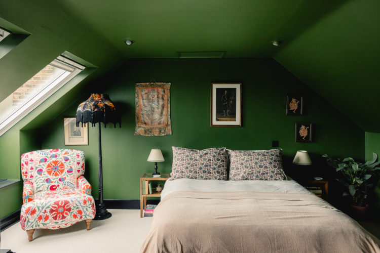
There are two green bedrooms. The one above is the perfect answer to what do in rooms with sloping ceilings. Rather than tie yourself in knots wondering where wall ends and ceilings starts just save yourself the bother and pick one colour you love and go for it. This is the so called “drenching” of the title.
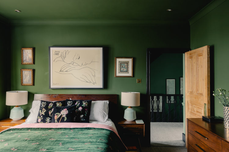
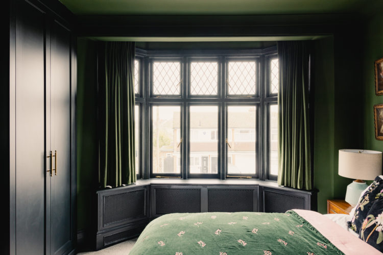
A similar route has been taken in this bedroom even though the ceiling is flat. It’s cosy and cocooning and perfect for a bedroom – assuming it’s a colour you like. You can, of course, do the same in shades of blue and even pink. You can contrast the ceiling with a soft pink (think of the kitchen downstairs) or use the same colour as the walls but several shades paler. The point being that there are lots of stunning options that don’t involve reaching for the white paint. Note the dark painted window frames too – white would be too much of a jarring contrast in this room.
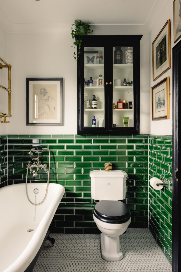
Finally, the white paint in force. In the bathroom along with more of this house’s signature green, here in tiles. It’s a small room, it’s a bathroom, there’s already lots of white in the “furniture” and this is the one room where you might want things to be a light as they possibly can be. There is a window so the white can do its job and the overall effect is clean and fresh with a vintage feel that’s not too bathroomy, which, in an old house, always works well as an overall style as it’s not too much of a contrast with the period features elsewhere.
So there you have it. That felt like a lot – I hope it was useful A reminder of that code once again should you wish MOTHERSDAY15 at Create Academy.


The best blog with beautiful house and the house decoration and the organizing looks really great. The flooring also looks very nice. Nisarga Builders a are dedicated to designing, developing and constructing the finest homes in the Bangalore
I feel like the killjoy in the room but it just looks like a gastropub to me.. eek.
I’d be amazed if the new owners kept this colour scheme. Let’s face it this interior could have been so much better, especially the kitchen. Should ‘style writers’ be working with estate agents?
I’m not quite sure what you mean apart from this decor probably isn’t for you.
Love the look, sophistication, and coziness of deep and rich colored walls. However ,in my experience, limited doses are best, especially if your space is ‘natural light’ challenged! Dark walls (and other surfaces) suck up light like a vaping, goth, teenager. Ask me how I know.
Thought by now I might be getting tired of the dark colours but Nope!
Green works particularly well in my opinion – mother nature is timeless.
Thanks for lovely post
I came across a copy of Conran’s Plain, Simple, Useful interiors book in a charity shop last week and have been dipping in. I must say it is a blast of fresh, airy yet restful elegance after these very heavy and busy ‘saturated’ interiors that have become so popular. I might enjoy this interior for a weekend in a hotel, but couldn’t live in it. Waaay too much!
This is such a beautiful house – I love everything they’ve done with it. Euromillions tonight – keep your fingers crossed for me!
What a hugely appealing house!
I find it interesting that ‘colour drenching’ is being seen as a current trend – I think many 18th and early 19th century interiors would have been decorated in tonal colours, and that the idea of painting all woodwork white is much more recent. On a practical note, painting everything the same colour is significantly less faff, too, as you don’t need to worry about keeping crisp lines between different colours!
I love that blue bedroom with the dark starry wallpaper on the ceiling! Exactly the sort of thing that will work in my son’s new bedroom. Thanks for the inspiration!
I LOVE this house, though I say this as someone who has painted 4 rooms of their house dark green since moving in a year ago! The first was our bedroom in Harley Green by Little Greene and though the room isn’t finished I love it so much. It’s like a lovely dark cave to sleep in and feels so nice and cosy. On a practical level too having it dark makes napping during the day much easier.
This tour felt like going on a little holiday – likely because I read it in the park surrounfed by massive trees and holding a cup of amazing coffee, but you have provided the accommodation. And for that I thank you.
Inigo have the best houses! It’s my go-to site to peruse when I’m feeling a bit down. This one is fabulous, especially that kitchen! Another house where I would move in and not change a thing. Thank you for starting my Friday cheery.