This will be a polariser I’m sure but for many of you in the industry this will be instantly recognisable as a location house which has provided the setting for many fashion and lifestyle shoots. It is even rumoured to be the house that inspired Abigail Ahern on her own journey to the dark side.
It’s a four bedroom house in Hackney, east London, on the market with Aucoot for £1,850,000 designed by Jo, a fashion stylist, (I couldn’t get her page to link at the time of writing but it’s JoAtkinsHughes.com) and Graham-Atkins Hughes, a photographer and known as Location 78. I suspect it might be one of those houses that sells on the basis of its looks and is then redecorated. We once sold a house, apparently, on the strength of the bathroom decor and the sitting room fireplace we had installed and neighbours told us six months later they were the first things to be ripped out!
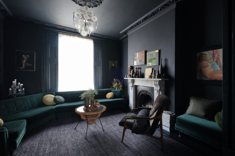
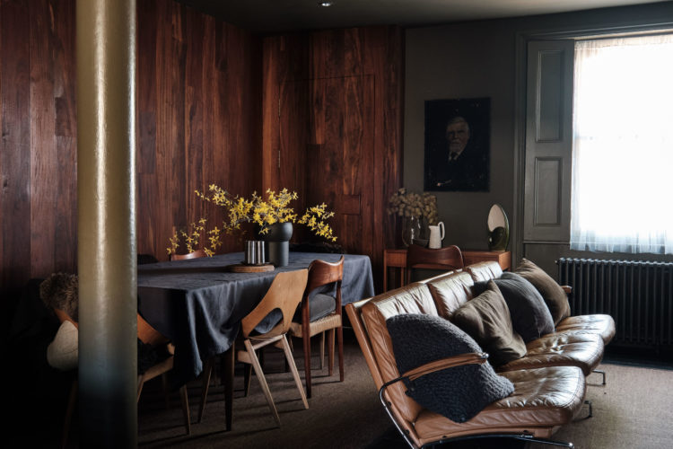
So yes it’s dark there’s no getting around that. It’s inky and moody but it’s also spacious and flexible in layout as it’s largely open plan on the ground floor. The classic Victorian layout, which is prone to small rooms, has been opened up and a more modern layout created. The owners have married Victorian character with colours that are earthy and warm and a mid-century influence can be seen especially in the solid hardwood panelling, bespoke teak joinery and the custom built-in storage throughout.

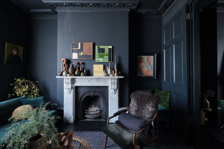
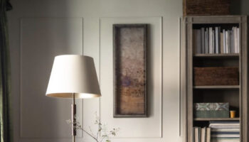
The point of a scheme like this, however, is that you have got to go all in. It’s woodwork and ceilings and floors as well. But look at the tricks used to bounce the light around. The pendant lamp is white and will reflect and catch the light. The fireplace is marble. There is a coffee table with a glass top.
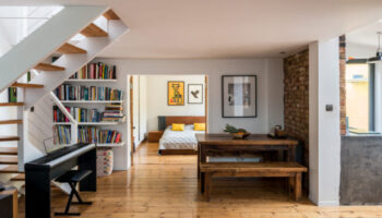
Here’s that panelling that was mentioned earlier and just look at those dining chairs…. Again you can see the light bouncing off the leather bench and the pillar. And by the way, if you are wanting to go dark but worried about sucking light out of the room then try a gloss paint. This works particularly well on ceilings – although it will, of course, show up any lumps and bumps in your plasterwork. But dark matt walls and a matching gloss ceiling can look amazing.
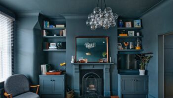
This is also the house of texture too – look at that stone wall, the wooden panelling and the paint not to mention the leather chairs and velvet cushions. If your colour palette tends towards the monochrome (remembering monochrome is single colour of any colour not just referring to black and white) then add in as many different textiles and textures as you can. They are a vital, if often overlooked, part of the interior design scheme.
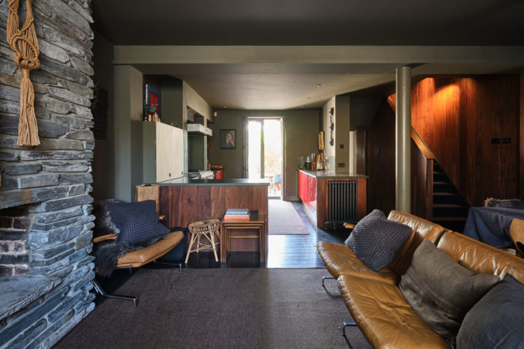
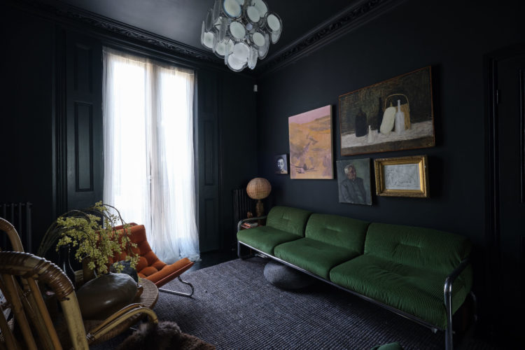
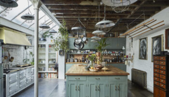
And then you can always throw in a bit of a disrupter colour like the red glossy kitchen cabinets above or the orange carpet below which looks so lovely against the navy blue.
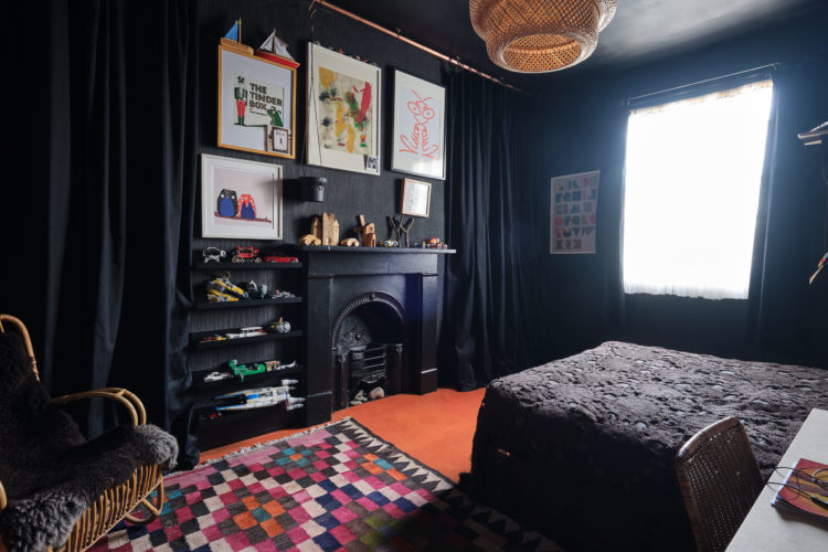
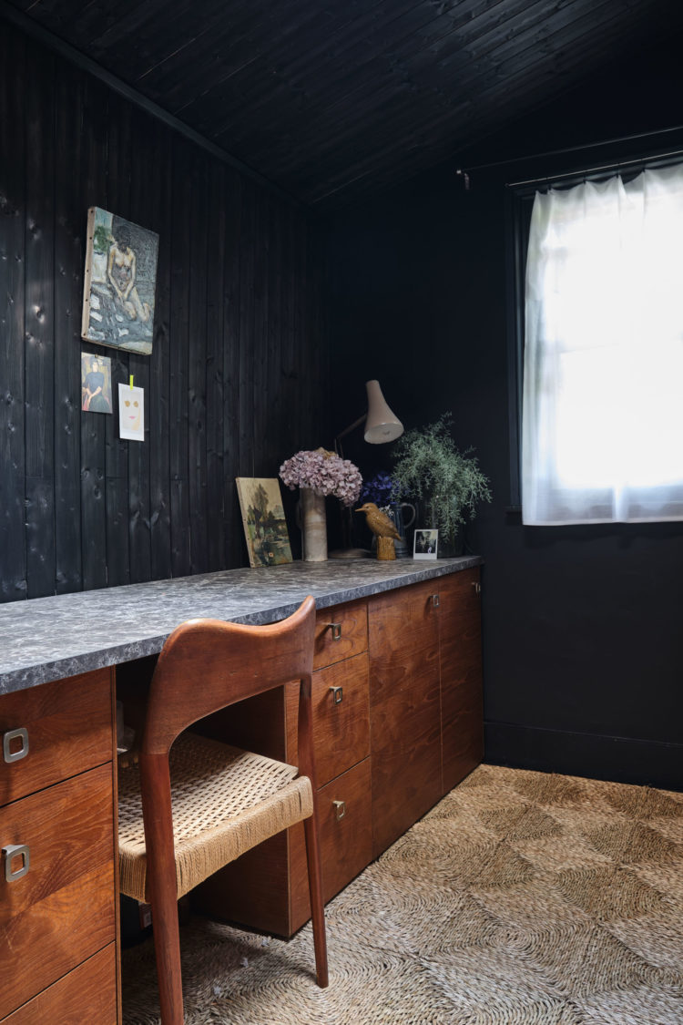
And I’m very keen on this room below which is all clad in black tongue and groove (more texture) with the long worktop and sisal flooring. Yes it’s dark but you want to touch every surface and that brings so much more to scheme than flat walls and floorboards.
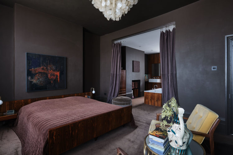
Finally, this open plan bedroom suite with heavy curtains to pull across for privacy (and perhaps noise deadening?). Here the colours are earthier with the pink bedspread which tones with the wooden bedhead and bath panelling but the yellow velvet chair brings the light.
What do you think? I’m guessing it’s a love or a loathe with no middle ground this week?
All images kindly provided courtesy of Aucoot

Each to his own, but what bothers me more is that people sleeping on the second floor have to go all the way down to the basement – three floors down – for a shower, in what looks on the plan like a really mean little shower room.
Feels so claustrophobic- I even did an involuntary shudder! I despise dark used without a careful and thoughtful eye. I once saw a blogger painting her workspace blue/black but explain that she had to work with the lights on. Seriously? Each to there own obviously, but constricting daylight is very obviously not a good thing.
YES! YES! YEEEEEESSSSS!
Lol, sounds like I am having an itimate moment in front of all of you!
I am partial to dark rooms and I love the mix of textures and the furnishing choices…also, the drama! That white chandelier popping like a zit of rainbows!
So, in short: si!
Love it!
My goodness. This is the house of doom. Such beautiful features wasted in black. Its a loathe from me. Dark interiors can work so well in period properties but this is all wrong for me. I feel depressed looking at it.
I love it – sort of – certainly the bold use of colour. I am drawn to dark rich colours and the mixture of textures was interesting too. Even if there are certain elements less to your taste the point is to demonstrate how useful and overlooked texture in a room can be. I think this style certainly would work in particular buildings, especially where the size / layout / light were perhaps less than they should be, such boldness brings a surprise element. An outside space would be my essential so that I could have daylight if not sunshine on tap .I would relish the sharp contrast between inside and out so give me this rather than beige or magnolia any day – its only paint folks!
These photos appear to have been shot in natural light. I once painted a room navy blue and know it would have looked like a pit if shot this way. I suspect you would actually have to visit this house to determine if it were gloomy or like living wrapped in velvet – two very different effects.
One aspect I find really faddy is the tongue and groove. Shiplap is the equivalent in the USA, a fad popularized by television makeover personalities. My guess is these finishes will get old very quickly if you have to look at them every day.
I totally love it!! I have a few rooms painted black in my house-floors, walls and ceilings and on a wet day like today, they are so cosy and inviting. I would love to just move right on in.
WOW! I am sort of amazed that no one loves it. I wouldn’t ‘t want it for myself, but I find it incredibly fascinating. Thank you for sharing!
I’m in Scotland where it is cool and rainy and kind of depressing today. I wonder whether my reactions would have been different if Kate had posted this last week when we were baking in a heatwave?
Wow! No lovers of this house yet! How interesting. Thanks Kate for providing such a thought provoking house on your always terrific blog!
Nope Kate. Too much darkness in every room. Not sure I like the actual house tho… that’s part of it. Still…. keep these coming… helps people to see what really dark rooms look like!!
I would find such darkeness depressing (especially in EVERY room – no relief anywhere). More importantly, getting my personal preferences out of the way, I believe the monochrome look is ‘off’ here – the colours are not harmonious enough to be monochrome in most of the photos (maybe it looks different IRL? – but as the husband is a photographer then that’s on him ?) The result is a bit of a mash-mash. If you have wood (or stone) that you’re not going to stain/paint then you need to study the underlying colours in the wood (or stone) to create a cohesive look. … the large en-suite bedroom scheme has taken no account of the tones of the wood which clearly is intended to be key to the look … the study is a study of two halves – the drawers & chair sing with the floor and the marble top sings with the walls and ceiling, but together lose something of the magic. The living room works. The orange-carpeted bedroom works. Makes it look like two different homes ??
NO, NO NO NO NO!!
Far too dark and depressing, confusion of styles, any one element could look good somewhere else (except that stone wall!!), but not all together.
To me dark walls and ceilings look like cheap cover-ups, remind me of student flats and teenage angst.
Talking of people buying houses and changing things, I once spent the best part of three years restoring a wood-block floor – hands and knees, painstaking scraping-off of dirt, rubbing-down, polishing, all by hand.
First thing new buyers did was have fitted carpet.
It’s a loathe from me too! Apart from the seagrass matting. My own house has just gone on the market this morning and I nervously looked at it just before I read your article. Mine is the polar opposite, so not surprising I don’t like this one. But life would be v uninteresting if we all chose the same things and thank goodness most of us who read this are fortunate enough to have a choice.
I love Abigail Ahearn’s home with all those textures and dark colours, however really not feeling this house. I think I would spend the whole time either squinting or switching lights on during the day – how on earth do they read a book!. The photos are really bad (or maybe its just on screen?). Abigail’s house seems to be filled with light which is the difference
It’s a loathe from me too. I’d find it too depressing. I’d be the one to move in and redecorate everywhere straight away although strangely I do quite like the red kitchen units!
Love reading your blog everyday and Friday is one of my favourite reads.
I had to walk away, my reaction was so over the top! I think it’s the incoherence of it all that gets me – net curtains and a stone clad fireplace which to me looks more Coronation St than anything else, mid century rancher cabin look, elegant victorian drawing room, and drapes all over the place. I can’t make head nor tail of what they were thinking. I suppose that’s the fun of all this!
One good point — for me, nostalgia for the sisal matting! When I was a student lodging with a Danish architect’s family(and they had charcoal walls in the entrance hall) the wife used to water the sisal matting every so often to bring out the jungley scent!
Agree with Catherine – the one photo I liked in the sales particulars was the final one of the garden looking back towards the house! By which time, I found that my heart was racing; I’ve never experienced such a visceral reaction to photos of interiors! So a definite loathe from me, think I’d suffer depression from November to March..
Gosh I feel really claustrophobic looking at the pictures. I’m sure it’s all done beautifully but absolutely not for me.
Very interesting! I love elements And individual rooms of this – inky blues and green, splashes of orange, gorgeous textures. But en masse I find it oppressive and depressing- writing this as the rain pours down! Looking through the sales info, every time they showed a photo of the garden, I felt relief. Now I think that really is telling me something important about my reaction to the house!
Yep, certainly a ‘loathe’ from me. I used to like the dark look when I first started seeing it, but I think it was just that I liked the novelty. I even considered painting my living room dark, and had tester splotches over the walls for ages, and I’m so glad I didn’t. I absolutely hate dark rooms or overcast days, they make me feel so down. No idea what I was thinking. I’d feel a bit like I was peering through the gloom to try to see the details of the room, which isn’t relaxing at all. And the toe stubs. Ouch.
Kate, you hit the nail on the head with your last sentence, I really dislike all of them, just too dark, more depressive than moody, a bedroom in those colours I may certainly learn to like, but not the lounge. The house I now call home was all magnolia when I moved in and I thought that was bad. Clearly not. Great blog , it’s one email that always gets read.
Oh my goodness, you are so right about this house! Whilst I can appreciate it….I’m NOT mad about this house this morning! But maybe it’s like a wine; how it tastes can vary depending on your mood at the time! Today it’s pretty grey looking out of the window and I need light energy!