It was a tricky choice this week – between the incredible folly conversion extension which was lovely to look at and the house that might give you some proper tips and ideas for your own spaces. The latter won out. This week.
So it’s a three bedroom Victorian terrace in Bath that is on the market for £750,000 via The Modern House and it’s a good way to see what happens when you take the walls down. Victorian houses are often so long and narrow – this one is 17ft wide which is the same as mine (my last one was 15ft wide including the hall) and the rooms can be small and dark so there is a desire to open it all up.
But beware of opening the whole thing. It’s fine when children are small as you want to see them but then there is a window when they won’t go to bed and you can’t watch the news and are still tripping over Lego till all hours. Then the window closes and they go back to their bedrooms again.
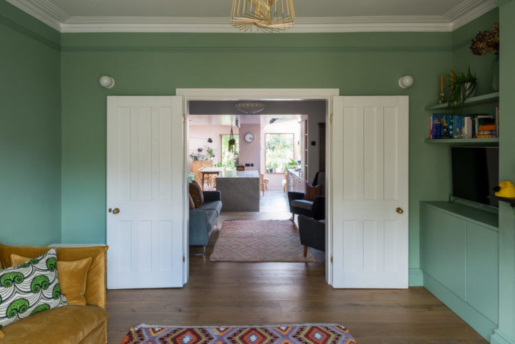
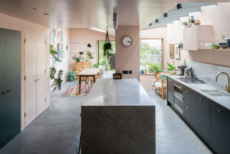
So the key is to take down the walls but add some doors. This shot above gives you an idea of how that can work. The hall wall remains partially intact so there is a sitting room at the front with doors creating a self-contained space. The rest is open and means there is more light from the front door as the stairs are incorporated in the room while the steps create a broken plan feel and help to zone the space into different areas.
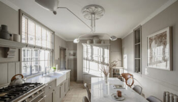
Here is a view from the front to the back allowing as much light to flow through the space as possible (yes the doors I know. – I’ll get to those in a minute). The middle room, and we all have them in Victorian houses, is often dark as there are no windows. Here it functions as an extra sitting room. Perhaps a space for smalls to play in view of parents or an evening room as it’s dark anyway so you might as well be in here in the evening.
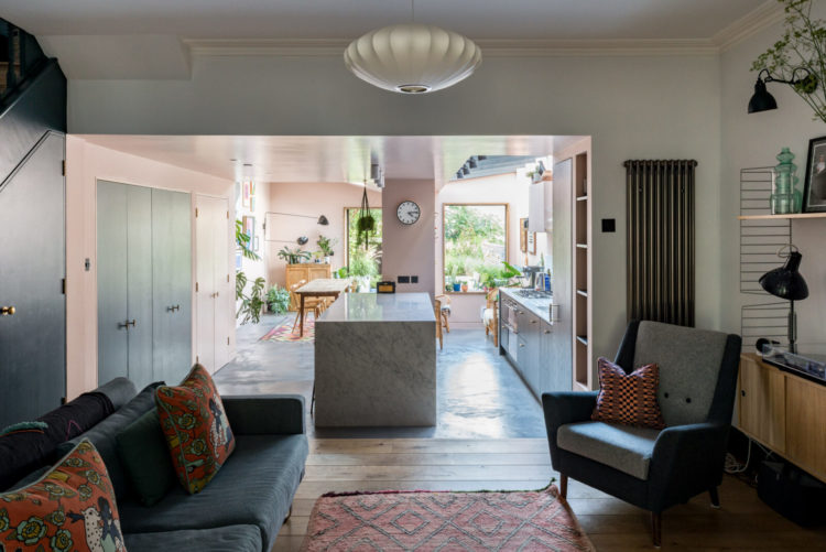
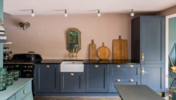
Another option, which is gradually being adopted, is to put the kitchen in here – by which I mean the actual cooking part and then you have a lovely large light dining and relaxing space at the back which they have created to a degree. You could also then use the front sitting room as a home office – that has got to be a real consideration now as I think just perching on a corner of the kitchen table isn’t going to cut it any more.
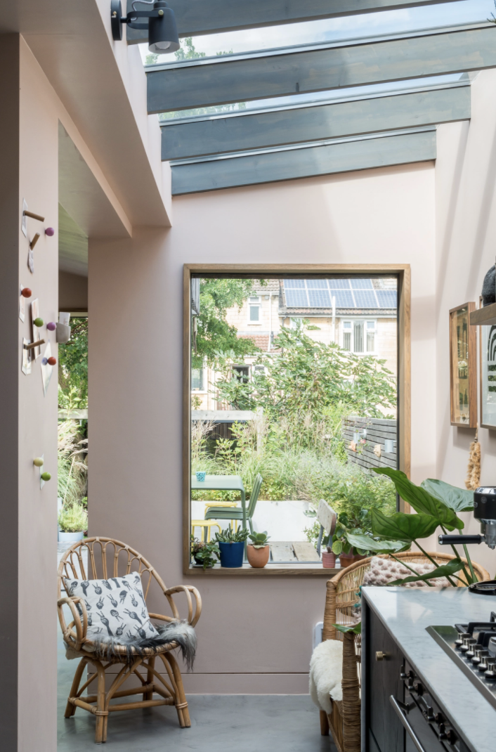
You can see how they have made a sitting area at the back at the end of the kitchen and that picture window is a lovely place to sit. So the owners have three seating options front, middle and this small one at the back. Another option – and it’s all about how you live, would be a front room and a large seating place at the back with the kitchen area in the dark spot in the middle – with an island which would work in winter when you need the lights on a breakfast anyway. There is no right and wrong it’s just about thinking through the different ways and not assuming the original floorplan is the best. The Victorians didn’t live like 21st century families after all.
Now about those doors above…. Of course I’m going to say they shouldn’t be white but they don’t have to be green to match the walls either. That is one way but, given that this is such an open plan house, they could be painted in the same soft pink as the kitchen which would like the space and, particularly when the doors were closed, the pink would face out into the pink end of the house. So you could do them green one side and pink the other…. just a thought. Also since the kitchen has a pink ceiling you could do this room pink too as a further link between the front and back of the house. Again, just thoughts to ponder….
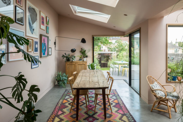
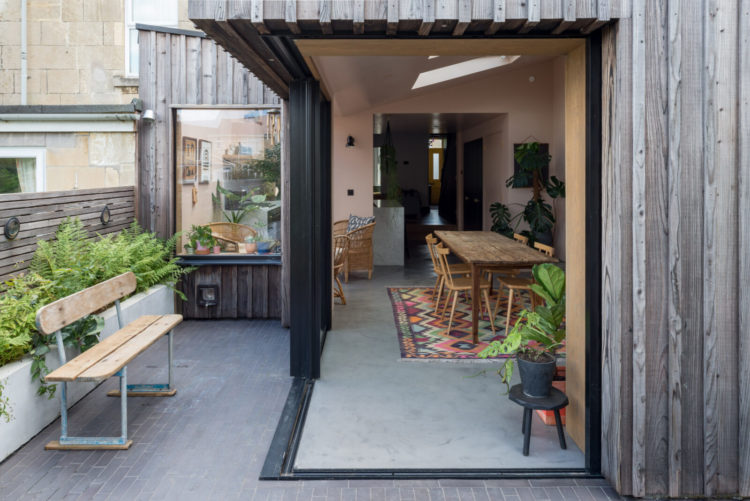
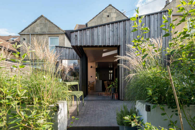
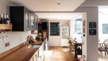
Another issue that is common in these houses is the shape of the extension. Many councils won’t allow a full width extension that runs all along the back and it’s usuall to do with the right to light of the neighbours – although the rules do change, and seem to have done three times in the 10 years we have lived here. However, this means you can end up with a sort of dog leg or long thin room – as they have here. But you can see that the full length glass doors on the corner and the picture window mean the space is still light and bright and, in this case, means they have a dining area and a another seating area so it’s all zoned quite well. And you can see below how they have cantilevered the extension so the roof appears to float when the doors are open which also makes it properly part of the garden too.
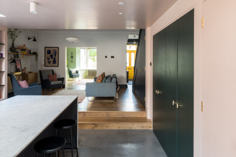
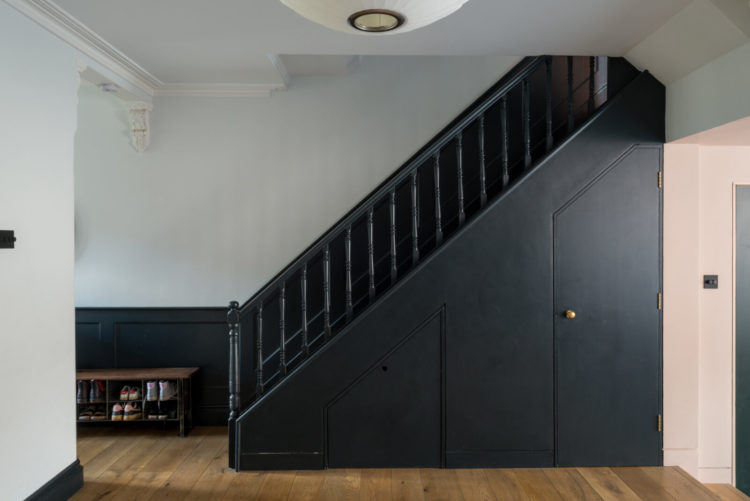
Coming back inside and this hall works really well. As it’s part of the living area it needs to be uncluttered and the dark paint from the half-painted wall, up the stairs with the bannister and understairs cupboards all matching works to clean up this space, which might otherwise be quite disjointed and messy on the eye.
If your staircase is open plan this is a good template to follow – it doesn’t have to be dark but imagine if the bannisters were a more traditional white against the dark or the skirting boards in white led your eye up the stairs. This is a great example of how a really solid block of colour can be a really good solution to a busy space.https://www.themodernhouse.com/wp-content/uploads/2020/09/EASTBOURNE-AVE-_-BATH-_-TMH.pdf
Do check out the rest of the house via the link at the top and here’s the floorplan if you live in a similar house or have ever pondered taking out the hall wall to create more space and add light.
Love this! Mine is a similar size, but with smaller kitchen that we are currently adding. Love the middle room ideas and we are DEFINITELY putting double doors into the living room at the front so we can shut ourselves away from the kids 😉
We have no hall walls, in fact no corridors at all. I’m pretty used to it and like the extra space we get in each room because of it. Really inspired by the use of paint on the stairs as ours are open to the living room.
Interesting, I have all the same problems with my house, particularly the dark middle room which in my case is a study. But the extension is so ugly. All the ones I’ve seen look like monstrosities on the back of Victorian houses.
This is really helpful Kate, so many practical ideas. Just curious, do you have any thoughts on whether it would be possible to squeeze a downstairs toilet into this layout, and if so, where?
If you check article on The Modern House website there is a PDF floor plan for this house and it shows where they’ve added a downstairs toilet (under the stairs)
Intriguing as always. Thank you.
I like this house a lot. It is well thought out and looks very livable. I especially like the glass wall in the extension.
Hi Kate
What a lovely house! Even though it’s Victorian is given me lots of ideas for our 1950s house, similar colours etc. Thank you!
Love this! Sadly I dont have a spare £750! 🙁
So beautiful, thank you for sharing it.
This is so interesting as so many of us have or do live in the classic Victorian house. So beautifully done