Deep diving into a properly colour saturated space this week and hopefully giving you a chance to see how this all enveloping colour soaking might work in your own homes. This is a two bedroom flat in Tottenham, north London, that is on the market with Brickworks for £500,000.
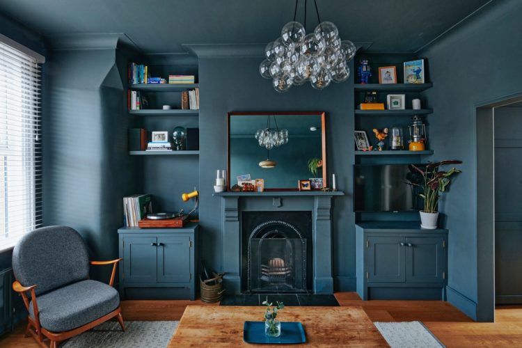
It’s worth having a really good look at this room as it’s so dramatic, but also I wonder if the owners had a wobble when they were doing it. This is a look that you need to commit to. And, I hope you can also see, that while it’s obvious the impact would have been lessened with a white ceiling and woodwork, it would also have looked more traditional rather modern and well, perhaps a little bit dull.
The moral of the paragraph being – if you decide on something bold it’s perfectly normal to wobble halfway through but keep a grip on the reasons why you thought it would be a good idea and carry on. And if it does turn out to be wrong – well it’s paint. You can redo it. And you could do the woodwork and ceiling in a different colour that isn’t white – pale pink, emerald green, gold or silver – the last two being metallic which will also bounce light around
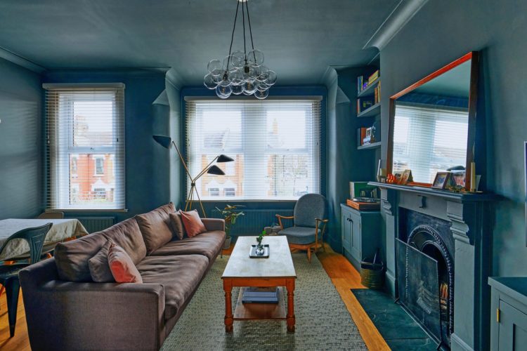
Now this room has two windows – one of which is very big – and note also how the mirror on the mantelpiece grabs the light and throws it back out into the room. The glass pendant light will also do that to a degree and there is an opening to the kitchen, which also has a window so the light can flow from front to back of the building unimpeded by walls and doors. All that helps.
And don’t forget the owners have also got a matching chair and a dark sofa, if you wanted to recreated this look – and it’s a particularly lovely shade of blue – then you could have lighter furniture.
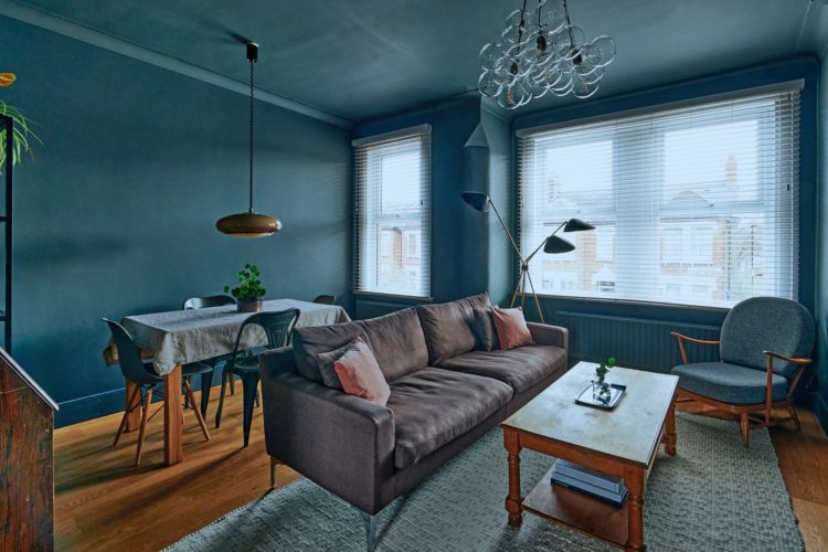
One more detail before we leave this room and that’s the pendant light over the table. It’s good and low which works brilliantly over a table and moreover, since this is an open plan space, having just this light on will create an intimate space while the rest of the room is in shadow. Actually another thing – there are two pendant lights in this room and that’s ok because they are in different zones, at different heights doing different jobs.
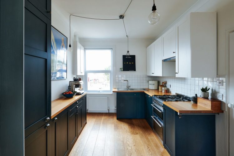
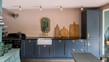
Now you can see from the kitchen to that sitting area and back into the kitchen. The rooms are linked as there is no door but the colours follow through perfectly. The navy blue kitchen cabinets keep the thread to the sitting room but the white walls (too high contrast for a relaxing sitting room but perfect for a busy working kitchen) make it light and fresh.
And take a look at the lighting. I have spoken about this before but it can be hard to find pictures. If you have a central ceiling rose that isn’t directing light to where it needs to be then replace it with a multi outlet and drape long flexes from there to wherever you need the light to tall – just stick a cup hook or special hook in the ceiling. Here the owners have avoided using spot lights by directing their pendant lights to where they want them to be like this.
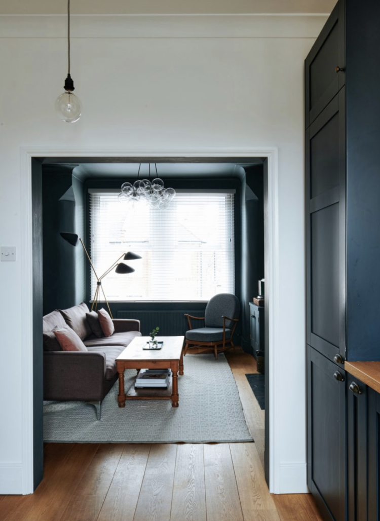
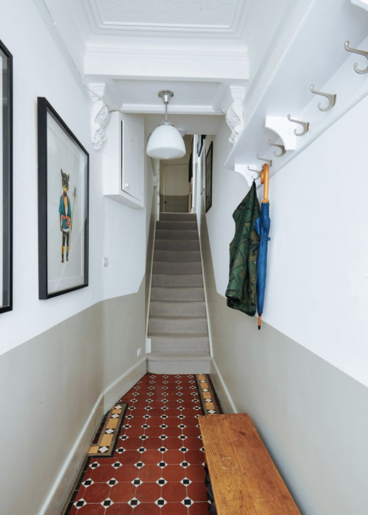
Let’s just stop for a moment in the hall before we go up to have a look at the bedrooms (of which there are two and two bathrooms) and the first point is that you can see how the space has been divided up to create this flat as the original tiles are still there peeping out from under.
That aside the half-painted wall, which is so practical in a hall as it is constantly scuffed by bikes, and pets and shoes and coats and, well all manner of stuff – life basically. It’s clearly a narrow hall as you can tell by the stairs filling the whole width but look how the walls and matching carpet take the eye up and away from the narrowness.
If you don’t want to use two contrasting colours then try painting the lower half in gloss – hardwearing and wipe clean – and the top in matt but the same colour. This is both practical and gives a really modern feel.
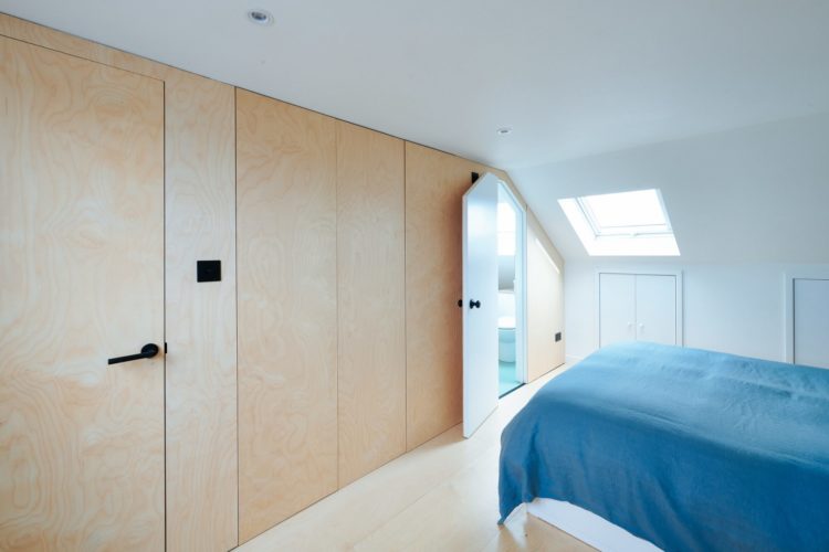
To the bedrooms and note first how this wall of cupboards opens to reveal a little bathroom. That’s a really good idea to make a smaller space feel more streamlined. The handless wardrobe doors add to that smooth effect making it look more like a wall. Imagine how much busier it would look with panelling and handles on each door.
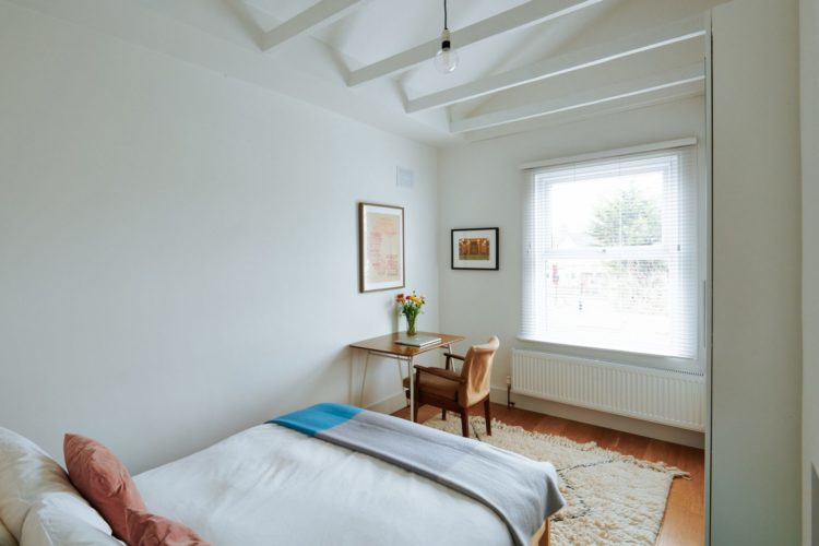
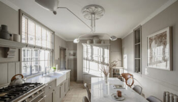
This room has a little desk area by the window which is what many of us have to do to carve out a working space at home. The two pictures zone it as there isn’t room for a screen. But also look at the ceiling which has been removed but the beams left in place to create a vaulted effect. This can be a good counterbalance to a small room or a room that you want to make feel bigger.
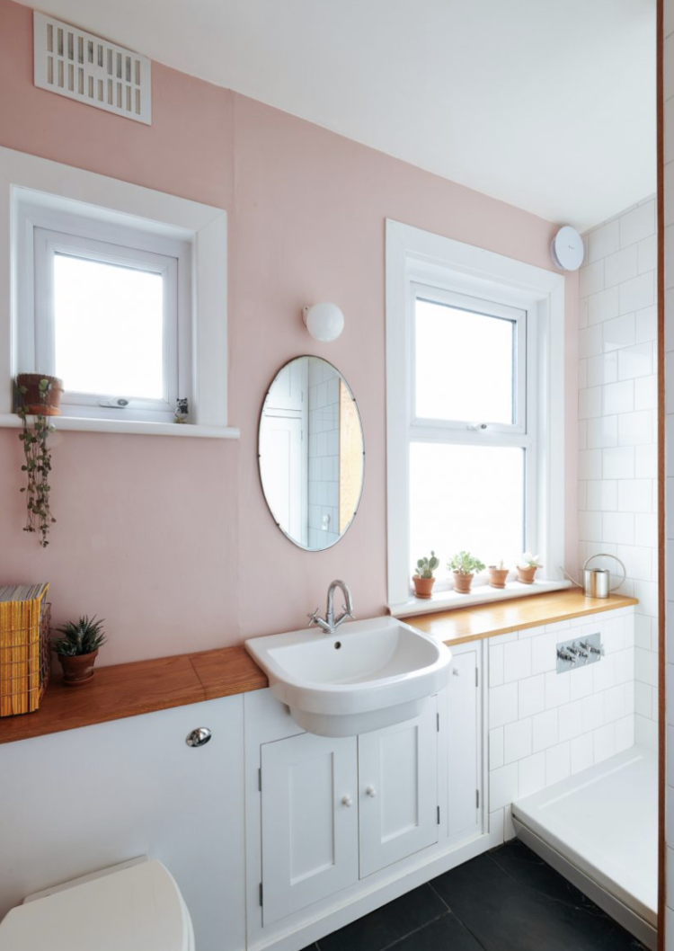
Finally. the bathroom on the first floor. It’s a pretty tight space – 8’6″ by 6’6″ although it has two windows so I imagine it was once a separate bathroom and loo which is pretty common in Victorian houses and it’s pretty common to knock them into one larger space too. There’s also a large cupboard in this room which I suspect might hold a water tank thus further restricting the space. So the owners have decided to dump the bath and fit the biggest shower they can – often a good idea if you aren’t a bath person. The next owner can always reinstall if they wish.
But look how they have continued the shelf along under the window and put the shower controls there too. Much better to have them there so you can turn the shower on to warm up without having to get in and stand under an icy blast for the first few minutes (although topically that is said to boost immunity so… ). As for the splashing, well there are equations about splash zones and the like but that shelf looks well varnished and it looks like a UPVC window so I suspect the splashing is minimal and the precautions have been taken to protect the surfaces. But if you have a similarly sized or shaped bathroom then take a look at the floorplan of this one and see if it might help you. We did a similar thing with our tiny bathroom – took out the bath and put in a big shower. That will always feel more luxury and more hotel than a tiny bath with a shower over and one of those aggressive curtains that stick to you and threaten to come down off the ceiling.
Now have a lovely weekend all and many many thanks to anyone who has bought the book. I really hope you will like it and if any of you want to leave a review that is also massively helpful too.

I am so in love with this colour!
This living room looks so dramatic with this dark, moody colour on all walls and carried onto the cupboards, shelves and mantelpiece. It looks so very modern. I LOVE it.
Enjoy your weekend,
Renaud
http://blogbyrenaud.wordpress.com/
Love the deep colour – great space right up my street. I could live with this a very long time .
An aggressive shower curtain….now, that made me chuckle this morning 🙂
I’m stealing the idea of extending the wardrobe doors to be the bathroom door as that looks great but not the multi-pendant kitchen light as that makes me think of a giant spider.
Thanks Kate. Amazon tells me your book is due to arrive on Monday. Can’t wait!