A big house this week but one that is filled with colour ideas and is also one of the most distinctive properties in the area of East London in which it lies. This detached building is on the market with The Modern House for £1,795,000 and has four bedrooms.
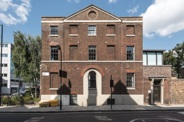
It was built in the late 18th century and is Grade II listed in recognition of its interesting architectural details including that arched ground floor window surrounded by stucco and the stone cornicing. What the listing doesn’t say is whether the missing windows were bricked up and if so why. Given they aren’t symmetrical one can only assume they were but who knows why.
Anyway, we’re more about the inside than the outside here so let’s go in….
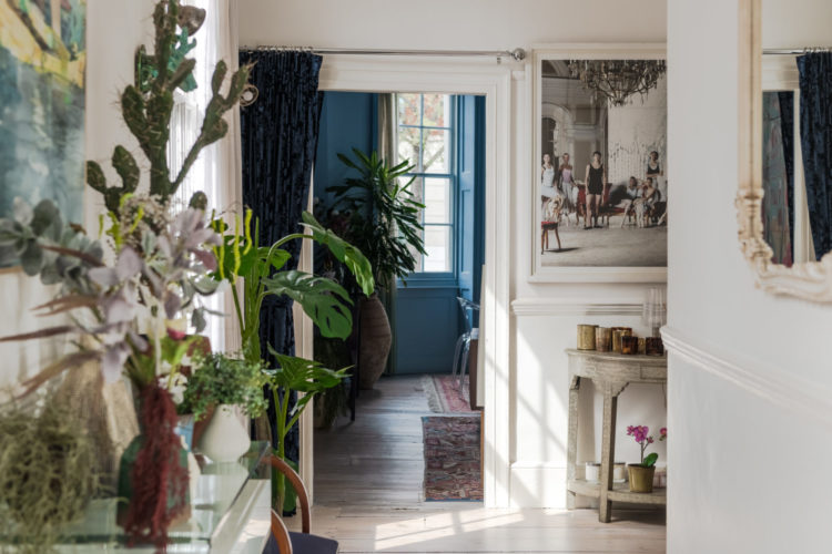
And you come into this white plant-filled hall with the large bay window sitting/dining room off to the left as you can see from the picture above. Now one thing to note is that this house has a slightly strange lay out as you come in on one side and turn left to the accommodation and right to the garden which is street side and is the same width as the house. Prospective buyers need to check what’s behind the building and how close it is.

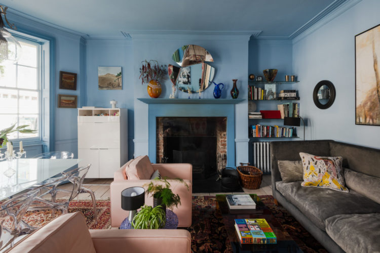
Then you come into this wonderful room with its large bay window making space for a dining area and the sitting space behind. I’m just going to nod to the details – the woodwork and ceiling all match the walls and the fireplace surround in a deeper shade of the same colour. You could also have done the woodwork to match the fireplace in more of a colour blocking scheme. Either way: no white paint.
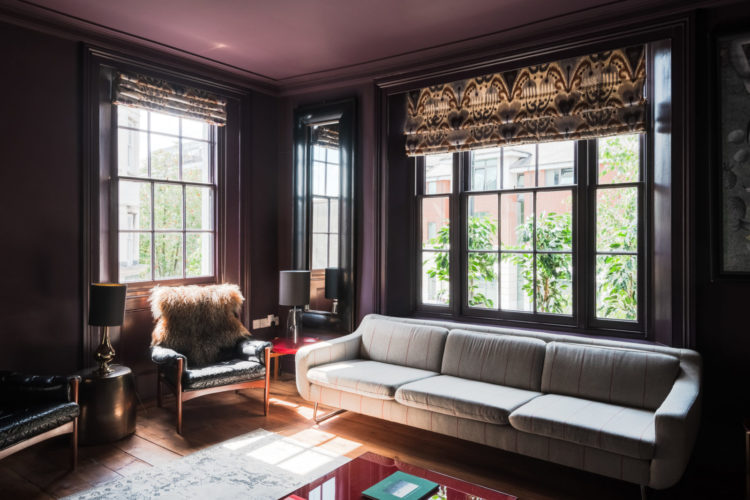
Not much in here either where the same trick has been used in a deep plum colour. This is an upstairs reception room with windows on two sides, which give more light but also has the air of an evening telly room rather than the one downstairs with the dining table which looks more conversational.
There is a school of thought that if you have a light room why paint it dark but I would say consider first what you plan to be doing in there. There is something rather lovely about having the space for an upstairs sitting room and it being a sort of stopping point on the way to bed.
A sort of – let’s lock up downstairs and wander upstairs with a last glass of wine to watch the headlines before we turn in sort of room. Or to watch a film on a cosy weekend night in. If you have a spare room (literally) that doesn’t get used much then this is a great use of that space. You could put a sofa bed in it after all.
This is one of the bedrooms and in complete contrast to the plum room above this is light and airy. Again – no white paint though. The woodwork and ceiling is a pale minty green – this colour is coming people so get ready. It’s a bit Tranquil Dawn from earlier in the week and the wallpaper is very pretty and tonal.
But the decor is prevented from being too matchy and twee with the contrasting bold bed linen and the yellow curtain.
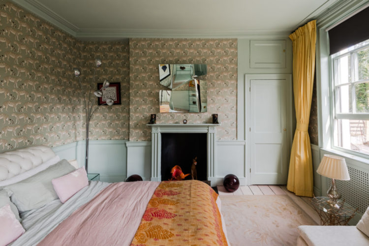
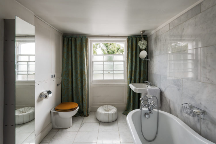
There is another bedroom the same size as this and a much smaller one next to the generous bathroom below. As I said you could use the plum room as a bedroom if you wanted three larger ones and the small one could be a spare – you could just about squeeze a double in – or an office.
Interesting to see curtains in a bathroom. You don’t very often but they work to soften the marble clad walls and will definitely soften the acoustics a bit. I quite like it although part of me feels it’s wrong for reasons I can’t quite fathom. What do you think? The full length luxury of them helps and I do think it would be a bit stark with all that marble otherwise.
So we like? We don’t like? Who’s spending their fantasy lottery money on a house in east London this week?
Ambivalent about the house mostly but really hate the curtains in the bathroom. Would prefer a simple blind or shutters with plants, pictures to soften the room.
Loadsa potential in that house … i’d completely start again tho and throw all the furniture out!! Sorry 😳
I think the term “daylight robbery” was coined when a tax was imposed on the amount of windows people had and consequently were judged to be “robbing” daylight.
Love the house! The drapes in the bathroom are too much for me, personally. I would’ve gone with a valance or a soft Roman shade.
I thought the house was a design mess with great potential.
Those see through plastic chairs placed in the blue room for example. The thick curtains are definitely wrong in the bathroom. Shutters at those window would have been a good idea.
Depending where it is located this house is worth saving. Take a look at The Weavers House Chan and Eayrs to see how it could be done.
A beautiful house.
Love the plum room and could live with that for a long time but when it did finally need a change what a job to start again with a lighter shade. Still to me its the most sophisticated look and love the pattern on the blinds too. Like you Kate I’m definitely an autumn type.
Just about to say the same thing Galiya but I’ve never seen quite so many bricked up, they must have hit hard times!
In England and Wales Window tax was introduced in 1696 and was repealed in 1851, 156 years after first being introduced. To avoid the tax some houses from the period can be seen to have bricked-up window-spaces (ready to be glazed or reglazed at a later date).
Love the house!!
The windows were bricked to avoid paying the taxes imposed in the 18th c.on windows.