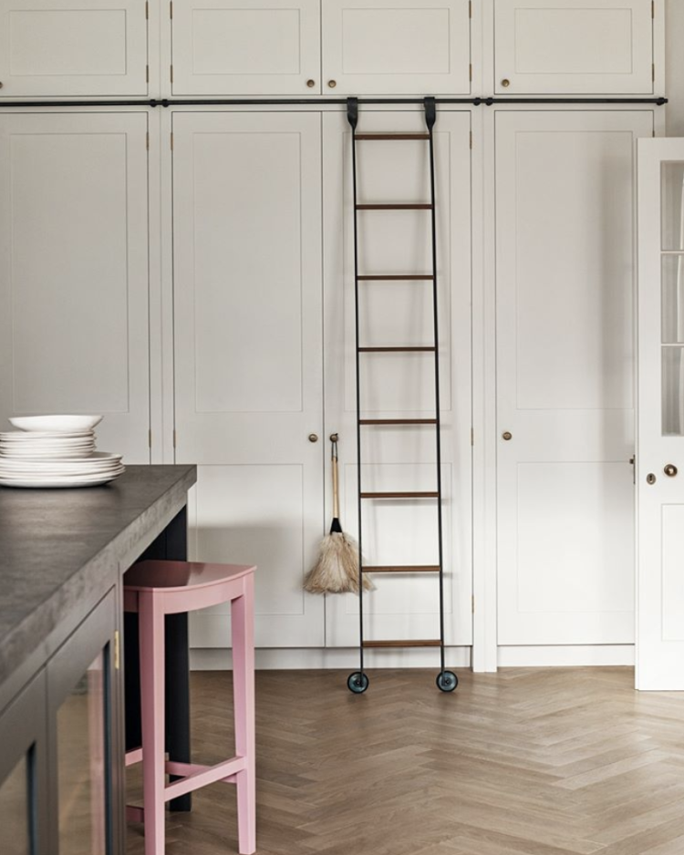
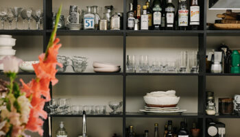
Morning to you and Happy Monday (or whatever time or day of the week you are reading this). I thought we’d start with this very jolly kitchen from Plain English which has been painted in the new colours created for them by Rita Konig. So that’s cupboards in Nicotine (yes strange name but lovely colour) with the island in Burnt Toast.
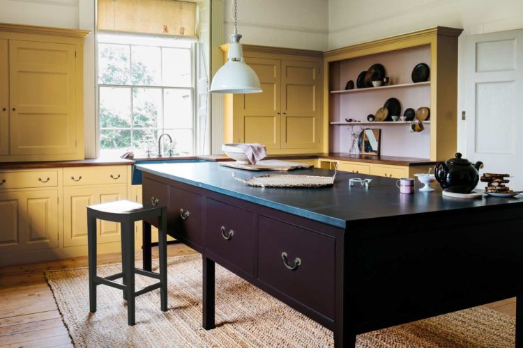
This is Rita’s third collection for them and it also includes this orange Medlar Jelly and Bib and Braces. I’m interested to know what you think because while, I’m sure, we can all agree that we are becoming bolder with colour, it tends to be on the walls that we are experimenting with brighter shades. In other words the large flat expanses that are relatively easy to cover over if you go off a colour.
While there are lots of inspirational pictures of coloured kitchens in magazines and on social media I would be interested in how many of you are actually choosing them for your own homes. Do let me know as Sophie and I are planning to look into this for a podcast recording (later this week) so please jump into the comments box and let me know where you stand on kitchens in all shades of the rainbow.
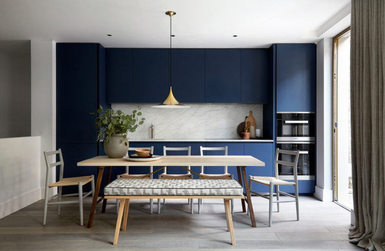
Blue is a more classic kitchen shade but even that feels bold compared with the all white choices we were making just a few years ago. That said, using a strong colour in an open plan space works really well as it not only zones it but also makes it look a bit less “kitcheny” which is another trend that is gathering pace.
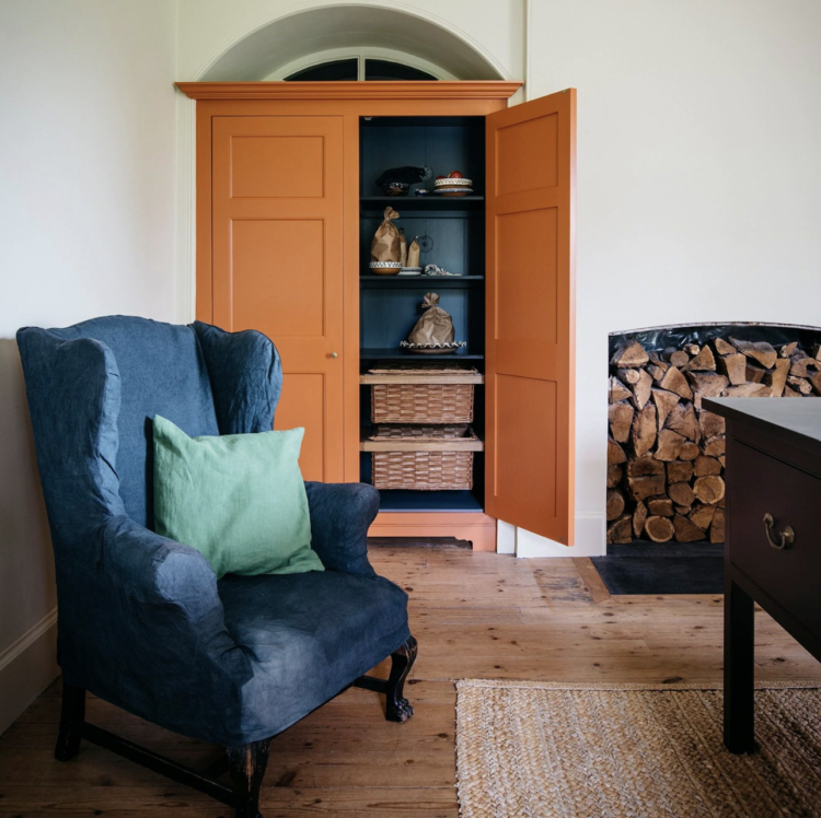
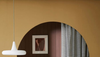
And then, of course, there’s the one that really decides to go for it and does the walls and the cupboards as well. Bizarrely this will probably make the space feel larger than it is as it will all blend in against the walls. Yes it will be darker in this colour but there is a large window and the white sink and marble worktop will bounce the light around. I love this picture but it would take a brave decorator to do it in their own house. Would you? Let me know your thoughts – what if it were yellow, or pale pink?
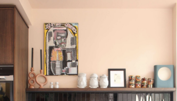
Interestingly, Rita Konig, who is known for her love of colour, says you need four colours in a kitchen; one for the island, one for the cabinets – upper and lower can be different and, she says, one for the stools – if you have them. Which is an interesting premise because I might not have thought of that and, more to the point, would probably have chosen natural wooden stools (as indeed I have in my kitchen) and then you see this below. And suddenly that classic, rather neutral kitchen (let’s ignore the ladder – we definitely can’t all have one of those) is transformed into something with style and personality.
All with a pot of paint. And don’t forget you can do this with a cheap wooden stool from Ikea so it’s an easy change to make. Again and again. Am serious wondering about moving my vintage stools (from ebay) to somewhere else in the house and buying something I can paint in a deeper shade of pink than the walls to sit next to the chocolate brown cupboards…. that’s a job for a rainy weekend for sure.
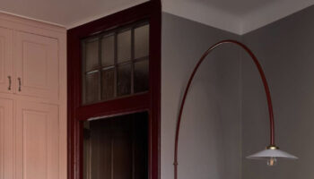
Moving on from kitchens to bedrooms (it’s definitely Monday for some of us). I have seen a few headboards like this and while you have to make them yourself (or commission someone) it does bring a sense of luxury to an otherwise plain bedroom. Bianca Hall has posted a tutorial for anyone who feels like having a go.
Her’s is a little different but take it as a base from which to customise. This one has a shelf for books as well as a couple of bedside tables in front but you could have the lamps on the shelf as well and keep it all more pared back and simple.
Another clever idea is this from Jane Day. These colours are gorgeous in her light-filled bedroom but look at the empty gilt picture frames on the wall. They provide decor in their own right and will also catch the light from the window opposite. You could, of course, add mirrors or even stick unframed postcards and picures inside to create an ever-changing gallery wall.
Finally, another affordable idea by Emilie Fournet Interiors. Emilie has been working on this Georgian house for two years and has finally finished it. This is the spare room and this wall is a great idea if you don’t have a bedhead – and often divan or storage beds don’t have bedheads.
Instead get yourself a role of frog tape to mask off the shapes you want to create and buy a base colour and a couple of tester pots or small pots of different colours and have fun. You can use as many cushions as you like to prop yourself up for reading and extra decor.

Nicotine and burnt toast; a fair summation of most of my student house mornings.
I’m just about to go for birch ply fronts (to a galley of Ikaa drawers) so will have those as the backdrop to a succession of deep, lush wall colours. Wood as a neutral, kinda like a camel coat over a wardrobe of jewel-like cashmere sweaters.
We recently had a black kitchen installed with a black granite worktop and a brass splashback and I couldn’t love it more! The room is a large kitchen/sitting room with a lot of natural light but we have painted the window frame black and added black and gold wall paper and I couldn’t love it more! Always difficult to explain but I am so glad I went with my gut instinct and went dark. It makes it look far less kitchen-y and more like furniture which is exactly what I wanted considering what the entire room is used for.
We have a huge painted built in shelving unit in the dining area of our kitchen (F&B breakfast room green) and we have tiled the back of the kitchen island in blue geometric (optik – Topps Tiles).
We are updating an inherited kitchen extension with white gloss and wood units, cream corian worktop. We also plan to paint Marine Blue geometric sections on the wood units, and have orange chairs partnered with a 1960s gplan dining table.
Too many colours? Walls are pale grey but we are thinking of repainting in pale cream as it’s north facing.
I don’t think I could order a colour called ‘Nicotine’, no matter how lovely. It’s always quite entertaining reading the names of colours and wondering what thought went into them and I think it does influence how you feel about them. ‘Elephant’s Breath’ is much more inspiring than plain old ‘grey’. But ‘Nicotine’ … would put me right off!
I’m in love with all of the beautiful colors in other people’s homes, but in my own, I stick with classic white for almost everything. (I’m prone to anxiety and panic attacks, so having a serene space with neutral colors is really important for me personally.) I do love using houseplants, artwork, cushions, throw blankets, etc. to add touches of life and color, changing them out as I like!
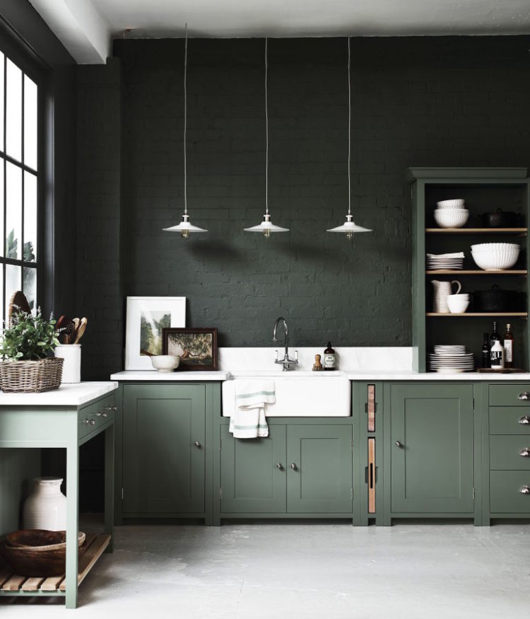
I can vouch for the use of a dark cabinet color in a small open kitchen. We have just completed our reno and went with a dark grey-green, similar to the picture above. A light countertop and tiled backsplash lifts it up from being too dark. The rest of our house is light colours so the green delineates the kitchen space beautifully.
The Rita Konig colours used in the Plain English photos look stunning in the space – but one needs space, height and light to ensure maximum effect and not look crowded. Could happily use one bold colour (or rather “non-kitchen” colour on a freestanding piece for example in a smaller room
The working/practical area of my kitchen is very dark so I have gone for mid sage green units and oak worktops, the dining end of the room is light and bright so I have just painted the legs of my dining table a deep charcoal grey – not sure about the dining chairs yet – a soft pink or a mixture of colours I think!
I’ve been colour brain washed by Sophie Robinson’s posts so we’ve gone for it in the kitchen! Teal Units (in Farrow and Ball Vardo) and, at one end, wrap around Pink Walls (in Paper and Paint Rhubard). There is some Taup (Paper and Paint Stone 1v) so that breaks it up. I still can’t believe the hubby agreed to it 😉. It’s definitely jolly !
This really got me thinking as I’m dying to re-do our kitchen. Growing up we had a burgundy kitchen, so I’ve never questioned dark units and can definitely see myself going for colour. Perhaps just on the island to make a statement as a compromise. However all these examples look amazing!
Great article, lots to take on board about how to feature colour in the kitchen and elsewhere in the home.
I would love to hear more not just about using colour in the kitchen but how to make it look less “kitcheny” as mentioned in the article. Most of the kitchens in the photos are bespoke and probably cost a fortune so how to do it on a smaller budget maybe?
Also how to think ahead and if I choose a strong colour for cabinets or walls, what are the tweaks possible down the line if I get tired with things? I am planning a kitchen in a very long open space, combining, living, dining and kitchen space and am very set on having a kitchen that doesn’t look like one so all tips on this aspect are very welcome!!
I am a Rita Konig fan but in her world budgets are fairly large! A new kitchen is an investment for most people and this will influence the choice of colour in my opinion.
The colour will surely also depend upon the room’s proportions and the quality of the light? Hence the spectacular green kitchen in a large and tall room.
IKEA units being inexpensive, can be spray painted by professionals at reasonable cost if you long for a Nicotine coloured kitchen, I do not.
There is no “one fits all” when it comes to kitchens but I do like the idea of the units and walls being the same colour if the size of the room can take it.
I have to stand up for white because it doesn’t get much support these days!! Although I love the new Rita Konig colors, I just know that I couldn’t bring myself to choose them for my kitchen. There is something about white that makes a kitchen seem clean and fresh and paired with grey, light or dark, it still does the trick for me. I have added light wood and greenery in the breakfast room and it provides a calm airy feeling at all hours of the day.
I was keen to have some colour in the kitchen, either blue or green but the husband wasn’t to be persuaded. So we have light grey but it’s a good neutral and we can always change the wall colour if we want to. I have sneaked some green in by painting a splashback around the sink and sealing it with varnish and we have patterned tiles behind the hob.
Number four works for me. The dark colour is prevented from being strident, gloomy or overwhelming because
– it is not wrap-around
– the surfaces it is used on are of contrasting textures (brick and wood)
– the brick colour recedes behind the white of the understated lamp cords and shades
– the mid band of white creates interesting, balanced shapes softened by the pale wood
– the ceiling is white but distant (high!)
– the floor colour is pale and soft
Lovely!
Thanks for the brilliant idea of painting wooden chairs for a colour pop in the kitchen. Perhaps this will end my 3 year quest for the perfect stool!
Our kitchen (cupboards, walls and ceiling) is Mulberry Red. It’s bold and dark, but helps blend the cupboards with the walls, and does make a small kitchen feel larger I feel. It wasn’t our dream kitchen, but it was fairly new and in good condition when we moved in, so opted to paint it in the meantime while we save and plan our dream kitchen. It certainly makes an impact.
The Rita Konig Plain English paint colours are gorgeous. They all work so well with my favourite – Burnt Toast (love it!). But would I be brave enough to use several strong colours on expensive kitchen units? Probably not, unless I was wealthy enough to pay someone else to repaint them every time I felt the need to change my teatowels!
Love the dark green kitchen.. unfortunately my kitchen is quite new so doesn’t need replacing! But I can do the coloured wooden stools – love this idea as I was wondering how to replace our current boring ones 🙂
I was once told by a kitchen designer that they (showrooms) put a red kitchen in the window to draw customers in off the street, but they only ever sell it in white or cream. It was back when Paolo Pininfarina launched a Ferrari red kitchen for Snaidero and I’m not surprised the red option didn’t sell but the idea that people liked the look, but couldn’t bring themselves to commit/live with it, fascinated me. It was back when dinosaurs roamed though, and things have definitely moved on towards a braver buyer (esp dark shades) but still no Ferrari red. ps. I have a LOT of colourful kitchen pics on file if you need some for show notes or whatever, happy to pop over.
Hi Kate,
Thanks for the great post.
I love Rita Konig’s new colours for Plain English but I’m not convinced about the idea of having four colours in the kitchen. I LOVE pink and seriously thought about it for the kitchen but in the end went for very neautral Slipper Satin on walls and wall cupboards and Mouses back on the island. The reason for this is because I spent so much time in this space it need to suit so many moods, seasons and occasions – school day breakfast, smart dinner party, big cooking session – the list goes on!
I still have colour else where in the house, the landing is pink and I have some doors upstairs painted in an acid yellow, but for me the kitchen was not the place for this.
Thank is again for all your inspiration, keep it coming.
Lizzy
@pink.walls.at.number.13
I love looking at pictures of dark dramatic kitchens but not sure I could live with one. I am distant planning a kitchen cupboard paint change and thought I was firmly on the blue fringe and then I saw the four colour kitchen and have fallen badly!