Following on from yesterday’s post about how we react emotionally to colour I thought I would look back to the time I did Sophie Robinson’s colour course. I found it completely fascinating and bang on and while I don’t think she is running this exact course any more she has recently launched an online course on how to be your own interior designer. I also know – sneak preview – that she is working on a colour course so stay tuned to her site. In the meantime read on to find out what season you are when it comes to picking the colours in your home.
I have always been fascinated by this subject, albeit with tongue slightly in cheek. I have never taken it completely seriously as I know the colours I like and have never really thought about how they might make me feel. Having said that I always enjoy hearing stories of how people react to colour and why certain colours are chosen for certain meanings and brands. Orange, for example, is supposed to signify good value – think Easyjet and Sainsburys. The Victorians thought blue was the colour of hygiene and often painted their kitchens in it to keep flies away in the days before refrigeration.
So when Sophie Robinson, formerly of The Great Interior Design Challenge and currently of DIYSOS, invited me to go and review her new course with branding expert Fiona Humberstone, I was immediately intrigued.
Since learning more about colour psychology Fiona says she has been able to predict what colours a client will choose and why when it comes to creating a brand identity. And, she says, it can help interior designers and those of us who are trying to decorate our own homes, narrow down the colours we want to use. She and Sophie planned a full day of workshops to teach more about this subject and it’s not just for professionals but has useful information for anyone who has ever been paralysed by choice when it comes to decorating their home.
And the key question is: How do you want a room to make you feel when you are in it. Not what colour but what emotion? And once you have created a list of emotions, you will be able to marry them to a season and from there you will have worked out the right look for you.
I’m going to put a massive bracket in here for those of you who remember the 1980s. This is not like Colour Me Beautiful for your clothes. There are no banned colours. This is not about saying you can’t have blue because you are an Autumn person because, and this is the key – you just need to find the right shade of blue for your palette. OK? Read on.
The key to finding your seasonal personality is to make a list of words – can be up to 20 – that are the emotions you want to feel in a room but that also describe your personality. From there Sophie and Fiona have identified a list of colours and styles that are right for your home and will help you pin down a look.
So, fancy a go? Before you do I’m going to reprint a conversation I had with someone on Instagram when I posted there about the course:
Him: I would love to do this to use in my design work. What would you place bleak Scandi under? Winter?
Me: It’s about feeling not look. Give me a list of ten words you want to feel in your workspace.
Him: “Calm, creative, energised, nature, focus, peaceful, positive, light, distant and I’d like to feel the space around me so space. Kind of the feelings you would get being out in nature.”
Me: I would say not winter but summer is for you, which means the soft, light Farrow & Ball colours – pale with lots of grey in. Some symmetry in arrangement of objects (which is calming for the eye). Plants and classic furniture, which doesn’t mean antiques necessarily but more design classics.
Him: That’s crazy. I never thought summer would my season but everything you mentioned I nodded my head to and this just sounds just like my style. A design classic can be the Eames chair I have always wanted.
Ready to check yourself out? Read on for the seasons:
SPRING
Forward-thinking, creative, expressive, approachable, youthful, light, bright and playful. Their youthful looks can mean they aren’t taken seriously but they are bright, fresh and fun.
This person likes pops of intense colour with a clean, simple interior. The classic Scandi look is good but this person doesn’t take things too seriously. The clean lines will be balanced with a sense of whimsy and cuteness. No faux plants for this person, it’s all about the new season and a burst of energy. Circles and patterns and sparkles also appeal. This person won’t use black in an interior but a dark grey or navy can work just as well to define the space.
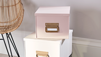
SUMMER
Calm, classical, formal, elegant and reserved. Logical with attention to detail and love of quality as well as soft, soothing, responsible and romantic.
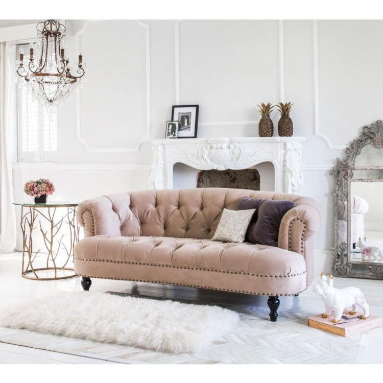
This is not the gaudy purple hibiscus of summer but more the cool faded colours of the Ile de Re or Provence. Shades of pale grey or lavender with classic pieces arranged in symmetry. It is, above all, tasteful. If you like The White Company then you are a summer person. Yes, there is pink and red but they will be faded and desaturated rather than the brighter more intense colours of spring.
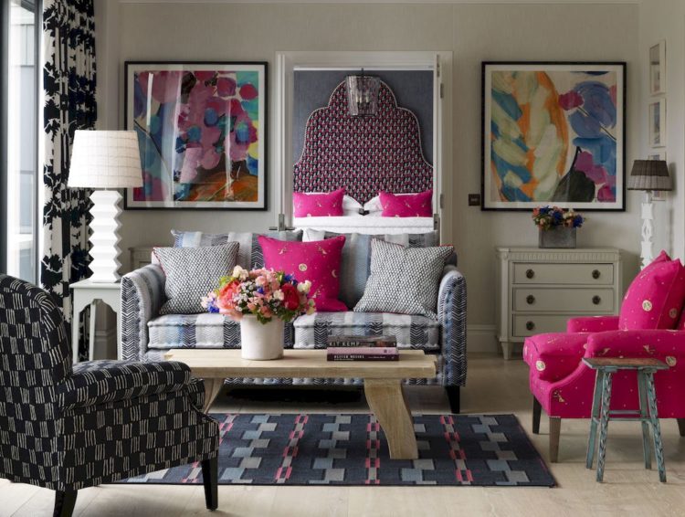
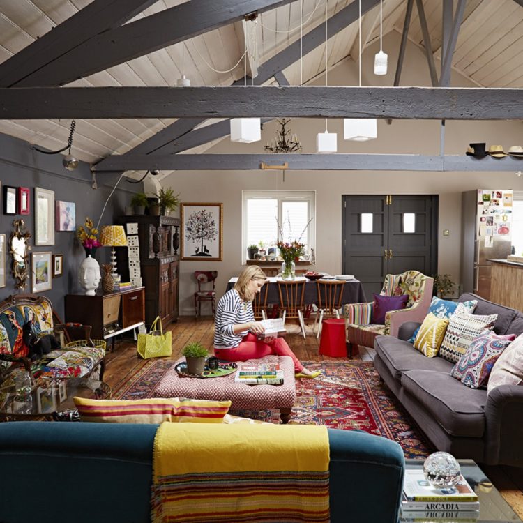
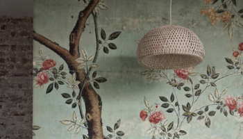
AUTUMN
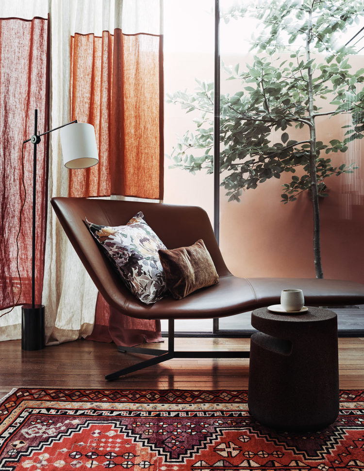
Comforting, cosy with energy and flamboyance, eclectic and intense, friendly yet independent and above all welcoming.
This is a room where books will be part of the decor. The colours are warm but can be muted as well. They like stuff – collections of objects – and textiles will be made from natural fibres with lots of plants. There will be an informality to an Autumn room where you will be invited to come in, relax and take your shoes off. But the surfaces might be slightly worn, the velvet patched and layered. It’s not a calm space because there is so much to look at but it is welcoming.
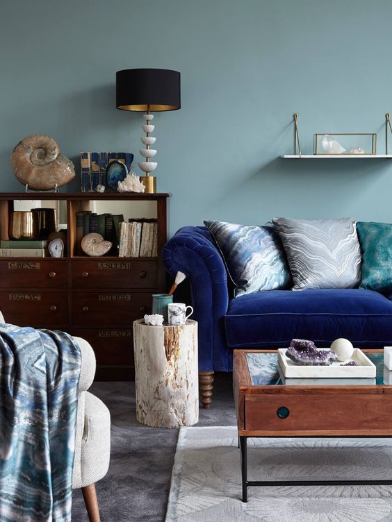
WINTER
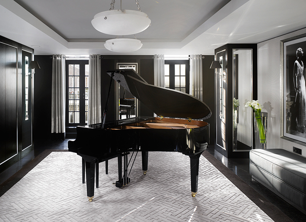
Dramatic, uncompromising and uncluttered. This is the only season to include black in its pure form. Cutting-edge, decisive, unfussy and expensive yet also understated.
A room of strong contrasts – bright colours, neons, and strong contrasts of block colours. A monochrome room with clean edges usually belongs to a winter person. It will be neat (in contrast to the cosy clutter of Autumn or the carefully placed arrangements of summer). This room will feel austere to the other seasons but like it or loathe it, a winter room always makes a big impression.

So what do you think? Sophie is clearly a Spring with a hint of Autumn person. I am basically Autumn with a touch of Spring – which I was not expecting when I turned up. If you want to learn more about this (while eating great cake) by hearing the presentation and then making your own mood boards and putting your new skills into practice you can book a place here. I do really recommend it for both professionals and anyone who is decorating and is a bit lost on where to start.


Loved this post! And kept nodding along the descriptions- I’m a complete Spring/Autumn cusp, both personality and interior wise. x
Yep. Pure Autumn, but I knew that before I even read the descriptions: colour me Leo, BoHo, rooms filled with rattan & plants & cats & books & rugs & wind chimes & textiles. I thrive in shades of gold & cantaloupe, mango & passion fruit, paprika & chili & curry, with tones of aqua & turquoise & lime & a swirl of cream to cool the heat. My words include: lanquid, heat, tropical, jungle, elephant, India, patchouli. LOL! For the record, I’ve decorated like this for 50 years, which either means I’ve known my style forever or I’m hopelessly out of date 🙂
I’ve tried so hard but honestly, I’m every season.
I wrote down my words before I looked at the seasons and I’m every one of them!!
Not so much Winter, but I am just about to paint my office black and white and I want less clutter than my front room.
I love SPRING – Circles and patterns and sparkles, I love SUMMER – classic pieces arranged in symmetry, I love AUTUMN stuff – collections of objects – and textiles will be made from natural fibres with lots of plants.
My home flows, I checked, I have a ‘red thread’!! its Plants, Car memorabilia/art and Black frames.
Why do I love every season!!!
From the descriptions above I think that I am ‘late spring/early summer’!!!!
I thought Autumn before I scrolled down, and there it was: a room very like the one I’m sitting in.
Fantastic post! Makes total sense to me. Just self-tested and it’s spot on. My very recent lounge make-over features ichyra blue with all things you describe for an autumnal lass. And my new interiors autumnal styling preference reflects my autumn clothing palette too. . Thank you from a happy Welsh redhead.
For me this has been an age old idea, (I am now a grandma). In the late 80’s having been made redundant from quite a high powered job, I applied to a then famous American computer company. Tough job, full day and I’d once again be “the last MAN standing”. My office was painted pea green, that year’s Corporate Colour. Yes truly. So I said I’d accept the job upon the understanding that I would paint my office Magnolia, (hardly a risky choice) because I would be living in that office more than my home. They withdrew the job offer!
This colour idea is just as relevant in work place as at home in my opinion. Oh and I am Summer it seems.
Very interesting. But I am a bit amused by the view that we are now turning towards our homes in view of the uncertainty of the world. Ha! I think we have been doing this for the past 20 years, don’t you? Besides, that is my concept of home anyway–it is a refuge, literally.
What is new is the idea that different colors make different people feel good or safe or happy, rather than the soothing neutral shades which the interiors world dictated was the answer for all. And that is very interesting…..According to this theory, I am a Summer with shades of Autumn. I feel cosy and safe in muted lighter shades but prefer order and elegance with lots of books and throws. Age, however, has a weird way of altering preferences. I am leaning towards more scaled-down interiors, perhaps as a way of de-cluttering my mind and life.
I absolutely love this Kate. It’s so interesting that colours can create a certain aura in a room that has the ability to influence our emotions; I’m definitely an ‘autumn’! Keep up the good work.