And here we are again with a little bit of soothing green for a Monday. This is for all those who need to take a breath. Green is a calming, creative colour (I wrote about the psychology of it here) and as the school holidays start but the actual holidays don’t seem to, it seemed like a good colour to go with today. So gaze on these pictures and see if they make you feel calmer.
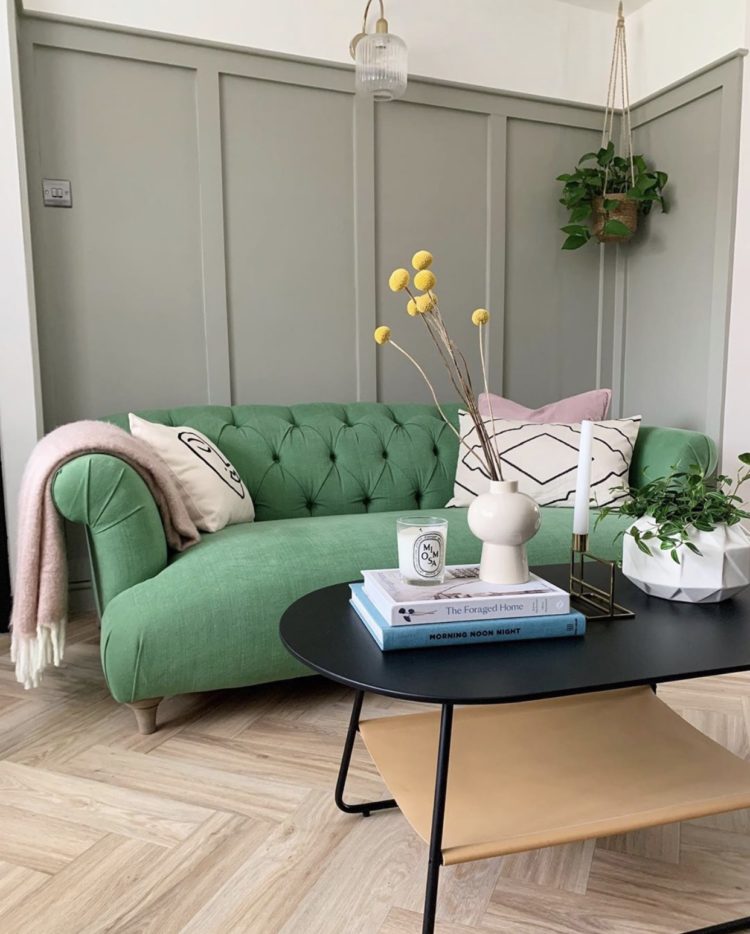
Because I’m guessing that this strong minty green is a colour that many people wouldn’t think of for a sofa but actually it’s relaxing not only to look at but to sit on and this sofa looks so pretty with the natural wood and pink. The punch of yellow flowers adds a disrupter colour to stop it all sinking into tasteful matchiness but you can see how it sits happily against the neutral wall colour.
If you have a bold colour that you love but were afraid to use, then instead of putting it all over the walls, where it might be overwhelming, think about adding it in a solid block like a chair (below) or a sofa.
That way you can take the whole scheme down with neutral walls (if you want) and even add plain cushions so that even though you have a really punchy colour it’s not so out there that you might find it unrelaxing or worry that you will go off it. Use the walls and accessories to dress the space around it – either up or down, or even both to change the mood. This can be punched up in summer with strong pinks and oranges and taken back down again in winter with ivory and pale pink. And green with brown furniture? Of course – think mint chocolate chip ice cream. If you’re not sure about colour combinations think first about nature and secondly about flavours.
And on the subject of not being sure, the interior stylist Lucy Gough used her lockdown (between wrangling her sons aged 4 and nearly two) to launch an online styling course. Lucy is responsible for some of the most imaginative magazine shoots you will find (including the Christmas Living etc which she regularly works on) and can help you find your way around a mood board and a colour palette. She created the shot above for Monsoon and you can see how the minty green table pulls the eye into the room and makes you want to see the rest of it.

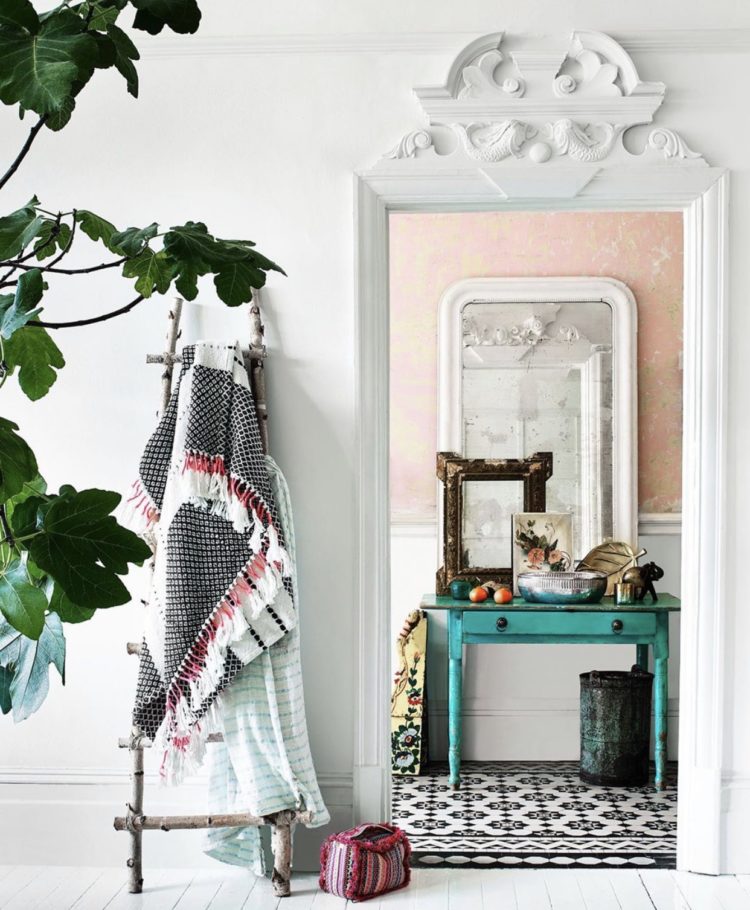
She is also responsible for this image above which is one of my all time favourite images and reminds me of the importance, not just of the disrupter colour, but of not playing it safe. If I had chosen that paper I would think I had been brave enough and would have painted the chest in that dark pink. Which would have looked gorgeous – but how much braver and bolder is that chartreuse? Keep this picture in your head to remind you that sometimes it’s important to make the unexpected choice and to push things a little bit further than your instinct might at first assume.
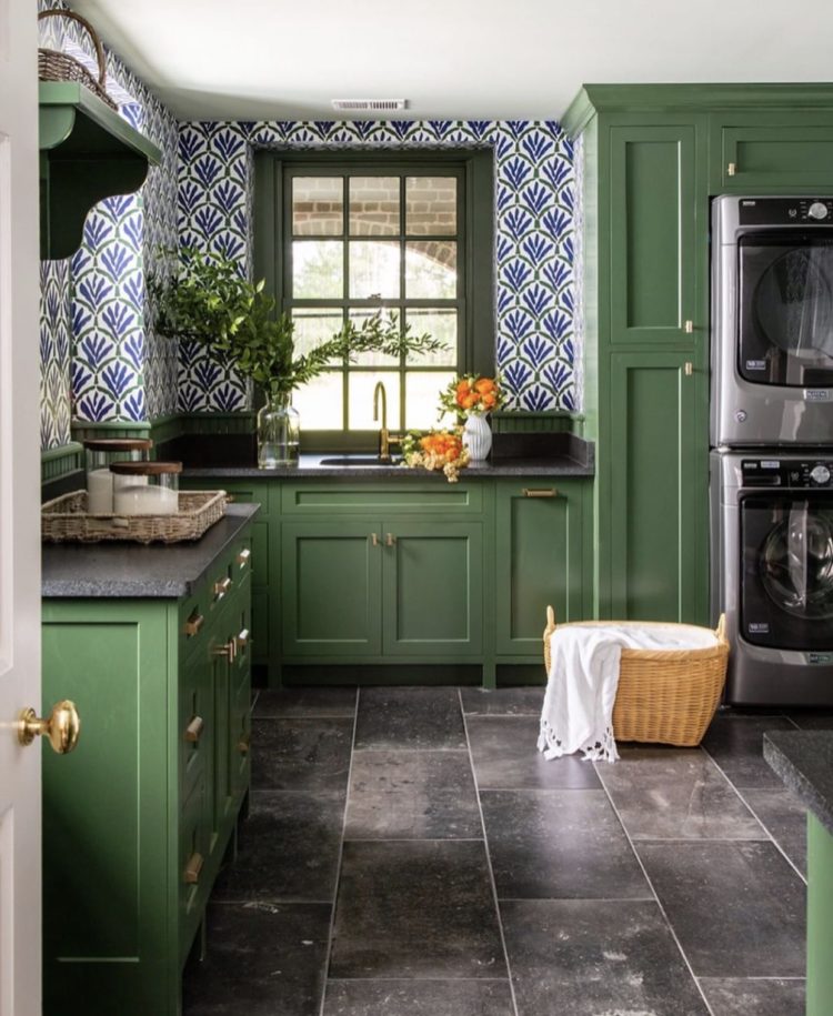
What about a green kitchen? There was a time when all the magazines were showing green kitchens and I toyed with the idea myself, before reverting to bitter chocolate, but I think it hasn’t quite come yet. Currently navy blue is all the rage among real people (by which I mean those who are actually buying and decorating kitchens for themselves and not for the ‘gram or the press). I suspect that green hasn’t yet fully arrived. And when it does this is a gorgeous version. Again, I wouldn’t have put it with blue but it works.
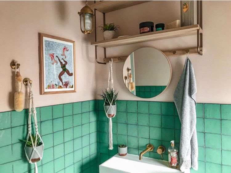
We’ll finish with this fabulous minty green bathroom and pink walls by Shrez of Plum and Crumble. Two years ago I gave a talk on how to take pictures for instagram which Shrez was unable to attend at the last minute. I think we can say she didn’t need my help either in learning to photograph her house or even to decorate it. Mint green is a classic bathroom colour, but when paired with pink instead of classic white it becomes interesting and unusual as well as warmer and much prettier. Note also the art, the natural wood and the vintage style lighting. You need all those elements in a good bathroom so no wonder it’s working.
So, who’s up for making a brave colour choice then? And who just feels a bit calmer now their eyes have drunk in all that green?


I’m about to paint my interiors in heathery-lilac shades, with a pale grey-blue ceiling & I’m surprised to find that I’ve been drawn to quite jewel green shades for cushions & things like that. Green isn’t a colour i’ve ever liked before, but your blog is one of the things that’s really opened me up to colour more. Thanks for that!
Green is my red thread! We’re just about to have a new kitchen installed in three weeks and we’ve gone for an olive green. Both my husband and I love spending time outdoors but our tiny house doesn’t lend itself to bifold doors to open up the space. We call it our junglow as it’s full of plants!
The older I get, the more I find myself appreciating the color green. I have been slowly finding ways to incorporate the color into my home design.
I’ve been toying with going green in the living room for at least a year. Just can’t decide on the right green. Grey green (Too safe?) pea green (too yellow?) or mint green(too blue?) Any suggestions?
I’ve been with you all the way, Kate, but I think I’m going to the Sophie side!!
The science of color is interesting. As a retired photographer, I came to realize that my clients actually interpreted color very differently from myself. Our eyes receive differently, just as our nose receives smells differently. It would be interesting to see what the research says on this.
I love the green kitchen. I see the wallpaper as more purple than blue and it is a combination right out of nature – lots of wildflowers here sporting the same shades at the moment. Very refreshing.
Owner of a sage green kitchen here!!!
We have no green in our house – I think it might have something to do with the memory of our green bathroom suite from my childhood. 😆
I am loving the tranquility in the photos – so I might order some samples as we are weeks away from painting our study hague blue (yawn – perhaps?).
Also, love the brass details working so well with the green.
Team green here. It’s the only colour I HAVE to have in my house. I can’t feel right without it.
Oh I LOVE green. It is definitely my red thread, love that sofa at the top too! We have a far more subtle green chair in our living room but we have green somewhere in pretty much every room, definitely my calming homely colour of choice.
I have found in planning the decorating at home recently that green is the colour I am most drawn to. Both the rooms we are changing have very different amounts of light and yet green (different shades and tones) seem the way forward to me. Maybe it’s the calming/ nature aspect or perhaps a wish for a fresh change in this strange year. Love the colour contrasts you have shown too.
Well, here is your anti-green reader again! I don’t find it calming at all, I find I recoil from it – isn’t it odd? That green from Benjamin Moore is one of the vilest colours (to my eyes) I have ever seen! The psychology of colour is indeed very interesting. In my house, the only green things are plants and that is never going to change. It’s blue and white all the way here – can we agree to disagree?
Thank you for your blog, I always jump to it when it pops into my inbox.
I’m so sorry Jean, I had forgotten! Look away now and come back tomorrow! There was a reader once from the former Soviet block and she was really unhappy whenever I posted about the trend for half-painted walls as for her it meant institution! We all react in different ways and that’s the joy of interiors for me. Its cultural as well as about our own tastes and trends.
Ha! The same here – as I am also from a former Soviet-occupied country, half-painted AND mint green walls are super institutional thus repulsive to me! 😀 (I have to add that maybe “institution” evokes different feelings in a person who lived in a dictatorship even as a child than in you ;))
Interesting! I am from Serbia (former Yugoslavia), and we pretty much have the same esthetic as the Soviet countries. Half painted walls were all over schools, hospitals, police stations etc. BUT the only institution where I spend a lot of time was my school – And I loved going to school. So, I just did the half painted walls in my living room and I love it! My mother had the same reaction as the rest of you though…