Starting today with a bright burst of yellow as the clocks went back yesterday in the UK and although I’m typing this on a beautifully sunny Autumn morning (albeit with no idea what time it actually is) it might all have gone to winter by the time you are reading this in 24 hours time.
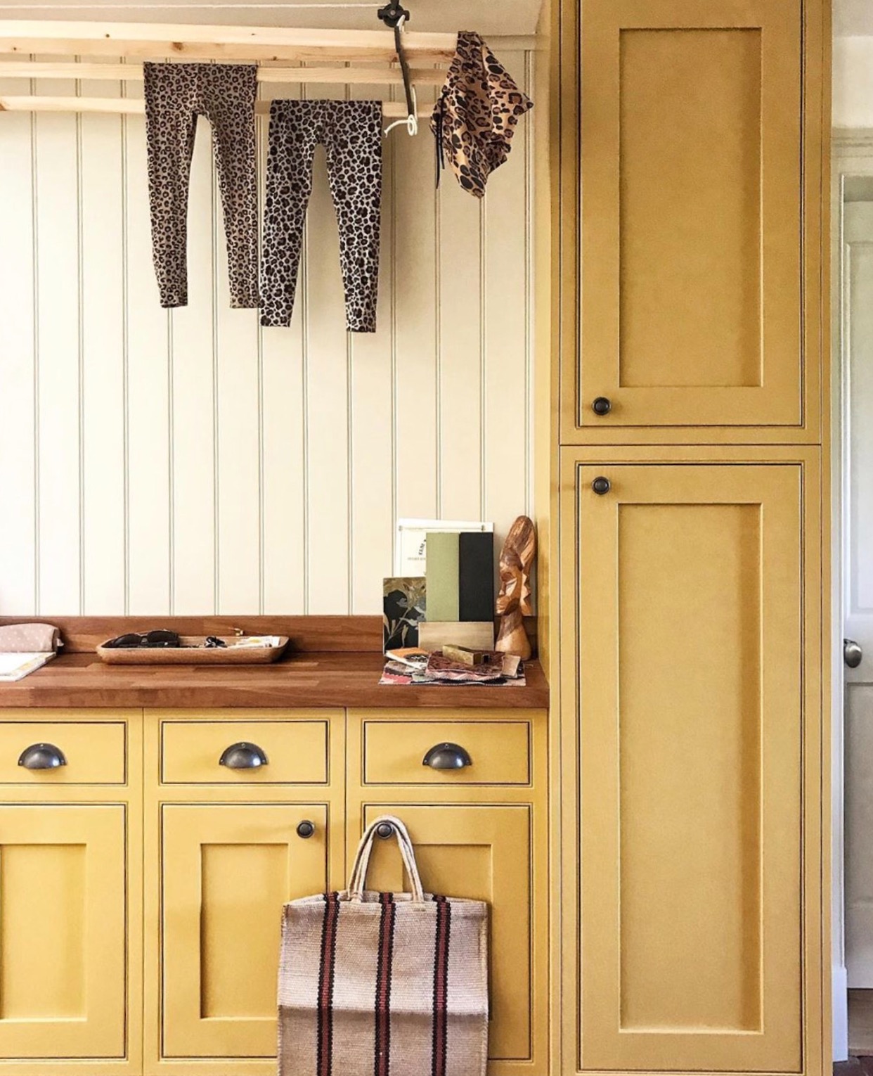
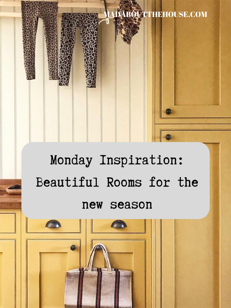
Listeners to the podcast will know that I’m not a huge fan of yellow. Sophie has splashes of it in every room but I have none. However, I have recently worked out that I really, really ( I mean really) dislike that bright primrose and daffodil yellow whereas I actually rather love that turmeric, slighty dirty, old gold sort of yellow. Like this India Yellow as used on these cupboards in a utility room by Wendy Clarke, of @our_esses_house_renovation (and captured here with matching leopard print drying laundry by Erica Davies.
I have also, in linking to this colour, just discovered that it is made from the pigment collected from the urine of cows fed on mango leaves. So there’s that.
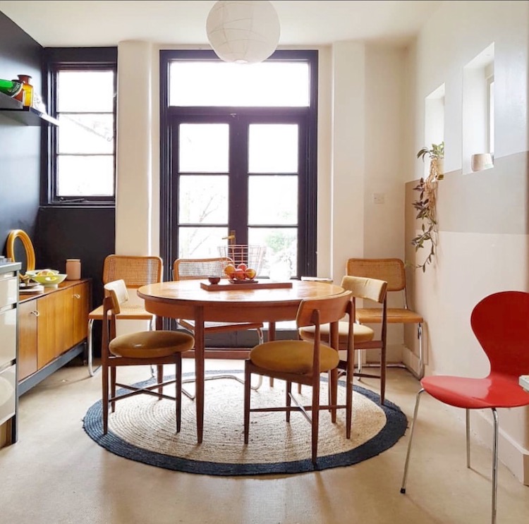
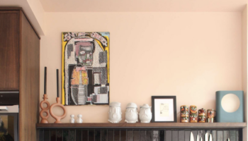
Moving (swiftly?) on to this equally warm, and less uriny? kitchen belonging to Mary Le Comte of vintage store Mosey Home. The mid-century chairs with their yellow seats reflect the warm wooden tones elsewhere in the room while the black accents highlight the shapes and bring the whole scheme more into focus. The red chair is the perfect disrupter colour.
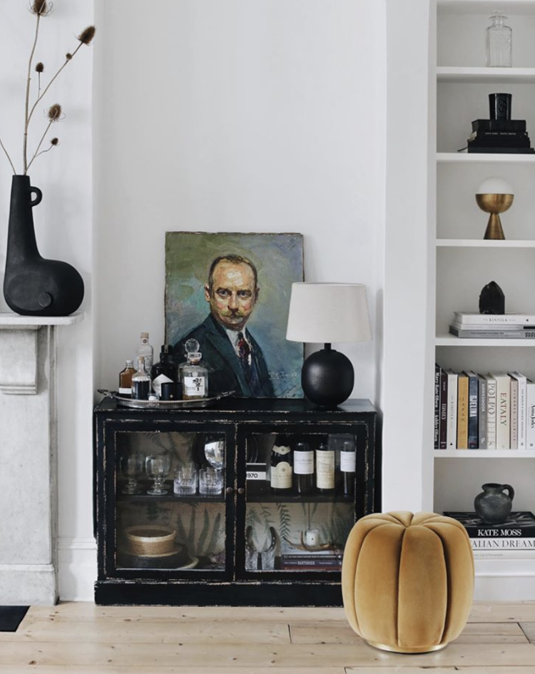
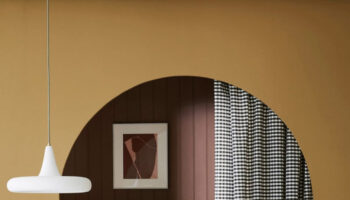
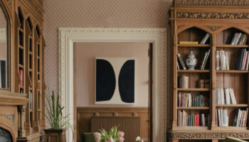
Staying with that vintage gold yellow shade and we have this pouffe from the recent Anthropologie x Soho Home collection in the home of No.17 House. As you can see the scheme is mostly black and white but the velvet just picks up on the painting on top of the cabinet and pulls the brass and mustard shades out on the shelves and in the cabinets and even the book.
That’s what a well-placed drop of colour can do. Without that piece you would notice the painting but I’m guessing the other details might disappear. With it there, your eye is carried around the room and you notice the subtle details. With a neutral background like this you could add any colour you like or change it when you got bored. You could add a deep red chair, which might highlight a pink book and maybe even change your perception of the skin tone of the painting. Blue is another obvious choice given its background.
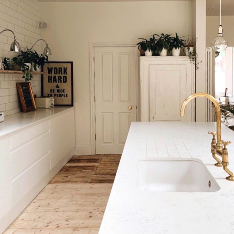
Heading for a couple of warm neutral kitchens now where the brass and wooden elements stop them being too sterile and modern. You don’t have to use lots of colour to create a warm homely effect but you will need to incorporate lots of different textures and surface materials and, it has to be said, nothing too perfect. That is why something vintage is always a good idea in a room, even a modern functional one like the kitchen or bathroom.
Whether it’s door handles, lamps or chairs or, if that’s your vibe, 60s plastic furniture, always try to have something that was hasn’t just been made and had no life before it came to your house. That’s how you get the finishing touches and the final details. And, I know that will seem obvious to many but it’s a question I am asked every week so I thought I would mention it in the context of this post.
That’s all for the rooms but if you want to hear my very short interview about sustainable interiors (buying vintage and getting a mention for #DoLessHarm on BBC Radio 4 You & Yours then the link is here and the feature starts at about 28 minutes in until 32 minutes.

Hi Kate
I love reading your blog, and if you have any design tips on whether you think yellow goes (at all) with green (Breakfast Room Green in this case) then we’d be really grateful!
Thank you
We’ve been contemplating painting a feature wall in our kitchen yellow for some time. It’s a north facing kitchen extension and while it’s got big bifolds it never gets any sunshine.
Question for you Kate, we’ve painted a big built in shelving unit in our kitchen Breakfast Room Green by F&B. I loved it last year but in the north facing light it’s a bit light sapping. What would you pair it with on the other walls to lighten up the room? Currently it’s pale grey (too dark) and so we are thinking pale cream. Thank you
Thank you for these inspirational yellow colors! I love yellow, and almost daily I dream of creating a yellow kitchen in our fixer upper . I may even make yellow the “red thread” in our house — I just can’t decide between yellow, cobalt blue, or blush pink. They’re all just too beautiful! 🙂
Like you for years and years I refused to have any yellow in my house. Not even yellow based colours. I stuck to cool, blue based tones. I even took the philosphy into the gardena and there was not a yellow bloom to be found, not even a daffodil. Since moving house things have changed. I bought a pair of delicious yellow Moroccan leather mules from a charity shop and painted the kitchen wall the same colour! Brightness, warmth, sunshine, fun. Spring and Summeriness all year round. Sometimes one can be too tasteful and leave out certain colours in order to ‘look good, on trend or so as not to offend others’ but what the heck, do what you love, what you need and hang the trends
So interesting.
Just checked my F&B paint chart- India Yellow looks so much darker than those lovely cupboard doors… thank you
What a brilliant blog today. Some really useful tips.