Now this is a lovely sun-filled property that is on the market with Brickworks for £735,000 and there’s lots to see and be inspired by. Coming in?
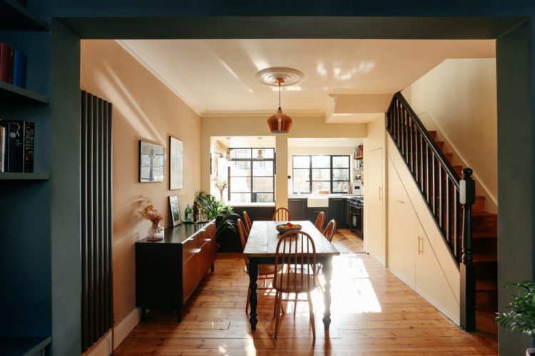
It has been extensively remodelled by the vendors who opened up the whole of the downstairs to create a lovely light-filled open plan space with a kitchen at the back, dining area in the middle (traditionally dark spot of a VIctorian terrace) and a sitting room at the front.
While they have kept the wall between the hall and the sitting room so that you don’t walk straight into it, they have opened up the walls in the middle to make the dining area feel more spacious and encourage light to flow from downstairs.
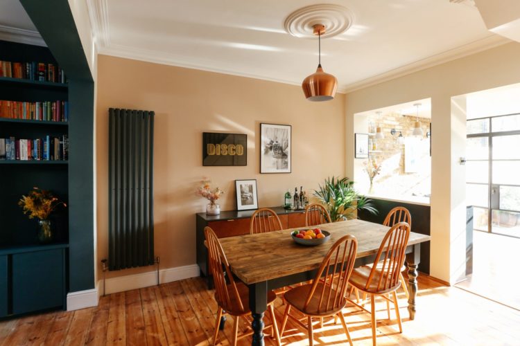
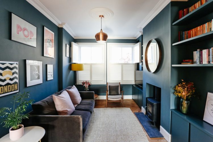
I love the soft pink walls too which contrast beautifully with the navy blue sitting area and you can see how the navy blue has been tied together with the kitchen at the other end and the Crittall windows. Even the radiator is made into a feature. As I have said before, if you have a modern featureless white panelled rad then paint it to match the wall so it will disappear.
If you have spent money on something a little more design then by all means make a feature of it as has been done here. It acts as a colour red thread linking the spaces together and the columns even mirror the dark bannisters on the other side of the room, not to mention the table legs. It all looks very considered and thought out which is mostly how you get it right. Even if it was a matter of luck rather than judgement.
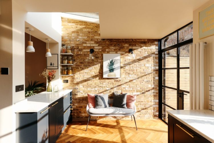
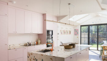
As you can see the kitchen has a peninsula to divide it from the dining room. This, for anyone who doesn’t know, is an island that is anchored at one end – usually for reasons of space. This is also a classic example of broken-plan living.
The space is open and the light can flow from front to back but there are dividing mechanisms to stop it feeling like one giant room. It’s another way of zoning a large space. You could also put an internal Critall window in that window like space over the peninsula that looks towards the dining room if you wanted further division or a bit of a sound barrier.
Moving into the kitchen and you can see here that there is a herringbone floor whereas in the dining area the original floorboards are there. One way of minimising the hard line between the two spaces would be to cut a few of the floorboards so the herringbone could flow out into the dining room slightly and if you can finish the boards with a diagonal edge all the better. It’s a bit fiddly but would create a more harmonious link between the two different floorings.
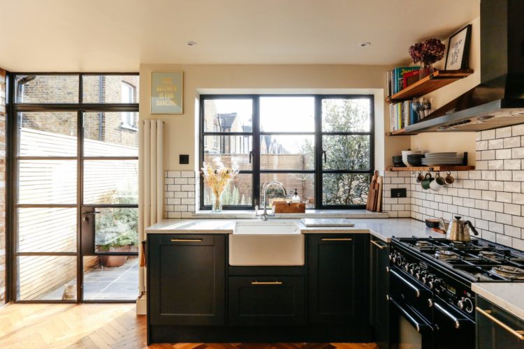
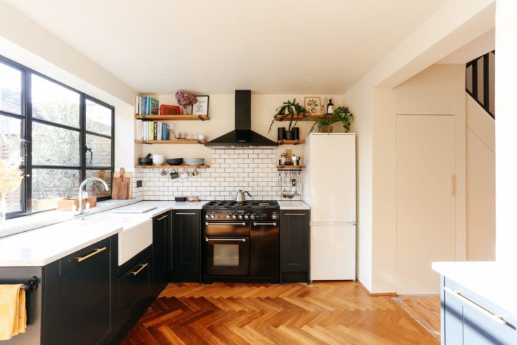
The kitchen has a soft industrial feel with its classic metro tiles and dark grout. It may be a look that has been around for a while but it’s a classic and it still works. I love it with the dark framed windows and navy blue units. It’s also really practical for a kitchen as grease and cooking splashes won’t stain the grout or make it dirty as it’s already dark.
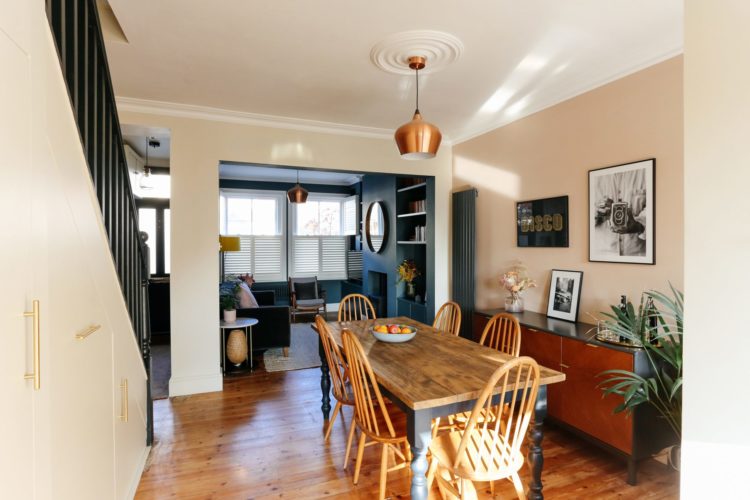
And here you can see from the dining room into the sitting room below with a glimpse of the front door so you can see how the walls were rearranged. Note also all that storage under the stairs.
Victorian houses tend to be long and narrow so there often aren’t many choices when it comes to furniture placement. That said if, like me, you tend to spend your days in the back of the house which is lighter and brighter, then think about going dark in the sitting room. If you’re only there in the evenings then why not?
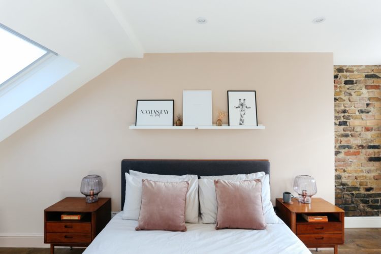
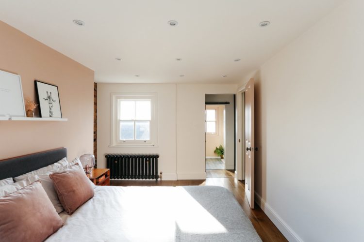
Moving upstairs and the pale pink and brick theme continues right up at the top of the house where this bedroom suite takes up the whole of the floor leading from here into a dressing area and from there into a bathroom.
This shows you exactly how it was done if you are considering your own loft conversion at any point. Not all houses are the same shape and they may have extended on top of the bathroom below so it won’t always be possible but it’s worth having a look at the floorplan to see if it mirrors yours in any way.
Just one thing – the grid of spot lights on the ceiling. Now they may be on a dimmer but there are a LOT. The ones on the left look like they will be shining directly in your eyes when you lie down, the ones in the middle are pointless which leaves the ones lighting the floor at the end of the bed. Builders love a symmetrical grid of spots but do think about what they are going to be doing.
As I have said before you need to do a floorplan first so you know what will need lighting. In this case there probably weren’t any other options for the bed placement given the sloping ceiling so it was obvious that the lights would be over it. Instead, since there are bedside lights, think about having a spot in each corner or even one that shines down onto the bedside table and one over the window to show that off. Usually the recommendation is to put them about 30cm in from the edge of the wall but it’s only a guideline and if that means it’s shining in your eyes then move it. Further back would highlight the pictures on the shelf and be prevented from dazzling you.
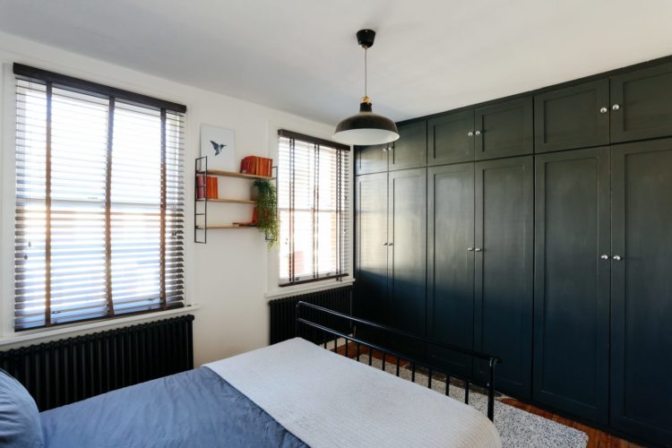
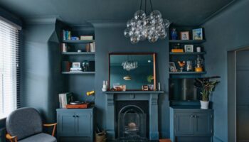
Finally this bedroom with its wall of built-in cupboards. More navy blue to continue the theme. The cupboards also go right up to the ceiling which creates a more uniform look and stops dust gathering in the gap.
Here again, the pendant light, which is in the middle of the room, is just lighting the end of the bed. Consider lengthening the flex and draping it perhaps to one side to hang between the windows (if you move in that shelf won’t be there) or adding a second flex and leading two lights over to hang either side of the bed.
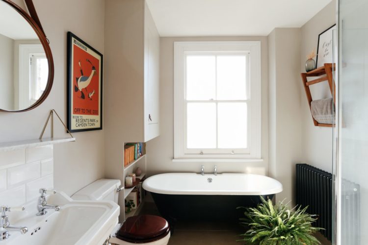
And finally the bathroom. Always a treat to have a bathroom with a natural window and big enough to squeeze in a free-standing bath. This is so simple and classic in black and white with touches of natural wood to warm it and a vintage poster on the wall.
It’s a great house. Anyone fancy it this week?

Lots to love about this one but not so sure about the total barrier between dinning and kitchen space to garden. Love the doors but feel for cat who looks like, where’s the cat flap gone…
I love lots about this house. Not the price, but everything else! Thank you for sharing
I love all of this house. The pink and blue and style — it’s gorgeous!
Of course it’s Under Offer, it’s a very appealing family house. I wish they had not painted the skirting boards white and that they had chosen tiles for the kitchen floor. The different designs of the wood floors meeting each other would irritate me.
I would also change the seating in the sitting room. That sofa is over powering.
Love this house, however would have to move the small sofa in the kitchen as I am sure that I’ll keep tripping over it when trying to get to the cupboards.
I’m loving that pink wall in the loft bedroom, any idea what sort of colour that might be? I have all the colour cards at home at the moment (about to embark on the loft ourselves) so will have a look later too.
It looks quite a bit like Farrow & Ball’s ‘setting plaster’? We have that in our kitchen and it’s soft and warm!
Thanks! I wondered about that one, I’ll take a look.
I have a problem with the “railway carriage” sitting room, it is very narrow and wonder whether reversing the kitchen and kitchen with the sitting room opening out into the garden may give more living space?
Oh my, what a lovely house. I particularly like the sun-filled kitchen. It must be so nice to prepare breakfast there in the morning!
Have a lovely weekend.
Renaud
http://blogbyrenaud.wordpress.com/